Monkeeyum is a website that helps users choose snacks based on nutritional criteria. The site offers a set of nutrition goals categories created by nutritionists with the precise amount of calories, proteins, carbs, etc. considered accurate for each goal or diet. Users can also do a custom search based on their own criteria.
HOME PAGE
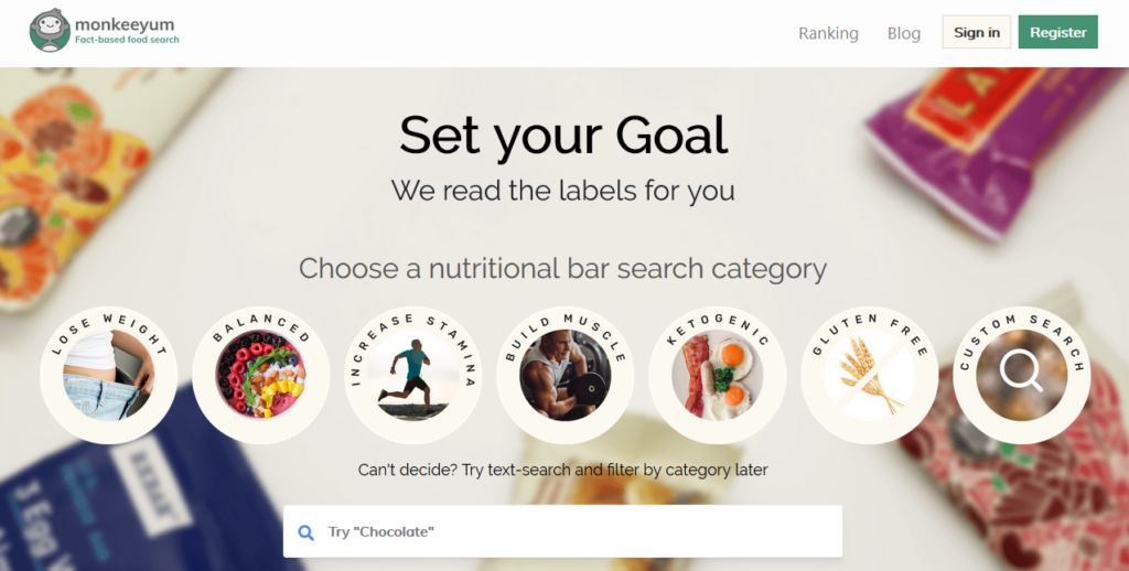
The home page is intuitive and straightforward. There are buttons with the categories and a search box enhancing the discoverability of the main functions of the site. There’s also a hamburger menu on the top left signifying that there are more options available.
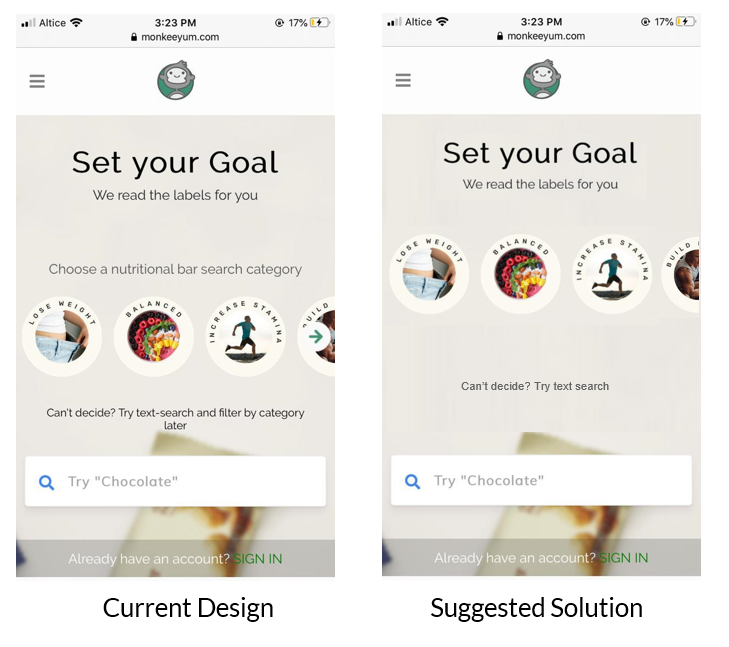
However, a minimalistic design would make the experience more streamlined. To achieve a minimalist design I suggest removing unnecessary text and relying on natural mapping to signify the affordance of the horizontal scrolling of the categories instead of the arrow (Figure 1).
SEARCHING FOR SNACKS
Once a category is selected the page changes, giving the user good feedback. However, a Gulf of Evaluation arises given the lack of signifiers of being in the selected category. This gulf can be bridged by adding a signifier such as the buttons on the home screen to reinforce consistency.
My visceral reaction when looking at this page is “this doesn’t look good”. There’s too much information and affordances that makes me feel overwhelmed, e.g. sort by function and nutrition facts cards. The solution I suggest is adding some constraints to limit user’s possible actions only to text search, scroll down and customize filters so they don’t feel overwhelmed (Figure 2).

CUSTOMIZING FILTERS
Users can customize the filters by tapping on the easily discoverable filter icon. Once tapped, a page opens displaying the categories -as in the home page- signifying which category the user is currently viewing. From here, the user can move to a different category by tapping the desired category button. Below, there’s a list of customizable filters that correspond to the nutrition facts: calories, fat, carbs, net carbs, fiber, sugar, sugar alcohols, and protein. These filters afford sliding matching users’ conceptual model–sliding to the right means increasing and sliding to the left means decreasing. The user gets immediate feedback when manipulating the filters since the numbers change immediately. Additionally, there are other filtering options such as gluten-free, non-gmo, vegan and USDA organic.
When a user intends to customize the filters, a Gulf of Execution arises since the user gets the categories that they most likely have already selected. This gulf can be bridged by removing the categories from the filters (Figure 3).

PURCHASING A SNACK
After finding a bar fitting the user’s criteria, there are two options available, signified by two buttons: product details and check price. Product details affords looking at a description, nutrition facts, and ingredients of the bar. Check price redirects to the product page on Amazon to complete the purchase. This page is clean and intuitive, it communicates very clearly what are the affordances, bridging the gulf of evaluation (Figure 4).

Don Norman’s Seven Stages of Action have been applied while using the website.
CONCLUSION
Monkeeyum is a website with many useful and easily discoverable features as the categories, the text search and the filters that afford selection of products and customization of the results. Nevertheless, some improvements could be beneficial to avoid frustration at the visceral layer of processing and to offer a seamless experience.