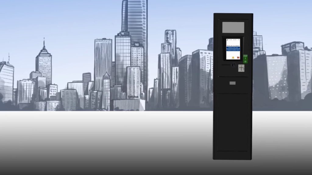
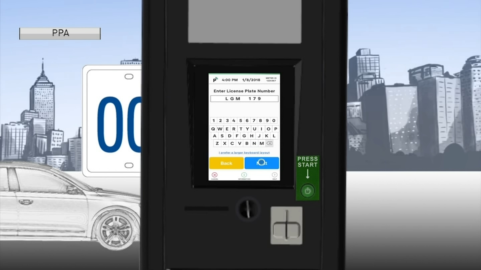
The Pay-by-Plate parking kiosks were recently installed throughout the city of Philadelphia to improve the overall parking experience for Philadelphia’s residents and visitors. This new kiosk is designed with features such as make payments, four languages, additional receipt options, solar-powered, and tracks payment by license plate number.
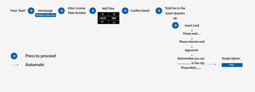
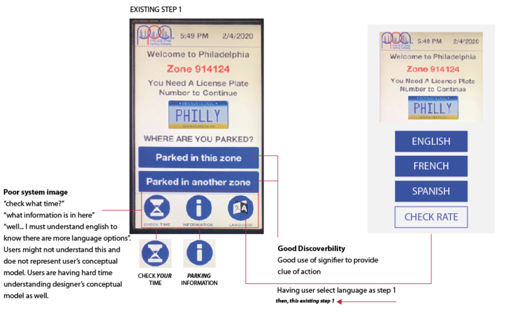
Homepage
The homepage design is quite simple. This simple interface aims to make parking experience easy and quick. The main actions on the homepage are Park in this Zone or Parked in another zone. These are examples of signifiers that provide a clue for an action. It also consists of important information such as license plate reminder and current zone number. Some of the secondary actions are check time, information, and language.
The design is straightforward and did what Norman suggested to focus the interplay between technology and people to ensure that the products fulfill human needs. Discoverable and feedback are great on this page. People use this kiosk to pay for their parking, so making sure people can proceed to make payment quickly is essential. In this case, the color and labels are used to signify actions. The most important tasks such as Parked in this zone and Parked in another zone are emphasized by a blue background with bold white texts like a button you can click. This button design is a signifier for the user to click or press on it. Therefore, users are immediately drawn to this action and able to target their needs efficiently. It’s also considered a good design because it’s designed to understand people; for those who parked and ready to pay. Great system image(for the most part) that accurately illustrates what users need or their conceptual model. According to Norman, “it’s not our duty to understand the arbitrary, meaningless dictates of machines.”
Homepage Negatives
Check Time, Information, and language at the bottom of the page seems confusing and not clear. In this case, we are now responsible for understanding machines which are not what Norman is suggesting. In my option, language should be the first thing users need to select if the additional languages are an option. Re-wording and clarify are necessary to something like ” check your time” and “Kiosk or Parking Information” to better match our conceptual model. It’s considered bad design if no one understands the purpose of it or use it.
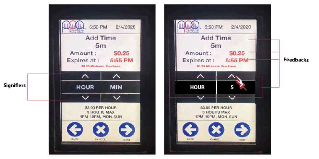
Add Time Page
This page is an example of a good conceptual model because it’s easy to set and understand. The discoverability or gulf of execution is great, instructions are clear and easy to follow. Users can see the amount of time they put in and when it will expired. The arrow signifiers allow users to increase or decrease the amount of time.
Add Time Page Negatives
The gulf of the evaluation process can be improved. For example, there’s no interaction between the arrows with “HOUR” and “MIN”, which was in my conceptual model.
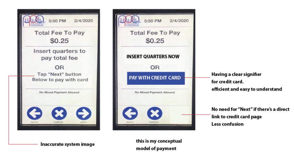
Payment page
On this page, you can pay with a quarter or go to the next page to pay with a credit card. The designer expects the users to read texts on this page since there’s no signifier or affordance on payment methods.
Payment Page Negatives
System image is unclear and did not adequately communicate with the conceptual model. Compare to the other page, this is poorly designed. It forces us to behave in a way product wishes rather than as we wish(consider bad design by Norman). The “Next” on this page has a different function now. For those who want to pay with a credit card, they have to click “next” after reading the instruction. Users need to spend extra time figuring out the next step, which defeats the purpose of efficiency. I tent to insert my credit card on this page very often because, in my conceptual model, the purpose of this page is to pay. After a couple of seconds of not machine not responding, then I realized I have to press next.