
Splitwise, a really popular application which was launched in 2011, helps people by making it easier to split bills and other expenses. It stores the user data on the cloud giving them the flexibility to access it anytime, anywhere. Splitwise provides a really aesthetic and clean UI to help people manage their expenses by giving them a clear picture of who owes whom along with the amount owed.
Home Page
The initial home page is pretty well designed. The “+” sign embedded in an orange circle (Fig. 1) is easily discoverable and acts as a good signifier and informs the user that it represents adding an expense. The home page also features a total balance section along with a pie chart giving the user a snapshot of the total amount owed which is visually very impactful.
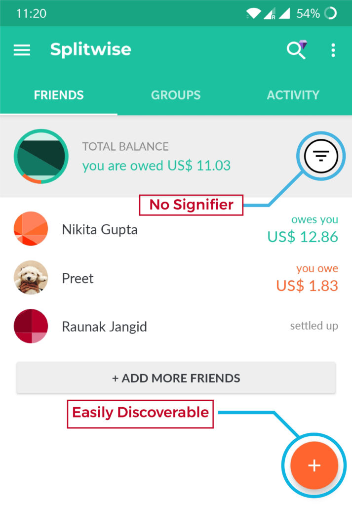
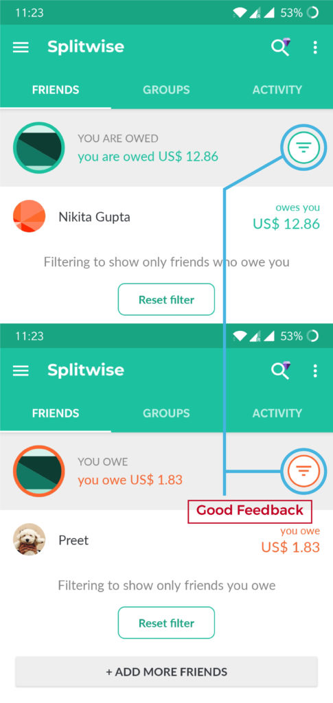
The Problem: The filter icon lacks a signifier (Fig.1) creating a gulf of execution, i.e the icon is not descriptive enough of it’s function. Although the filter icon does provide proper feedback (Fig.2) by changning the colour which follows the Norman’s principles of design.
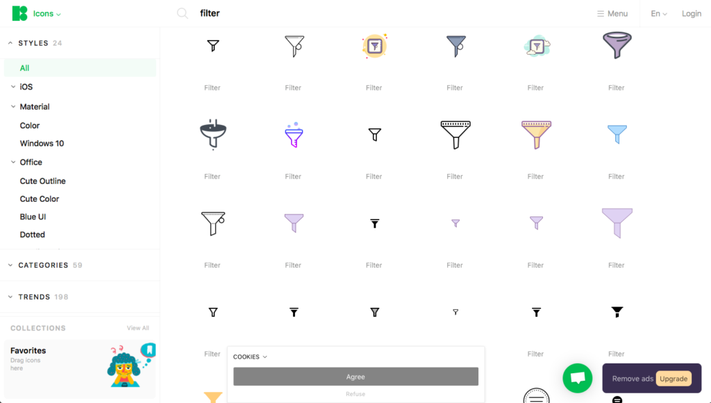
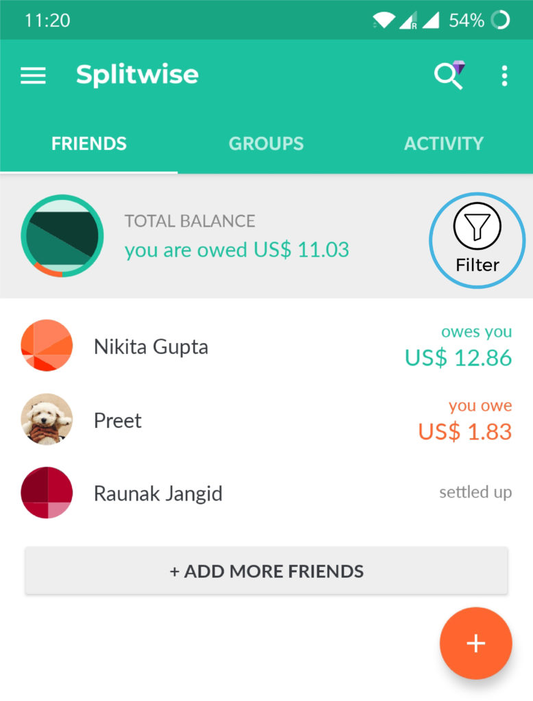
The Solution: Most commonly used filter icons can be seen in (Fig.3), using one of them or placing a label beside the icon (Fig.4) would help the user make use of the knowledge in the world and perform the intended action leaving no scope for action based slips.
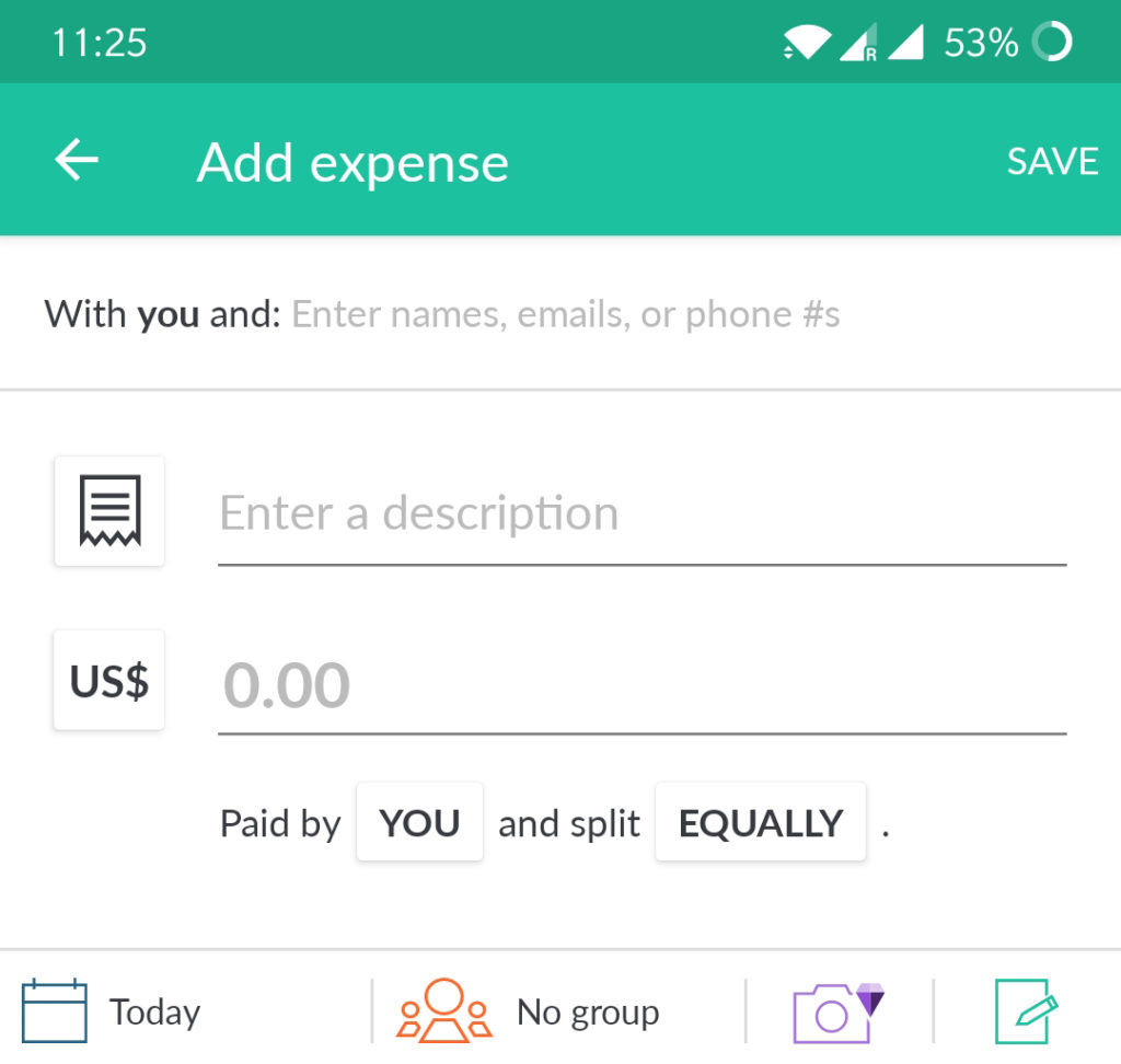
Add expense page
The ‘add expense’ page is designed following a minimalistic style (Fig.5) which provides logical constraints on what all actions can be done, ex: text can’t be entered in the amount field. The icon for the description changes according to the entered text.
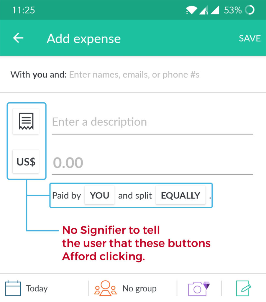
The Problem: The description icon and the currency can also be changed as per users preference directly from this page, but there is no conceptual model to tell the user that these button afford clicking. This simply constitutes for an incoherent system image (Fig. 6).
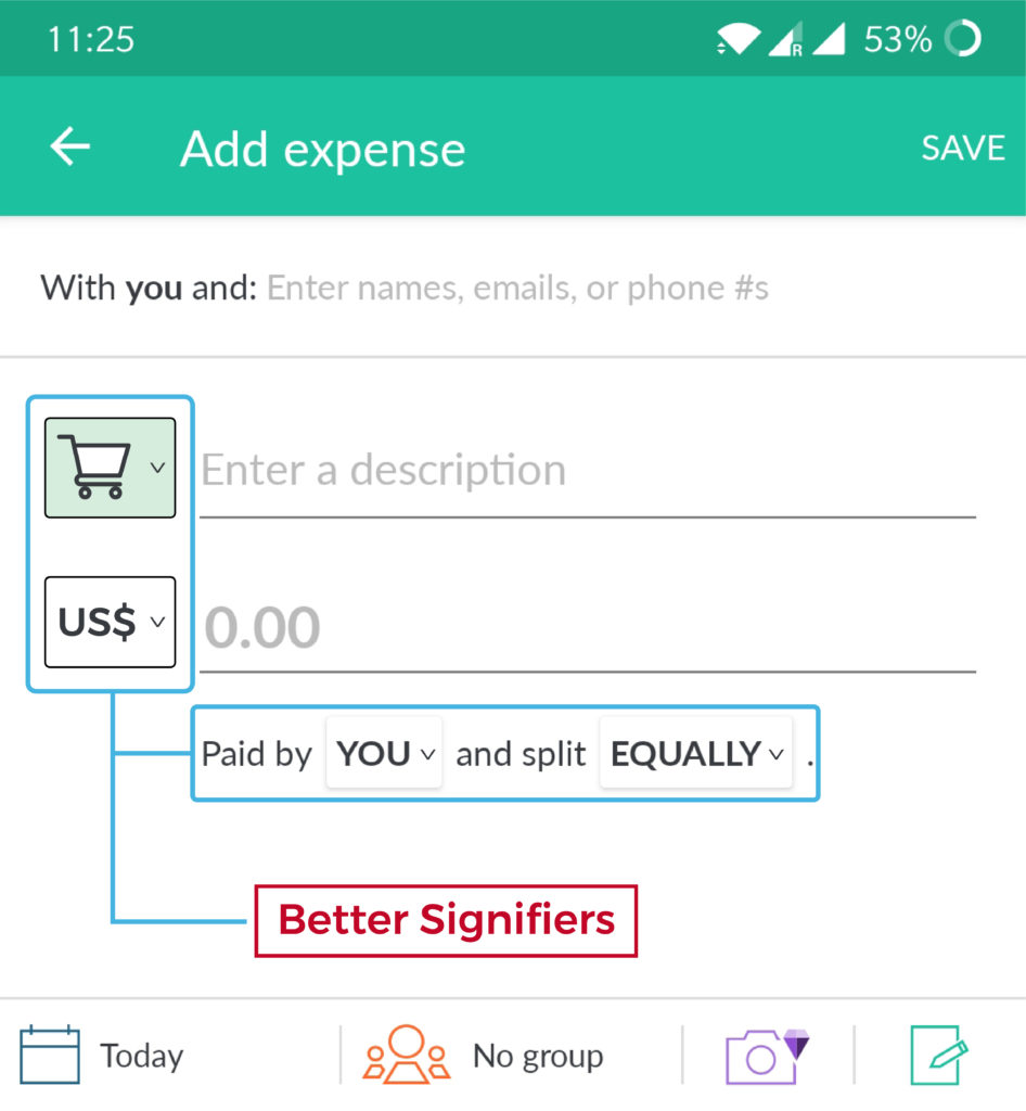
The Solution: These problems can be easily resolved by providing a drop down list icon in front of these icons which easily combines the knowledge in the head and in the world to create a coherent system image for the user (Fig. 7). Similarly the “Paid by YOU” and “split EQUALLY” options can also feature a drop down icon to communicate that they afford clicking.
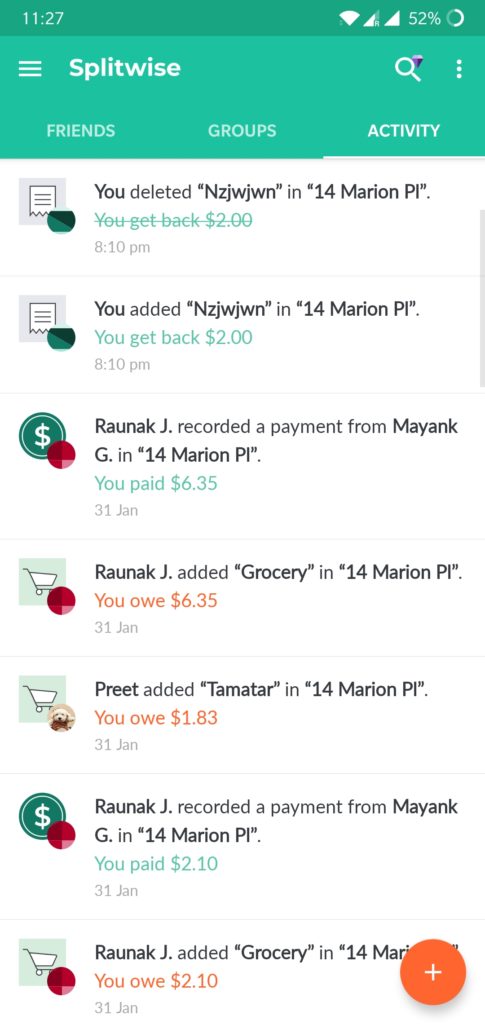
activity page
The activity page shows all the spending of a month arranged from the most recent ones to the oldest (Fig. 8), giving the page a natural mapping. By clicking on any particular payment user gets a feedback in the form of redirection to a detailed page where they can either edit or delete the expense.
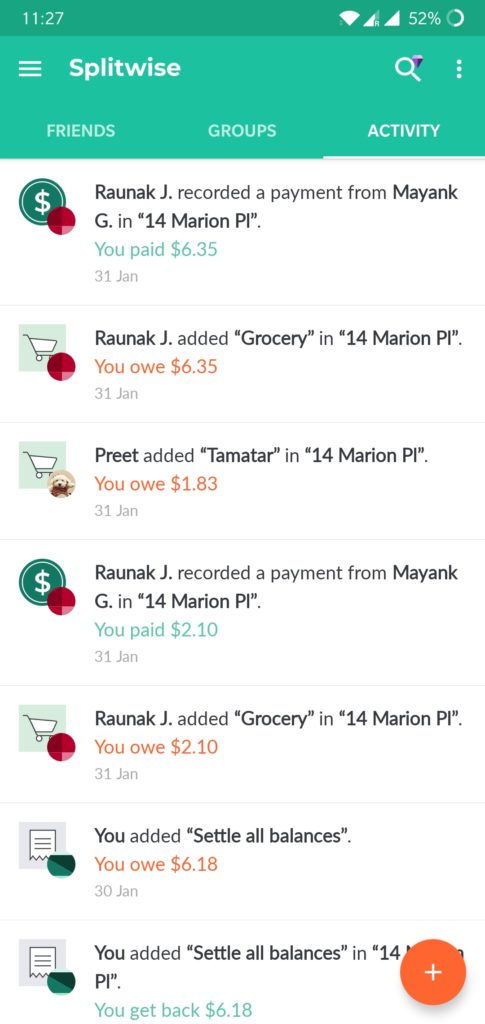
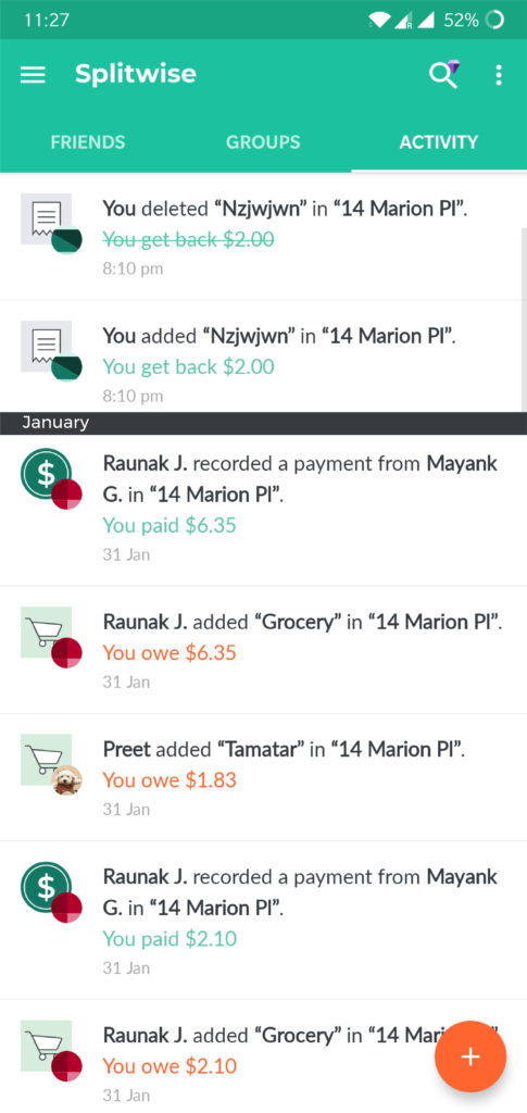
The Problem: There is a lack of signifier to distinguish between the entiries of one month from the other. Once an expense has been added it can’t be deleted completely (Fig.9). The expenses are not grouped according to the description categories.
The Solution: Labels can be added to the list, to signify the months (Fig. 10). The delete expense option should give the user the flexibility to either completely remove the expense or keep it for record purposes. Grouping the expenses into categories and providing signifiers in the form of icons would constitute for a more human centred design and make the overall experience of the user more pleasent.
conclusion
Splitwise is a well designed and well implemented application, it solves the major problem of keeping track of expenses amongst friends. The paid subscription of the application also adds on a few more features like, expense search, itemization, etc. Making a few changes can make the already enriching user experience of the application absolutely seamless.