SPOTIFY is an audio streaming service (free or subscription-based) available via web browser and desktop or mobile apps. It affords searching, organizing, sharing, and of course playing of audio content, including albums, books and podcasts.
The convenience of addressing the ‘entire activity of music enjoyment’ is noted by Don Norman himself in The Design of Everyday Things when he cites the iPod’s success in this area (p233, Second Edition). Indeed, Spotify as an app readily utilizes and builds on existing conceptual models from old-school record collection and music playing first mastered by the iPod, as well as advances that have come since.
This critique will evaluate, in order, smaller activities and tasks that contribute to the larger activity of creating and listening to a playlist on the desktop app for the Mac platform.
1. Logging In and getting oriented
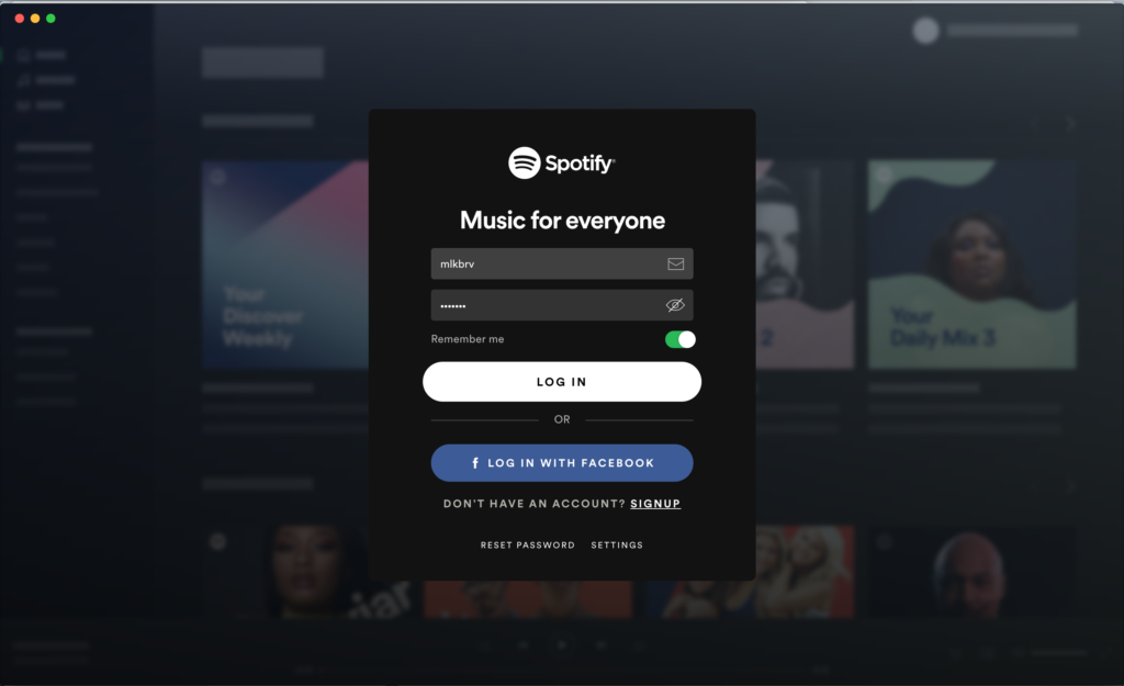
Upon installing and opening up the app, one is prompted to log in or sign up, with fields that afford that action. Here is the first example of Spotify’s uneven use of signifiers. The skeuomorphic envelope icon is featured in the first field, indicating (only) one way that an existing user might log in, but it is not clickable. Directly beneath it is an icon that is clickable, toggling the visibility of the user’s password and providing feedback both by changing the icon and revealing or concealing the password. This inconsistent tying of icons to functionality establishes a gulf of execution. Distinct treatments should be created for directions or descriptors (e.g. clearly formatted text) and functioning buttons (e.g. clickable icons) and used consistently throughout the app.
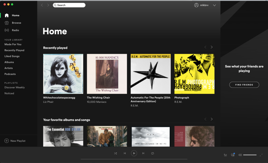
Alas, this inconsistency exists throughout the environment. Focusing on the left pane of the home screen, different signifiers, including icons and typographic treatment, are used to indicate and highlight navigation items that are not dissimilar. In contrast, the app successfully uses color bars in this pane as consistent feedback for which section one has selected and now exists within. The three sections should either have a consistent treatment, where all items listed in the pane are treated similarly — or more clearly define the differences, through noticeable changes in type weight, color or background.
2. Creating a Playlist
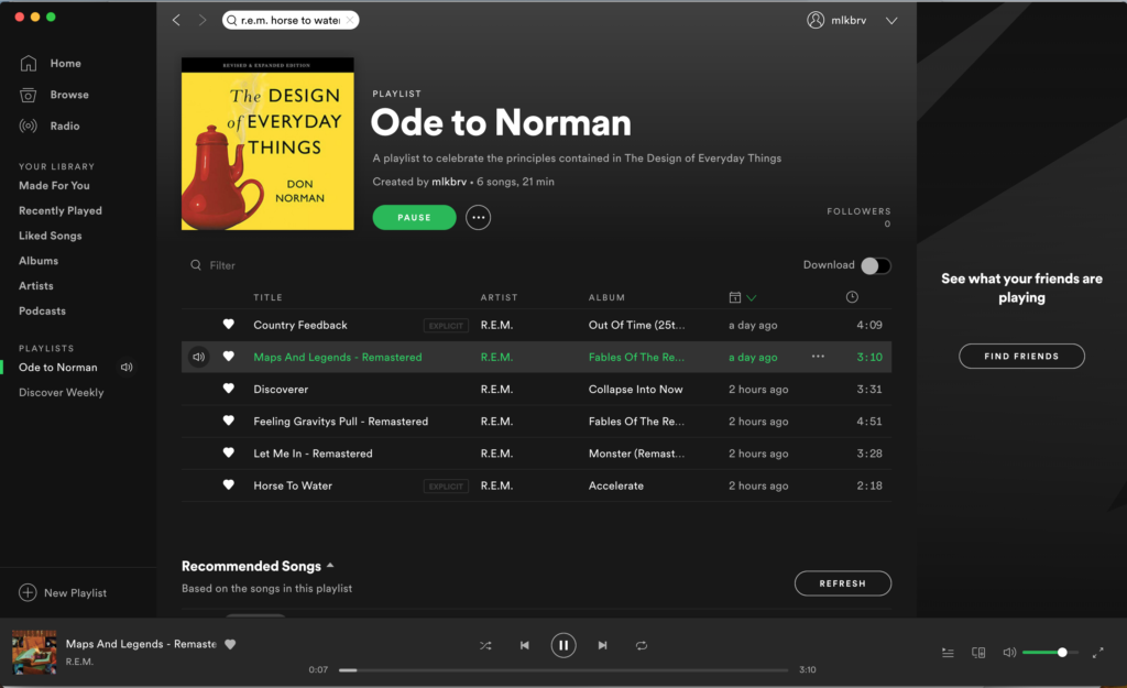
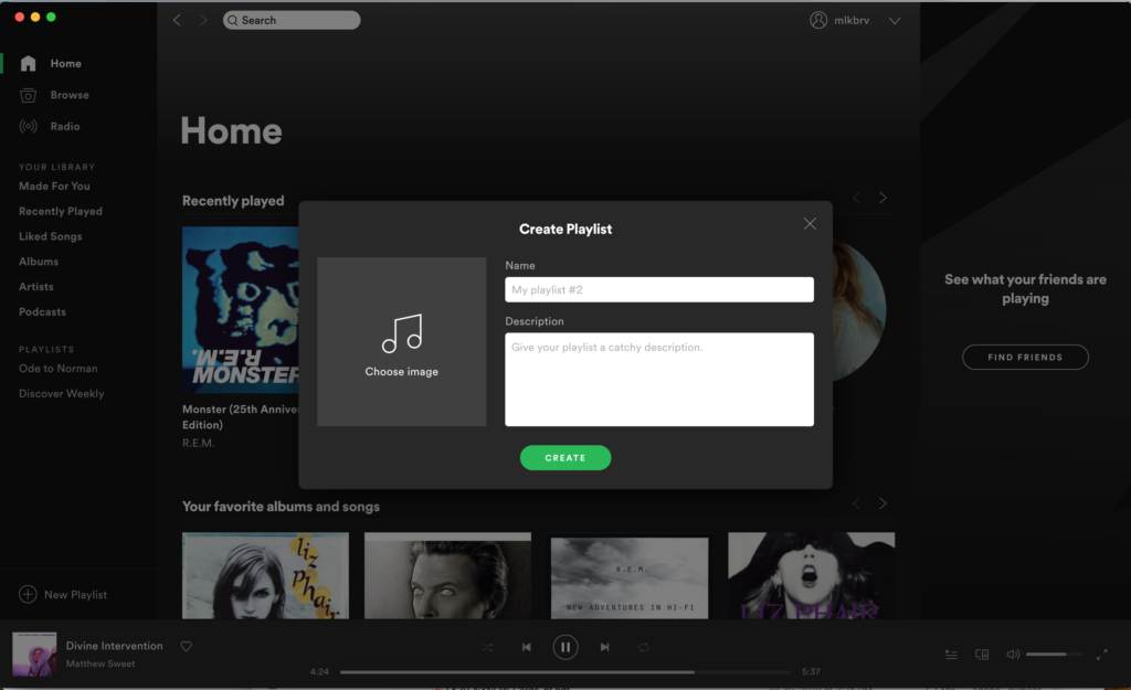
Creating a New Playlist is an easily discoverable activity, with the icon/button located below the existing list of Playlists in the left-hand column. Feedback is immediate in the appearance of a pop-up window (note the unnecessary icon). Once the user has filled out a title and description and selected an image, clicking a clear button creates a playlist and presents a new window. Execution and perception are clear.
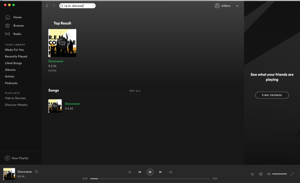
Part of creating a playlist — especially a thematic one — is Searching for songs. The first step in this activity is prominent and easily discoverable, as a field at the top of the page that utilizes standard signifiers of shape and icon.
Search exemplifies knowledge in the head combining with knowledge in the world. A user brings to the discussion partial memory of a song or artist. The search bar affords entering what knowledge the user has and counters it with its own vast store of knowledge in the world, occasionally (algorithm-willing!) allowing for the error of misspelling (e.g. helpfully finding ‘Sandinista!’ when one types in Sandanista). Spotify filters this input with real-time feedback, changing the offering below the search bar until the intended song or album is found, or an error is caught.
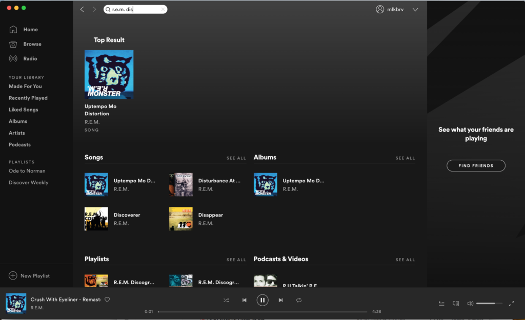
But a gulf of execution is created. There is no immediately discoverable way to add the found song to a playlist, an action one cannot perform until selecting the song (displaying all other album tracks in the process) and clicked on a three-dot “More” icon and drop-down menu. This is easily resolved by moving that same three-dot icon to the search results page and placing it near the found song. When one does eventually add a song to a Playlist, there is no feedback indicating this — a gulf of evaluation made infuriating by the fact that Spotify provides a very clear blue pop-up when one saves to Liked Songs (see below). The same approach to feedback should be used for creating a Playlist.
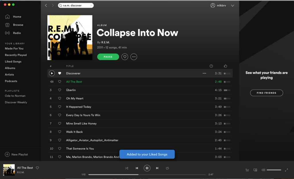
Note: Since this sample Playlist contains two tracks labeled ‘Explicit’, suggestive of cultural constraints, the author should point out that Spotify does allow in its settings for restricting the playing of such tracks. Of course, one does not know that just by reading the word. This could be an effective signifier if it were clickable, offering the option to block the song, or at least take one to the settings screen, rather than just alerting the user.
3. Playing music
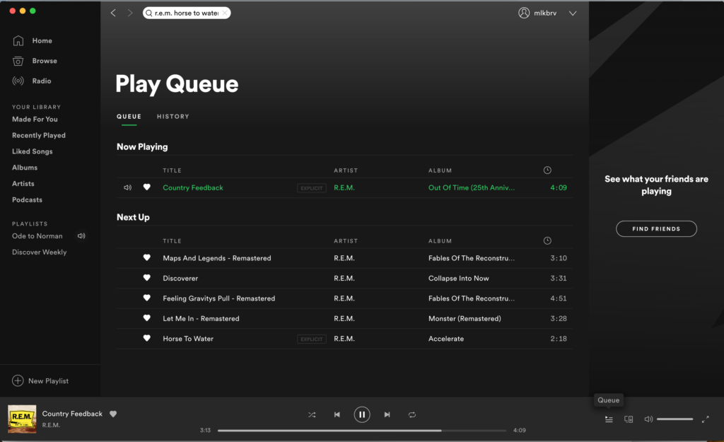
The actual music player pane of Spotify is probably its most successful aspect — owing no doubt to its use of a well-known conceptual model. It affords playing, pausing, moving forward and back in the queue or playlist, looping or shuffling, and communicates these through well-known signifiers (knowledge in the head for some dating back at least as far as cassette tapes). Equally well known is the heart that now has near universal ‘Like’ or ‘Favorite’ connotations. Spotify’s bit of feedforward — a hover function — may be unnecessary for those icons, but the more complicated and cryptic ‘Queue’ and ‘Devices available’ icons on the right side of the player could easily lead to action-based slips, were it not for these labels.

This area also contains the app’s clearest example of mapping and constraint (bundled with clear discoverability, feedback, signifier and affordance), with the volume bar controlling and indicating both the degree and the limit of playback.

Feedback is near immediate for every action. The heart fills in and announces that the song has been added to one’s Liked Songs. Shuffle and Repeat turn green to show they are on. The Pause signifier changes to Play (plus the music stops). Having looked at all those signifiers and the varied affordances and feedback, this area of the app achieves understandability — if not consistency. An icon signifies an affordance. But looking at the Queue above that controller, one finds an icon above the track lengths; an analog clock over digital song lengths. Click on it and nothing happens. Looking back to that first login screen, we have come back to the same gulf of execution.
Conclusion
The strength of existing models holds Spotify together, making it quite usable, despite various smaller design decisions that could lead to increased usability and a better user experience. One can figure out what to do, and usually knows what is going on, but it stumbles more often than it should, considering the shoulders it stands on.