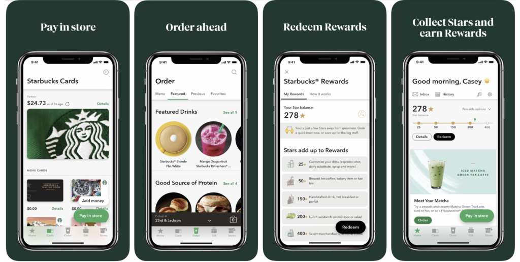
Starbucks is the largest coffee house company in the world, founded in 1971. Starbucks launched its mobile app in 2011, which provides a convenient way to pay in-store or skip the line and order ahead. Also, a built-in rewards system allows users to collect Stars and earn free drinks and food with every purchase.
Introduction
As a coffeeholic, I use the Starbucks mobile app almost every day and currently have a 611-star balance (I’m a loyal rewards member since 2017). In this critique, I will analyze and evaluate the pros and cons of the Starbucks app using Don Norman’s design principles then suggest recommendations to improve usability.
Evaluation
[Home page]
Grouped contents on the home page
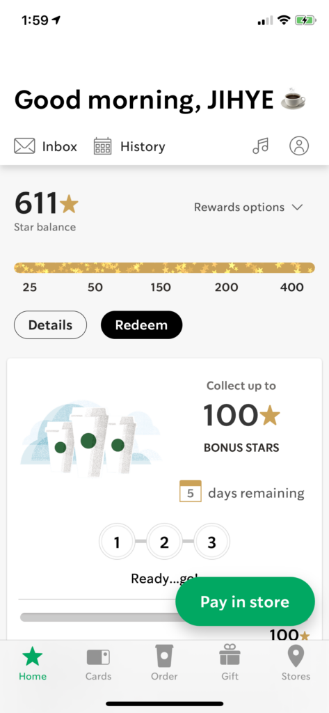
On the top part of the home screen, it provides user-focused information, such as ‘Inbox,’ ‘History,’ ‘Star balance,’ and ‘offers.’ This part allows users to engage with Starbucks in various ways; for example, see how many stars I have, redeem the rewards to get free drinks or food. One of the famous Starbucks marketing strategies is a rewards system with immediate stars for each purchase. The app emphasizes that the marketing strategy by placing the rewards information on the top of the app.
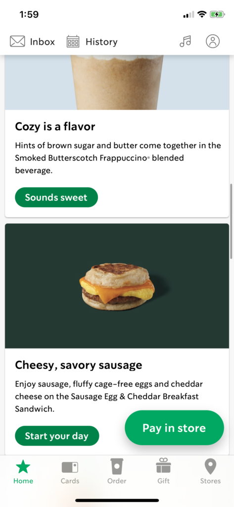
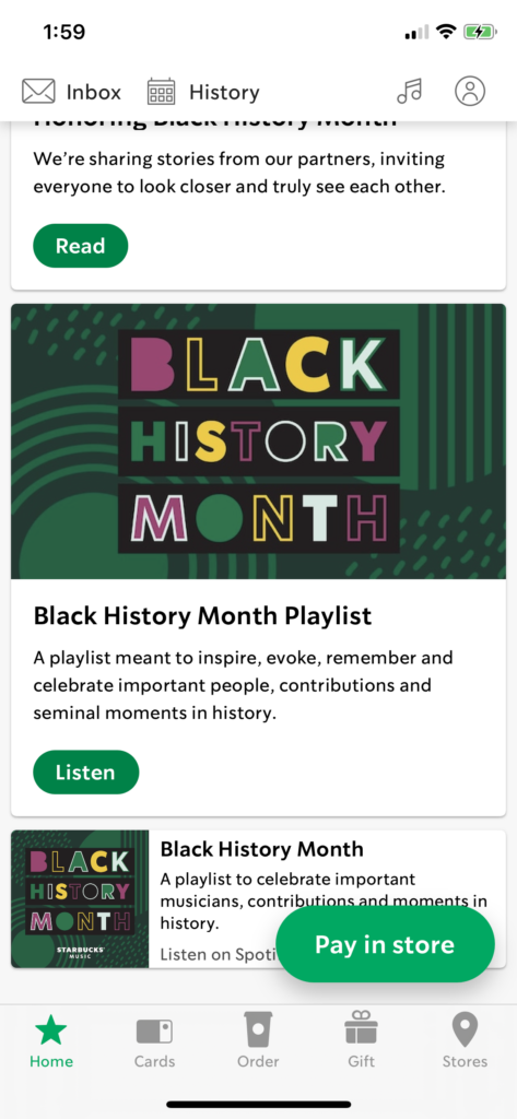
When you scroll down, there are other types of content curated by Starbucks. They suggest specific drinks and foods, promote a credit card, inform stories and news, and introduce the music playlist. Every content in this part is not user-specific, but it contains a story in which users can explore and communicate with Starbucks more deeply.
I think the content arrangement and layout on the home page follow the principle of groupings and proximity, which is an important principle from Gestalt psychology. The two types of content, users’ information, and promoted stories, grouped at the top and the bottom. The proximate grouping enables users to recognize and navigate content more easily.
“Pay in store” button as a signifier
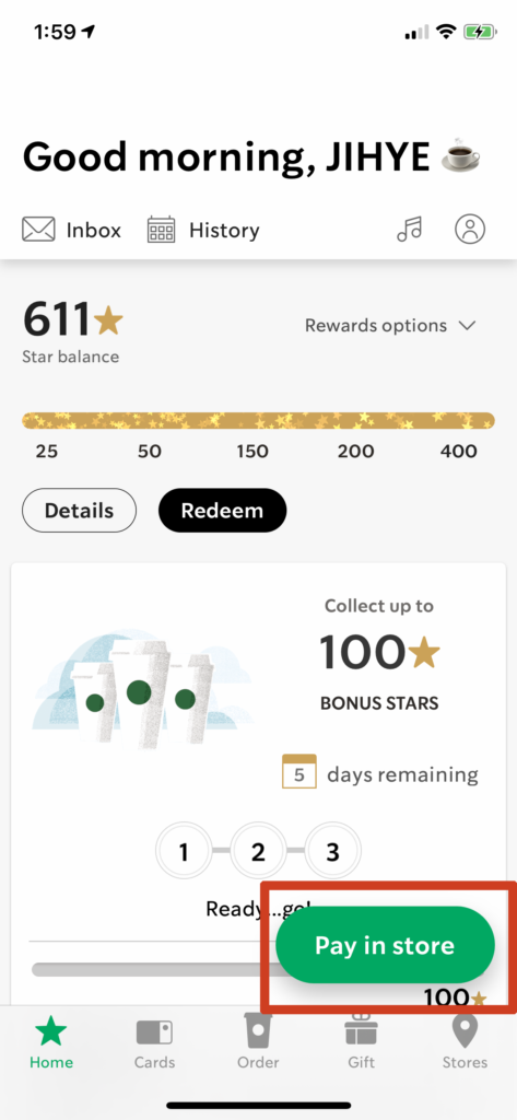
One of the main purposes of the Starbucks app for users is the payment. Thus, not only discoverable but also signified payment button is an essential element for this app. Starbucks is doing very well to satisfy those needs. I can see a clear and bold ‘Pay in store’ button at the bottom right corner. The button is fixed so it always remains there even though users scroll up and down the page. I think the visual style of the button plays an important role as a signifier.
Furthermore, the location of the button is well-designed based on the human’s physical aspects (General right-handed person holds a phone with a right hand, and he uses a thumb to tab the button for most tasks on the phone) following the mapping principle.
Also, every button, not only ‘Pay in store’ but also other buttons like ‘Done,’ ‘Add item’ is located in the same place. This consistency of placing a button helps to reduce the learning time for a product since the users get familiar with the given experience.
[Pay & Order]
Pay in store
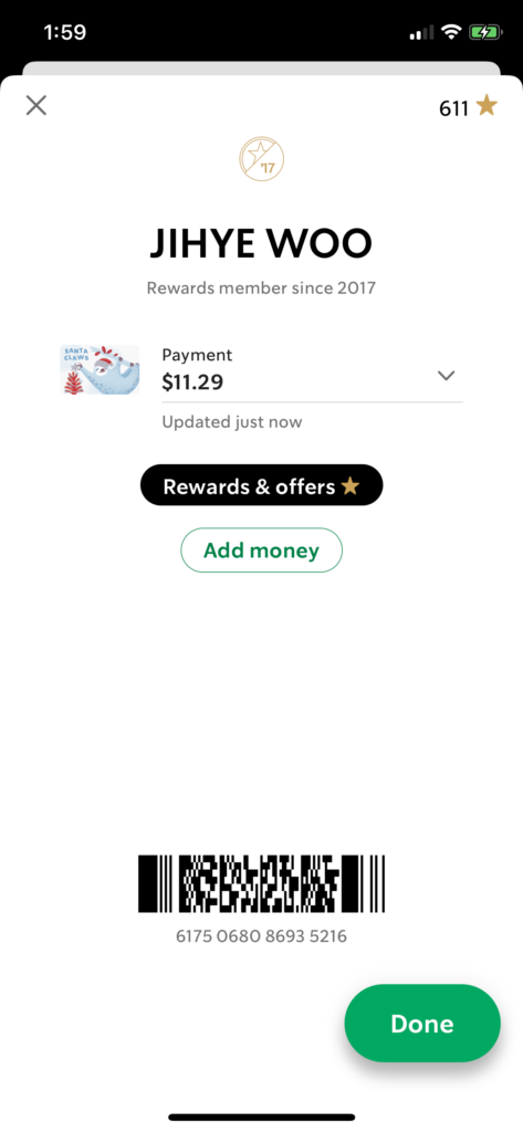
The pay in-store feature has quite a straightforward flow. When users hit the ‘Pay in store’ button, a new page pops up, containing users’ brief information like how many stars have, the balance of Starbucks card that users own, and 2D barcode (Figure 2). There is no doubt that the overall design of pay in-store has great discoverability and understandability.
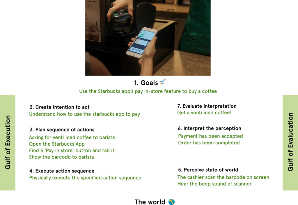
In addition, I applied the 7 stages of action into the pay in-store using the Starbucks app (Figure 3). I set myself as a customer who wants to order a venti iced coffee using the Starbucks app’s pay in-store feature rather than paying with cash or credit card. I realized that the gulf of execution and evaluation I encountered was simple and clear.
Order ahead
- Step 1: Browse menu
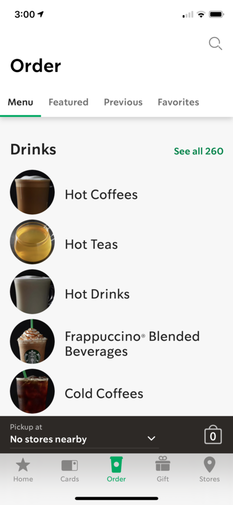

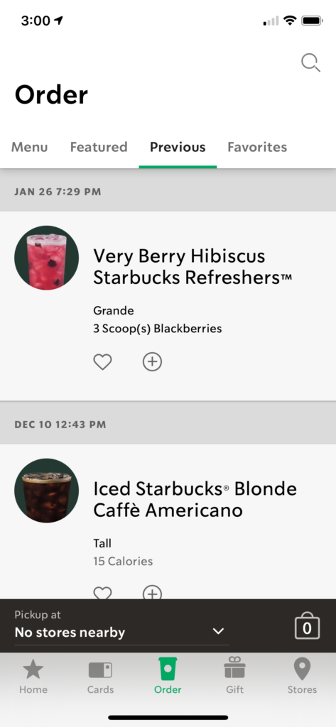
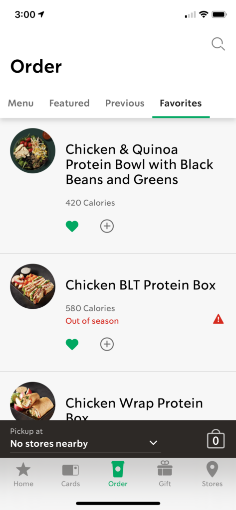
Order is consists of four tabs; Menu, Featured, Previous, and Favorites. You can browse full menus categorized by drinks, food, at-home coffee, and shopping bags. Also, Starbucks suggests featured drinks and foods on the Featured tab. Those two tabs show a suitable example of grouping principles. You can also see your previous order record on the Previous tab so that you can recall items very easily.
- Step 2: choose the item
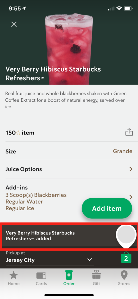
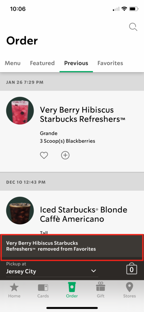

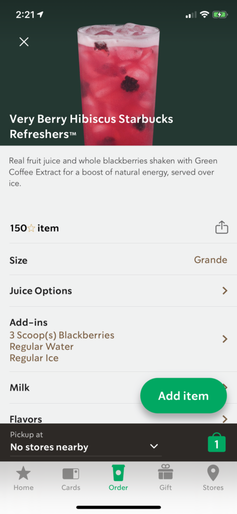
Let’s assume that you want to order a very berry hibiscus refresher. When you hit the item, you can customize the size, juice options, add-ins, etc. Once you customize it, you can hit the ‘Add item’ button, and immediate feedback appears with a pop-up message at the bottom. This type of feedback is found through the entire Starbucks app. Whenever the user takes action, immediate feedback occurs, indicating that the users’ request is successfully made.
- Step 3: confirm the store
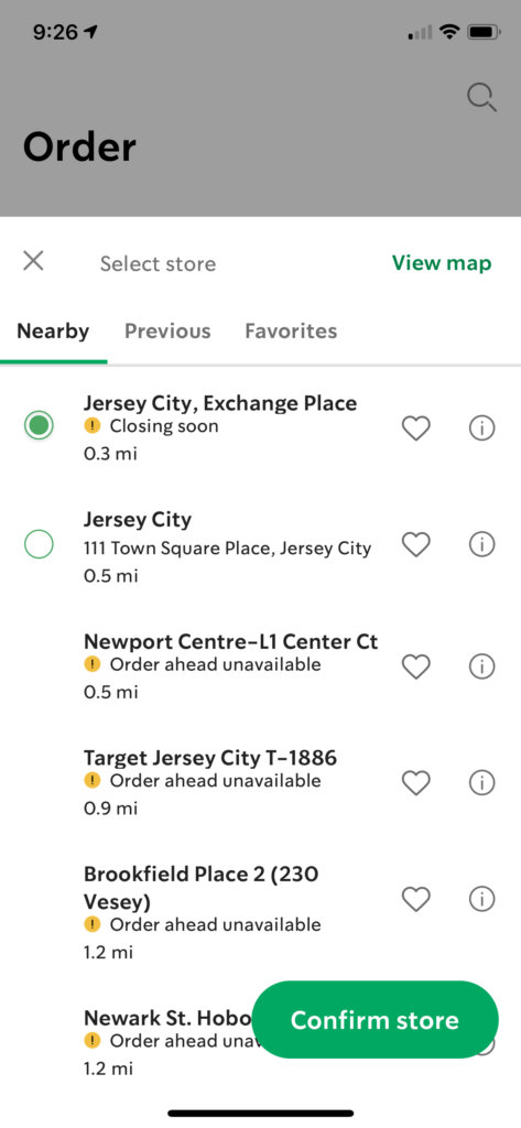
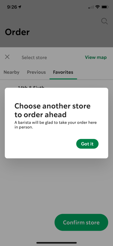
To finalize the order, you should confirm the store you would like to pick up from. You can view nearby, previously visited, or favorite Starbucks store.
However, not all stores are eligible for mobile ordering; these stores will show a yellow circle with an exclamation mark and warning that says “Order ahead unavailable.” Starbucks’ mobile ordering may also not be available if it is close to closing time.
I believe that the app has a high warning signal to users, providing explicit notification. It is a great example of feedback and constraint, preventing orders from the wrong location.
- Step 4: Review your order & make a payment
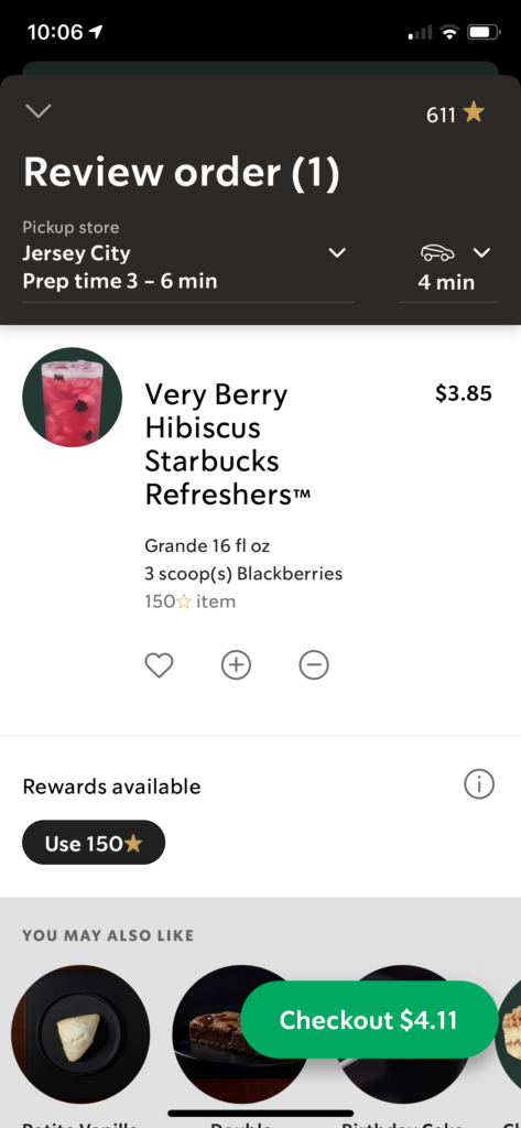
Once you decide what to drink and where to pick up, you need to review and make a payment. It shows an order detail, such as the name of the item, customized options, and total prices. However, the amount of the item is only viewable in this checkout page. You cannot check each item’s price on each item’s detail page. This is the most annoying moment when I use the Starbucks app, so I used to put an item to the bag just to check the price and delete it. I will suggest my recommendation below!
Recommendation
Current Design 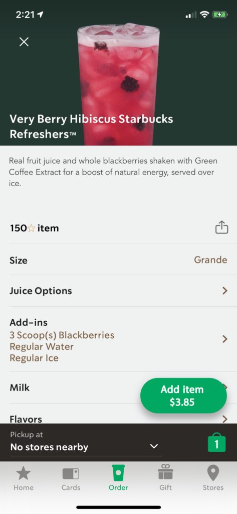
Suggested Design
My only suggestion for the Starbucks app is an indication of the menu’s price on each item’s description page. I put the price on the ‘Add item’ button following the style of the checkout (Figure 7.), where users only can check the price on the current app. I wanted to keep the consistency of the button’s design to eliminate any confusion.