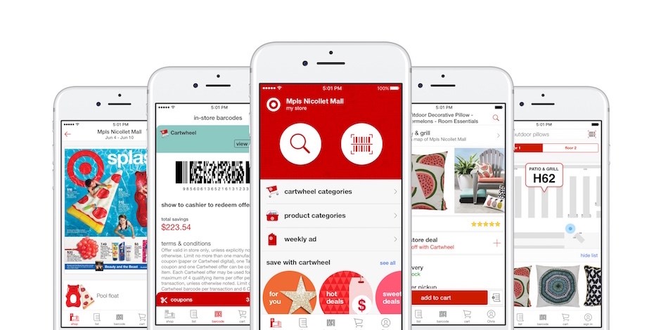
Target is one of the largest retail stores in the United States. I go for a target run at least once a month for home appliances, kitchen utilities or even personal-care essentials. It wasn’t until recently that I came across the Target app. Through the app I was able to browse through various categories, check out product availability at the store closest to my location and even ship items from other stores to the store nearest to me so that I can pick it up at my convenience.
For the design critique, I will be analyzing three flows– Searching for products, shipping items and creating a target run list.
Searching for products
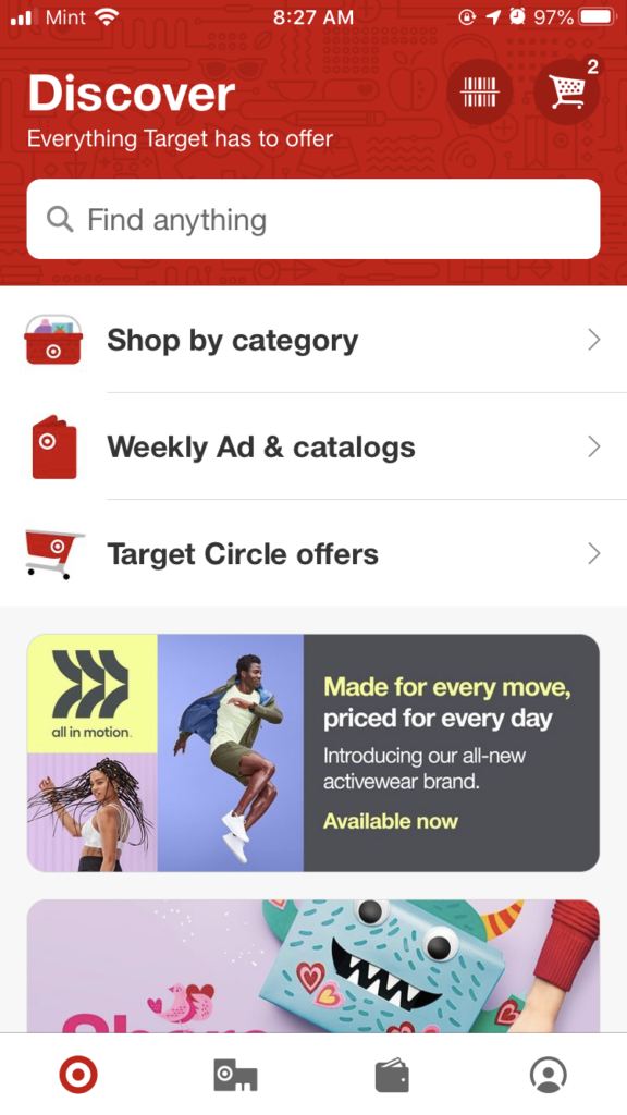
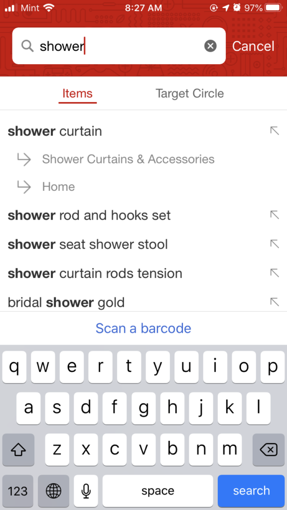
The homepage of the app is simple. The navigation elements are easily discoverable. As soon as you look at the homepage, the signifiers guide you to select the right navigation element. You can either shop by category or use the search bar. The flow for shopping by category matches with user mental models and the category labels act as good signifiers as they meet user expectations. The search bar affords you to enter the product name after which a dropdown shows the category wherein you can find the product. This information is adequate feedback for users to recognize whether they entered the correct product information or not.
Shipping Item
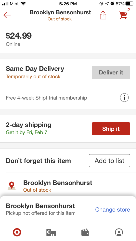
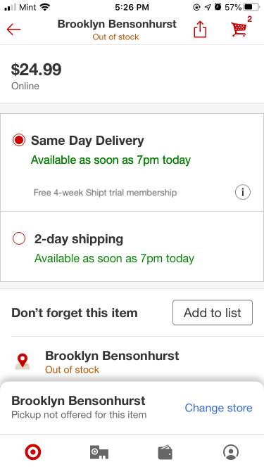
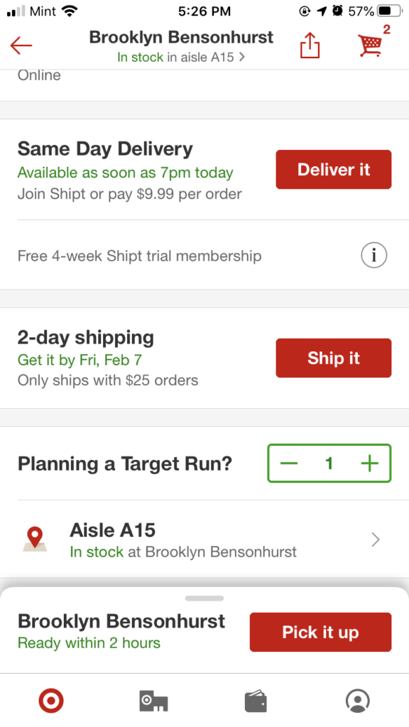
As soon as you select the product you want from the search results, you enter the product details page. There are three buttons on the product details page for shipping the item – ‘Deliver it’, ‘Ship it’ and ‘Pick it up’. The ‘Deliver it’ and ‘Ship it’ buttons were vague signifiers which resulted in a gulf of execution. To understand what these signifiers meant, I noticed a description concerning the buttons on the left. I believe having two signifiers for the same function is unnecessary therefore I have included a suggestion to improve the signifiers for shipping items.
Creating a Target run-list
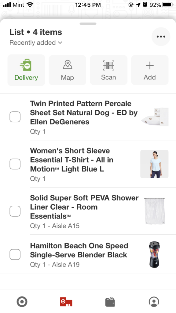
On the product details page itself, items that can be picked up from the local store have the option to be added to a list. I thought this feature was brilliant because not only could I create a list of items to pick up during my next target run but I was also informed of the location of these items. The ‘Add to list’ button was an effective signifier and as soon as you clicked the button there was immediate feedback– the button border turned green and you had the option to input the quantity of the product.
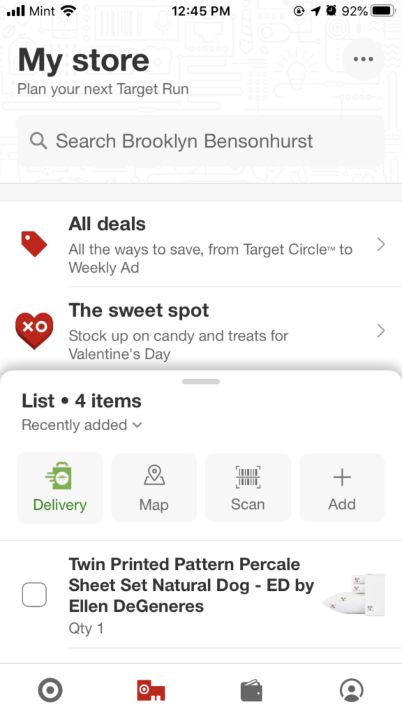
While I was planning my next target run, I opened the app and clicked on the account icon to search for the list. This was where I encountered a gulf of execution because I couldn’t find the list. I evaluated the situation and deduced that the list might be in the ‘My store’ page. My sequence of action was successful although according to my expertise I believe that the list should be under the personal account page because according to the user mental model, a user’s list would be expected to be in the user’s account.
The Target app, in my opinion, is easily understandable. Besides some minor execution difficulties which can be solved easily through my suggestions, the labels and buttons are good signifiers and each action provides sufficient feedback.