
The Bend & Bloom Yoga mobile application is designed to make it easy for students (users) reserve classes at the Bend & Bloom Yoga Studio in Brooklyn, New York. From the application, students may view the class schedule, register for classes, and modify their personal information. As a regular student of the studio and weekly user of the app, I can say that the app reflects a core tenet of the studio—”high quality classes for students of all abilities and backgrounds.” Therefore, this critique will highlight aspects of the user’s class reservation process on a mobile app.
Find a Class
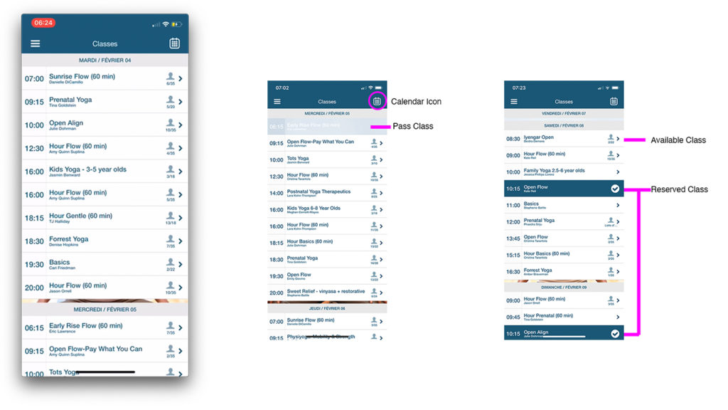
The app opens to the Classes screen (Figure 1), which displays a scrollable menu of classes, their times, and spots available. Color and clickability provide discoverability and understandability of this menu (Figure 1), as:
- Available classes are clickable and shown in white boxes with blue text
- Closed classes are greyed out and not clickable, and
- Classes that the user has reserved are highlighted in clickable dark blue boxes with white text and checkmark icons.
The presence of the directional arrow in the boxes provides clear mapping which connects users with more information on the selected class. And feedback is immediate, as the clickable boxes guide users to another screen (Figure. 4) which leads to making a reservation. Additionally, calendar icon signifier (Figure 1), allow users to customize their selection to a specific date.
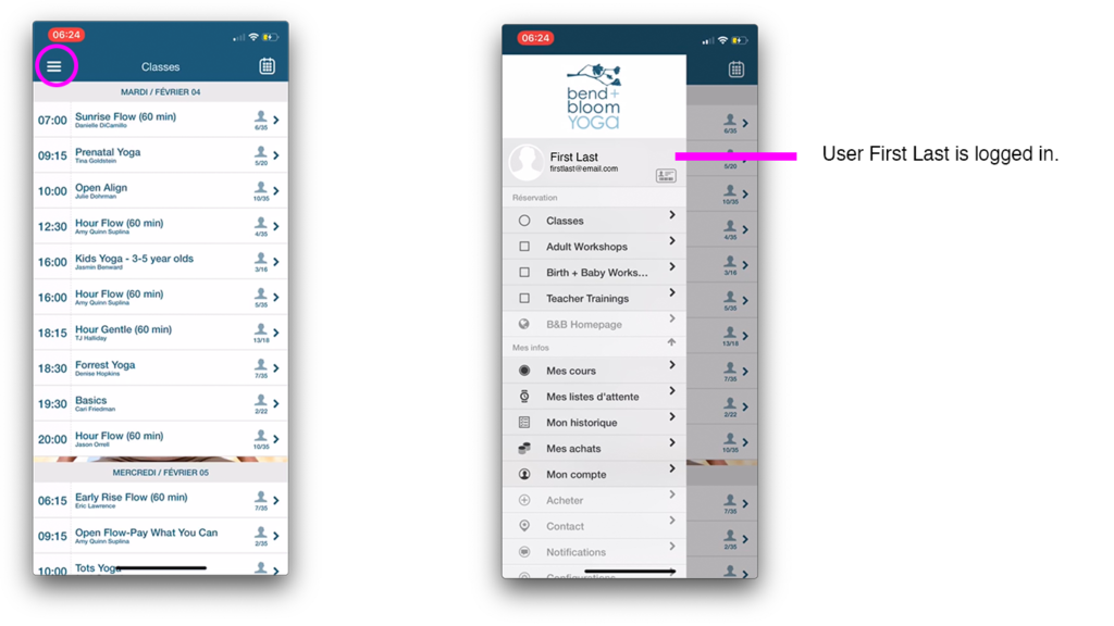
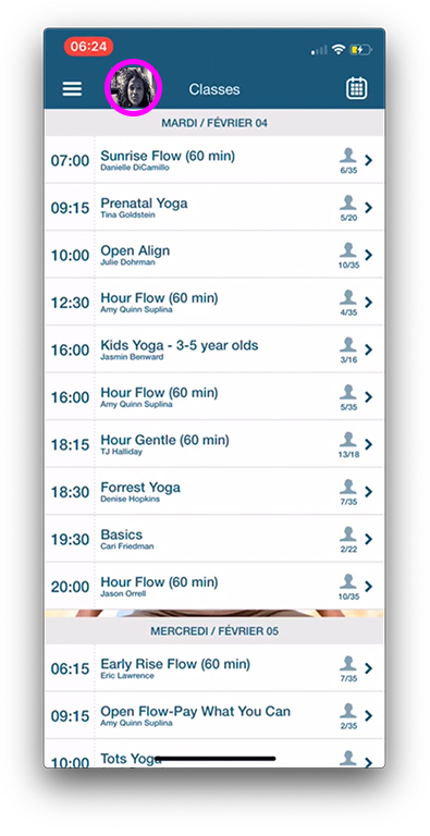
Though the Classes screen utilizes a concept of natural mapping—current classes at the top, scroll down to future classes—as the screen lacks a signifier, like a scrollbar, it is not readily apparent to the user that the screen is dynamic. Additionally, as the app can be viewed by registered students and unregistered students, the Classes screen lacks immediate signifiers to indicate to the user that they are logged in to their account. It is only after clicking the hamburger icon for the navigation menu or proceeding with the reservation process that the user is made aware of their status (Figure 2). Therefore, I feel that as the functionality of the Classes screen relies on a knowledge of the world, which not everyone may have. This could be improved by adding a person icon at the top bar that could display the user’s profile image to signify they are logged in (Figure 3).
Reserve a Class
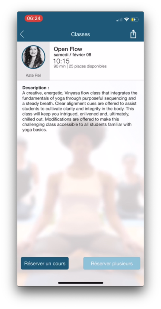
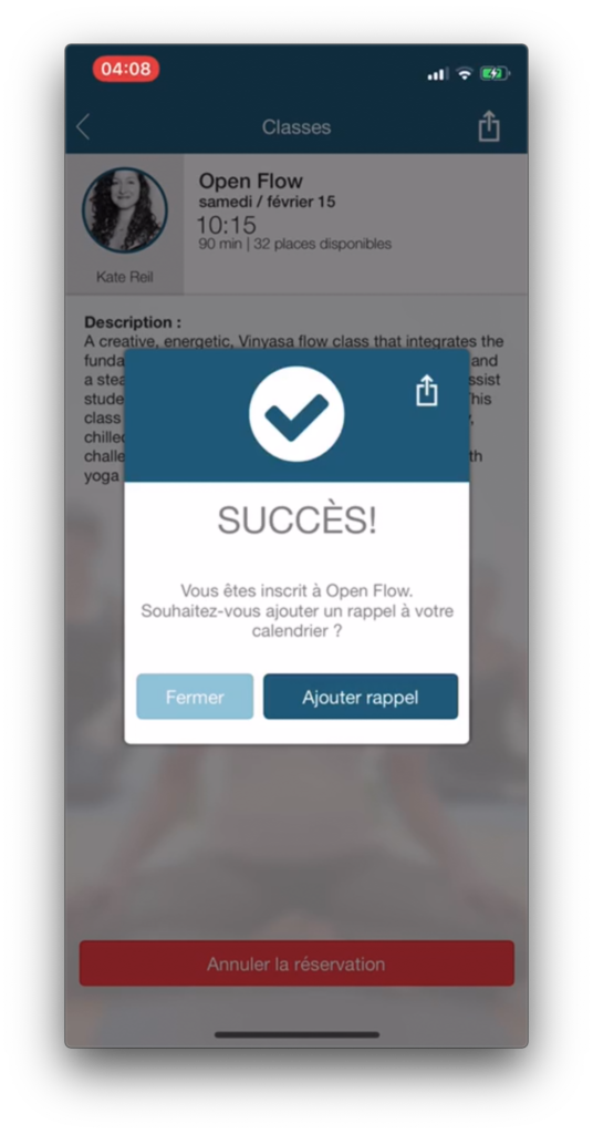
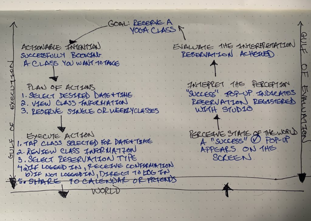
The selected class screen provides the user with a description of the class, the instructor, and key signifiers at the bottom that inform the user to tap left to reserve a single class or tap right to reserve this class weekly (Figure 4). The screen follows a good conceptual model, as it logically constrains the user to information regarding only the selected class and replaces the hamburger icon in the upper left corner with a new signifier, a back arrow icon, which affords the user the option to return to the Classes screen. Tapping one of the reservation options provides instant visual feedback in the form of a pop-up, which states that the user was successful in reserving the class and provides signifiers to add the class to the user’s calendar or share the event via text message, email, or AirDrop (Figure 5). Overall, this screen allows the user to successfully traverse Don Norman’s Seven Stages of Action as outlined in Figure 6. Furthermore, if the user makes an action based slip, and accidentally reserves a class, once closing the “Success” pop-up, the app allows the user to navigate this Gulf of Execution by clicking the “Cancel Reservation” button, which stands out in red at the bottom of the page (Figure 5).
Viewing Reserved Classes
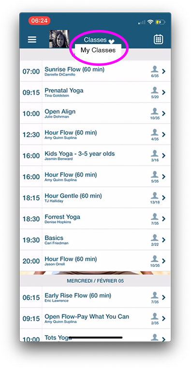
While user can view their reserved classes on the Classes screen, as previously mentioned, if the user wishes to see onlytheir reserved classes this option is not easily discoverable. To do this, knowledge in the head is required to realize that this feature is only accessible to a logged in user from the “My Courses” tab Navigation menu (Figure 2). As users are consistently logged in to their account unless they log off, I feel that to view only one’s reserved classes could be made more accessible on the Classes screen. For instance, if the Classes title was also a drop-down menu with a down arrow icon to signifying a configurational change, one of the drop-down options could lead to the My Courses screen (Figure 7).
Conclusion
While I still believe that the Bend & Bloom app reflects the studio’s class focused philosophy, I think the usability for registered users could be improved with few adjustments. However, as this critique illustrated, it is not that these functions are missing, it is just that they are not as readily discoverable.