Things is a personal task manager app developed by Cultured Code. Users are able to use it to manage their tasks and achieve their goals for almost everything in their lives, and they can categorize and track them in many ways. I’ve been using this app for a very long time, and in this post, I will be discussing several features that Things has: Main Function, Task details, Calendar integration, Categorization.
Main function
Users use Things to create tasks, and check them when their tasks are finished. This reflects The Seven Stages of the Action Cycle.
- Plan: Users set their goal
- Specify: Users select Things as their productivity tool
- Perform: Users list their specific tasks
- Perceive: Users do their tasks in the real world
- Interpret: Users analyze the finished tasks in detail and check them in App
- Compare: Users check the progress of their projects
- Goal: Users consider their goals are achieved
Task details
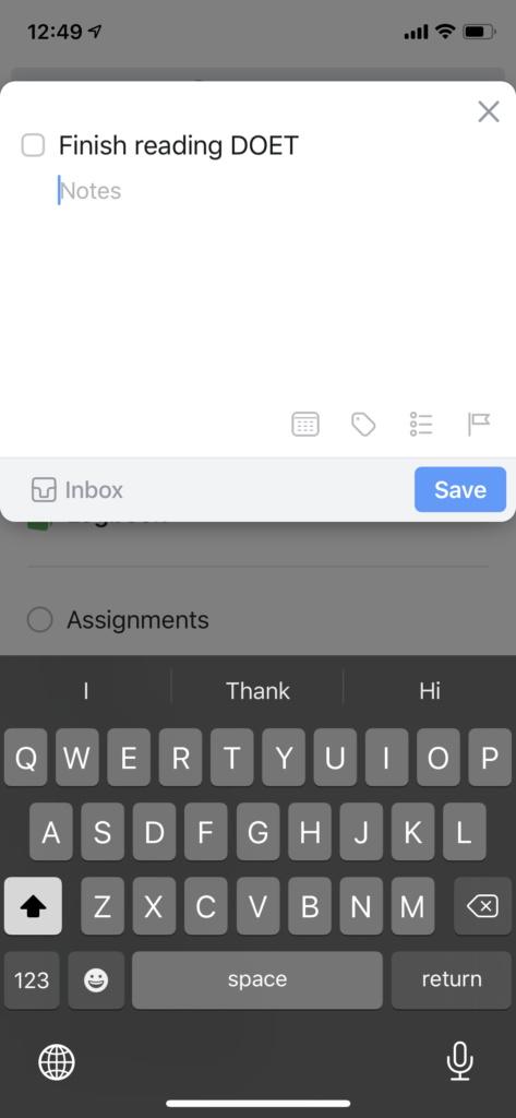
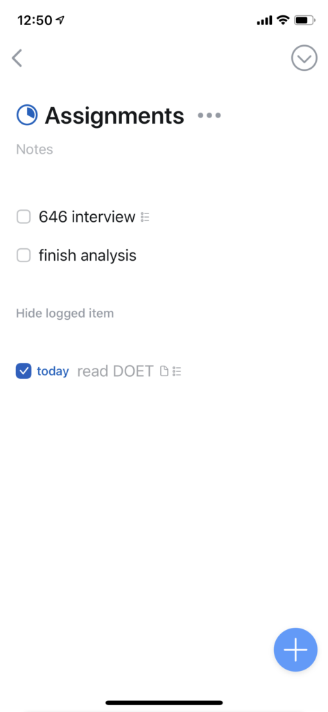
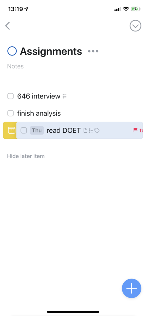
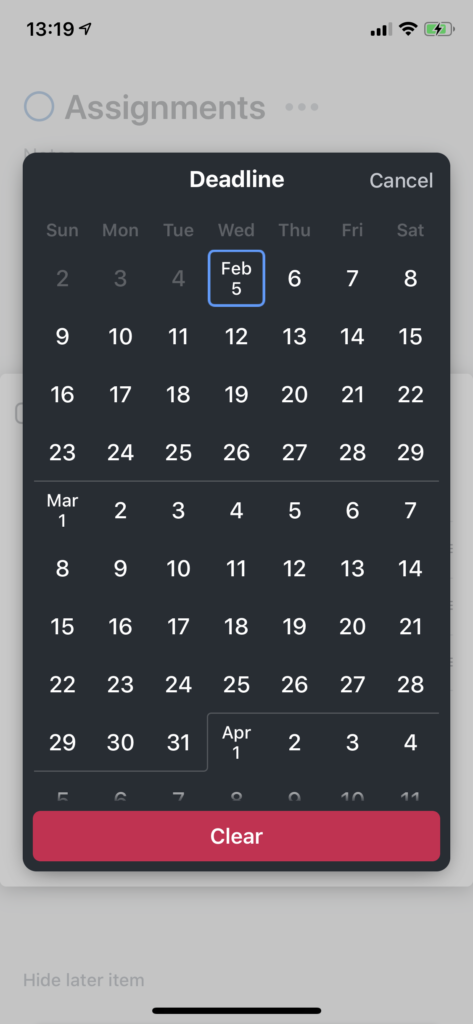
Notes, Date, Tags, Sub-checklist, Deadline, Check/Uncheck action
Things allow users to add a new task as well as task details like notes, date, tag, sub-checklist, and deadline. All these options are DISCOVERABLE when the user hit the + button on the bottom: The Notes section is in gray by default, but users will notice it is editable; Date, Tag, Sub-checklist, and Deadline are represented with clickable icons in gray color. These visual elements are SIGNIFIERS to indicate the properties of the selected or new created task.
When users hit the square mark to check a task, the device vibrates to provide a haptic FEEDBACK. When they try to uncheck a task, the user will be notified if they really want to process that, because it is considered as unusual action and the app is designed to prevent SLIP.
These options and buttons I described all show possible actions users can take with it, so they are all AFFORDANCES.
Calendar
Today, Upcoming, right-slide, calendar event
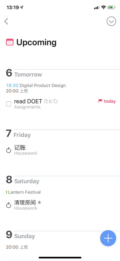
Things is designed to integrate with user’s calendar. As a result, users will see their calendar events in the Upcoming category. There is an intentional CONSTRAINT that, to avoid confusion, calendar events are not designed as to-do-list, but they are shown in small text for reference. It encourages users to specify their tasks according to their calendar events, which enhances their possibility of utilize this app.
If a task item is swiped to right, a yellow calendar icon will be shown to indicate the result of this action. Users will be able to assign a date for this task, and the task itself will be added to the specific date in Upcoming category. The icon is a SIGNIFIER for the following action, but the action is not quite DISCOVERABLE if users don’t try to swipe it, but users will learn to do it in the initial tutorial project.
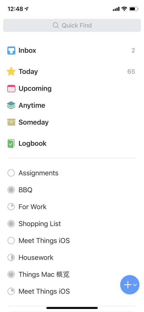
Categorization
Icons for different types, Project pie chart, Headings
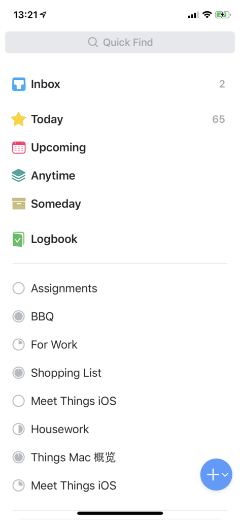
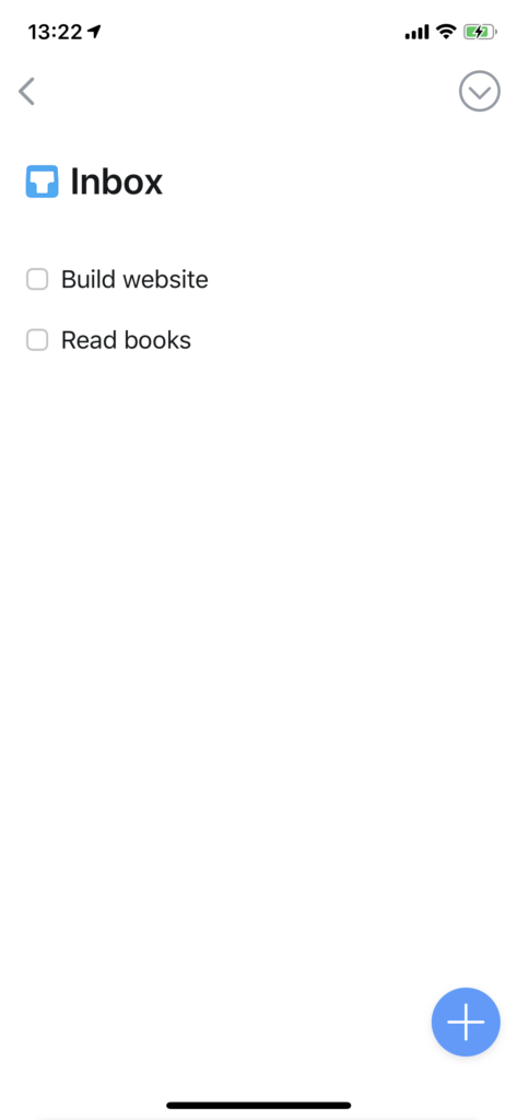
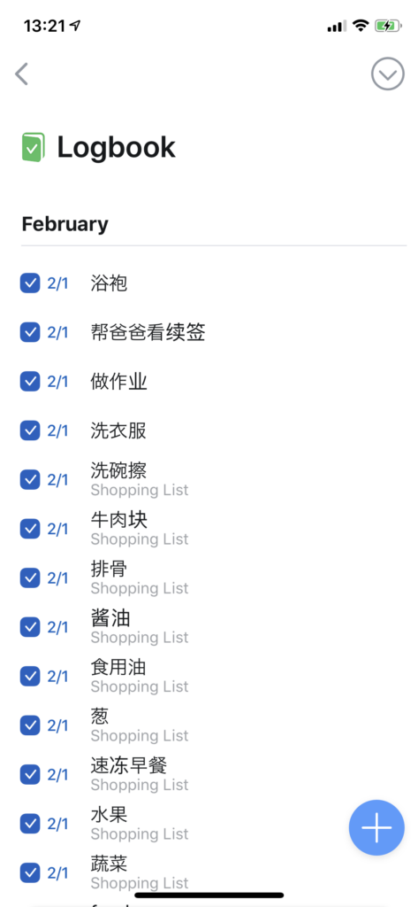
Tasks can be categorized in different types: Inbox, Today, Upcoming, Anytime, Someday, and Logbook. All of them have icons and are in different colors. Inbox, Upcoming, and Logbook are CONCEPTUAL MODELS: Inbox makes new tasks like unread letters for user to process, Upcoming is like a calendar for user to check future tasks, and Logbook is like a diary to record what happened before. They are understandable and practical.
Users can also create projects for sets of tasks. Different projects show different progress with pie chart-like icons. It is a good MAPPING example, and users will potentially know what to do next, because in many cases user will choose to finish projects that are almost done first.
Conclusion
In my opinion, Things is a typical well-designed productivity app that has no useless decoration. Although users have to learn some techniques to utilize it, all interactions follow the iOS Human Interface guideline and it will be easy for an iOS user to master them.