VSCO is an iOS app that helps creatives make beautiful photos and connects them to a creative community around the world. Some of VSCO’s features include a variety of photo editing tools and a community for users to explore original content and share their work.
Home/Navigation
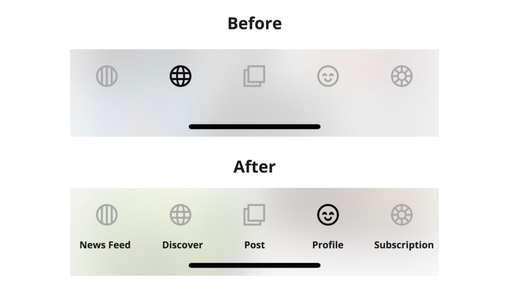
On the home page, once logged in, the users can scroll through a news feed of photos and projects shared by other VSCO users (image 1). The navigation bar is easily discoverable, giving users a sense of which parts of the app they can explore. The navigation bar also provides good feedback. For instance, once an icon on the navigation bar is tapped, it’s immediately highlighted, indicating which part of the app the user is currently exploring (image 2).
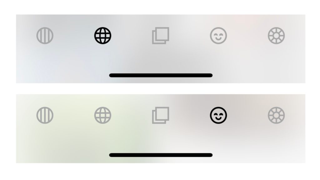
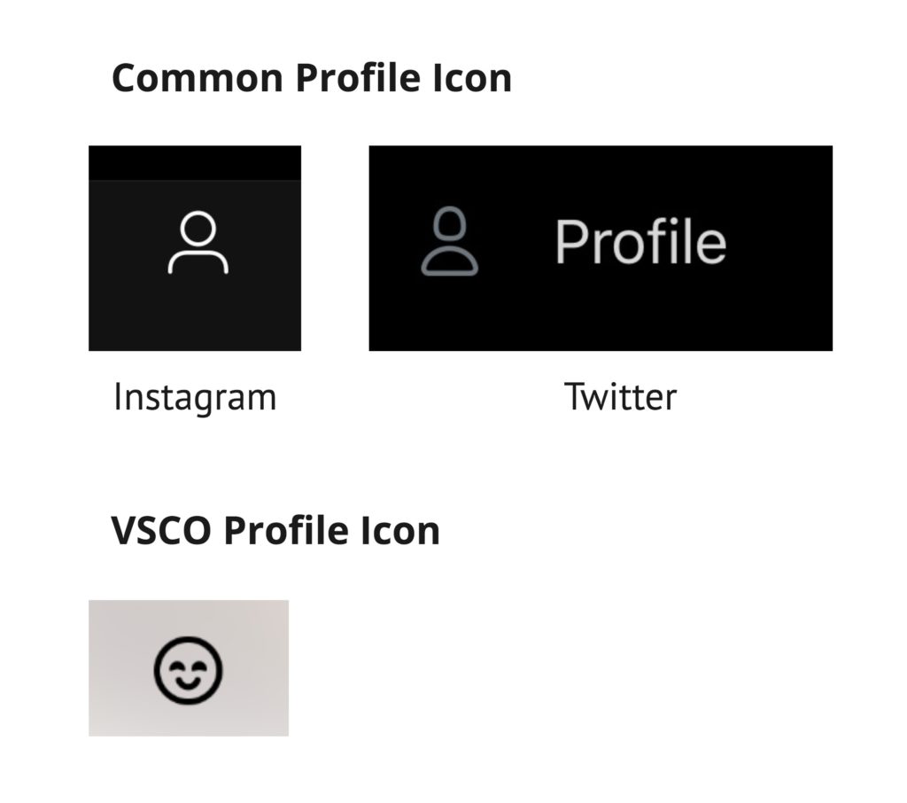
While the bottom navigation bar is easily discoverable and provides useful feedback, it does not offer sufficient signifiers to clarify what each icon represents, which increases the gulf of execution. For instance, I initially thought the fourth icon represents social sharing, but it actually represents my profile. This mistake was made because the VSCO profile icon is not consistent with the icons that are commonly used by other apps and websites (image 3). Therefore, the VSCO icons do not match the user’s conceptual model and their perception of what the icons actually represent.
A quick solution to resolve these issues is to add text under each icon to indicate what each icon represents (image 4).
Save a Photo
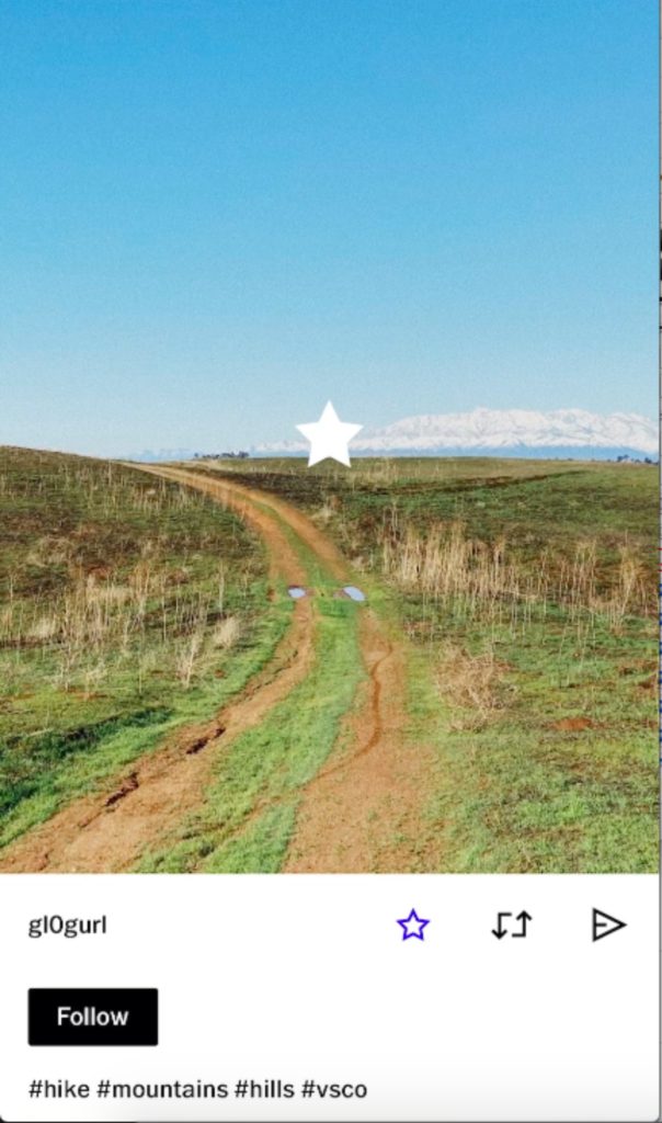
As the user scrolls through the news feed section of the app, they can see a selection of photos shared by the VSCO community. Each photo affords starring (or saving) and sharing. The user can star a photo by tapping on the star that’s underneath the photo. While the signifier for the star icon could be made more prominent, the feedback for tapping on the star icon is strong. The icon is highlighted once it’s tapped, indicating the action has been completed. Additionally, a star appears on top of the image to signify that the photo has been starred (image 5).
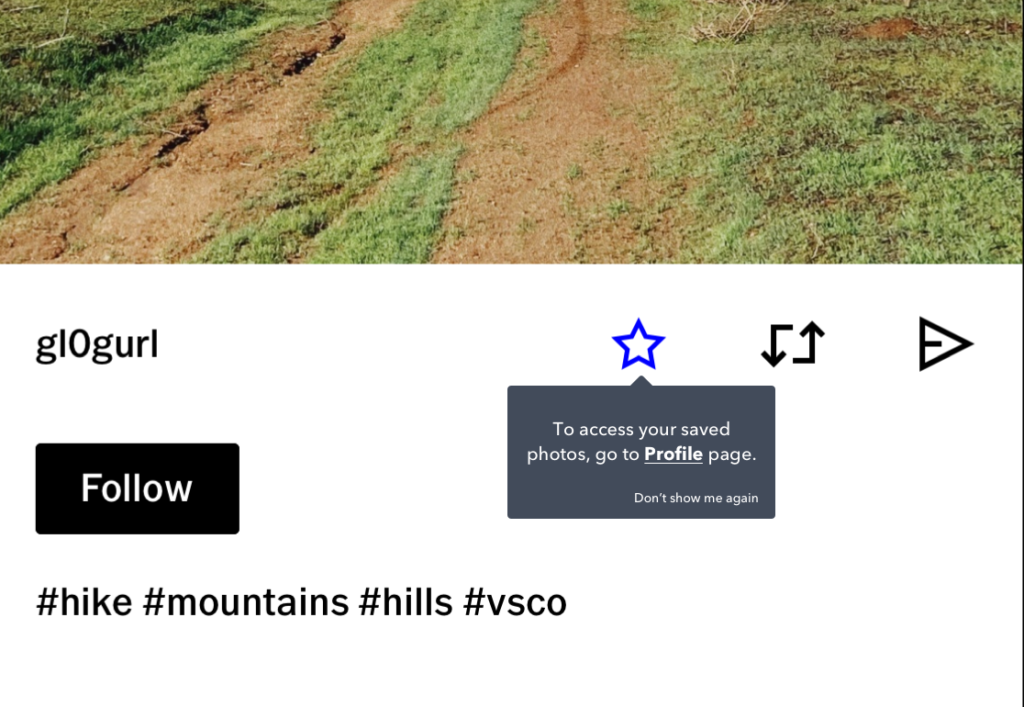
Access Saved Photos
While the process of saving a photo is pretty seamless, a user may wonder where they can access their saved photos. Their first instinct may be to go to their settings page. To access the settings page, they would have to locate the navigation bar again, where all the controls are stored. However, the navigation bar is not discoverable on the page where they saved the photo. It turns out the user has to go back to the initial news feed page where they first saw the photo to access the navigation bar. Once they arrive on the news feed page, they would have to rely on their short-term memory to tap on the right icon on the navigation bar to access their account settings page. The gulf of execution could increase at this point due to possible memory-lapse. The designers at VSCO expect users to rely on their short-term memory to access the settings page. However, short-term memory is unreliable, so that’s why it’s beneficial to remind users how to access certain information.
A solution would be to first make the navigation bar discoverable no matter which section of the app the user is on. Second, a tooltip could appear right after the star icon is activated to remind users where saved photos can be accessed (image 6).
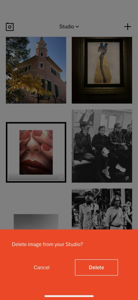
Deleting a Photo
The VSCO app uses a red alert prompt to inform users that deleting a photo has significant consequences (image 7). The red alert prompt is a great solution to prevent creatives from accidentally deleting a photo. In most cultures, the color red typically means stop or slow down, so this cultural constraint forces users to stop and think about their action before deleting a photo or cancelling that action.