
While people using chunking strategy based on “context” to percept information, reading not-interested content can be painful for a user. For those who have a visual deficiency and for those who have a reading disorder or language barrier, it would be quite challenging to understand how to interact with a site if the navigation and structure are not clear enough.
So, how can designers test the clarity of structure? The answer could be simple: Blurred-eye test. While we are in blur vision, we can only identify patterns in a limited way. This makes the designers simulate the situations the users might encounter. It’s quick, and won’t eat up any budget.
What can the designers see through blurry-eye?
Structure
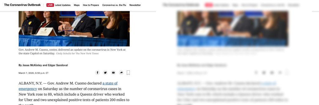
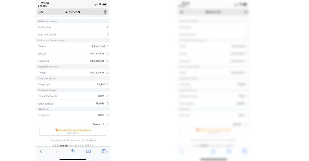
Does the user know where would the next chapter be if he/she wants to skip this chapter but does not want to miss any important elements? Can the user understand which paragraph is related to an illustration without paying attention to the text? The designer should see a clear structure even without understand any words on the website/ user interface.
Importance
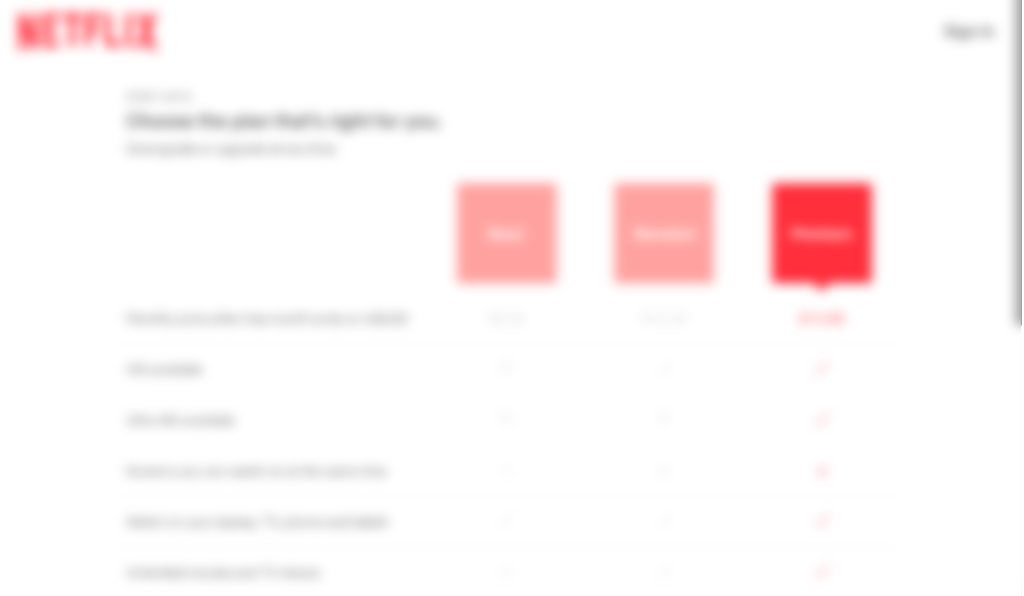
Can the user find the button on the screen? Which part of the website I should pay the most attention to? In designs that are promoting a specific task over any other, it’s more than important to make sure the entrance of that flow would be the first thing users aware of while they’re interacting with the screen.

Choice:
If the page is designed to show users their options, it’s important that the user can know how many choices they have immediately so that they won’t miss any of them. It is also useful to evaluate if the advantages of promoted ones are obvious and attractive enough at first glance.
Alert
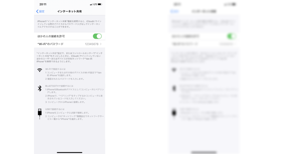
My mom always calls out for help while the computer or her mobile devices ask her to make any confirmation — usually, it’s a general update. However, this describes the situation that people who have less confidence in tech-term reading would need more clues when they encounter alerts or checking the system status.
Indeed, create a user-friendly UX writing style has been an issue. these days. However, using a blurred-eye test can help us promote the effect of good UX content.
Conclusion:
The blurred-eye test can simulate many situations, such as poor eyesight, fast-pace website browsing, general low attention or low motivation — it can even simulate drunk users. The blur-eye test can be operated by adding a layer to the screen, or, for people who have poor eyesight like me, simply take off the glasses can do a similar effect. This technique is useful, quick, and lay in the way.
Resources:
https://uxdesign.cc/the-blurry-eye-test-1bd12bc6c3f8 The blurry-eye test, UX Collective