
Introduction
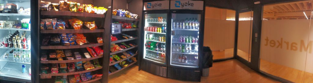
Since my first day at Pratt Manhattan Center, I’ve became a heavy user of the MicroMarket in our building. The market locates on the 7th floor of Pratt Manhattan Center , aiming to provide Pratt students with fresh snacks and beverages with self-checkout technology.
By linking technology to users’ everyday activities, the MicroMarket has offered a richer digital experience than products solely replied on interfaces. It’s also a low-cost, high-efficiency solution for students and faculties on Pratt Manhattan Campus to stay energetic and hydrated every minute, every day.
This blog would firstly introduce how the product works. Critique on conceptual model of the MicroMarket would be addressed. Norman’s Three Levels of Design would be used at last to provide a overall design critique on the MicroMarket.
How the MicroMarket works
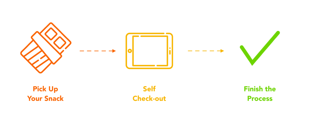
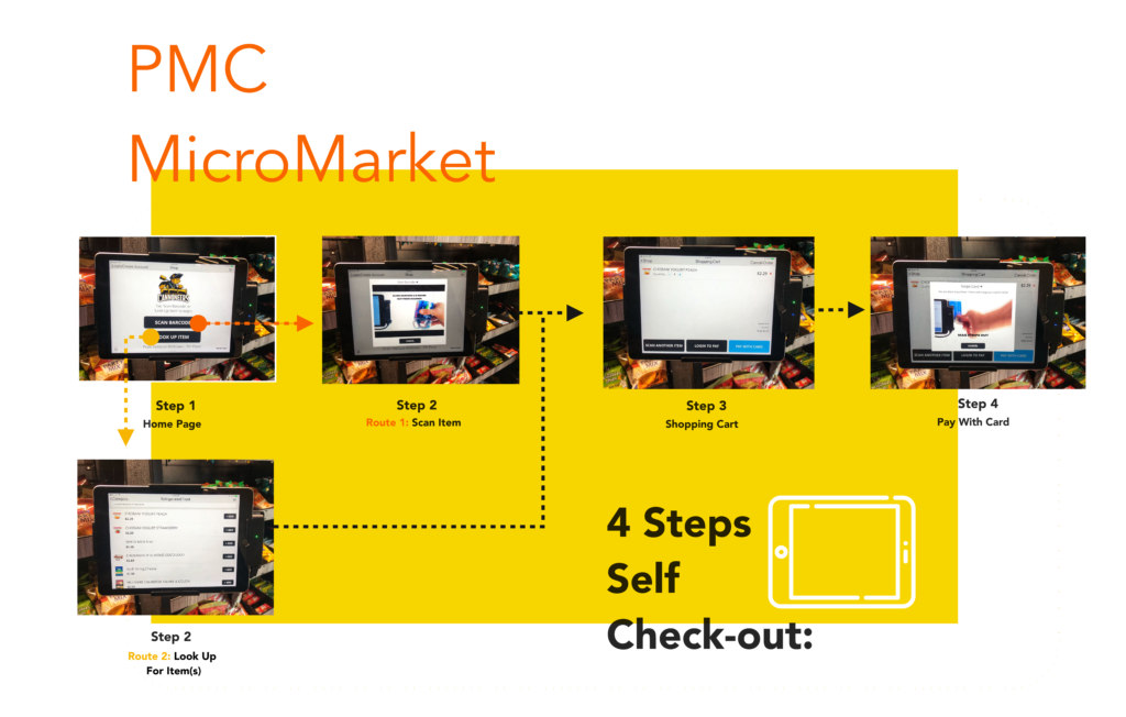
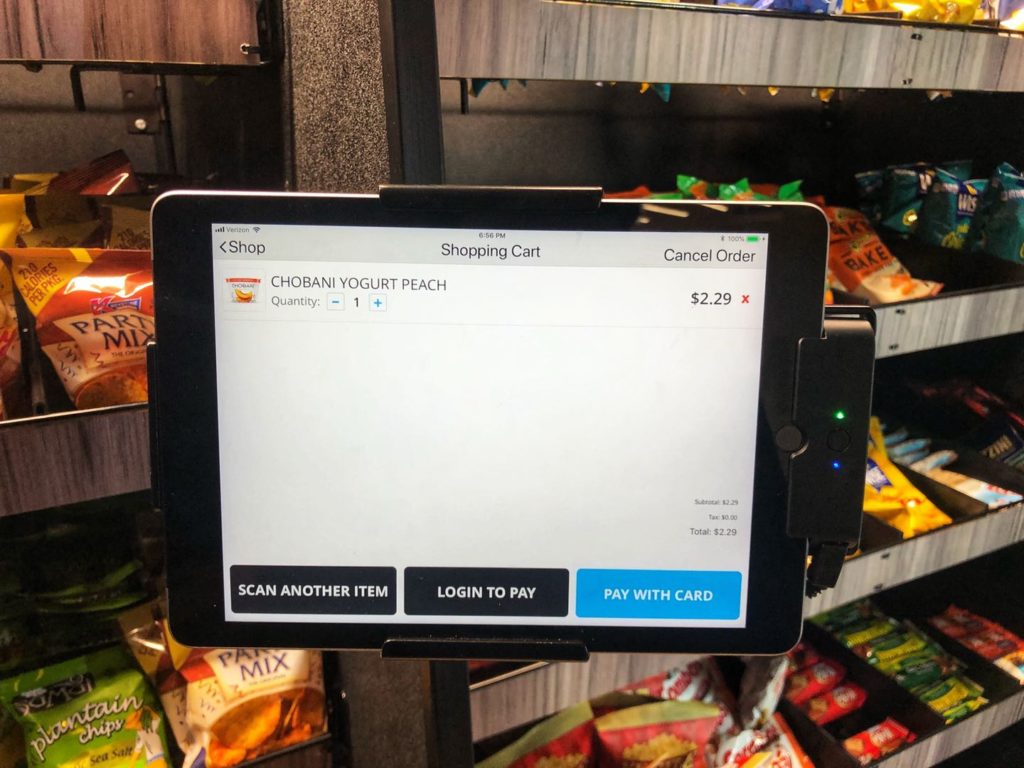
The MicroMarket asks its users to pick up snack(s) and go to a self-checkout tablet to pay for their snack(s). All the snacks and beverages are displayed on shelves as in a traditional grocery store. Users are required to check out on their own using the tablet fixed on a wall. Users could either scan barcodes or search for the item they chose to put it into a “shopping cart.” Then they would be asked to swipe their cards on a device linked to the tablet to accomplish payment. The whole process could be finished in less than 3 minutes.
Design Critique: Conceptual Model.
According to Norman, “for someone to use a product successfully, they must have the same mental model (the user’s model) as that of the designer (the designer’s model). ” While it’s not realistic to force users to coordinate their mental model with that of the designer, a good design should be able to function as a “coordinator” between designers and their users.
From a design perspective, designer’s model of the MicroMarket is quite straight forward: Allow users to choose whatever item(s) they want, ask them to input item information on their own, and pay for the chosen item(s) with credit or debt card.
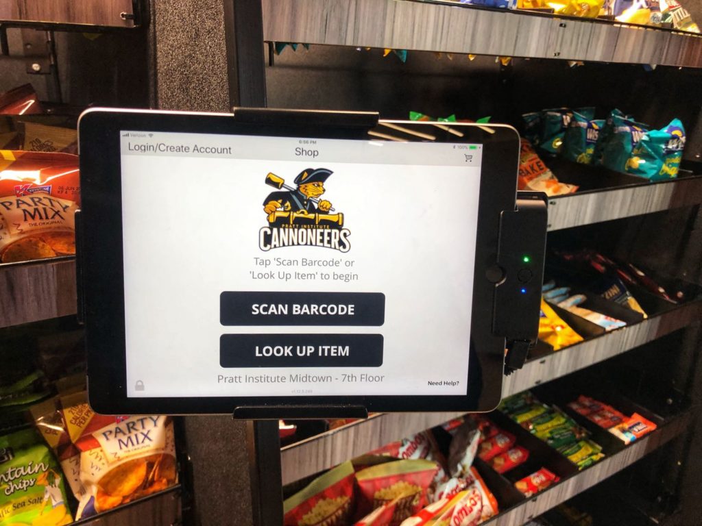
The MicroMarket is doing a good job by setting the self-checkout tablet at a conspicuous spot ( right opposite the only entrance of the market). Users would notice it as soon as they enter the market. Furthermore, description shown on homepage of the tablet is providing clear instructions to its novice users: “Tap scan barcode or look up item to start.” Users’ model and designer’s model are coordinated perfectly with this approach.
However, some other interface pages of the self-checkout tablet have failed to convey the right kind of signal clearly. For example, on its “shopping cart” page, the tablet failed to notify users about an available option: Users can go back to the previous pages to add more item(s) from “Look Up Item” feature. A simple solution to this problem is to add another button indicating “search for another item” on this page. Otherwise, only an experienced user would know that she can click on “back arrow” to search for another item and put it into her shopping cart.
Design Critique:
3 Levels of Design.
Visceral
Norman argued that “At the visceral level, physical features-look, feel, and sound dominate.” Although Norman’s “3 levels of design” was proposed in the 20th century and other experience building theories have dug much deeper into the nature of “experience” itself(eg. Wright&MacCathy), Norman made a point at contending that all designed products are experienced first at the visceral level.
While simple and minimalist, the MicroMarket has a good visceral design. Smells of coffee, colors of packages and shining lights of the self-checkout tablet have composed a pleasant visceral experience for everyday users. Furthermore, interfaces of the self-checkout tablet are also pleasant to eyes.
Behavioral
As Norman addressed:”Behavioral design is all about use.” Behavioral level of design is about usability and communication.
While I personally love to visit the MicroMarket, I have noticed many usability problems in the MicroMarket. In the future, I would love to conduct a usability evaluation on the MicroMarket and provide recommendations based on evaluation report to help improve those usability issues.
Conceptual model(mentioned in previous section) is a concept Norman proposed to improve behavioral design. It’s not only about usability but also about understanding. Overall, the MicroMarket has a successful conceptual model. As mentioned before, it has provided clear and useful information to guide its users and help them to understand the product. However, some puzzles are missed. The self check-out tablet, for example, should improve its conceptual model to help users to better under stand the process.
Reflective
According to Norman, reflective design is about “a lot of territories.” Based on Norman’s original model of “3 levels of Design”, Bruce Hanington categorized pleasures that each level of design could offer to product users.
Hanington used “Ideo” and” Socio” to describe the kind of pleasures reflective design can bring to its users. To him, reflective design is more about values, aspirations and social relationships. While the MicroMarket has provided a place for students and faculties to grab snacks and beverages, it also became a place where friends and classmates could exchange small talks and relax. Personally, I have felt the ideo and socio pleasures offered by the MicroMarket. With Hanington’s approach, the MicroMarket should be considered successful on reflective design.
Summary
To wrap up, the MicroMarket on PMC 7th floor is a self-checkout grocery store linking technology to users’ everyday activities. Conceptual model of the product is basically good but need some improvements. Examined with Norman’s 3 levels of design, the MicroMarket is pleasing at visceral level and successful at reflective level. Certain usability issues and unclear messages could be improved at behavioral level in oder to help the MicroMarket with providing better user experience to its users.
Referrence:
Norman,D. (2007) Emotional Design: Why We Love (or Hate) Everyday Things. Basic Books. NY, United States.
Hanington,B.(2007) Design and Emotional Experience. Carnegie Mellon University. Pittsburgh. PA, United States.
M.J. Min I Pratt Institute