For our group project in Information Architecture and Interaction Design, Chris Orellana, Yilan Ye, and I chose to focus on a hypothetical redesign of NYC311, a government website which provides NYC residents with city services and information (actual site: https://portal.311.nyc.gov/). During the semester, we went through a thorough design process, from user research to wireframes and visual design.
Step 1: User Research
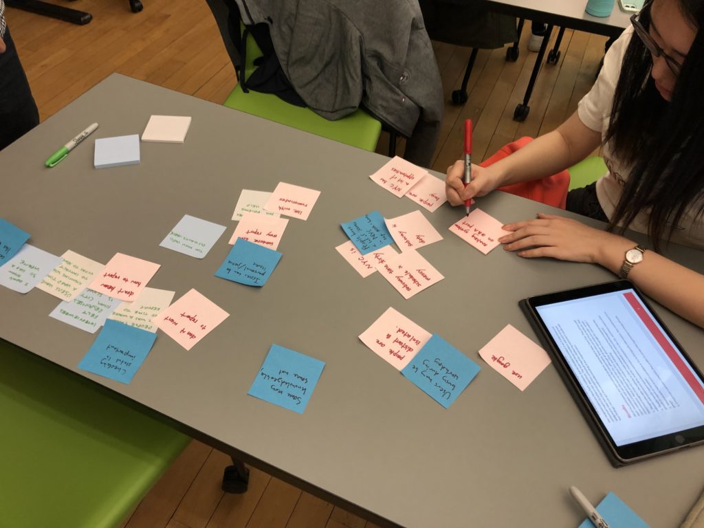
We began by talking with NYC residents, with the goal of better understanding potential users of the 311 service and their priorities and contexts. We conducted user interviews, as well as contextual inquiries involving an imaginary task that required contacting 311. Some key findings were:
- NYC residents have to deal with many issues when living in the city
- They are often busy, and not home during the day
- There is a wide range in knowledge of 311
- Some prefer calling 311, some prefer to use the website
- Issues reported can be personal and can be issues of injustice, such as housing violations
- Being able to check the status of an issue is important to users
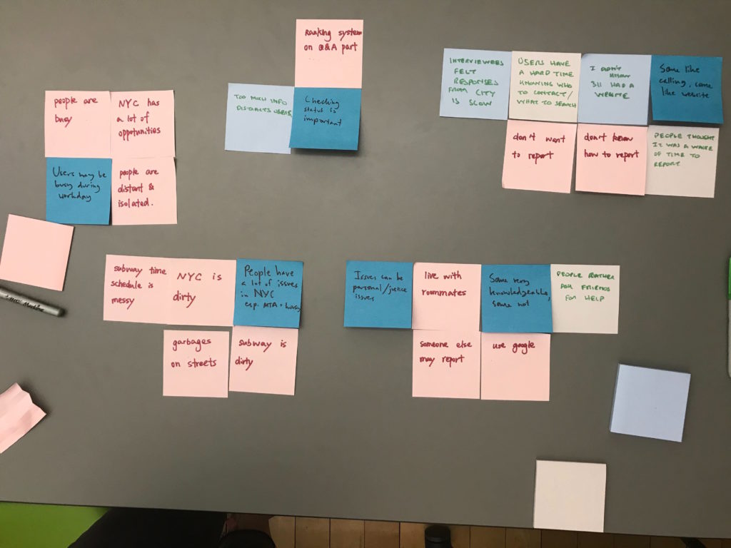
After completing our research, we grouped our findings using sticky notes to identify common themes:
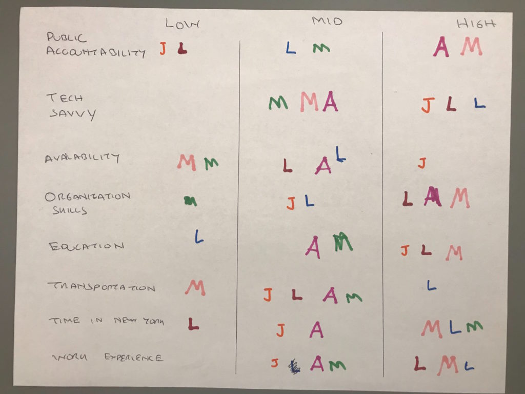
With the goal of segmenting our users, we identified a few key user attributes: feeling of public accountability, tech savviness, availability, organizational skills, education, use of transportation, time in NYC, and work experience. We then placed participants on a three-step scale for each one:
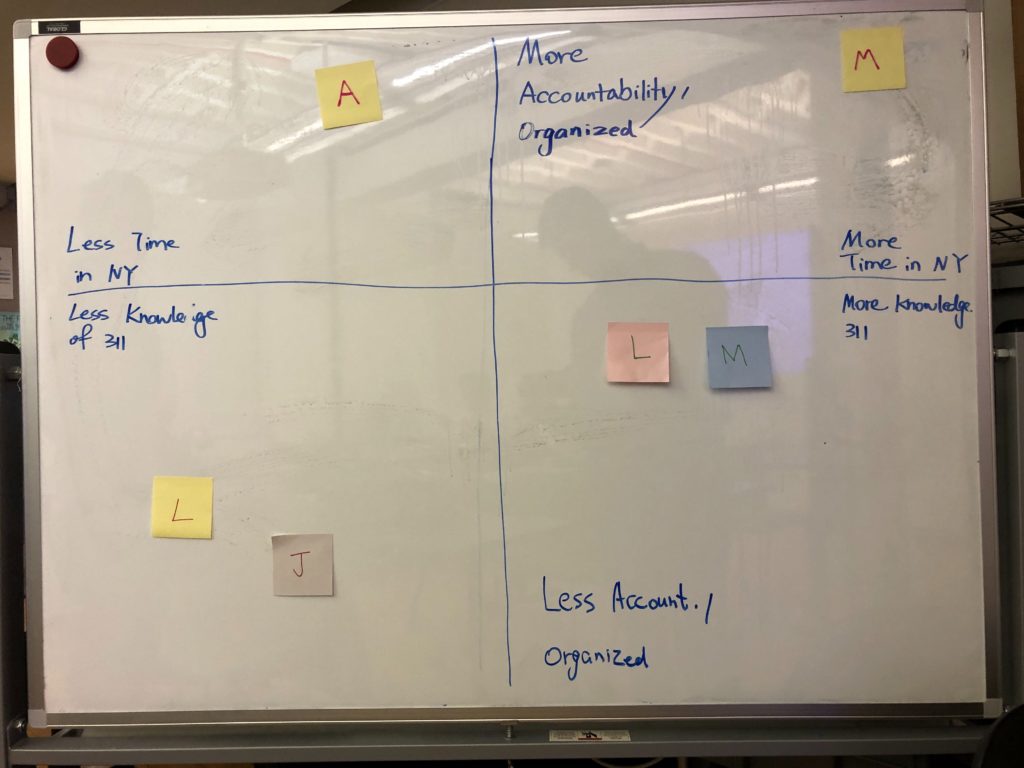
This helped us develop a framework with two axes for thinking about 311 users: one for level of accountability and organization, and one for time in New York and knowledge of 311:
For me, a main lesson of the user research was that there are large differences between users, on these two variables and others. 311 users include all types of people, including those with limited resources, for example, people who do not have a computer. Additionally, 311 can be a very important tool, for example, it could play an important role in someone seeking justice in housing court. This showed us that the site design should prioritize clarity and usability.
Step 2: Comparative Analysis
Our next step was to analyze similar services in a comparative analysis. I focused on GOV.UK, Amazon, and the Washington, DC 311 service, with the goal of evaluating how the sites 1) explained their purpose, 2) facilitated choice among many options, and 3) provided forms with a positive UX.
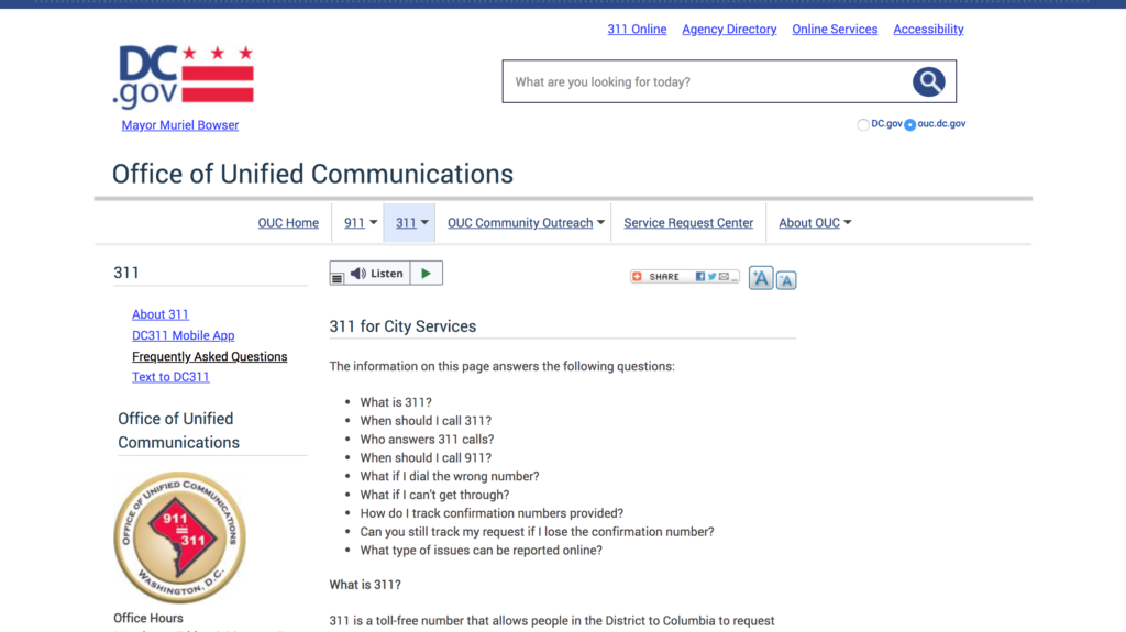
One of the most useful discoveries was DC 311’s FAQ page explaining what the 311 service could be used for, and answering common user questions:
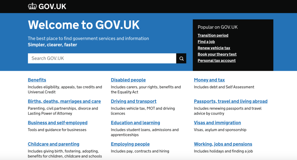
Another helpful example was the homepage of GOV.UK, which used a simple, high-contrast design, and showed a good example of how to make a large number of categories easily scannable, while also highlighting the most popular items. This layout made an impression on me as being simple while still looking professional and trustworthy:
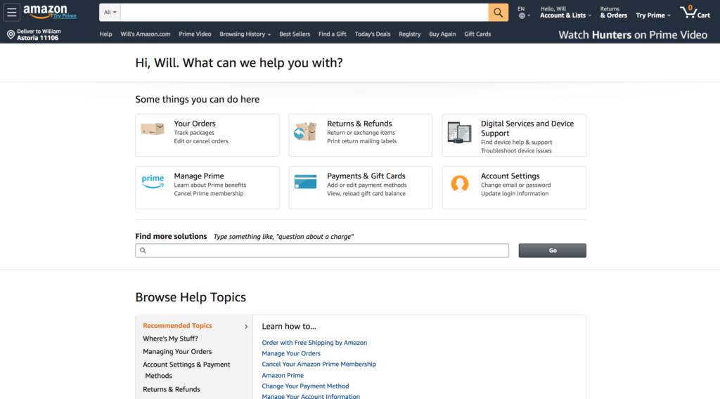
Amazon used a similar approach to facilitate browsing of categories:
In this phase, we also brainstormed a user journey, thinking through the user’s path from arriving on the site to submitting a 311 report. One thing we kept in mind was that users could arrive at the site from various entry points, including the homepage as well as an article page.
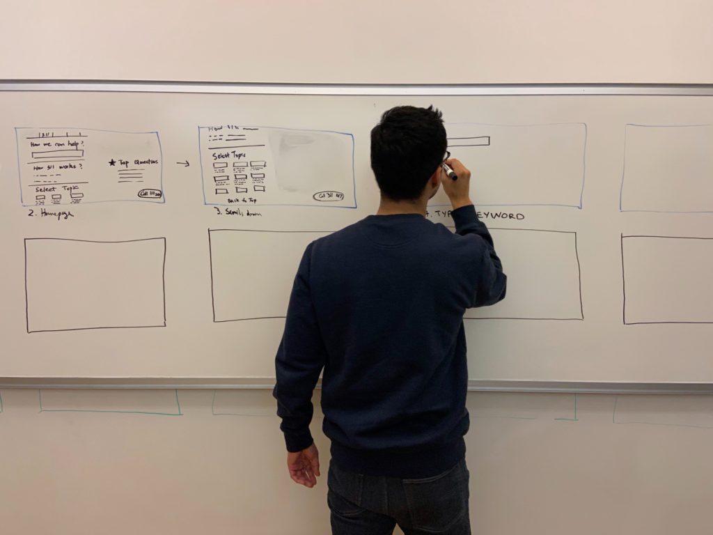
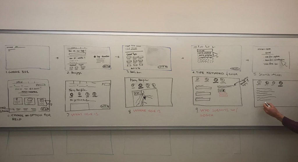
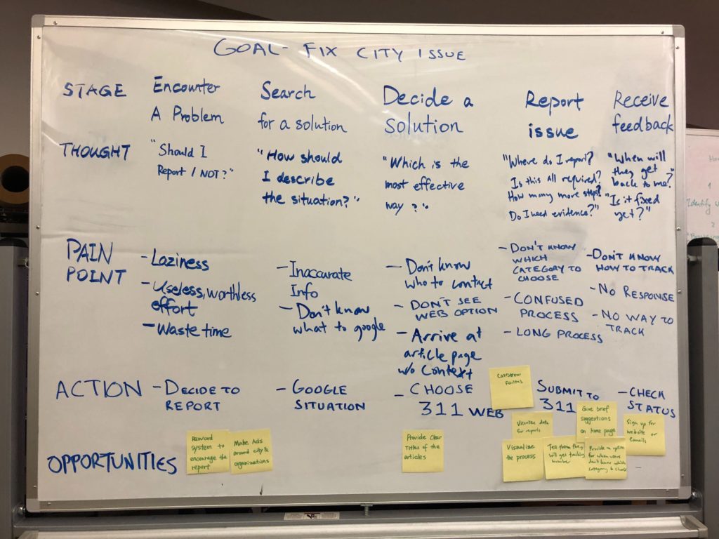
We focused on a user journey in which a NYC resident wanted to get help dealing with a noise issue, which included a large number of steps. Working at a whiteboard allowed us to quickly consider different feature ideas. We also mapped out the steps involved in reporting, with associated risks and opportunities:
One of the takeaways from these exercises as well as the comparative analysis research was the difficulty of finding one topic of interest among many. For a website like 311 that contains many possible user destinations, presenting multiple options clearly is important. Additionally, we identified the importance of including guiding notes throughout the user journey, for example, explaining what 311 is, the different ways to report an issue, what the reporting process involves, and what happens after the report is submitted.
Step 3: Prototype Evaluation
The next phase of our design process involved testing a prototype with several test participants. Following our user journey whiteboarding, we decided to have participants imagine they had googled “report neighbor noise NYC” and asked them open-ended questions about how they would proceed on the site. Our primary goal was to gauge user experience in the reporting process, although we also wanted to understand how users understood the 311 service in general.
We used InVision to create a clickable prototype:
We tested the above approach to the category page based on examples we saw in our comparative analysis. We also added notes on the report pages to answer common user questions which we brainstormed during our user journey mapping:
One of the most important insights from the prototype testing was that some users were confused by the 311 site living within the NYC.gov site. This led our group to eventually decide to have the site stand on its own, with its own main navigation, rather than within the NYC.gov site.
This confusion was exacerbated by the fact that some users did not know what 311 was, and had no mental model for the service, which confirmed our finding from the earlier user research about some users being unfamiliar with 311. This led me to focus on helping users understand 311 in my final wireframes. Another insight was that some of the labeling was confusing, which led us to try an alternate approach in our next phase of research.
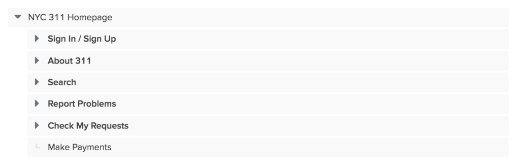
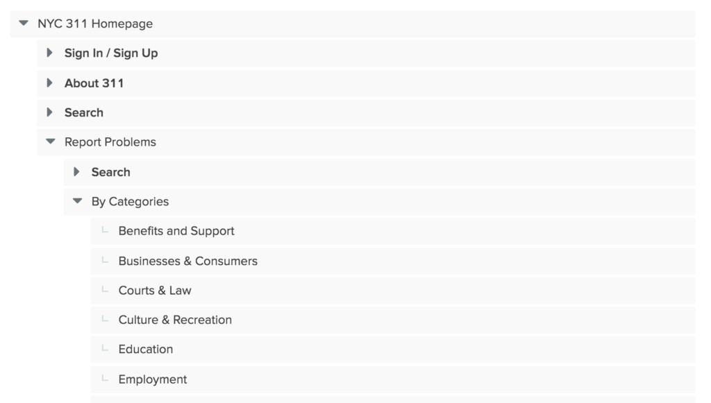
Step 4: Test Information Architecture
In testing the information architecture of the site, our first step was to create a site map. We made a number of changes from the current 311 site, the largest of which was removing the main NYC.gov navigation in order to avoid confusion about what website users are arriving at. We felt confident in this change given that the NYC.gov nav items are for unrelated areas not relevant to 311 users.
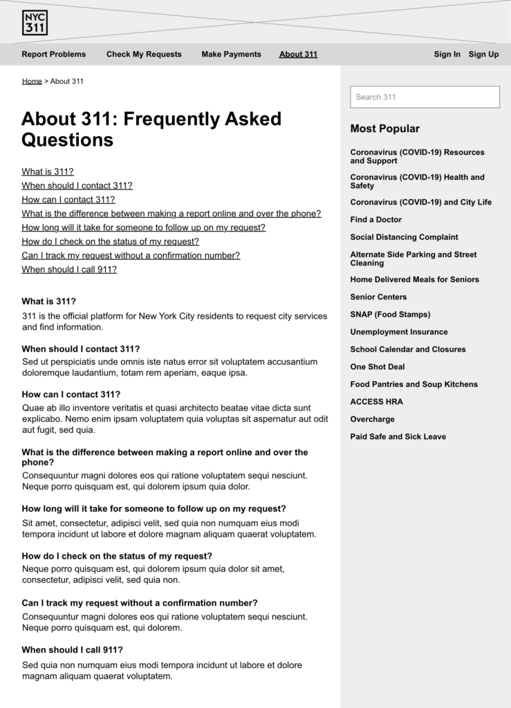
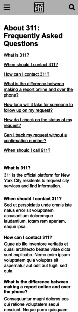
We also included an About page modeled after the DC 311 FAQ page as a way for users to learn in more detail what 311 is and answer user questions, and changed the “Look Up Service Requests” label to “Check My Requests”.
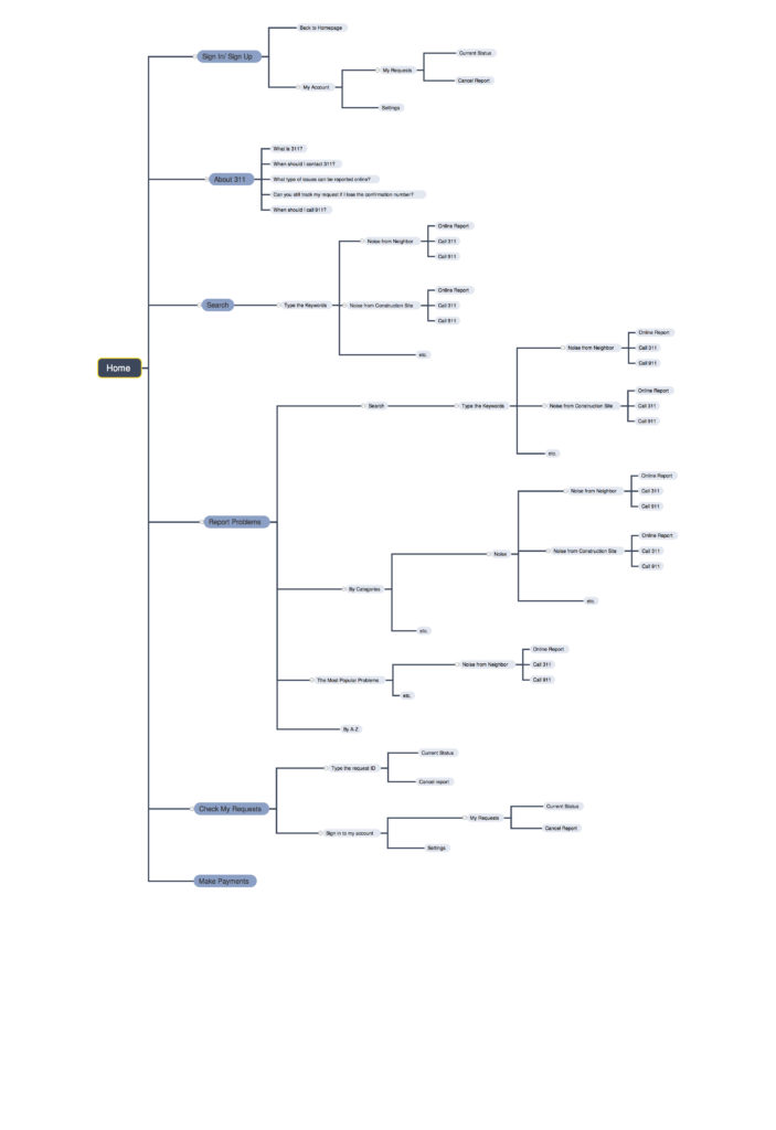
Following this, we conducted a tree test using Optimal Workshop in which participants were provided with tasks and asked where they would find the information.
Our tree test validated our navigation changes, as users were able to complete the tasks without confusion. We also found that different users had different ways of reporting problems – there were multiple paths to making a “noise” report, and users utilized all of them. We also learned that some users wanted to sign in before reporting problems, which was something we had not previously considered.
In this phase, we identified a set of “design principles” to capture the highest design priorities for the 311 site, based on our findings from all of our research:
- User friendly
- Accessible
- Consistency
- Accountability and reliability (responds to user requests)
- Informative
Step 5: Wireframes and Visual Design
Finally, we each created wireframes and a visual design based on our research and exploration. In my wireframes, I chose to focus on how users arriving at the site for the first time would understand the 311 service.
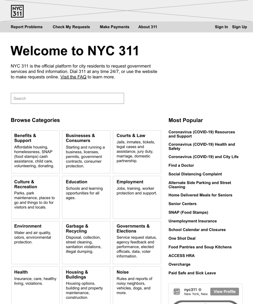
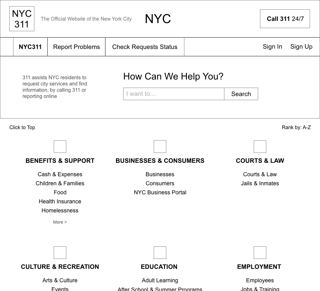
Inspired by the design of GOV.UK, I prioritized the categories, most popular topics, and search bar, and included a large “Welcome” header. The header makes clear what website the user is on, with the goal of avoiding the confusion we found in our prototype testing. Additionally, the subhead beneath it explains what the 311 service is and how it works, since our user research showed many people have not heard of 311 before. I crafted the welcome message with these confusions in mind, and included a link to the new About page to answer further questions.
I opted to keep the design simple and focused on the most important content to 311 users. I also wanted to prioritize readability and so chose not to include photos on the category tiles like on the current site.
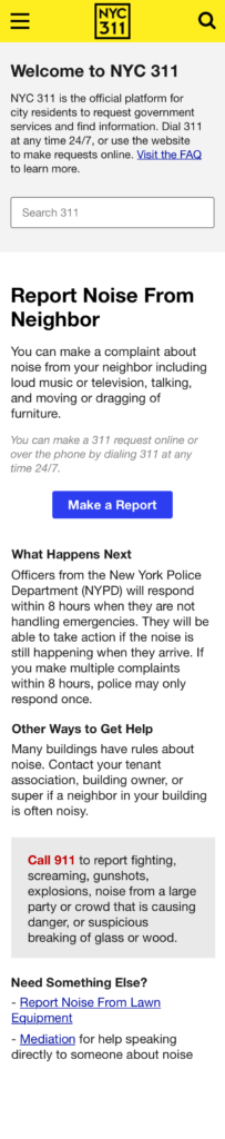
In the mobile version, I prioritized the welcome message and the most popular topics:
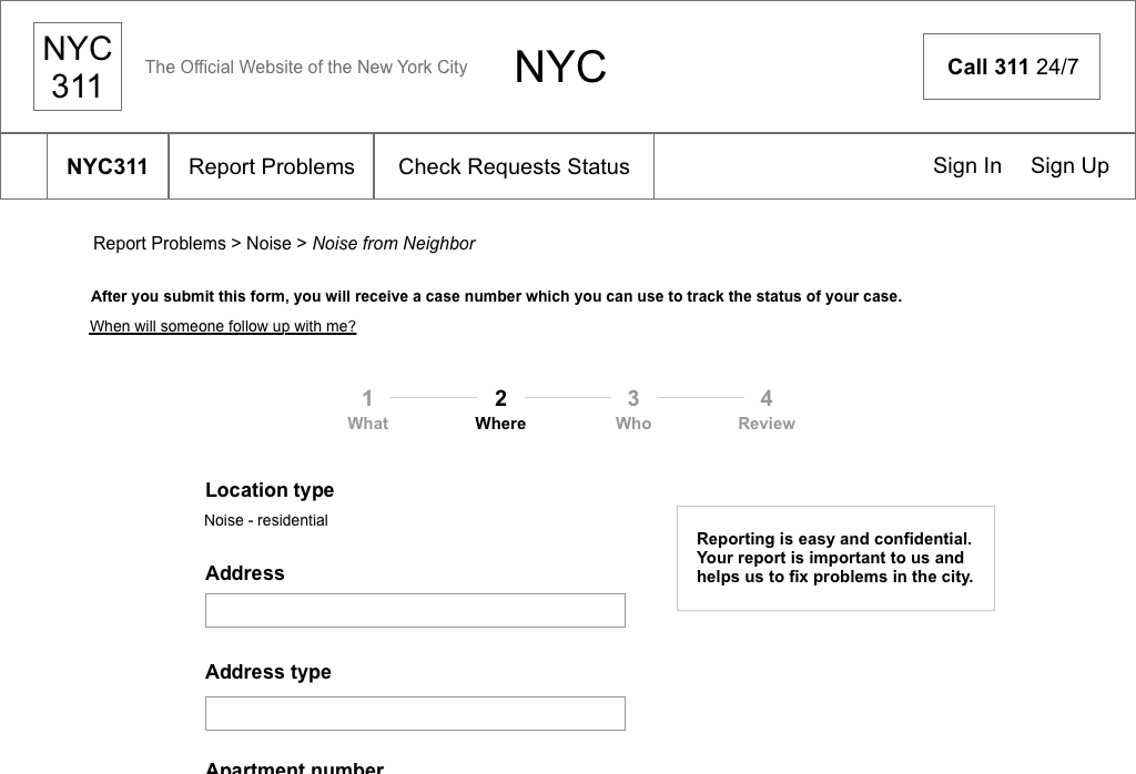
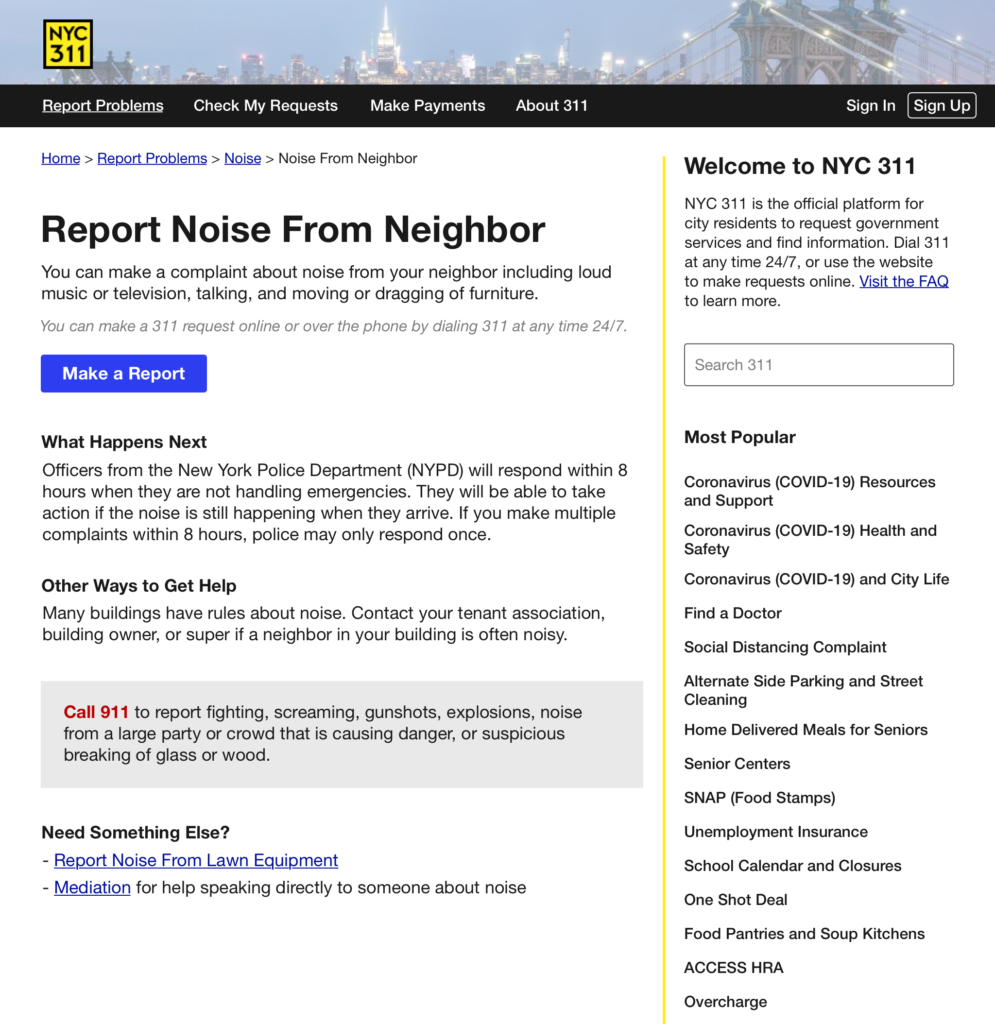
I also chose to include the welcome message, search bar, and most popular topics in a sidebar when in the Report Problems section of the site. This ensures that if users arrive at an article page like below (something we found to be likely based on Google searches) they are still provided with the most important information explaining what 311 is:
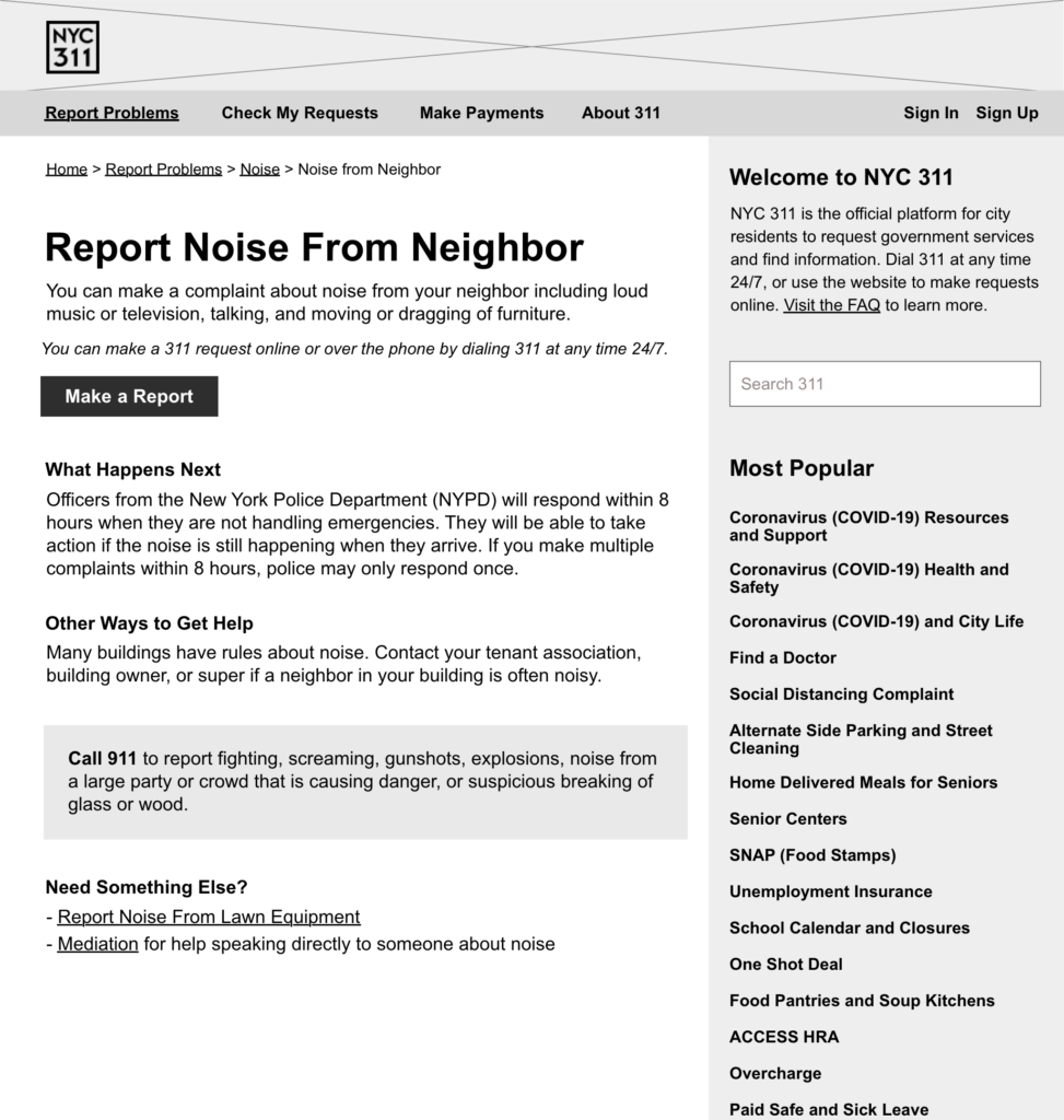
Highlighting the most popular topics provides direct access for users seeking those topics, but also provides examples of the types of services available on the site, helping users develop a mental model for the site and the 311 service.
Other changes included making the “Report” button a prominent CTA, with accompanying text that explains that reporting over the phone is also an option, and subordinating the 911 suggestion while still distinguishing it from the rest of the content.
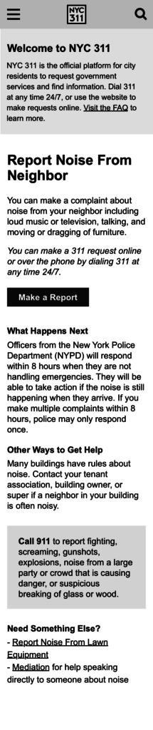
On mobile, the welcome message from the sidebar is included at the top of the article page, and the search and most popular topics are not included. More testing would be helpful to determine if having to scroll past this message could be frustrating, in which case a popup might be preferable.
I also created the new About page, which I decided to label as an FAQ, modeled after the example from DC 311:
For the visual design, I styled the article page. I wanted to build off of the current site design, so kept the black and yellow theme and the use of Helvetica throughout.
Next steps for this project could include additional design work fleshing out the rest of the site, and perhaps most importantly, user testing to assess whether these design changes facilitate a better user experience and successfully answer user questions about 311. Given the many different topics included in the 311 site, testing of different types of tasks would also be useful.