Introduction
The Canadian Museum of Nature is Canada’s national history of museum located in Ottawa, Ontario. Its mission is to enkindle the unforgettable connections and experiences with nature though engaging exhibitions, collections management, research programs, and engagement in a 21st-century global context. The museum also offers a fully bilingual dynamic in French and English of public and educational programs and events.
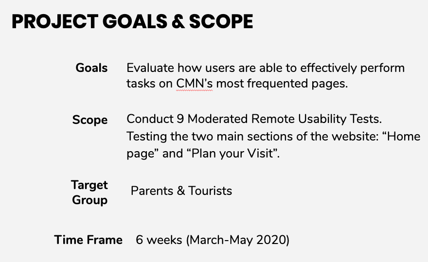
The Museum’s website launched in 20009 and was last renovated in 2010 with minor updates throughout the years. Planning a redesign in September 2020, the museum wanted to learn how users interact with some of its most visited pages, such as Homepage and Plan your visit.
As a team of four usability experts within the IXD graduate program at Pratt Institute – Alejandra Estigarribia, Janet Liu, Angela, and myself, Liza Burroughs – we conducted user tests on the site over a six week time period to review, analyze, and consolidate a list of usability problems and developed three three recommendations.
Process
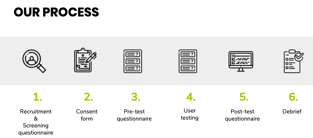
Our process consisted of:
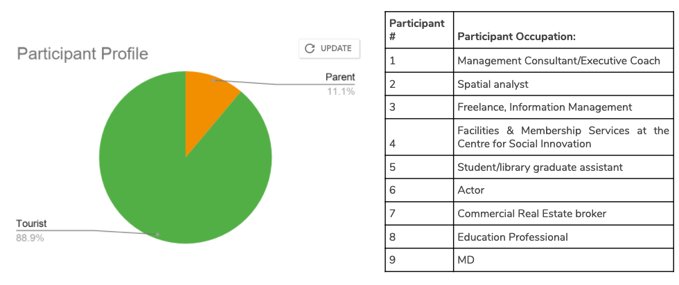
- Recruiting – we sent a screening questionnaire to a multitude of listservs such as Pratt School of Information, CMN’s, and professional contacts.
- Providing consent forms – all participants were required to sign a consent that was available for their review and provided us with permission to capture recordings of audio, video, and screen during the moderated user testing.
- Pre-test questionnaire – provided us with insight of our participants prior to interview.
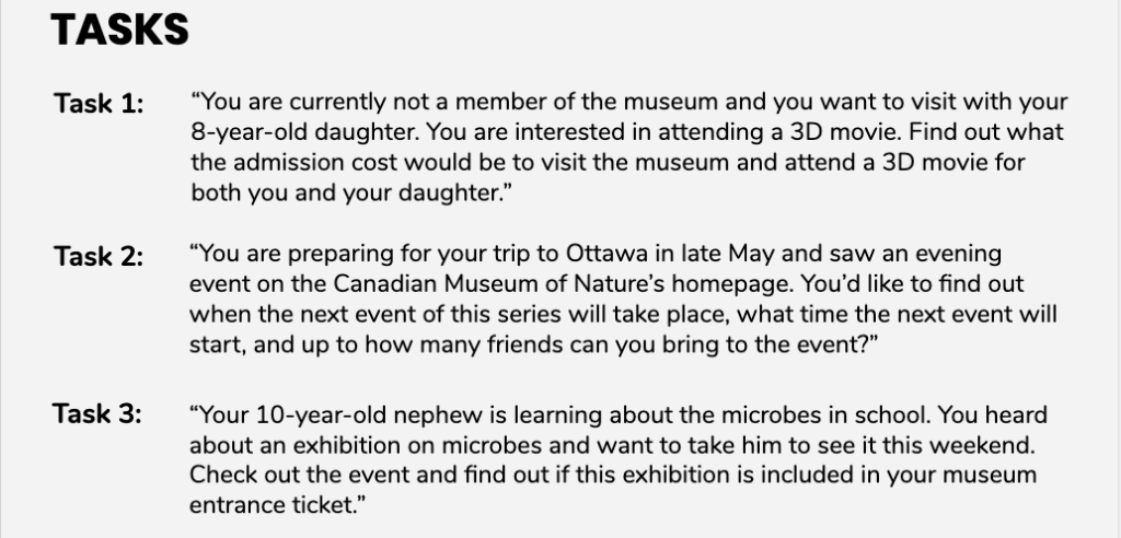
- User testing – we used Moderated Remote Usability Testing as our main method for this usability study.
- Post-test questionnaire – a series of rating scale questions that provided us with summary of their overall user experience during the test.
- Post-test questionnaire – after each task participants answered a series of three follow-up questions that provided more insight on how they felt while completing the task.
- Debrief– after each session, we analyzed our session data individually then later collaboratively discussed our general insights.
Findings & Recommendations
Problem #1: Information Architecture
- Too may secondary navigation options
- Numerous labels
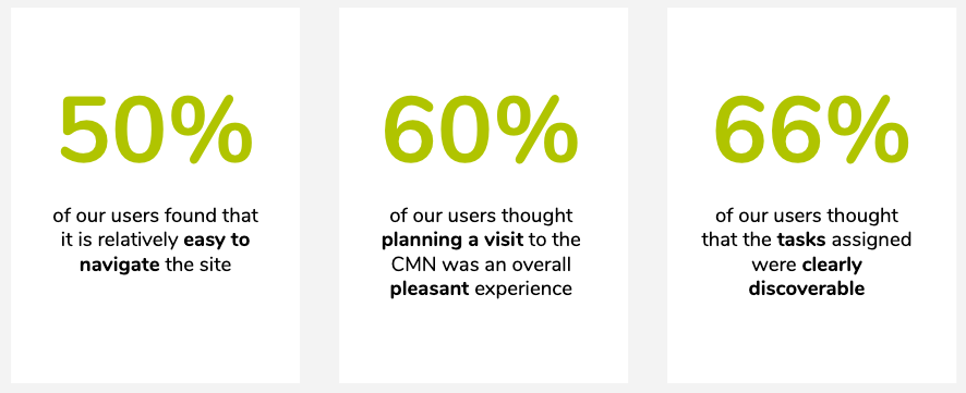
Though many of the participants found the site easy to maneuver there were too many ways to discover intended information. Also, the numerous labels did not align with the user’s mental model.
Recommendation #1: Present key information at the top and rely on one main navigation bar.
- To prevent detour from desired goals, remove “information for” navigation bar.
- Removing the middle navigation bar should direct users to the plan your visit tab which includes admission information.
- Add buttons for 2 key actions, Buy Tickets and Donate, above the navigation bar which will eliminate confusion. We also suggest another color instead of red because user’s associate red with warning or danger.
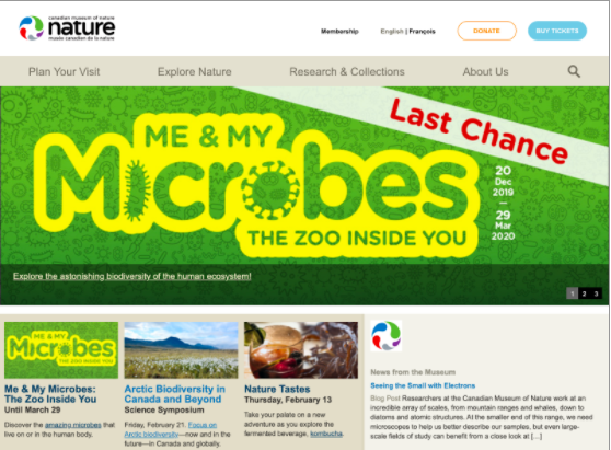
Problem #2: Visual Hierarchy
- Excess of text
- Unclear hierarchy
- Too much Scrolling
Users enjoyed the variety of content and options but struggled to find key information due to the way in which the information is presented. These issues were found on all pages but were particularly evident on the admissions page. Participants turned impatient when looking for information due to excess text and unclear hierarchy.
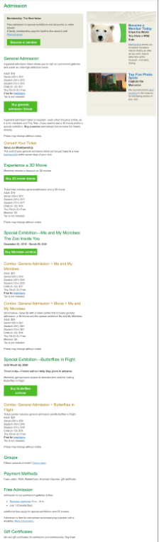
Recommendation #2: Improve visual hierarchy and use filters to organize information.
- Displaying most important information at the the top will help users find their way more efficiently.
- Organizing combo tickets in one row using boxes will allow visitors to compare between the combos and save time on scrolling.
- Organizing different options under categories that can be displayed in a dropdown filter format will reduce scrolling and confusion.
- Including a FAQ collapsible list for secondary information will provide the user with option of expanding depending on if they need the information.
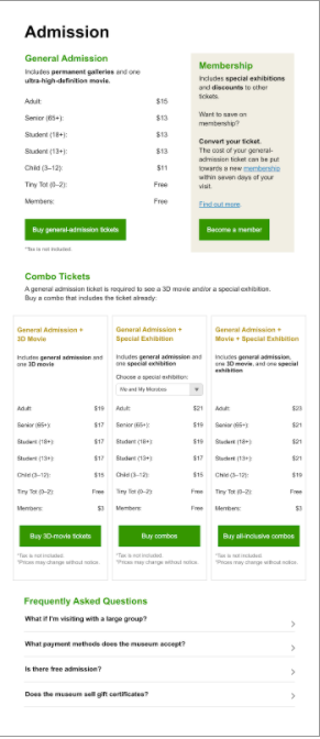
Problem #3: Layout and text
- Text heavy, lengthy sentences
- Small font size
- Photo collage overshadows vital information
- Real estate not used efficiently
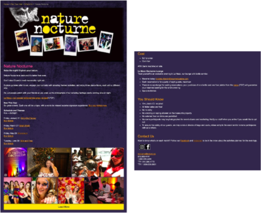
While the majority of participants were able to accomplish the tasks assigned, feedback and observation revealed that key information was hidden and a redundancy of information, along with lengthy sentences, inefficient photo arrangement, and lack of information hierarchy. All those entities played a factor in users missing the information the were initially looking for.
Recommendation #3: Emphasize important event details and information so it is easily discoverable.
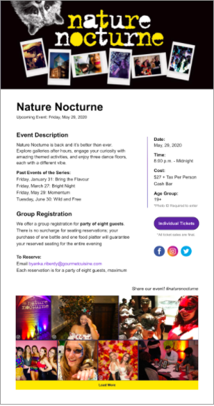
- Make date, time, cost, and age group of intended audience more visible because those are the main details that visitors look for when wanting to attend an event.
- Shortening text will provide users with option of skimming rather than reading through loads of text.
- Moving photos to the bottom will allow event information to be displayed first.
Conclusion
Most participants agreed that the Canadian Museum of Nature’s website is family-friendly and inviting. Now that user testing has been conducting, the Museum’s team is able to utilize these results to fix the usability issues discovered and enhance the user experience of their website.
Our recommendations were received positive feedback from the CMN team. They appreciated that our proposed solutions were achievable and realistic. I now suggest they conduct card sorting and tree testing to determine the ideal information architecture that would most be most efficient for their users. Once that occurs, they can proceed with our recommendation and conduct another user test post redesign to analyze the effectiveness.
Overall, it was a pleasant experience working the CMN for their upcoming redesign. I am looking forward to seeing the change in the next next couple of months and I am glad that I was able to be apart.