Problem:
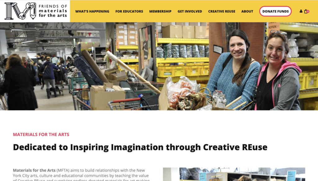
Our client Friends of Materials for the Arts wanted feedback on the functioning of their website. They very recently had redesigned their website and hence were not up for making dramatic changes. Their also wanted us to focus on functioning over the visual aspect. We were asked to suggest improvements for the websites organization and navigation that would make the website have more clarity have more clarity. This is what their website looks like today
Process:
Our project started with meeting our clients where they introduced us to their business and overall mission / vision. We had also looked up their website prior to the meeting and discusses all our questions and concerns going us a good understanding of MFTA. Our client also emphasized on which areas on the website they seek feedback on which gave direction to our research. Based on their feedback we brainstormed the 4 tasks we would like to test. They we mostly the the navigation and organization space. This was followed by the pilot user testing where we received feedback on our shortlisted tasks. As a group we then discusses the feedback made minor changes to get our final 4 testing tasks
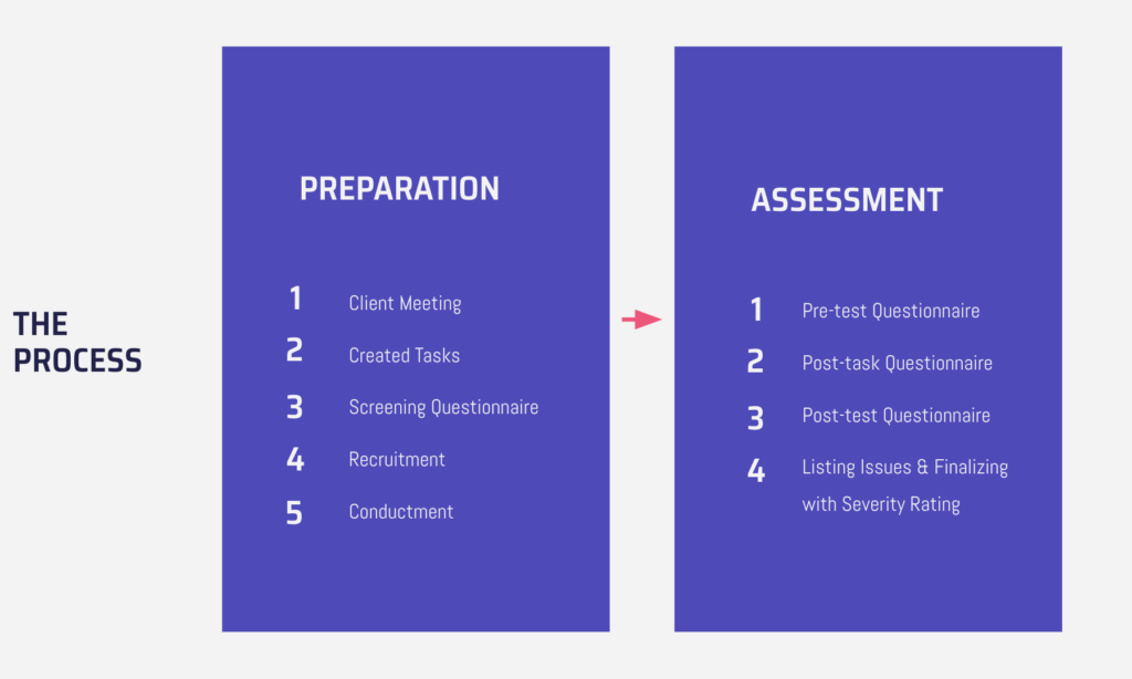
We used the remote moderated user testing method to gain insights. We recruited our participants through Pratt’s email groups and asked some colleagues. We wanted our users to more inclined to art / craft so they would be representative to the website’s real audience (amongst others requirements that were a part of our screening questionnaire). We individually tested two users and the discussed our findings as a group. The insights that were common and relevant to our clients focus were (organization & navigation) shortlisted as our 4 main problem areas.
Solution:
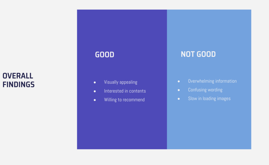
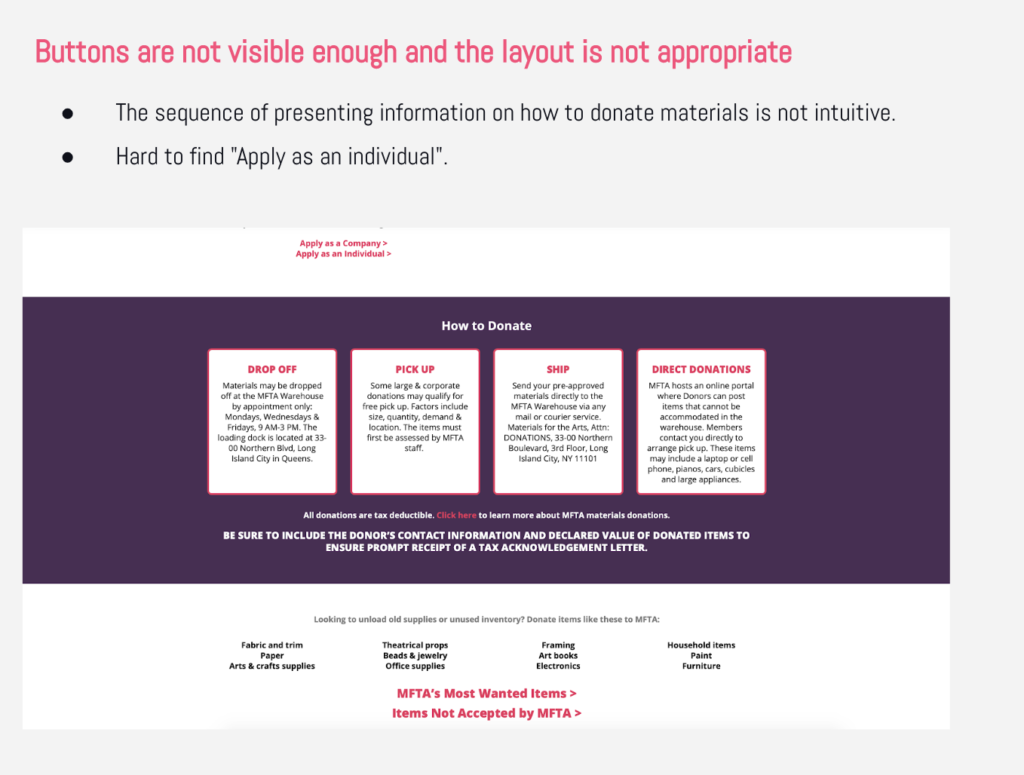
The participants found that the MFTA website is visually appealing, however, they encountered some usability issues with the navigation and structure of the website. Through my testing I learnt that user had to go through all the tab options before I found ‘donate materials’ under ‘get involved’, that articles could all by organized either into folders either topic-wise or year-wise and that users scrolled to the bottom of the page and expected the operation hours to be there near the location/map. When we pooled in or data these were over all findings and recommendations…
Issue #1
Recommendation #1
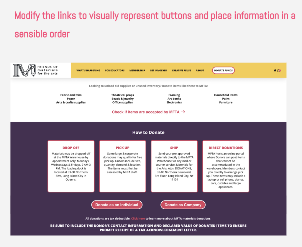
Issue #2
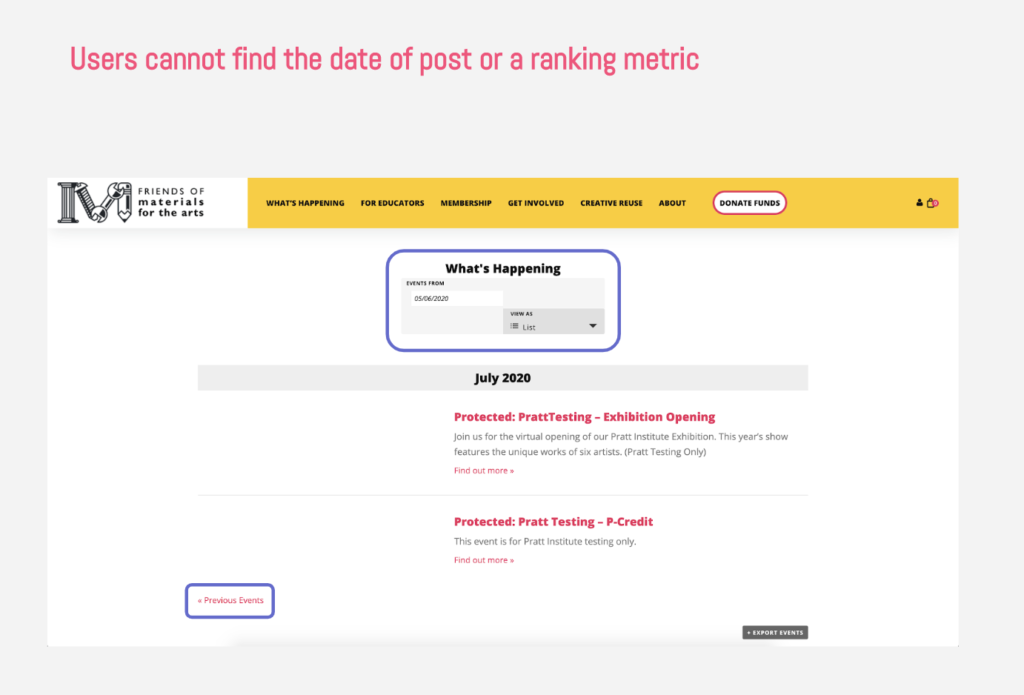
Recommendation #2
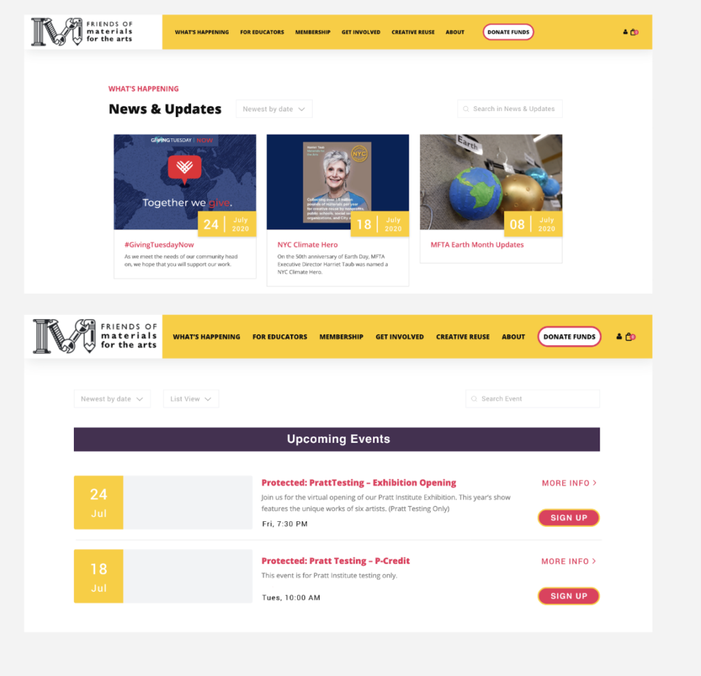
Display date and type; provide a sorting feature and inform users the basis of arrangement of posts
Issue #3
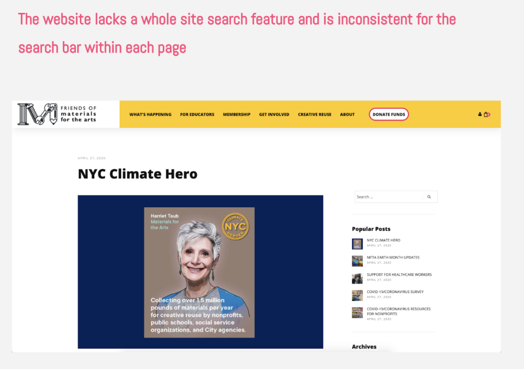
Recommendation #3
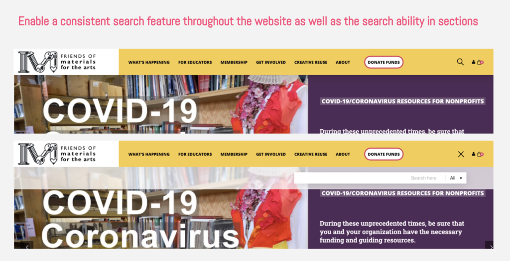
Issue #4
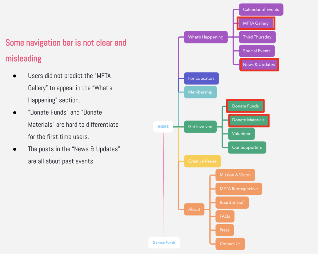
Recommendation #4
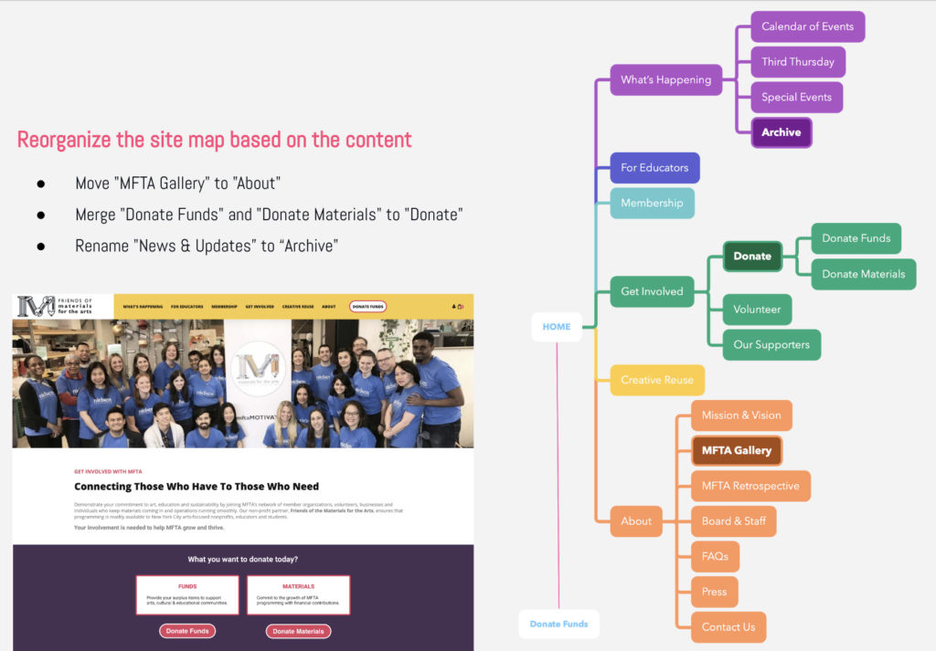
Conclusion
We delivered our recommendations to our client via a formal presentation. They were very appreciate and satisfied with what we delivered. Our recommendation were minor changes would help a more structures and clear browsing experience.
If I were to take this project further. Would work on the visual experience. Change the color, layout and composition making it more “artsy” and inviting for it’s audience.
My major takeaways are that communication with your clients is key. We had to be in sync so we could deliver exactly what they expected. Taking frequent feedback and discussing concerns along the way is a great way to make you’re making the right decisions.