— PROJECT SUMMARY
About the organization: Pratt Institute is a higher education university in New York City with a mission to transform academic excellence in architecture, art, design, information studies, and liberal arts and sciences through its defining heritage and visionary future.
Team: Olaide, Xin and Pallavi
My Role: UI/UX Designer, Interaction Designer, Project Manager
Methodology: Competitive Analysis, Google Analytics, User Testing
Timeline: 4 months
Goals:
- To redesign Pratt’s homepage and prioritize key points of information for current and prospective students as well as add features such as Events and News.
- To create a smooth integration and point of entry between Pratt’s Academic page and Courseleaf
— DISCOVERY
How Do We Tell The Story Of Our School (The Client Meeting)
Pratt’s Department of Digital Communications is currently planning a redesign of the website and wanted help with making and executing design decisions. In the first meeting with our client, they brought up an interesting question about the current state of the homepage—”how do we tell the story of our school?” The client was interested in seeing how the homepage can serve as a storied overview of the school. In addition, they raised some concerns about the current homepage and how users like current and prospective Pratt students were interacting with it. The current homepage does not provide any sort of fixed information about admissions and lacked a school news feature amongst other things.
Another crucial project we discussed was Pratt’s implementation of Courseleaf, a third-party platform that will be used to manage course bulletins. Thus, we were given the challenges to redesign the homepage of the Pratt website and create a smooth user experience between the Pratt website and Courseleaf. We split the project into these two goals, which allowed us to understand and work within the scope of each project goal.
Discovering More About Pratt’s Users
It was clear that prospective and current students were the primary users we would be designing for. They are Pratt’s key audiences, and therefore, both the homepage and the academics page had to be redesigned to fit their user needs. However, there were other users to consider. Users like Pratt’s faculty and staff members, alumni, and even parents of the primary users would be interacting with these pages as well.
So, we divided them into four archetypes— Prospective Students, Current Students, Faculty and Staff, and Parents and Alumni. For each archetype, we briefly outlined a user statement defining their needs and goals.
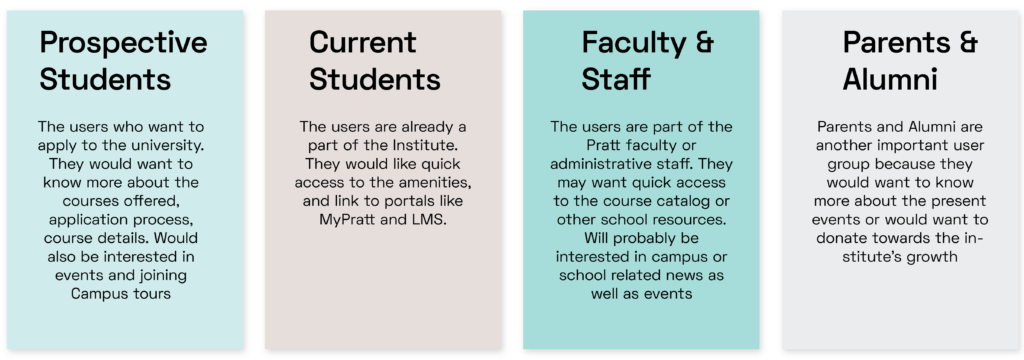
To identify specific goals and pain-points when it comes to users navigating the Home and Academics pages, we created two personas based on the two primary users—prospective student and current student.

Developing the personas went into us wanting to understand how users behave when they interact with Pratt’s current Homepage and Academics page. We completed an analysis on the website using Pratt’s Google Analytics and gathered some interesting findings.
— GOOGLE ANALYTICS
Users Are Not Really Engaged When They Land On Pratt’s Homepage
Even though Pratt’s Homepage was among the most visited pages of the website, it still seems to be underperforming. The average page per visit for new users was less than 2 while for returning users, it was less than 4. In addition, users even spend less time on the website when they enter in from the homepage than they do from any other page of the website.
This could mean a lot of things, but we gathered that the current homepage holds no appeal to users like prospective or current students because of the lack of content and visual hierarchy and detail. Therefore, they spend less time on the website since there’s not a lot of valuable information for them to connect to.
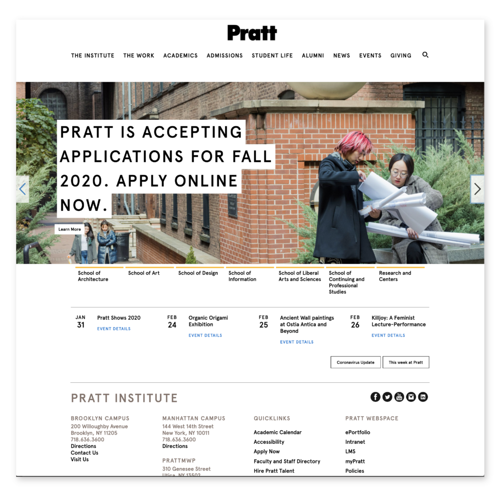
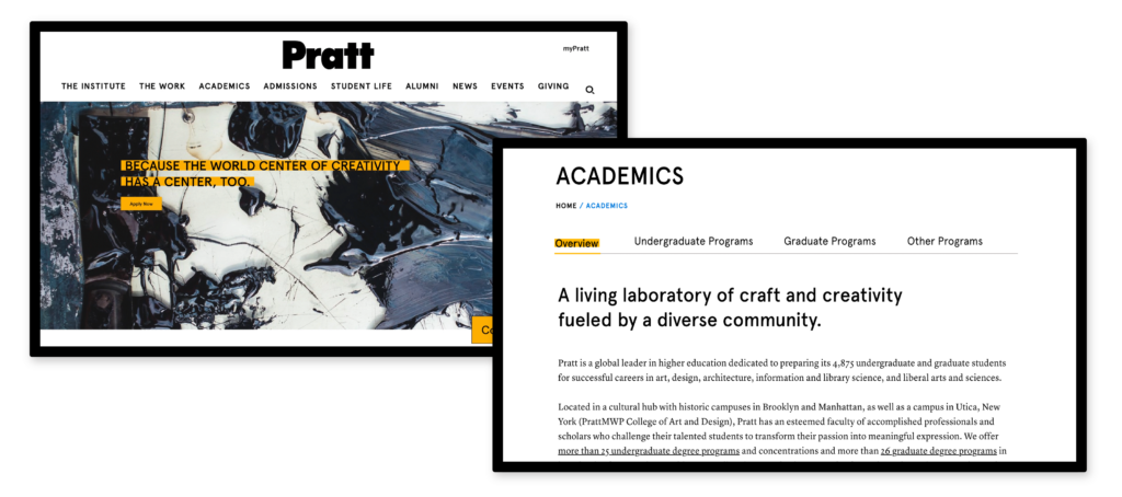
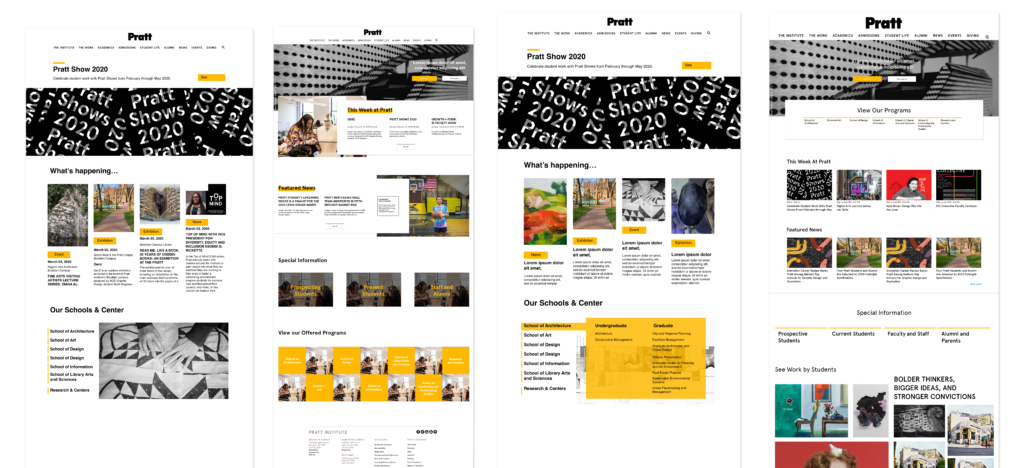
In the current homepage (on the left), the carousel used to display important information about application deadlines and admissions. Something so important as this should be static on the page.
The school menu that lies below the carousel is small and can be easily overlooked.
And the events section holds no visual appeal while the “This week at Pratt” and “Coronavirus” buttons seems to be randomly placed.
For The Academics Page, Less May Be More
We also found that new users visited twice as many pages as returning users, but spent only half the time on the website than returning users.
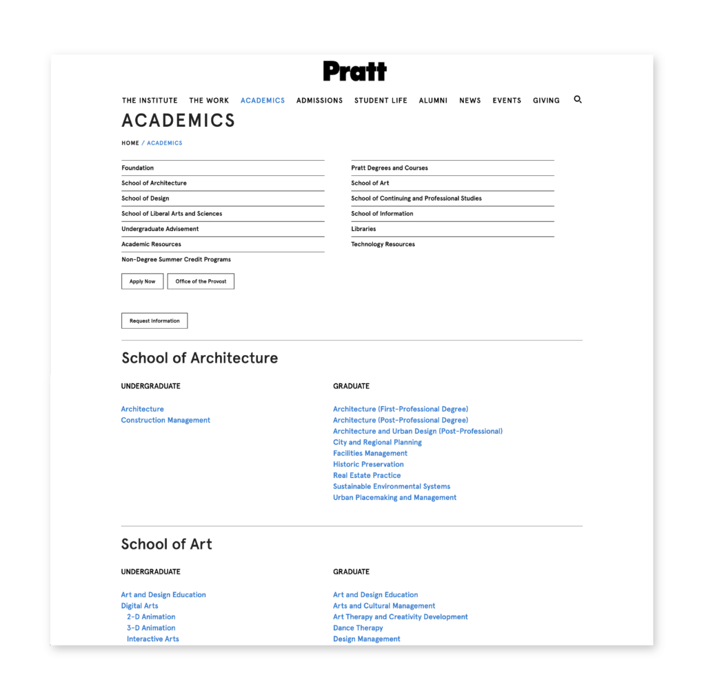
New users like prospective students may be just browsing the pages, however the current Academics page seems like an endless scroll of lists.
Also, there is no connection between the secondary navigation menu and the list of schools’ programs.
Overall, users are underwhelmed and less engaged on the Homepage whereas on the Academics page, users are perhaps overwhelmed by the number of links and choices. This gave us insight into how we were going to redesign the Homepage and Academics page to balance out the addition of the new features and improve the overall design and user experience.
— COMPETITIVE ANALYSIS
Bold Design Language vs. Good Information Hierarchy
We completed a competitive analysis to evaluate, compare and contrast the current trends and features used by other universities. 5 competitive art schools’ websites were analyzed based on the following parameters : Appearance | Organization | Features | Mobile-Friendliness | Content.

We saw that the schools did not compromise when it came to choosing between a bold design language and a logical information hierarchy structure. In fact, the use of vibrant colors, bold typography and images were used to highlight certain features like the news or events section and even student work on many of the schools’ Homepages .
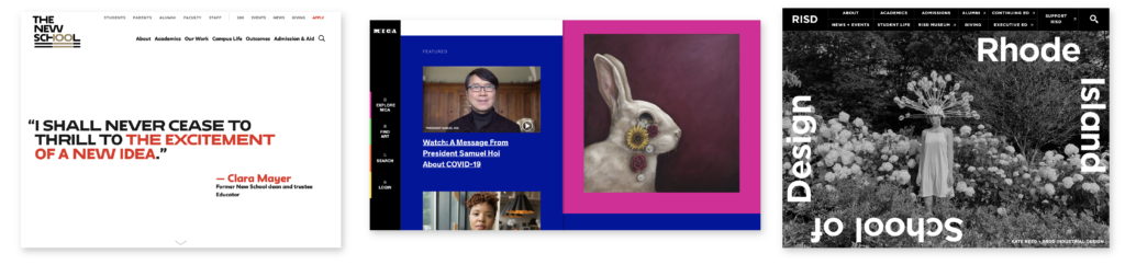
The New School, MICA and RISD later inspired the new design of the Pratt homepage.
— REDESIGNING THE PRATT HOMEPAGE
Based on the competitive analysis, the digital analytics findings and the features we discussed in the client meeting, we began to individually draw sketches of the homepage to explore different layouts. Doing these quick sketches helped us narrow down our ideas so that we were able to move into creating high-fidelity iterations.

With the high-fidelity variations, we added images and text to explore and discuss how these layouts would work with Pratt’s branding and identity.
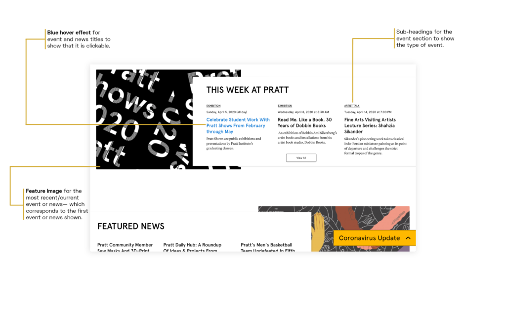
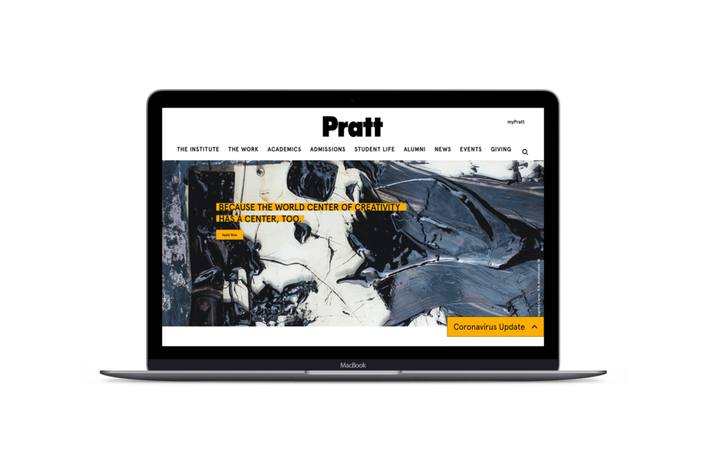
A Bold, Colorful And Engaging Pratt Homepage
We chose the final design because it visually balanced the text, images and features in a consistent layout and composition. Overall, we focused on giving the page a clear information hierarchy so that users such as prospective students or parents can get the information they needed from the page.


— REDESIGNING THE ACADEMICS PAGE
But First, What Is Courseleaf
We had a shorter time period to redesign the Academics page due to some unexpected circumstances. In addition to that, there was still a lot of ambiguity around what Courseleaf was.
In another meeting with the client, we were given more details and materials about Courseleaf and Pratt’s integration with the system. Essentially, Courseleaf is an information system that manages universities’ academic catalog in the form of a third party website. This website/catalog is customized by Courseleaf to reflect the identity of the schools while providing a comprehensive solution for users to interact with the academic catalog.

Discovering A New Information Architecture For The Academics Page
We understood that the Academics Page would act as a starting point into the Courseleaf catalog. So, we redesigned the Academics Page to model Courseleaf’s mockup of a department page for Pratt. Aside from making a few small changes to the tab feature design, emulating the Courseleaf catalog would provide users with a seamless transition into Courseleaf since the information is displayed in a similar structure.
Since we had limited time, we had to go straight into prototyping different iterations.

We spent a good amount of time trying to organize Pratt’s extensive list of degree/non-degree programs, certificate programs, concentrations and minors in a clear information architecture. We thought about how prospective and current students would navigate through the Academics page and decided on a final design that structured the content in a clear way for all users to understand and navigate.


— FINAL PROTOTYPES
— USER TESTING
“The Colors Drew My Eyes In To Important Areas Of The Page”
We conducted a remote user test on the finalized design to gain insights on how well users would be engaged by the visual design and content and how well it quickly communicated the overall message.
Many participants commented on the information hierarchy of the final design. In general, they were able to do a quick scan of the Home and Academics pages and understand what they were looking at. They also liked how the images and colors on the Homepage separated different pieces of information. This added a visual focus for them, which helped them identify key areas of information on the page.
— PRESENTING TO THE CLIENT
We presented the final prototype to the client in the form of a slide presentation that outlined our design process and explained our design choices. Even though it was done remotely on Zoom, the client enjoyed our presentation and was especially pleased with our attention to detail in the final prototype. We discussed future directions of the project such as working further with the department team on the Courseleaf integration.
— FUTURE CONSIDERATIONS
You Tell A Story Through The School’s History, its Culture and its People
Pratt Institute’s identity is bold, progressive and relatable. But the current website does not necessarily reflect the spirit of that. And still, the user testing we conducted on the redesign of the Home and Academics pages revealed that the design language was a bit too conservative for such a prestigious art and design school. Several participants said that the design wasn’t memorable enough. This was an interesting finding. In the end, we didn’t want to “overdesign” and present something that was completely out of the client’s expectations.
In addition, some participants thought that the design lacked the presence of students. And indeed, images of the beautiful Brooklyn campus and the students are hard to come by on the current website. We brought this to the attention of the client because showing images of students and campus life does create a sense of belonging and culture. Students, faculty members, staff and alumni all contribute to making Pratt who they are. To tell any story, you cannot leave out its characters.