In the “Elements of User Experience”, Jesse James Garrett breaks down the user experience process into five elements or planes: strategy, scope, structure, skeleton, and surface. Today I will be critiquing Peloton’s website with these five elements in mind.
Strategy: product objectives & user needs
As Jesse mentions, this is the most abstract element. I am a current Peloton user, but I only use one of their products — the app that offers on-demand class workouts. Being a prospect buyer for their other products, the physical bike and tread, I can say that the website meets my needs as it clearly lays out their products, how they differentiate from each other, and their cost. This allows me to gather all the information I need to make a decision. It also clearly shows me how to execute on that decision (when the time comes). The business’s objective would ultimately be product adoption. Their second goal most likely is emotional, having prospects think of their product as desirable to form some sort of curiosity (later adoption, per the aforementioned goal) and loyalty.
Scope: functional & content requirements
Second to the most abstract element is scope. Here I will focus is on content requirements. The site provides extra detail on each product, tying back in to the previous strategy element of each the user and business goal. For example, the user can directly begin a 30 day free trial for the app product. There is also a list of FAQs on that product. Additionally, when navigating to the bike product, there are videos that offer snippets of various classes. My only critique is that there are so many different videos that are shown, and that could be overwhelming, as well as unfocused (i.e. trying to please everyone).
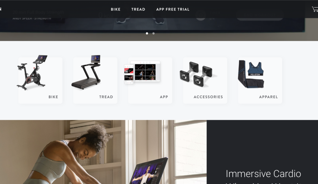
Structure: information design & information architecture
Next, I will focus on the content elements. I think the structure or information is simple and easy to digest. It provides direct and key information about the business’s products and offerings. One thing I find “strange”, is that the key focus are the three products: app, bike, tread. However, between the landing page’s hero image/video and the details of these three products, there are five images with text which includes those three products plus two other ones, accessories and apparel. It seemed to be a little out of place.
Skeleton: interface/navigation design & information design
The second to last element will be focused on the layout and navigation. The buttons are placed where I would expect to see navigation options on any website – there are three buttons that all lead to each respective product (drill-in with information). The logo name is on the top left, where I see it for most sites. The shopping cart is on the top right, where I also usually find it on other sites. The hamburger menu, however, was to the right of the shopping cart; this is not where I’m used to finding menus. Typically they are on the top left next to the logo. Finally, there is a help chat located on the bottom which is useful, and floats as you scroll down the screen.

Surface: sensory experience
The final element has to do with the look and feel of the website. I find the colors to be bold and exciting (red) but with neutral tones (grey) it does not feel overwhelming. The images are clear and opaque, so it provides a smooth and modern feel. The hero video on the landing page gives the user better understanding on what the product is, however I find it to be a bit noisy.