American Airlines is one of the major airlines in the United States. Similar to their web application, their mobile application allows a guest user or AAdvantage member to book a flight, check their flight status, or find an existing trip, along with a series of other less prominent features, like quickly accessing mobile boarding passes, tracking bags..etc. This critique will delve into an evaluation of the mobile application within the context of Don Norman’s “The Design of Everyday Things”.
Login Screen
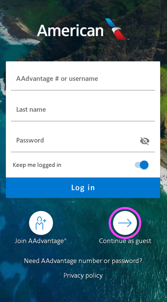
Initially, this screen, as shown in Figure 1, uses feedforward text to indicate the type of information needed from the user, and clear signifiers for two key actions at the beneath beneath the main login section of the screen.
Issue: additional options in the same section, using the same text size, but without clear signifiers to indicate if they can be clicked on. While this could be considered as a convention, lots of websites provide similar clickable text regarding “Privacy policy”, but the user is forced to explore and test if clicking the text will take them to the expected selection, or make them feel incompetent if the text does not allow them to take any action.
Solution: User a signifier such as an icon or arrow , so that the user doesn’t have to figure it out on their own. As a bonus, if they performed a root cause analysis, they could have determined why users often “Need their AAdvantage number or password” (no one memorizes their advantage number) and made the option less bias by suggesting what the user is trying to do, “Retrieve AAdvantage number or password”.
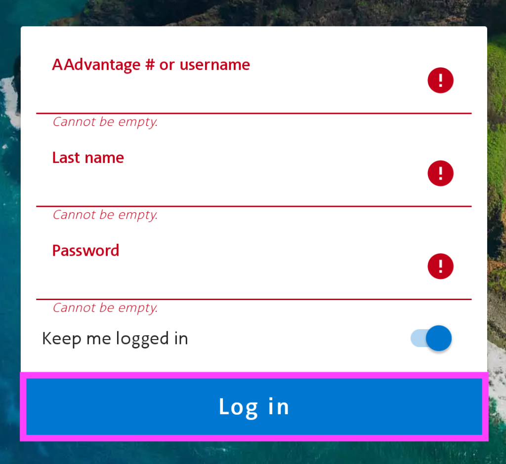
On another note, if I select the “Log in” button before filling in the fields, as a rule-based mistake, since I already know that the form needs to be completed before I can login and chose to proceed anyway, as shown in Figure 2, the application provides clear feedback to indicate root cause based error messages to fix the mistakes. However, this brings up an important point around mode-error slips.
Issue: The Log in button remains blue the entire time, per Figure 2, regardless if the fields are incomplete or completed, making the format prone to mode-error slip.
Solution: While it provides a lock out constraint if required fields are incomplete; offering immediate feedback with root cause based error messages to get to the user to the next step, this only appears after I’ve tried and failed to login. This could be resolved by using one color for the “Log in” button when the required fields incomplete, and the button should be un-clickable. Then, use another color and make the button active once all fields are completed.
Home Screen
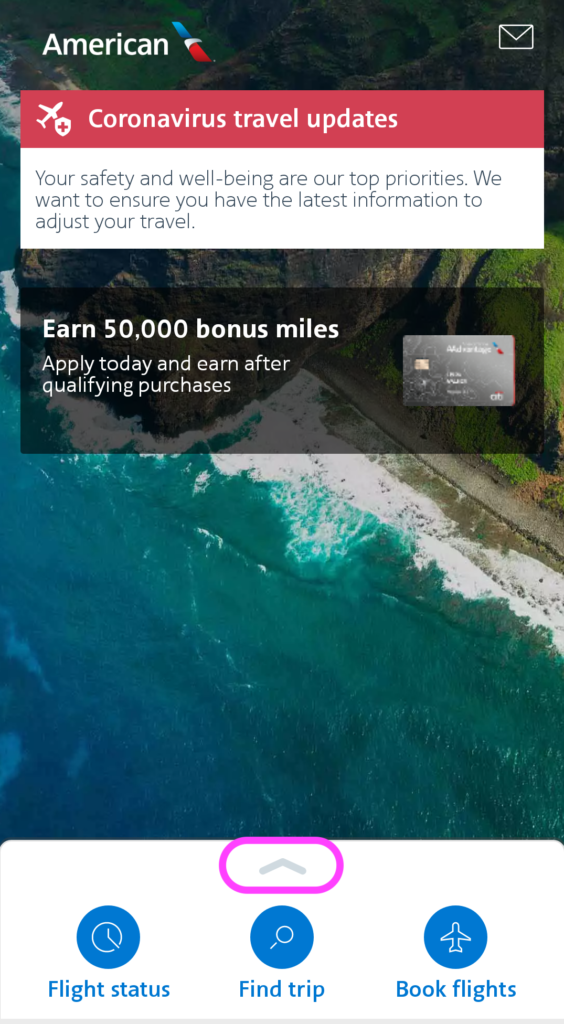
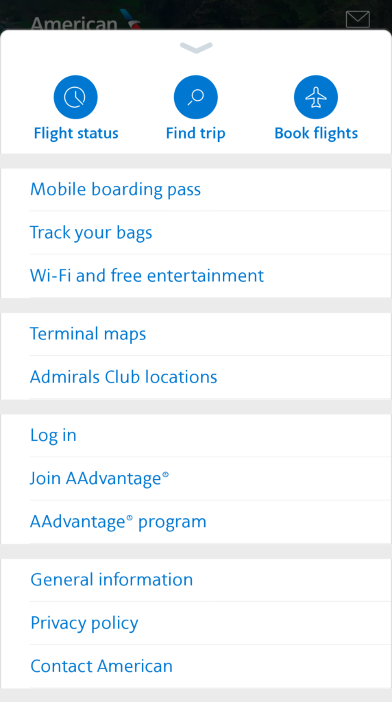
I selected “Continue as guest” as indicated in Figure 1, which led me to the main page. While there are no signifiers via text that states I’m on the home screen, I can understand based on the set of actions provided, what I can do to take the next step (unless I wanted to cancel a flight, more on that later), the app applies the Discoverability principle well with effective signifiers, shown in Figure 3; indicating what the user can do with the application such as checking a flight status, finding an existing trip, booking a flight, and swiping up for more options. It is also helpful to see the Physical Constraints as noted previously, there’s a wealth of helpful capabilities as noted on image to the right of Figure 3, that shows what I can do with this app while not logged in, and what I cannot do. For example, when I’m not logged in, I cannot cancel a flight directly and have to click “Contact American” to proceed. However, I can track my flight status, my boarding pass, my checked bags, the Wi-Fi available for the flight, along with the Admiral club locations and terminal maps based on the airport that my flight is departing or arriving into — all without logging in.
Booking a flight
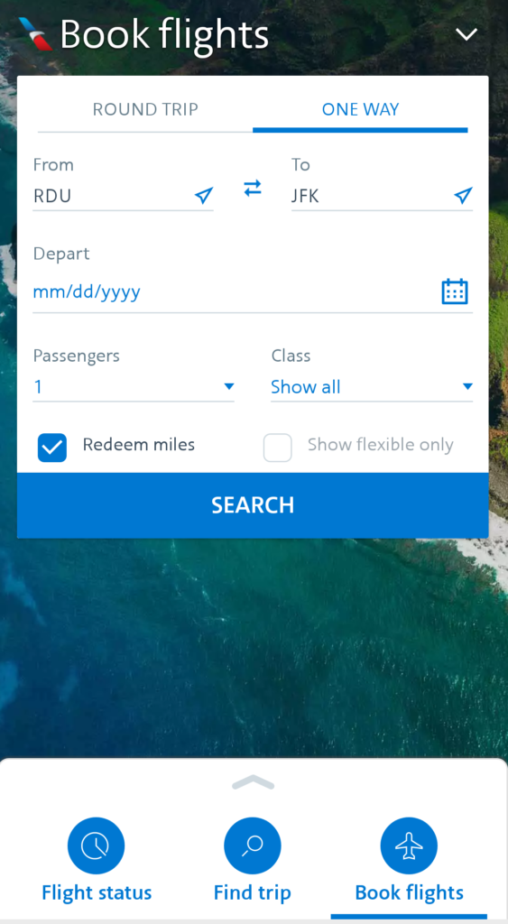
Once selecting the option “Book a Flight” it clearly indicates the page you’re on to signify you are in the right place with both the title on the page, and also with a visual signifier below the icon for the option selected. The signifiers also guide you to indicate which kind of flight you want to book: One way or Round Trip. It also provides a physical constraint (which is an unhelpful limitation of their UI): You cannot to book multiple connections. Let’s assess how the app follows Don Norman’s “Gulfs of Execution and Evaluation” and the “Seven Stages of action”! As per his actions: Goal, Plan, Specify, Perform, Perceive, Interpret, and Compare:
- My Goal: Visit family in NY during Thanksgiving, without incurring rush hour traffic, while on the go, and without having to login. And I want to use my frequent flyer miles.
- My Plan: Use a mobile app to figure out what flights are available because I’m not at home with my laptop, and web applications can be hard to use via phone.
- The Specification: Using the American Airlines Mobile App to figure out the flights because I already have frequent flyer miles to be used with them. Then I can login when I have determined that they have the flights that I want.
How I performed: This application presents information in a sequential fashion so that I know what to do next by providing feedforward text in fields unfilled in order to enter in the appropriate information. Additionally, it uses constraints to prevent error by making it very simple via Mapping or using a physical constraint to prevent the user from searching for their flight by:
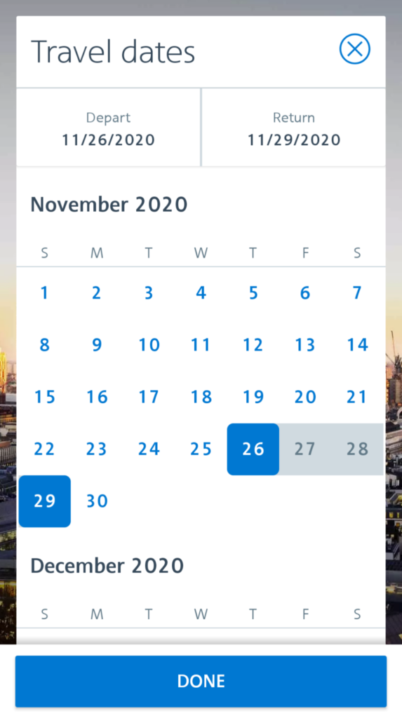
- Mapping: The intuitive relationship between date selection and the Depart and Return dates on the same page to easily make date selections.
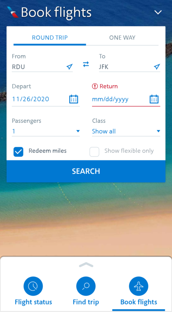
- Physical constraint: Providing immediate feedback on what needs to be completed if you forget to select one and click “Done” too soon, to avoid the error of only completing the Depart Date.
Lastly, it provides immediate feedback by presenting my inputs once selected, by filling in the text fields or a checked off box.
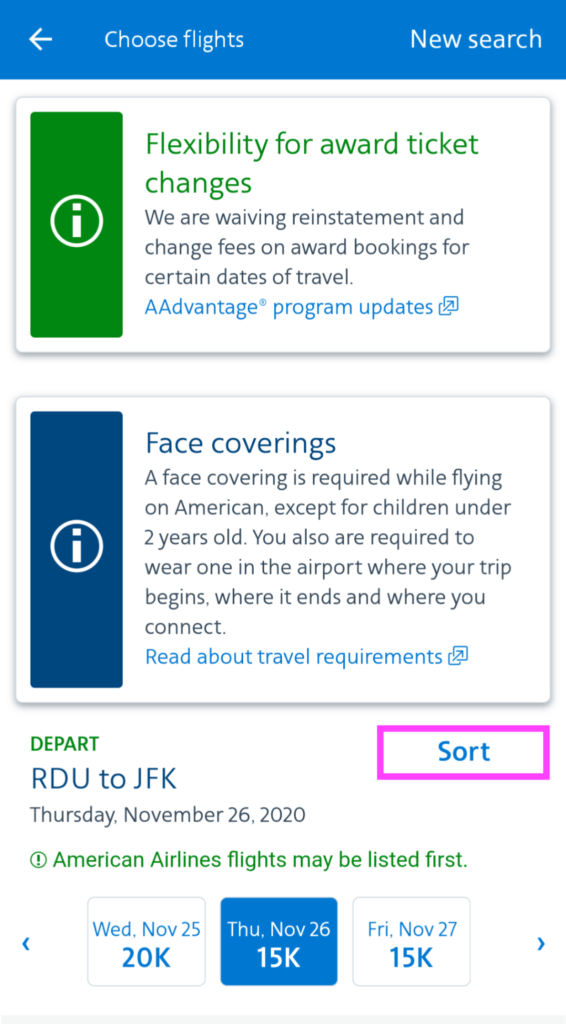
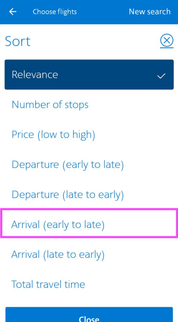
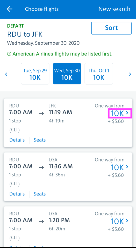
Once I click Search, as seen above in Figure 4, the system provides me with a world of ticket options, per Figure 5 below, based on my selections performed so that I can see if the selections I made are what I wanted, and am afforded the ability to sort by a given time to align with my goal of getting in before dinner time (rush hour traffic time) and determine if it allows me to get to the flight choices that meet my criteria to book my flight.
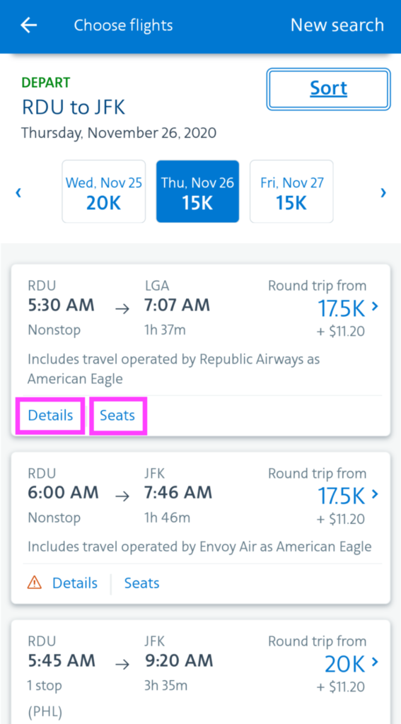
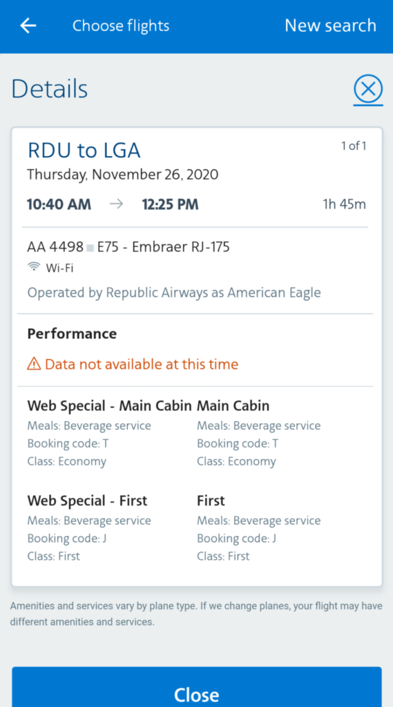
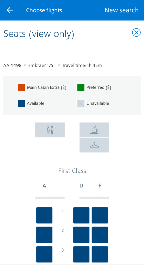
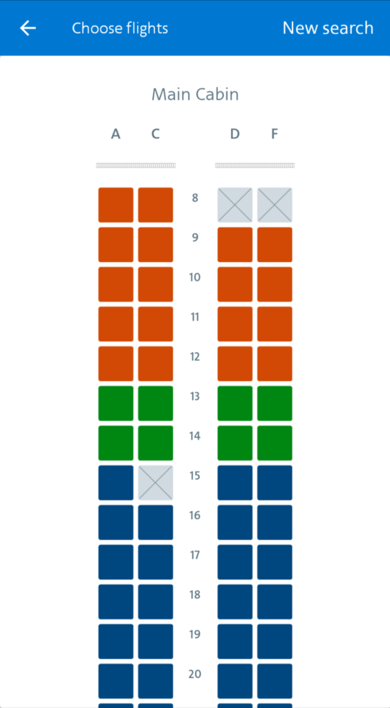
Based on the ticket options in Figure 5, I am also afforded the ability to learn more about each flight, found on Figure 6 below, such as if Wi-Fi is available, the types of food services, and the likely-hood that the flight is delayed, along with seat availability prior to even logging in! The heading for the Seats page is also a helpful signifier by indicating view only, so I know I cannot select my seats, but can view the availability per the helpful mapping of seating for the flight selection.
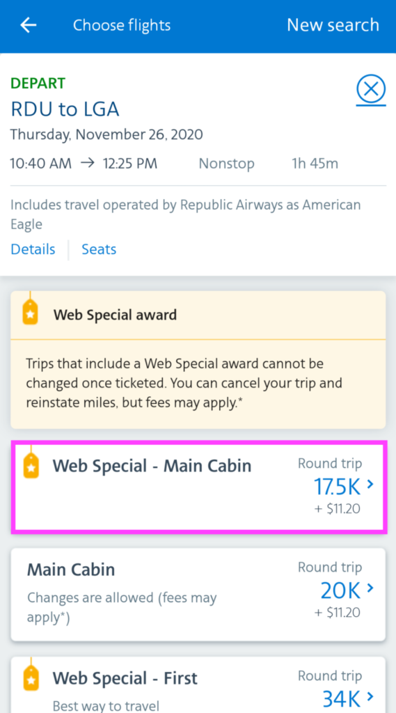
Once I’ve viewed enough information to vet out which flight I want, I am able to move to the next step by selecting the “number of points + arrow icon” which takes me to a screen to select which type of seating group I want to be, and then has me repeat the steps again for my Arrival ticket selection. See figure 7 below.
Issue: As a user not logged in, I found this experience confusing because I had to use process of elimination of the buttons availabe to get to the next screen, and the only signifier that tells me it will take me to the next step of the ticket selection process is the arrow icon.
Solution: Make the Arrow icon more prominent so that its better indicates that it is used to take you to the next page or make the entire element for each flight option selectable vs. just the price selectable.
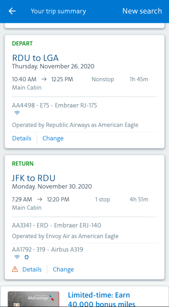
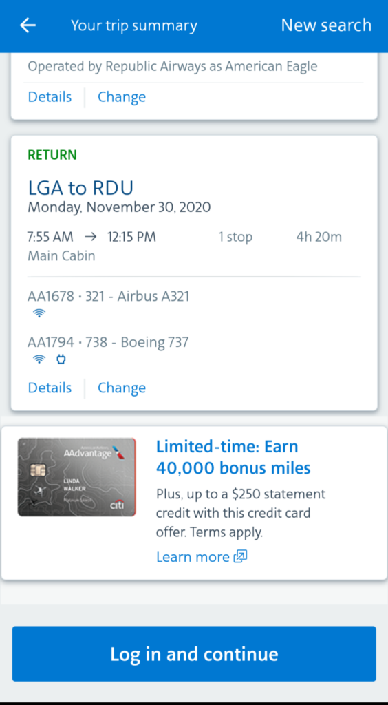
On the “Your trip summary”, per Figure 8 below, I’m able to perceive outputs provided by the application, based on my selections, interpret if the selections are accurately what I wanted or identify if I chose the wrong time for a flight. Once making the comparison that the flight times and dates reflect my goals, I can conclude that I was able to plan my flight and when ready, will “Login and continue”.
Conclusion
In terms of execution I was able to successfully go through the all Don Normal’s “Seven Stages of Action.”
- Goal: I want to visit family in NY during Thanksgiving, without incurring rush hour traffic, while on the go, and without having to login. And I want to use my frequent flyer miles.
- Plan: I chose to use a mobile app to figure out what flights are available and the likely cost to be incurred.
- Specify: Decided to use the American Airlines Mobile App to figure out the flights because I had frequent flyer miles to be used with them.
- Perform: I could easily input my criteria to identify the right flights, with little error, and was able to quickly correct mistakes as needed, to proceed to the next screens.
- Perceive: I could see that that the system produced based on my selections, per figure 8 above.
- Interpret: I could review tickets selected, per figure 8 above.
- Compare: I determined, based on the tickets selected, that the trip summary matched my goals based on the dates and times of the flights, per figure 8 above.
Overall, the American Airlines mobile app effectively bridges the “Gulfs of Execution and Evaluation” by making it easy to figure out how to work the App and determine what was feasible by providing a few constraints that ensure the user takes the appropriate steps to achieve the outcome intended: Tickets that allow me to use my frequent flyer miles and allow me to arrive in NY before rush hour traffic begins — all without having to login to the application, from my phone.