The United States-based Bookshop is an ecommerce intended to help independent bookstores assert themselves online and reinforce their market share in the book industry, which has long been under Amazon’s influence.
The business’s conceptual model was developed on Indiebound’s earlier model — books or any book — related items can be purchased on the site and a portion of the item’s sale (25% commission) will be transferred directly to an independent bookstore of the user’s choosing. This design critique focuses on the website’s user purchasing workflow.
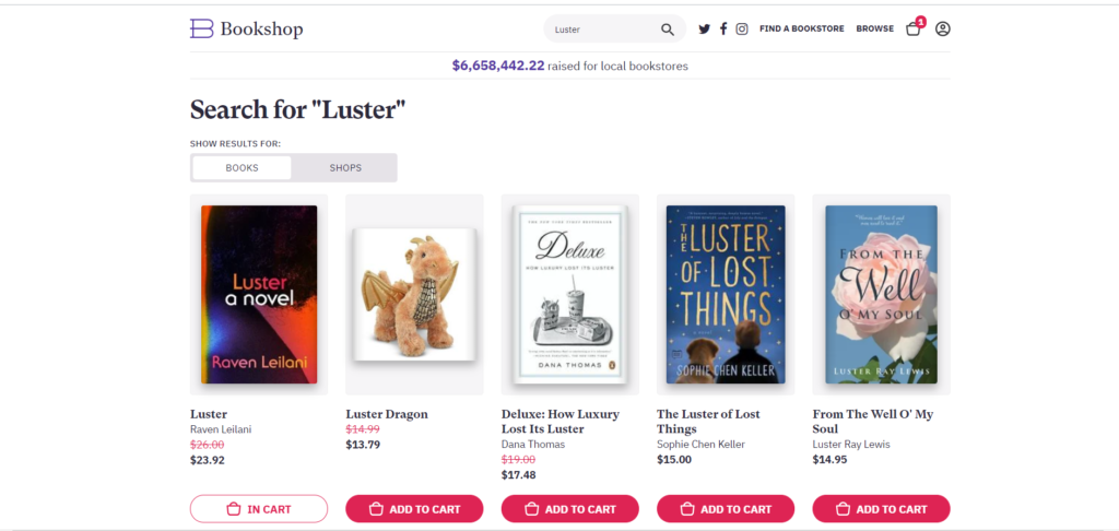
Searching for new books or bookshops
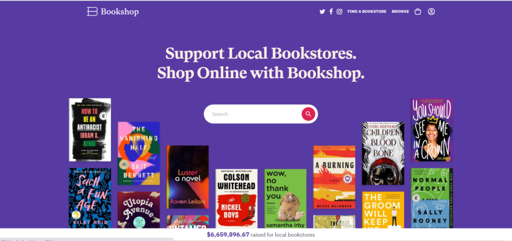
Right from the start, the user can easily search for new books or find a bookshop on the site via the Search bar placed directly at the top and in front of the user. The “microscope” acts as a signifier for the search capability and it notifies the user that the website affords the ability to search. Additionally newly released books are collaged around the Search bar and curated book lists are outlined below the bar as a browsing opportunity for the user (see the below figure).
Browsing through search results
If the user searches for any term, the user will automatically see all search results that include this term and the results are filtered in a specific order, depending on where the term is located (e.g. book title, then author’s name) and whether the user is interested in results related to books or a bookshop.
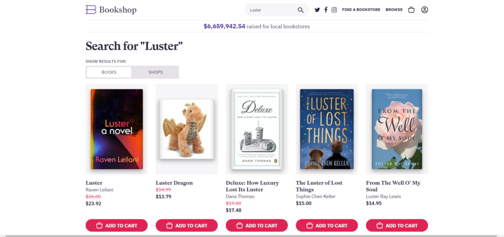
The website uses special mappings, such as the “Books-to-Shops Flip” buttons in the upper left-hand corner to reinforce the conceptual model; they want users to purchase a book rather than browse a bookshop’s offerings, therefore search results for books are shown by default and then results for bookshops can seen if the user selects “Shops.”
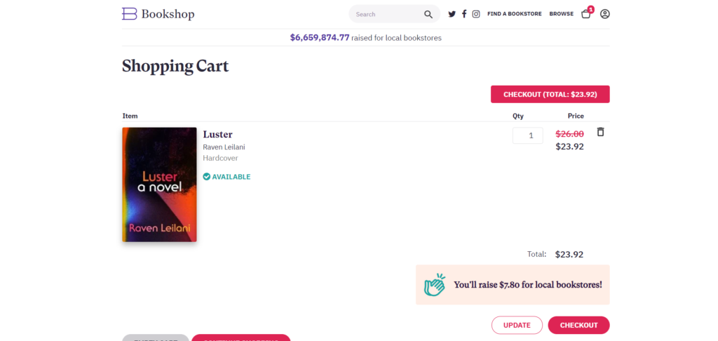
Adding to Cart
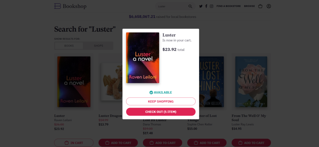
The “Add to Cart” button is a signifier and it informs the user of the affordance to purchase the book. Cleverly the site doesn’t direct the user to check out their selection upon clicking this button, instead a pop-up will appear and its mapping organizes its signifiers in a specific order — “Keep Shopping” button is placed above the “Check Out” button to incentivize the user to continue browsing or searching through the site.
Keep on Shopping
If the user “keeps on shopping,” they are redirected to their previous search results and the site provides feedback about their current “checked out” items by changing the text and color of the “Add to Cart” button in red to “In Cart” button to white.
However the root cause analysis for this redirection is unclear because it relies heavily on prospective memory versus memory for the future; this feature doesn’t promote more opportunities for the user to discover or be introduced to new books or shops. This gap can be resolved by providing book recommendations formulated by an algorithm that’s personalized for the user, alongside the user’s previous search results.
Checking out
In the checkout space, there are multiple buttons (e.g. “Empty Cart,” “Continue Shopping,” etc.) acting as signifiers for the user to afford specific tasks, such as emptying the cart or checking out all their items.
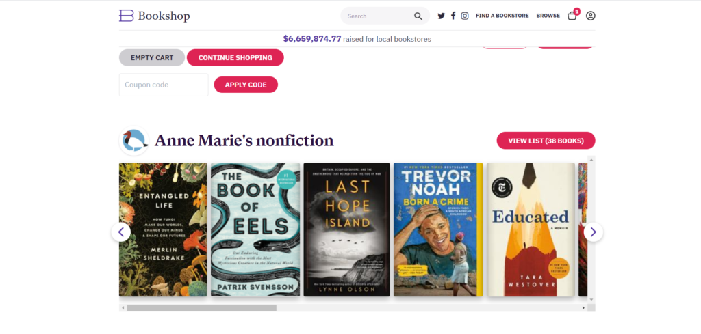
However the “Checkout” button is listed twice and it seems to be a great reinforcing signal, but it can confuse the message for the user because the user can experience learned helplessness since they can’t distinguish the proper way to complete the checkout workflow. As a solution, this button should only be listed twice at the end of the cart and this will move the user to the end of the page as well as remind the user of all their potential purchases in their cart and discover the curated book list at the bottom of the page.