
Car and Driver is an American automotive enthusiast magazine. Its total circulation is 1.23 million. It is owned by Hearst Magazines, who purchased prior owner Hachette Filipacchi Media U.S. in 2011. It was founded as Sports Cars Illustrated. Originally headquartered in New York City, the magazine has been based in Ann Arbor, Michigan, for many years.
Car and Driver also has a mobile application that serves digital magazines for members and non-members both. The users can buy/subscribe to digital magazines and keep up with the latest car and automotive trends.
Homepage
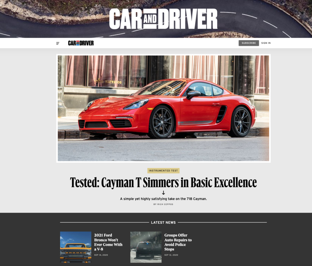
The homepage has a lot of sections that the user can navigate to and make selections from. The user can open the side menu panel to browse a specific page/link based on the user’s choices. The user can also scroll the home page to the bottom and look at the latest news, research for new cars or can read reviews, etc.
Car and driver started as a print magazine in 1955 and has slowly transformed into a digital magazine. Since then a lot has changed but car and driver has still been able capture the user’s interest by maintaining the same look and feel of the magazine.
One of the good design elements of the home page is the scrolling feature that takes the user to the different sections and gives the user the ability to look at other stuff while navigating from section to section.
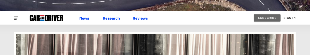
Also, over the years the user behavior has changed and users prefer to navigate directly to a section that they are interested in. I think it would be helpful if the top navigation had a section for quick links that would make the website more intuitive and user friendly.
Side Panel
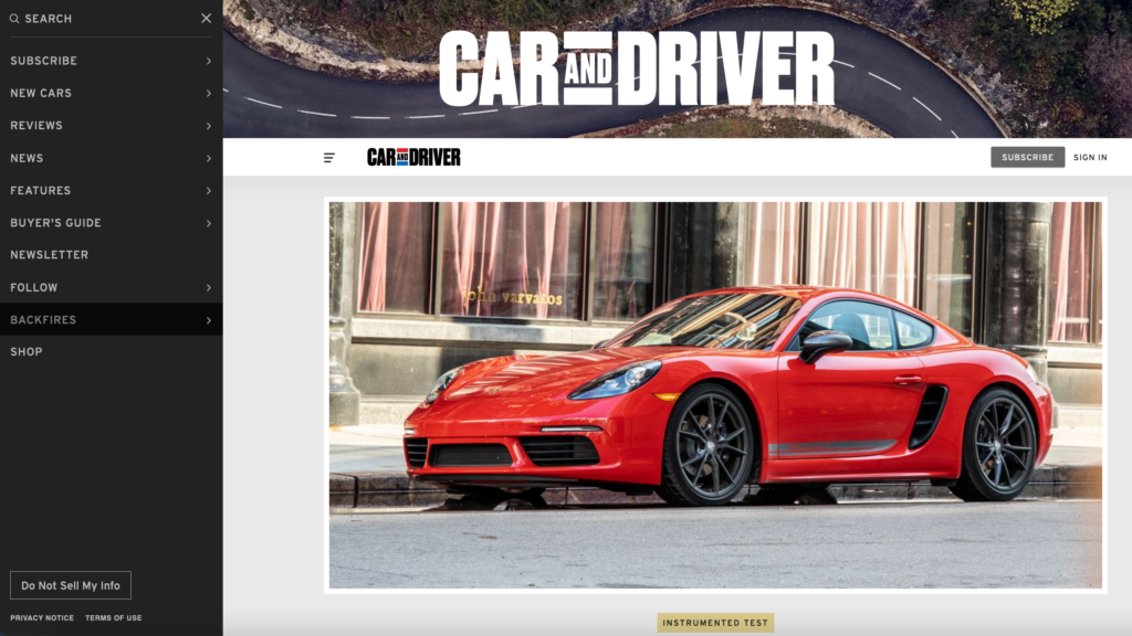
The side panel serves as the primary navigation for the website. The user can toggle the side panel by using the collapsible menu item icon located near the Car and Driver logo.
Users can expand the side panel and can select the option based on their choices. One of the option in the side panel is the new cars option which further expands into the different car manufacturer list. The user can then further scroll down that list to pick and choose a car brand/manufacturer and look at the different models that are in production.
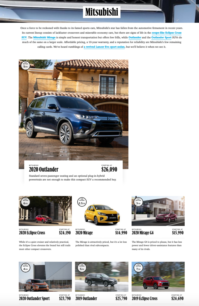
A good thing about this is that how all the models are displayed individually with ratings and prices. Also, each model has it’s own specific page which the user can navigate to get more details. In my opinion, the one thing I notice is that the brand logo is missing on this page and adding that to the top would definitely impact the user interface as a lot of users can directly relate a logo to the brand. The logo will also give a clean look to the page. The other thing is the most recommended/featured model that is displayed first in a block that is quite bigger than the other blocks. I think that is not an optimum utilization of the screen real estate and a different technique could be used to capture/highlight that block. A bright border or a specific label could be added to the regular image blocks to capture user’s interest.
Also, the search feature is embedded in the side panel which is really hard to find. A good website design should always have a search feature in the top navbar of the homepage as that is easy to find for all the users.
Research Section
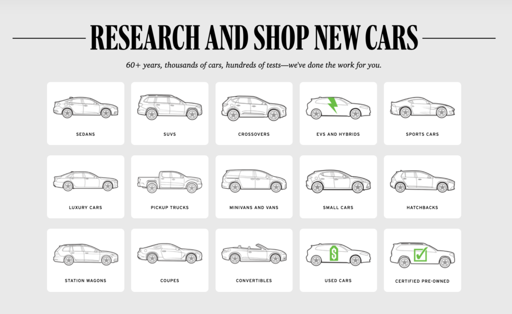
The research section focuses on car research for the users based on car types. For example, the users can look for SUV’s, sedans, hatchbacks, coupes etc. The cool thing about this is the arrangement of all the car types by their relative icons which makes them stand out as a basic filter. Also, certain icons have an extra touch to them that point out a distinctive feature about that type. The EV’s and Hybrids have a bolt logo, the user cars have a dollar sign logo and the certified pre-owned have a check mark logo that guides the user appropriately. In my opinion all these special logos should be placed next to each other so that they can standout better.
Reviews Section
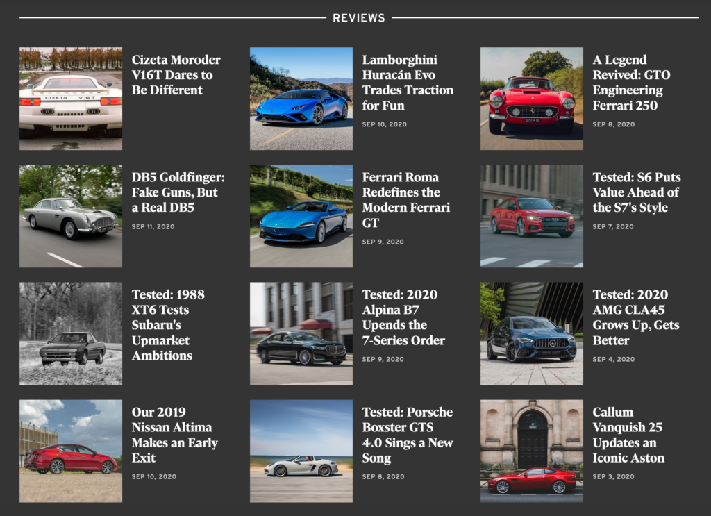
The reviews section present the latest feed of all the cars. The reviews have a timestamp and the model for which the review is for. The user can click on the review that they are interested in and can read that on a separate page. The review section does not have a search feature and I think that having one would really be helpful as that can help the user to find a review for a specific car that the user is interested in.