Duolingo is an application that gives users the opportunity to learn over 30 different languages on their electronic devices. The app provides short courses meant to be taken daily that users can access for free. In this post I be using concepts from Don Norman’s ‘The Design of Everyday Things’ to critique the design of certain features of this app.
Starting a new language
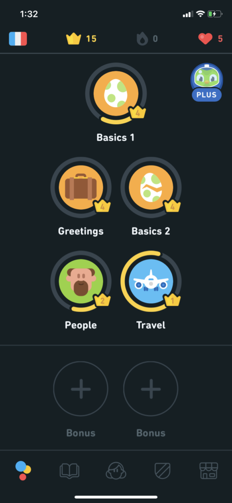
Image 1 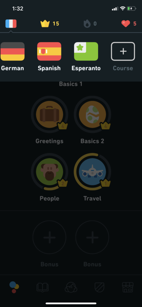
Image 2 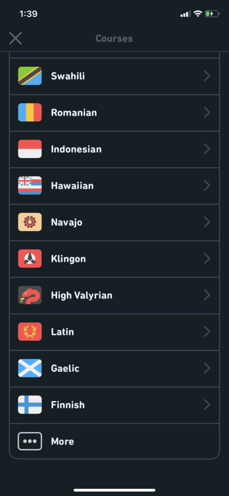
Image 3
Here we are looking at what it’s like to start a new language as a pre-existing user. The flag on the top left corner of image 1 is a signifier that lets us know that the user is currently learning french. We know from knowledge in the head (what we have previously learned about this app) that the app affords learning multiple languages. However, there is no signifier that makes the action of switching to a new language discoverable from the screen on image 1. When we click on the flag, a carousel appears (image 2), listing all the languages the user has already started learning, followed by a “+” icon. The conceptual model of this icon makes it a good signifier allowing the user to discover how to add a new language. From our conceptual model of lists on a phone screen, along with the help of natural mapping, the user knows that the list of languages on image 3 affords scrolling. The “…” icon and clearly labeled “more” button makes further language options discoverable. Even though adding a new language was not easily discoverable on image 1, the immediate visual feedback from clicking the flag leading the user forward saves this design.
language progress
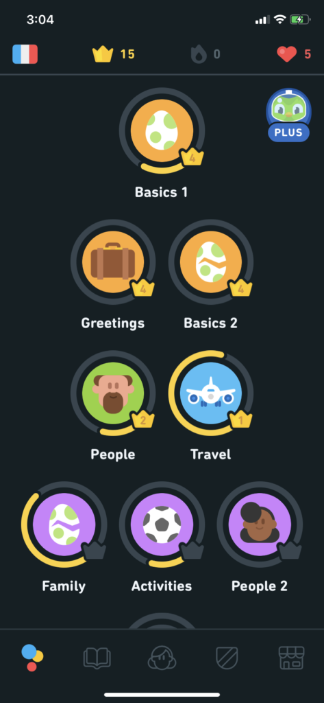
Image 4 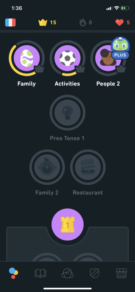
Image 5 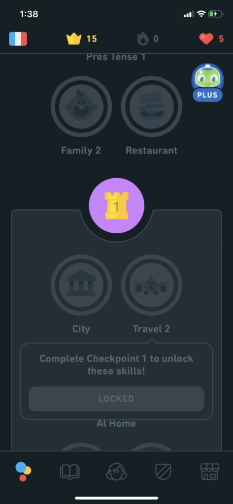
Image 6
The progress through each language course also guides users through the use of many signifiers. As shown in image 4, the list of circles representing each topic is cut off at the bottom of the screen, showing that this screen affords scrolling. Each topic has a grey stroke around it that turns yellow as users complete parts of it. This, accompanied by the numbers written inside the crowns, signifies how much of each topic the user has learned. In image 5 we see some topics greyed out, signifying that they have not been started yet. Right under that, we see a circle with a turret icon and the number 1. From our knowledge in the head (from video games, media) it can be determined as the end of one section of the course. As we scroll further down, in image 6, we see an entire greyed out portion. When the user clicks on the topic “Travel 2” the app displays an immediate visual feedback with a message telling the user what they have to do in order to access that topic. According to Don Norman’s book, this is good design as it guides the user instead of blocking their action without explanation. Another element making this design good in my opinion is the use of physical constraints to help the user learn in an organized manner rather than overwhelming them by the amount of topics available.
One problem I see with the progress feature of Duolingo is that there is no signifier that tells us how much of each topic is left. Don Norman mentions bookmarks used as signifiers and how they often motivate users by letting them know how close they are to finishing a book. In this case, if we look at “Basics 1” in Image 4, we can see that the user has completed part of level 4, but we don’t know how many levels are left. A solution for this could be to write it as “4/6” indicating that the user is at level 4 out of 6 total levels.
DELETING A LANGUAGE

Image 7 
Image 8 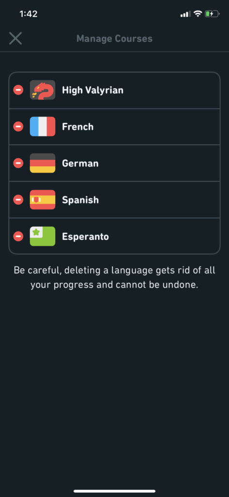
Image 9 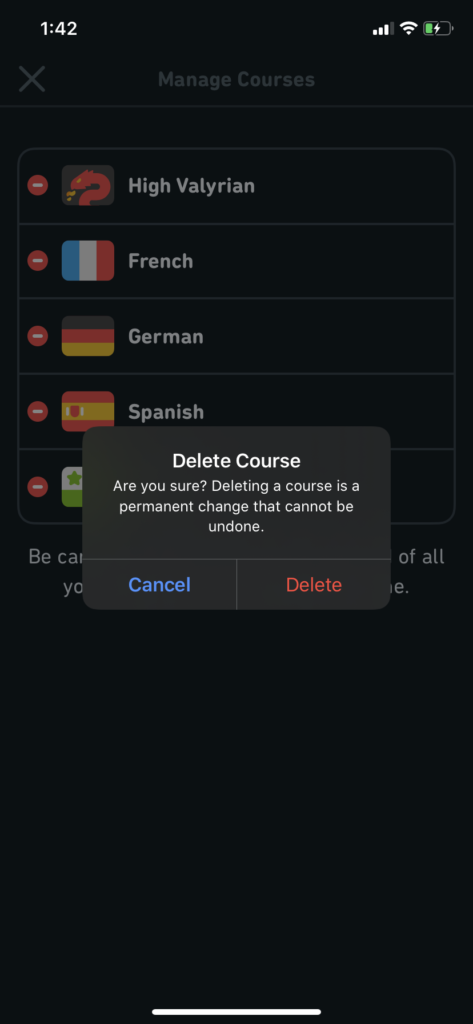
Image 10
I was curious about how to delete a language as I had added a few extra languages for the purpose of this critique. If we look again at the screen on Image 7, we have pulled up all the languages the user has already started, but there are no signifiers that communicate how to remove one of them. I had to Google search to find out that the user has to go into their profile, click on the settings icon and choose “Manage Courses” to be able to delete a language. Once on that screen (image 8) we finally see a familiar signifier, the “-” icon, that lets the user delete a language course. Once the user clicks on the “-” icon, there is an immediate feedback that asks the user to confirm their design incase of any slips. This particular part shown in image 10 is good design, based on Don Norman’s book.
The problem I faced initially, of not being able to discover how to delete a language course on the visceral level of processing lead to some frustration. One way this could be avoided is by adding a “-” icon like those on image 9, to the corners of the flags on image 7, which the user has much quicker access to. If the action of clicking on the “-” icon is followed by the same confirmation prompt, any slips would still be avoided, while being able to skip the extra steps shown in images 8 and 9.