
EXPLORER is an application that can create a virtual visitor guide to experience the 500,000 square foot New York City American Museum of Natural History (AMNH). It enables museum-goers to enjoy captivating interactives, stimulating quizzes, behind-the-scenes stories about exhibitions, and more. It includes indoor GPS technology, videos, and teaching tools to personalize the visitor’s journey, thereby decreasing the distance between audiences and exhibitions.
Introduction:
The conceptual model of Explorer comes from maps, audio guides, exhibition brochures, and educational information. The application has been designed for young audiences and their parents, offering a seamless mobile experience. It provides turn-by-turn directions with location services and Bluetooth enabling visitors to explore the museum and easily find information.
Landingpage:
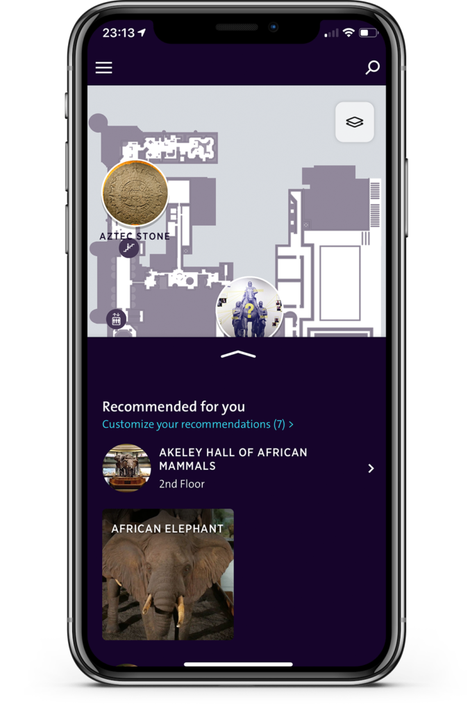
AMNH landing page [Figure 1.] shows a clear interface divided into three sections. From top to bottom they are (1) Menu and Research; (2) Galleries on Floorplan; and (3) Recommendations. Note that Floorplan and Recommendations each occupy approximately half of the page and has discoverability that the lists display major exhibits and interests that fit user’s choices on the map. By doing so, the gallery icons with the iconic exhibits on the minimal map also show the principle of mapping that the Explorer is visibility to use and leads to immediate understanding for audiences, especially teenagers, who can click on the exhibits they are interested in via natural mapping.
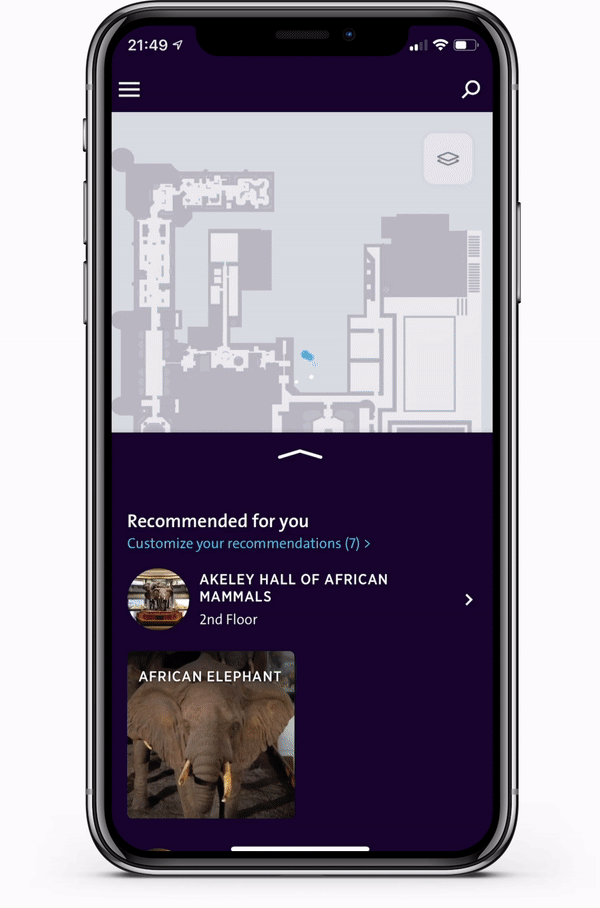
Although the main galleries on the floorplan are emphasized by large icons, there are fewer signifiers and affordances to remind users that the map can be resized in to display more exhibits or more details in the museum [Figure 2A]. Regarding research functions, the app provides two options: a research icon [Top Right Corner] and a floorplan icon [Still on the Top Right]. The floorplan research icon has visibility on the map but lacks affordance such that a user cannot determine whether it should be clicked on or if they should use another research function to learn more about the layout of the museum.
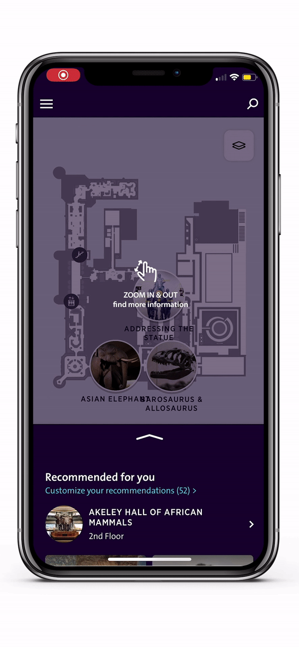
Solution: Adding a short demo animation with a notification at the beginning to remind users how to search floorplans and zoom in the map to see more details. This could lessen the user’s confusion and enhance the constrain and their experience with the app. [ Figure 2B]
Indoor Navigation:
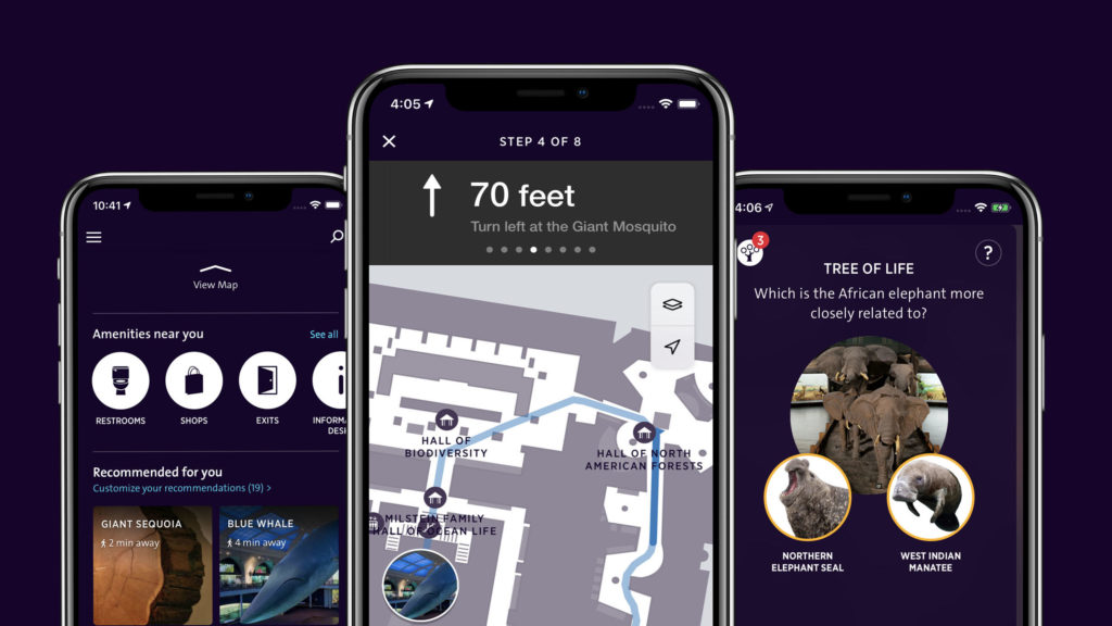
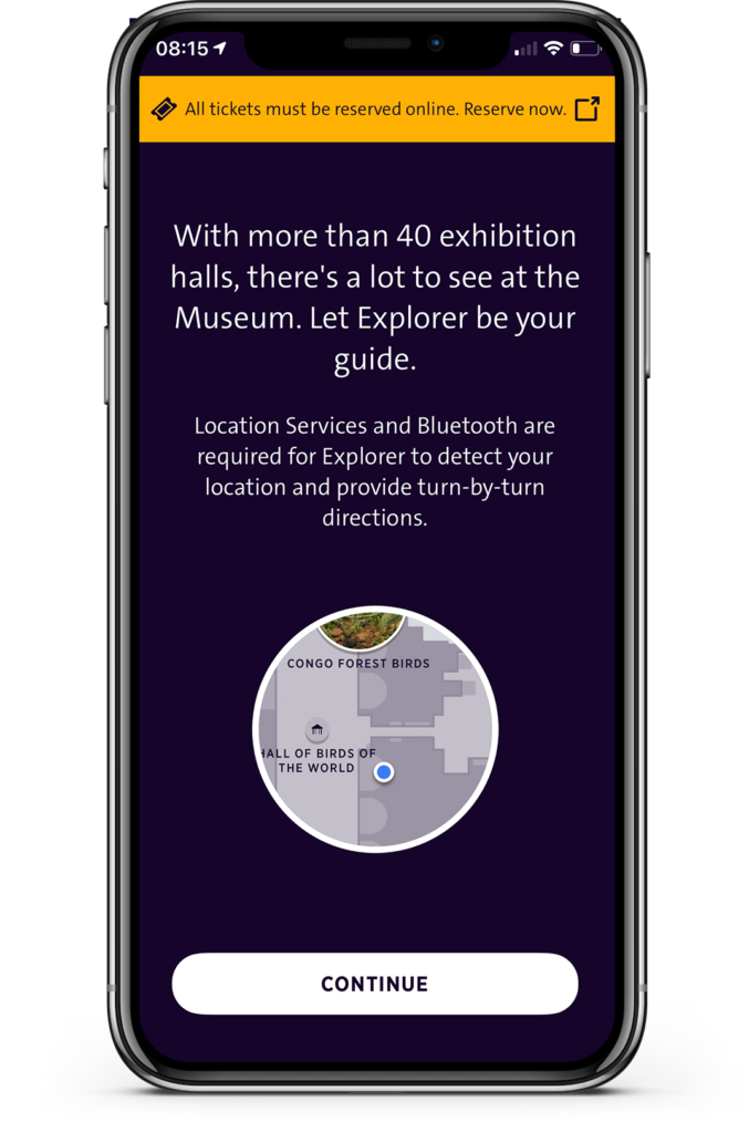
AMNH Explorer has a strong indoor navigation system that informs visitors about exhibitions, guides audiences to particular exhibits, and directs them to their desired destination. It happens as soon as a visitor opens the app for the first time. While opening the Explorer application, the user will be asked to give permissions for Location Service and Bluetooth to aid and localize 700 Bluetooth beacons throughout the museum [Figure 3]. They limited the options which are “Continue Button” and “Reserving Ticket Button” that users cannot skip this progress. This means that there are discoverability and signifier, but physical constraints limit users’ possible actions only to turn on the phone for navigation and detecting one’s position. Then audiences are allowed to browse the list and choose the interest from a list around them (including snacks and shops).
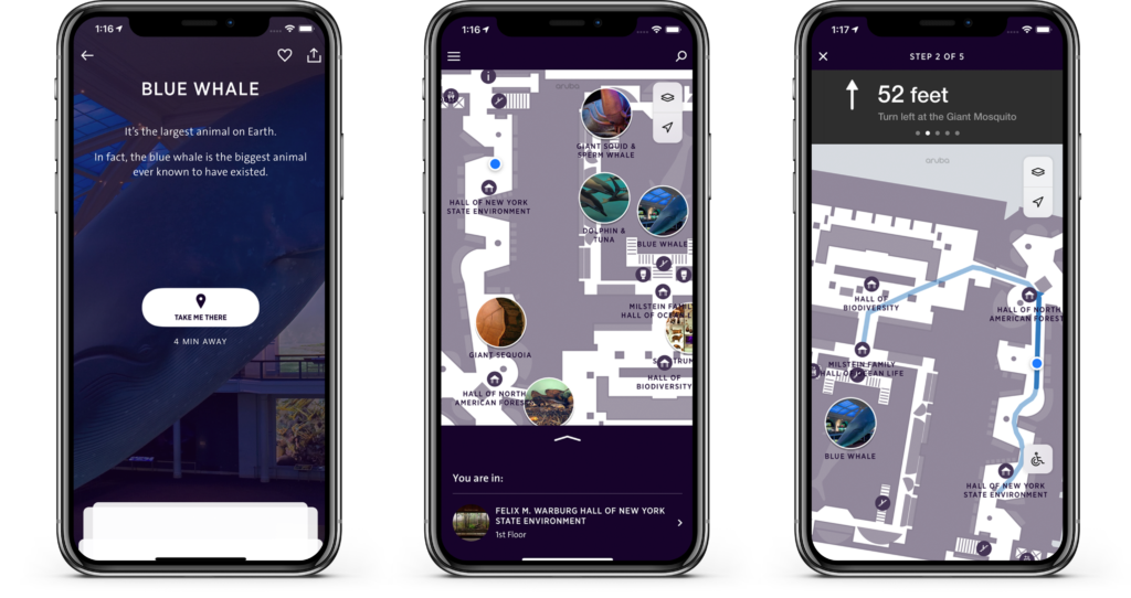
After that, as shown in Figure 4A, Figure 4B & Figure 4C, one notable feature of the app is that navigation helps visitors to find the next destination with a map function. The app shows not only how far audiences are away from the ones they want to see but also what exhibits visitors walk past and where they must turn on their way. This interaction is the natural mapping of controlling the relationship between audiences and exhibits so they follow the sign to find the shortest route to exhibits, cafes, shops, or the restroom. The blue arrow navigator and the information on the top also provide discoverability and logical constrain to remind the visitors to follow the correct way.
Personalize The Journey:
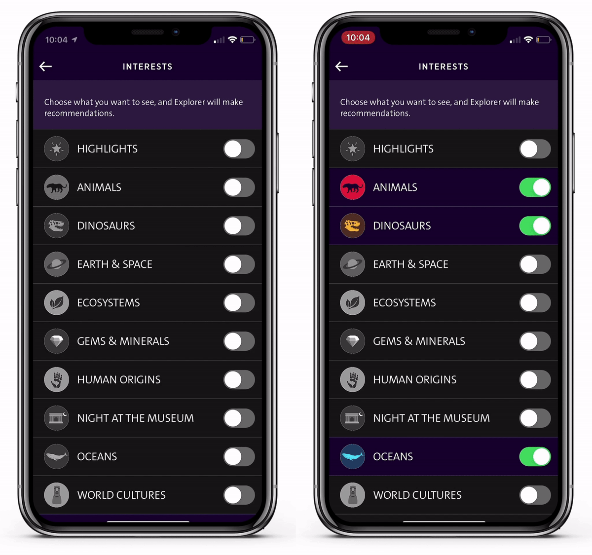
Personalization is another feature in the Explorer application. The Interest Section design encourages visitors of all ages to create their own route through the museum experience. After scrolling through major exhibits and clicking on one, users can enter the Interest Section in the Menu to choose topics they wish to see. The Selecting Interest page displays topics with colorful icons that make the topics easily identifiable, even for young children[Figure 5]. Once users have made the selections, the Explorer will list recommendations based on their interests and how close they are to their favorite exhibits to help them plan their journey at the museum.

However, the selection page in the application has low visibility and signifier. Although switching icons are present (“Chosen” and “Not Chosen”) the lack of visibility and affordance may cause confusion for the users.
Solution: To enhance the distinction between “Chosen” and “Not Chosen”, the color for each unchosen category should be changed to black and white. When the user swipes the “on” button, the section could change to be color. [Figure 6]
Overall, compared with other virtual tour guides, the Explorer App has clear, comprehensive, modern UX and UI designs, allowing visitors to experience greater interaction with the museum. Some of the design is clear and straightforward such as floorplan, navigation, and galleries icon, while other sections, such as Interest and Research, would benefit from greater signifier and affordance. At present, their design may initially cause confusion for visitors unfamiliar with the interface, but with minor adjustments would lead to an application that serves both the audience and the museum.