
Google Meet is a digital video conferencing application that allows users to join and/or host meetings from remote locations. While steadily gaining popularity over the years, digital conferencing platforms such as this became a standard and daily practice for businesses and education alike when the Covid-19 pandemic began to sweep across the United States. Almost overnight, face-to-face meetings, conferences, and classes had to shift to virtual formats to accommodate social distancing protocols. Thus, employees, business owners, and students around the world had to master the user interfaces of these digital conferencing applications very quickly.
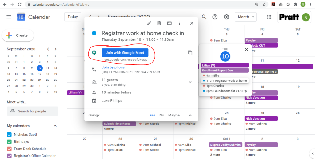
Perhaps the most useful feature of Google Meet is that it’s seamlessly integrated with the entire Google Suite. Simply having a Gmail account gives you access to Google Meet, and allows users to easily add conferencing to any event on their Google Calendar. When an event on your calendar includes a Google Meeting, users can simply click the “Join with Google Meet” button (pictured below) that serves as a clear and effective signifier of the appropriate action to take.
However, after clicking the “Join with Google Meet” button, users encounter the first design problem. The subsequent page is a landing page, or virtual waiting room of sorts, where the user can test their camera and microphone before actually joining the meeting. While this lock-out function is extremely useful in that it allows the user to get situated before they are visible to the other meeting participants, it is not immediately clear that the user is not in the actual meeting. It is possible to sit in this waiting room page for several minutes thinking that no one else has yet joined the meeting. In order to join the meeting itself, the user must click the “Join now” button, located to the right of the camera screen.
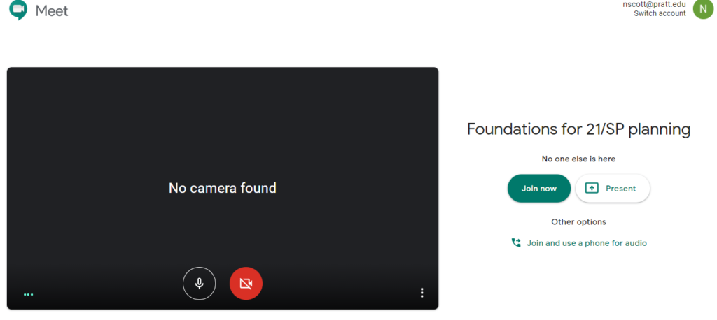
This interlock function, where the user must first go through the virtual waiting room before entering the meeting, creates a Gulf of Evaluation that is difficult to transverse. When the user initially clicks “Join with Google Meet” from their Google Calendar, they have reason to expect that the next step would take them to the meeting. When the user instead lands in the waiting room, it is easy to “evaluate” this as having landed in the actual meeting. A better design would place large text across the top of this waiting room screen saying “Test your microphone and camera, and click “Join now” when ready”
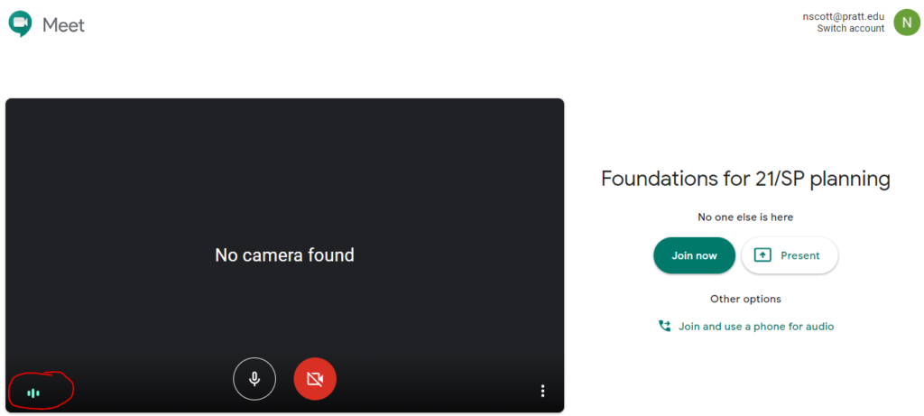
Once in the meeting, the interface is mostly intuitive. One excellent aspect of the meeting room is that the bars next to a meeting participant’s name move in the shape of sound waves when they are speaking. This feedback, which indicates which participant is speaking, is a particularly useful feature when the meeting includes many participants that do not know each other. The sound indicator aptly fits our conceptual model of how sound waves move through the air, and is a great example of skeuomorphic design in that it is a digitized model of how an analog frequency would be recorded.
While the meeting room interface doesn’t require much user interaction to when speaking, users encounter a second difficulty when trying to share their screen to demonstrate something on their computer. When a user wants to execute this function, they begin by locating a button in the bottom right corner of the screen that says “Present now”. The button is visible as soon as the cursor is moved, and is relatively easy to locate on the first use. However, after selecting the desired screen-sharing option, the user is given a pop-up window that is difficult to understand.
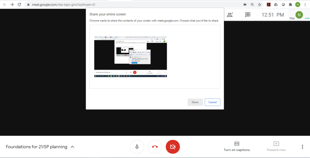
The “Share” button on this pop-up window seems like it would be the most obvious choice to click, but it is dimmed to indicate that it is not clickable. Here, the interface is asking the user to select the screen in the window by clicking it, and then “sharing” the selected screen by clicking the “Share” button. This is problematic because there is no signifier that indicates to the user what needs to be done here. The first attempt at screen-sharing is likely to take several minutes while the user tries to bridge the Gulf of Execution. A better design would have the screen selected by default, so that the “Share” button is clickable upon the window popping up. This still creates an interlocking function, in which the user has to go through a confirmation step before sharing their screen, but it closes the Gulf of Execution in figuring out how to use the feature.
Overall, Google Meet is very user friendly, and has greatly reduced our need for face-to-face interaction in the current pandemic. However, a few design improvements to the interface could increase the usability of the application and lessen the learning curve for first-time users.