Google Photos is an online photo storage and sharing website, used by many as an easy way to house one’s photos. It gives users free storage for up to 16 megapixels of photos and videos. It was released in 2015 and currently has over 1 billion users.
- Affordance – Exiting out of an individual photo does not hold your place
The most frustrating aspect of this site, in my opinion, is what happens after you ‘exit’ from an individual photo. Let’s say you’ve scrolled down through a lot of your photos and you see one that catches your eye, so you click on it. In this case I’ve clicked on the photo below, from 2009.
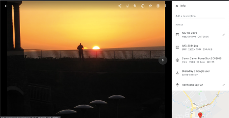
Now I click the arrow in the top left corner to exit out of this photo, expecting to see the rest of the photos from that time period where I left off. Instead, I am taken to the very top of the page to see the most recent photos in the library. This means that several minutes of scrolling I did through 11 years of photos has all been wasted once I click on any one photo.
Google Photos does not have the affordances to allow the user to execute the desired actions in this situation. It also violated my conceptual model, which made me confused. I thought that as you scroll down through your images and select one, your place is held, and it just makes a temporary stop while the rest of the photos from that time are still there in the background. Instead, it seems that once you click any photo, the rest are not kept in the background, and it resets the progress you’ve made. This could be solved by simply returning users to their scroll location when they exit an individual photo.
This also punishes users if they make a small mistake and click on a photo while scrolling. Norman strongly emphasized the need for an interactive system to be forgiving with mistakes and make it hard for users to make mistakes. Unfortunately, Google Photos does not seem to follow either of those principles and users such as myself are quickly punished for looking at an old photo.
2. Affordances – Undo & Error Correction
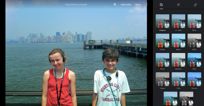
This page demonstrates some of the affordances that allow users to undo an action. After making edits, users can click the “Undo edits” text in the top right corner of the photo. This will revert their photo back to the original, untouched photo. The “Undo edits” text will undo all of the user’s edits, and users can also manually undo individual edits fairly easily.
In “The Design of Everyday Things”, Norman emphasizes the importance of allowing users to undo actions. He even goes as far as saying that the ‘Undo’ command is “Perhaps the most powerful tool to minimize the impact of errors” (Norman 203). I believe that Google Photos does a very good job of allowing users to undo actions, particularly when it comes to editing their photos.
3. Discoverability – Toolbar
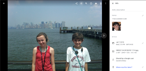
The image above highlights the strong discoverability that Google Photos has. This image shows what users see when they click on a specific photo in their library. On this page, almost all actions that the user can take are discoverable without having to click on something else or scroll down anymore. The only actions that are not directly on this page are the options you see after clicking the top right icon on the image, which is “more options”. This symbol is widely used on different digital platforms, so most users should be somewhat familiar with it. However, if that icon or any others are unclear, hovering your mouse over them makes a small pop-up text appear that describes the icon (“Share”, “Edit”, “Zoom”, etc.) The combination of the icon + text makes these signifiers effective in demonstrating what they’re used for.
This example is relevant to Norman’s idea of knowledge in the head vs. in the world. Google Photos does not require the user to have any prior knowledge in their head about what a photo software should look like, or what options you have available, since they are all clearly listed with names for you to see.