
Headspace is an app for mindfulness and meditation. Its recent growth in content and users is accompanied by modifications to the app’s design and features. This critique intends to highlight positive and negative attributes of Headspace’s digital interface, using concepts laid out in The Design of Everyday Things by Don Norman.
Search Function
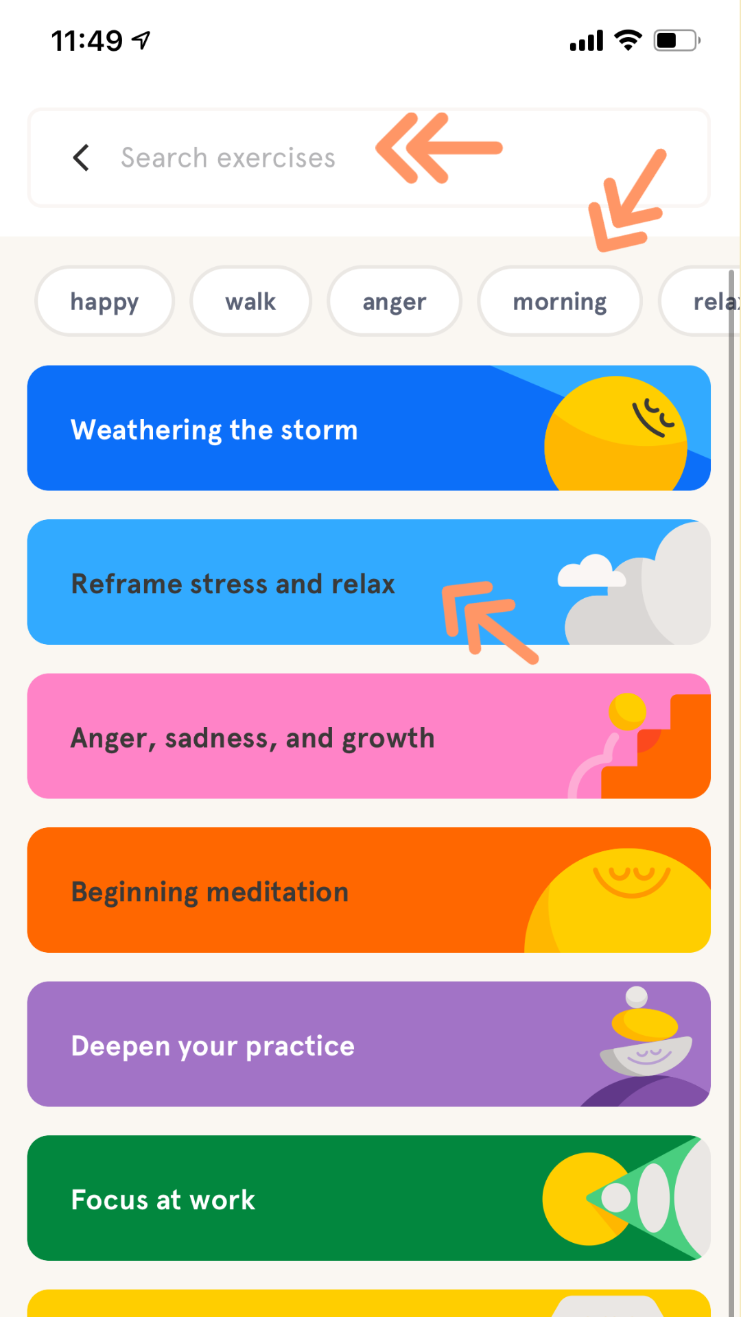
Every primary content page affords searching. Discoverability of the search function is easy given the persistent presence of the magnifying glass icon signifier.
Selecting the icon provides visual feedback as a new page displaying a search bar, suggestions and cards that categorize content by goals. However, given the subjective nature of abstract goals i.e. “focus at work”, these artificial constraints can lead users to make errors by searching for content in the wrong places, especially at the execution stages of action.
Solution
Add filter and sort functionalities. Adding an icon with imagery rooted in declarative knowledge to signify those functions. Clicking the icon would reveal checkboxes with feedback, improving both discoverability of content and evaluation of results.
Setting Configuration
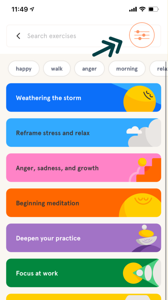
Some Headspace content affords configuring three settings: narrator “gender,” download and length. Narration and download are configured on the content detail page, which also indicates length, yet has no feedforward regarding where or how to configure length, creating gulfs of execution and evaluation. It’s logically constrained, the “begin” button is the only option for users to specify, and perform execution actions. The following page affords meditation and configuring length, the latter signified by a cog icon users will recognize from natural mapping.
Solution
Make the cog icon configure all settings, and move it to the content detail page. Doing so would bridge gulfs of execution and evaluation, streamline mapping, reduce slips (pressing play, not cog) and enhance the system image. Users typically do not expect to configure settings in more than one spot, and certainly not after having reached their goal: beginning.
To note: Including binary male/female options for narrator gender exemplifies the notion that knowledge of cultural constructs, such as notions surrounding gender roles, exist in the head. The app does not need to explain it in order for users to make a precise decision about narration. Further critique of this attribute is warranted, yet beyond the present scope.
Sticky Menus
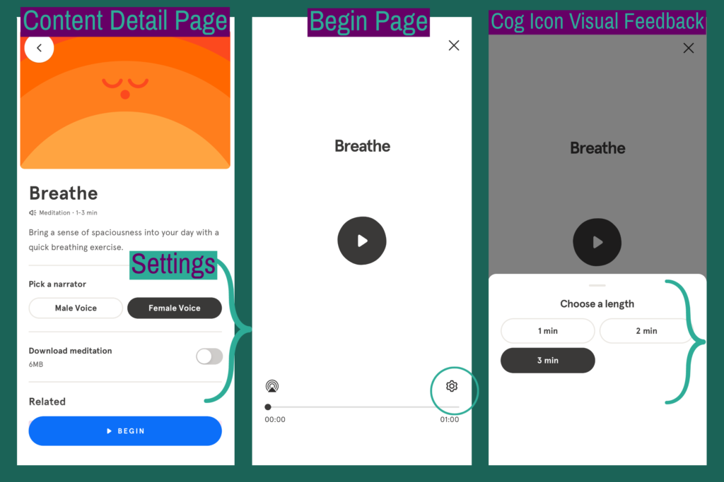
The top sticky menu features user and search icons. The bottom has 5 text/image icons, each representing a different type of content. The latter significantly contributes to a good conceptual model and system image through use of well-placed signifiers consisting of straightforward text and abstract icons. A user can open the app without a good conceptual model or specific goal and quickly see what the app affords and/or search for it. This is an example of activity-centered design. While the content associated with each icon is semantically constrained to that topic, i.e. “Sleep,” users can constantly access it. These design features reduce likelihood of memory lapses, as users don’t have to remember where or how to find types of content.