Overview
Komoot is route planner app, that is gaining more and more popularity recently. It´s target audience are hikers, runners, cyclists, or simply everyone who wants to explore an area on a bike or by foot. Komoot combines route optimizing technology, GPS, great mapping layer, that is constantly updated with a feedback from active users. Here is a link to a desktop version https://www.komoot.com, however in this article I will be referring to a mobile app.
Key Functionalities
Komoot works as an open service. To benefit from key functionalities, the user doesn’t have to register during the initial launch, and can start exploring the app. From the first step it’s clear what it´s key affordances are: discover routes (get inspired), plan routes and record routes. Signifiers for those three actions are placed on a bottom bar menu and are always available to a user. Dark-grey background of the main menu vs light canvas of the rest of screen and clear names “Discover”, “Plan”, “Record” makes actions very well discoverable (Figure 1). Though, each of three actions represent the same goal : Establish a Route, persons cognition works differently for each of them, depending on micro-actions a user has to perform. That eventually has major implications for the design.
The Psychology of Everyday Actions. Applied
Let’s deep dive into “Discover a Route ” and “Plan a Route”, and try to interpret them according to D. Norman´s concept of 7 stages of action cycle. Table 1 demonstrates similarities and differences in user perception of two actions moving along the gulfs of execution and evaluation.
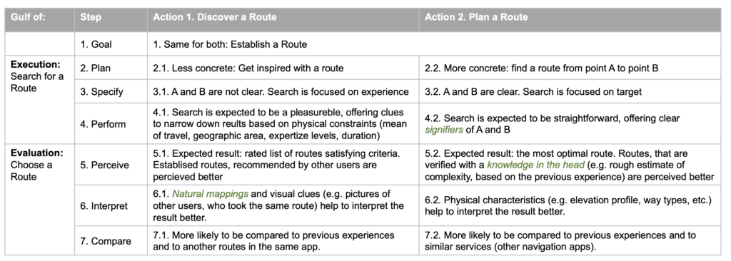
In combination with Norman´s concept of 3 levels of processing, a few considerations for the design follow up:
• Lead Time that user expects to spend performing action 1 and 2 is different (action Discover a Route is acceptable to take longer).
• For both actions physical constraints have differences (e.g. route duration might be a primary constraint when Discovering a Route, but only secondary when Planning a Route), therefore introducing them in appropriate sequence is critical for better processing on behavioural level.
• Action Discover a Route significantly relays on visceral level of processing (at least more, then action Plan a Route).
• For action Plan a Route comparison on reflective level of processing more likely to happen outside of the app (as this part of the service is not unique, e.g. Google Maps affords the same function).
Implications for the Design
What are key implication for the design, deriving from this analysis? And how are design principles implemented to address that? Here are some examples of good (marked with a green star) and bad (marked with a red star) design.
Discover a Route : Screen Flow Annotation
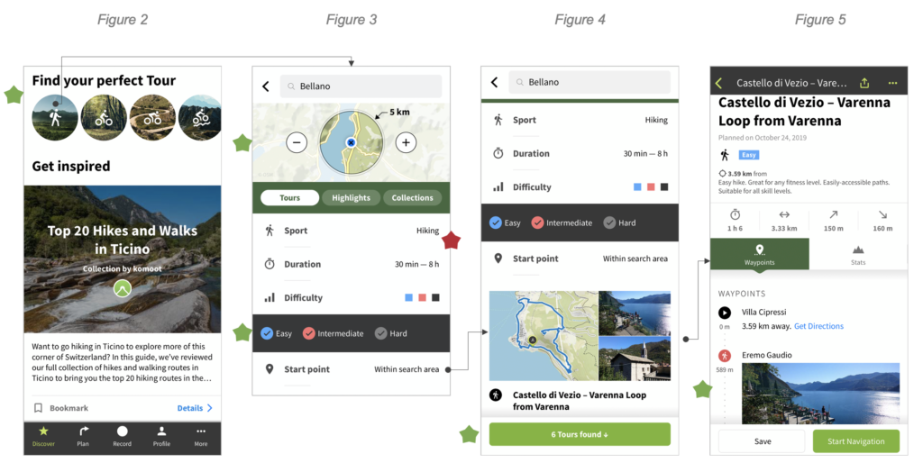
From the first step focus on discovery experience is obvious: call for action indicates: Find your perfect tour / Get inspired. The most important physical constraint (mean of travel) is successfully supported with a use of natural mapping: icons of hikers, cyclists (Figure 2).
After selecting mean of travel, the user is offered to specify search criteria (Figure 3). Selectors are sequenced appropriately, starting from the most relevant: area of search. However, search menu is lacking signifies: it´s not so obvious, that Sports, Duration and Difficulty are clickable. On this step, again, natural mappings are used quite effectively: colorcoding of difficulty levels is a reference to levels of complexity of ski slopes (and many other outdoor sports), so a user, who has been engaged in any of those sports before can build a mental connection.
Feedback (Figure 4) meets expectations of a user to see rated list of best routes. It’s also supported with visuals clues (images of the view points), that enhances user´s perception on the visceral level (Figure 5).
Plan a Route : Screen Flow Annotation
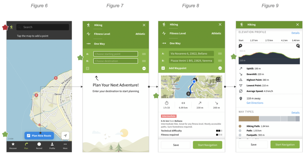
The first step has a clear signifier: Plan New Route (Figure 6). However top search bar appears to be more confusing: it´s not clear what exactly user can search for: is it a location? Is it a route? In any case, this action duplicates already existing (Plan New Route).
Compared to Discover a Route, this action implies pre-defined A and B, and search menu successfully accommodates this (Figure 7). On contrast, Duration is eliminated from the search, since its a secondary parameter, when looking for a pre-defined route.
Feedback (Figure 8) meets expectations of the user to find a single best route. Better interpretation is guaranteed with complete set of physical characteristics of the route (Figure 9).