Letterboxd is a social networking app that is devoted to a user’s love of movies. The app allows users to rate movies based on a five-star system and write reviews on movies they have watched. Letterboxd also allows users to create public or private lists on movies and the ability to share movies to Instagram Stories. Users can also connect with friends to see what they are currently viewing or what movie lists they have created.
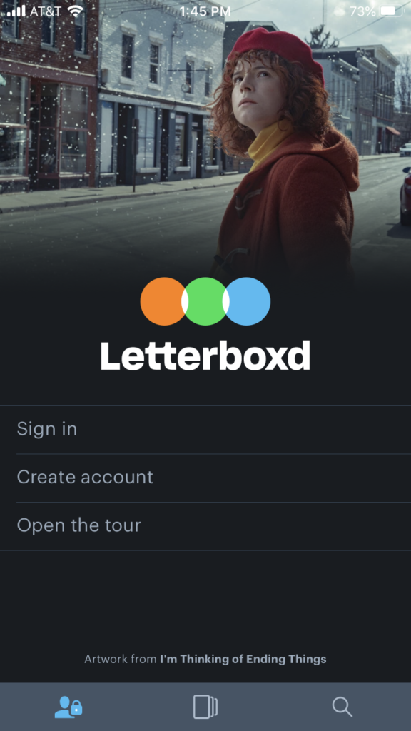
Initial Screen
From the initial screen, a user can see three options: “Sign in,” “Create account,” and “Open the tour.” (Fig 1)
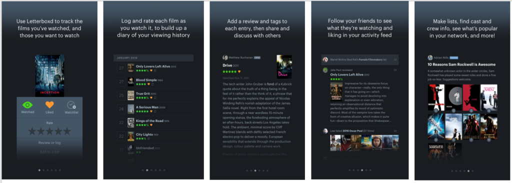
If a user is new to Letterboxd and wants to understand the app, the “Open the tour” feature has detailed slides with descriptions and images of what users can do on the app (Fig 2). Letterboxd does a great job of creating a conceptual model that helps users completely grasp what can be done on the application.
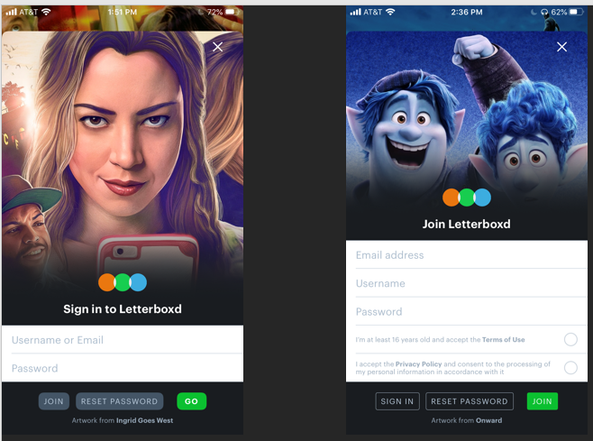
Sign In / Create account
The sign in and create account features have both been designed with the concept of knowledge in the world which is the understanding that the user is familiar with the process for both of these features.
The “Go” button and the “Join” button on both the Sign in and Create Account screens act as signifiers that affords logging in and creating an account respectively (Fig 3).
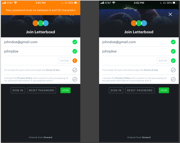
When creating a new account, the app provides feedback by showing signifiers such as a green checkmark when the email, username, and password are accepted. However, if a user creates a password that is below the limit of six characters, the app also does a remarkable job of providing visual feedback of what the password character length must be at the top in orange (Fig 4).
Navigating the app
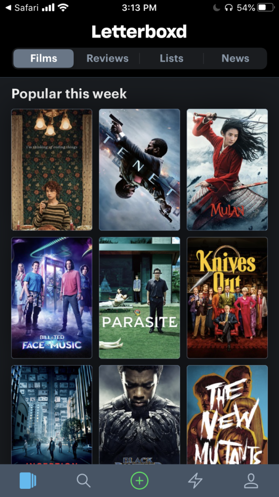
After logging into the app, the user is automatically shown the “Films” page that showcases the popular movies of that week. The user can see that there are several icons at the bottom of the screen including the search and profile buttons (Fig 5). These icons are both discoverable and understandable because they come to symbolize universally accepted icons for the search and profile icons of an app. These icons also utilize natural mapping as they provide patterning of controls and feedback to a user as they navigate to specific pages.
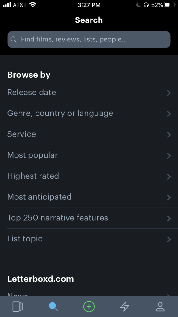
When the user clicks on the search icon, they are taken to the search page where a list of categories is available (Fig 6). There is spatial similarity between the categories as there are proper spacing, underlining, and division between the items in the list.
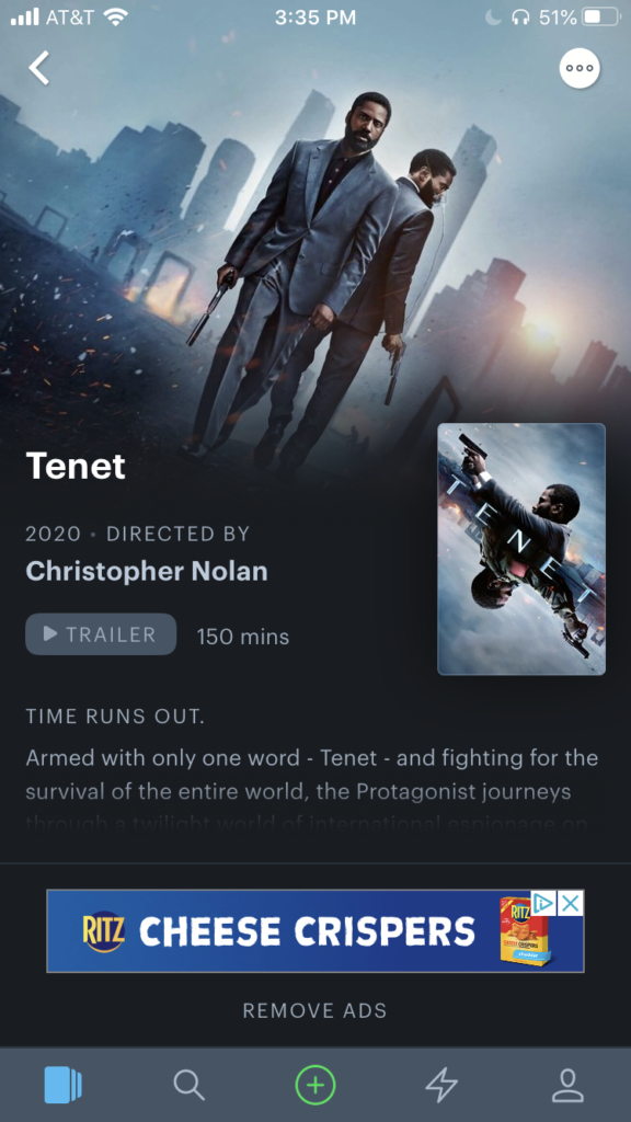
After typing in the movie that they want, a user navigates to that movie’s page. The page affords for visual feedback as the user is able to see an image from the movie as well as the option to click to view a trailer for the movie (Fig 7). However, there can be a gulf of execution as the user might find themselves looking all over the page for the signifiers to “like” or even add the movie to a list. This gulf of execution can be alleviated by placing the signifiers either at the top or middle of the movie page which would create an ideal system image. Letterboxd provides an icon at the top right corner in the form of a circle with three dots in it that brings forth several options that show signifiers including liking and rating the movie.
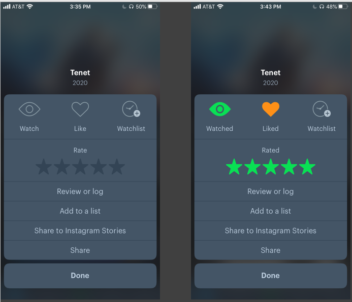
There is instant visual feedback when the movie is liked as the heart icon turns orange and the star-rating system displays green stars. The eye icon also turns green automatically to show that the movie has been watched (Fig 8).
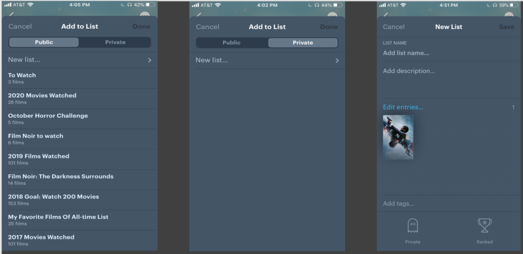
From the same options that are presented, a user can also add the movie to a list by clicking “Add to a list” which they can create as either a public or private list. There is visual feedback when a user clicks on the signifiers “Public” or “Private” as a gray bar highlighting the words moves from one or the other when clicked (Fig 9). A user can then click “New list” which will open a new page where text can be inputted into various fields. A signifier of a ghost at the bottom of the screen also provides the option to change the list to private if a user changes their mind about creating a public list (Fig 9).
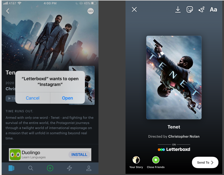
A user can also share a movie to their Instagram Stories by clicking “Share to Instagram Stories.” The function becomes immediately discoverable as a pop-up appears that wishes to connect to a user’s Instagram account (Fig 10). This feedback makes it easy for a user to understand that the application will navigate to Instagram for them. From the Instagram app, visual feedback is presented to the user in the form of an image from the movie which it affords adding to the user’s story or close friends in the form of icons that are signifiers.
Conclusion
Overall, Letterboxd is a great app that is easy to use and allows for fun discoverability. A user can quickly understand what to do on the app from the concept model in the form of an instruction gallery that is presented on the initial screen. A user can become a movie critic in their own right by rating and writing reviews of movies that they have seen. The easy and straightforward navigation of the social aspect of the app such as choosing to create a public list and sharing to Instagram also provides a fun way to display your movie interests. However, the placement of signifiers can be improved on a movie’s page which can eliminate the possible stress of trying to find out how to like or rate a movie. These signifiers should be readily available with easy to understand icons.