Libby is a free app for borrowing and reading ebooks and audiobooks from public libraries. With the app, users can input their library card information to borrow and read library books directly on their smartphones, tablets, or kindles. It is a product of the digital ebook and audiobook distributor, OverDrive. Libby is lauded for being aesthetically appealing, easy-to-use, and providing a seamless digital reading experience. In this article, I will specifically critique the usability of the Libby iPhone app using theories and principles from Don Norman’s book, The Design of Everyday Things.
The Landing Page
Upon opening the Libby app, the user is brought to the “Library” discovery page. This page has a search bar at the top left, a settings button at the top right, a scrollable display of different methods of discovering books, and a bottom toolbar with three buttons: “Library”, a thumbnail image in a circle, and “Shelf”.
The “Library” button is the app’s landing page. It acts as the library homepage and explore page. It affords the user the ability to explore their library’s homepage with the search bar while also providing booklists, suggestions, and the like (page 11). When you scroll down, there are guiding questions, such as, “what’s new?”, “what’s popular?, and “what’s available?”
The “Shelf” button affords users to see books that they: have currently checked-out; recently returned; have on loan; or have on hold. There is also a “tags” sub-button that brings the user to a page where they have access to books they have tagged in three different categories.
The app’s landing page looks slightly different when you have a book checked-out and when you don’t.
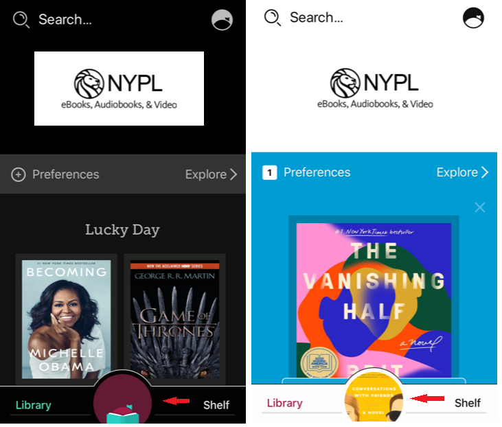
In Figure 1, you can see that the only differing element in the bottom toolbar is the is the center button, indicated by the red arrow. When no book is checked-out, there is the Libby icon. When a book is checked-out, there is a thumbnail of the book.
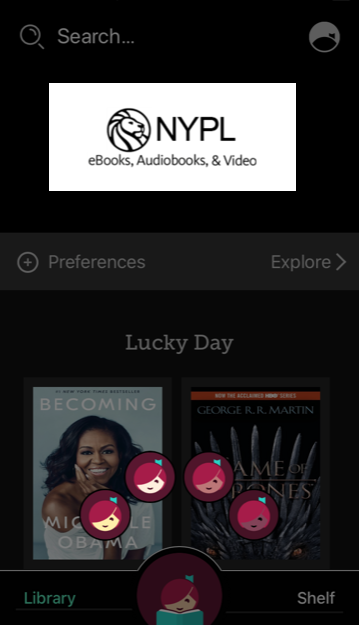
When you open the app for the first time, you are greeted by the first instance (Figure 1, left), in which you have yet to check-out a book. It is unclear what this center button signifies (page 13). When I first encountered the button, I thought it might signify a “profile” or “settings” page. With no real signifier, I was left wondering, what will happen when I click the icon? Turns out, it brings you to a carousel of the Libby icon (Figure 2), with the option to personalize the icon’s skin-color. This button affords the user some personalization, which suggests that the creators or their clients value representation, but creates confusion for the user with unclear signification. This design feature offers low discoverability – it is difficult to determine what actions are possible and the state of the device (page 72). When a book is checked out, the same button space occupies a different signifier for a different affordance – it signifies the book you’re currently reading (Figure 2, right). This represents good discoverability, as the state of the device is easily recognizable.
Solution:
It makes sense that the large, center button of the bottom toolbar signifies the book the user is currently reading – this offers good discoverability. When the user does not have a book-checked out, this icon should signify this. It would be more clear and consistent if the center button were, for example, of an icon of a book that when clicked, would say something to the effect of “Not Currently Reading Anything” or “No Current Book Checked-Out”.
The opportunity to personalize the Libby icon is a fantastic and inclusive feature. It actually exists in another instance in the app, which might be a more successful iteration of the effect. Users can click the settings icon on the top right, then click the Libby icon that appears again at the top left, this prompts the carousel to appear.
Searching for New Books
Searching for new ebooks through Libby is rather easy and straightforward. There is a classic search navigation bar at the top of the “Library” page consisting of a magnifying glass icon followed by “Search…”, signifying the bar affords the user the ability to search for books in the library catalog.
Checking-out Books
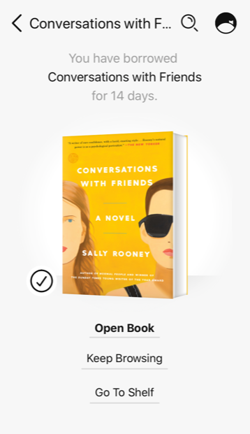
In the app, users digitally check-in and check-out books in a similar manner to in-person. A successful check-out of a book is confirmed by the notification that you have borrowed the book (Figure 3). There are due dates for each item and the ability to hold or renew them. This follows a user’s expectations of taking out books from the library.
Of note, is that the Libby app is meant for all ages; the app store preview gives an age rating of 4+. There are no lockouts or opportunities for parental control in the app. Lockouts are a forcing function that keeps a user in a space or prevents them from performing an undesirable or dangerous action (page 144).
Solution:
With no parental controls in the app, young users may have access to what is deemed inappropriate for their age group, as determined by their parents or guardians. Many parents and care-takers want some form of parental control with their children’s devices or digital interactions. The ability to designate that a given account belongs to a child of “X-age” or age-group, may bring more satisfaction to parental users and offer a better experience for young users who are looking for content that is appropriate or related to their needs and interests.
Reading
After checking-out a book, the user is prompted to “open book” (Figure 3). Then the user is asked where they would like to read the book – Kindle (apps & devices) or Libby (this app). This might be an unexpected prompt for some users. After choosing where to open the app, the user can begin reading. The mapping for reading the book is logical and spatially corresponds to the layout and the controls – you click on the right side of the screen to go to the following page, or the left to go back a page (page 20; 72). The pages simply slide forward or backward. The simplicity of this action offers good design in some respects, but lacks the foresight of designing for error or the slip of clicking the screen and flipping the page unintentionally or meaning to click the center of the screen, but veering a bit too far left or right so that the page flips (page 170).
Solution:
For a more seamless reading experience, flipping the page in the app should mimic flipping the page in real life. The page-turning animation in Apple’s iBooks is a good example of this design element. In the iBooks app, when you slowly pull your finger from one side of the screen toward the center, the page slowly turns as if actually turning the page. This design, while aesthetically pleasing and interesting, may also act as a way to prevent slips.
Conclusion
According to Norman, designers should design holistically and based on common sense – make things simple, visible, and expect the user to act through intuition. The Libby app is well-designed; it is simple and the user can figure it out rather intuitively. Libby provides a convenient and pretty seamless user experience for discovering and checking-out library books from your phone.