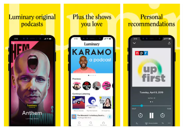
The Luminary app is designed to take the same subscriber-based model popularized by Netflix and Spotify and apply it to the podcast industry. Launched in 2019, Luminary’s model promises subscribers an ad-free experience where they can listen to Luminary exclusive content as well as the podcasts they’ve listened to on competitor apps.
Onboarding
Through explicit UX writing and clear signifiers, the onboarding experience of the Luminary app makes its intentions obvious as it guides the user to get started and customize the app to their preferences. On the second onboarding screen, seen in Figure 2, the user is directed to select what interests them so the app “can learn your taste”. The intention of this page is further signified as the options stand apart as individual stylized buttons. Feedback is clear as the selected buttons appear in yellow, exemplified in Figure 3.

Figure 1 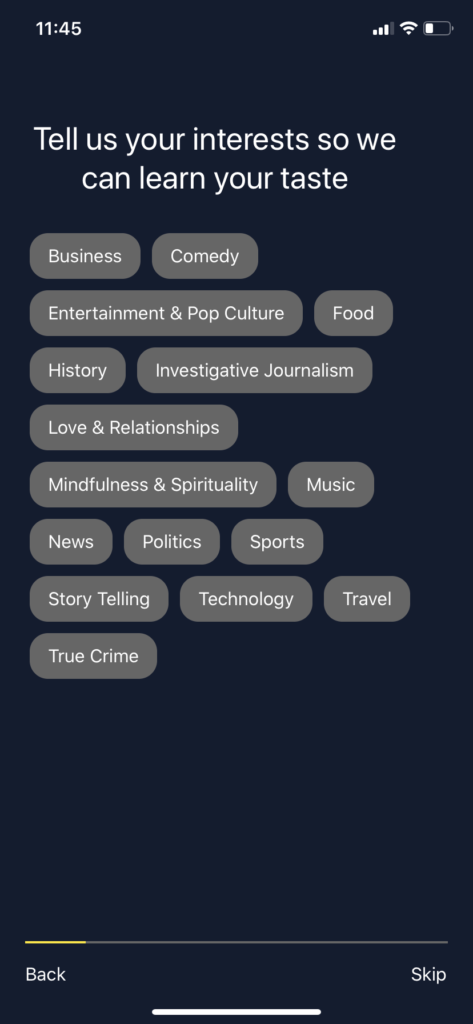
Figure 2 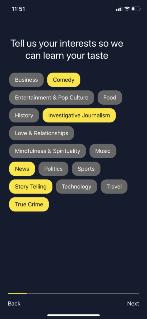
Figure 3
From this screen, the onboarding experience progresses, clearly identifying the user’s progress through the bar seen at the bottom of the screen. On the third onboarding screen, seen in Figures 4 – 6, the Luminary app takes advantage of the user’s conceptual models as the heart represents liking a trailer. This is used as a secondary option if the user doesn’t understand this screen’s affordance of simply swiping left or right as explained in the screen’s header.
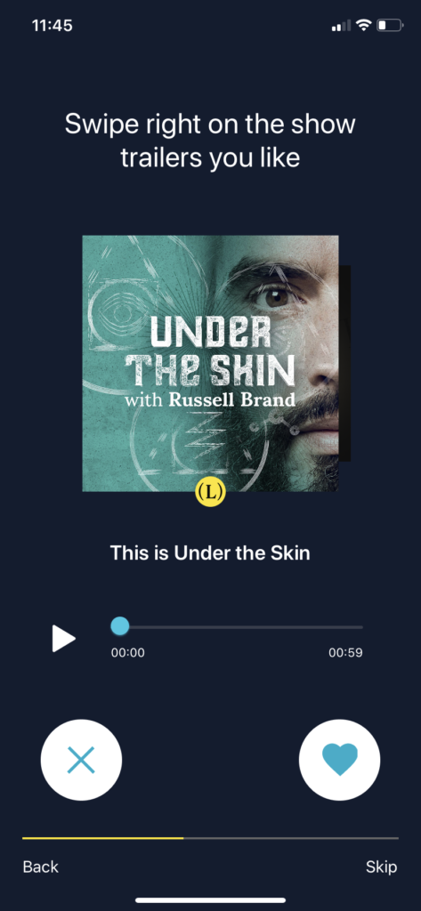
Figure 4 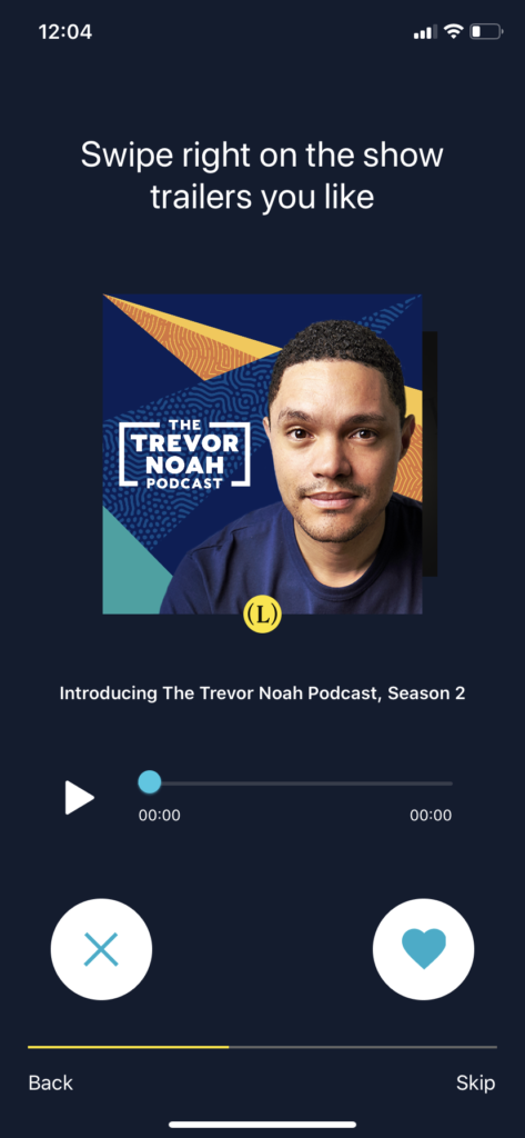
Figure 5 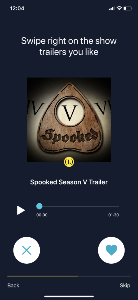
Figure 6
Home Screen and Play Functions
When the user enters the Luminary app, the first action that stands out is the ability to “Play Episode”, seen in Figure 7. This play button is associated with a podcast selected by Luminary based on their perception of the user’s interests. This button, predominately placed, helps bridge the Gulf of Execution as they are immediately directed toward a next action. Further actions are signified as the familiar icons of a downward arrow and a bookmark alert the user to the fact they can download or save the podcast for later.
In addition, the user can easily identify the progress they’ve made with other podcast episodes as a progress bar loops each play button. This can be seen in the “Continue Listening” section of Figure 7, providing a visual representation of the time a user has left with an episode.
If the user decides to play a particular podcast episode, exemplified in Figure 8, the actions that can be taken are displayed underneath the progress bar. What hinders a user’s understanding of these actions are the lack of consistency as these buttons are stylized differently than the buttons encountered on the app’s home screen. While the actions are represented using familiar icons, the user might pause if they aren’t immediately recognized as clickable elements. As a suggestion, Luminary could choose one way to represent buttons in order to help a user intuitively understand their action without having to pause to remember.
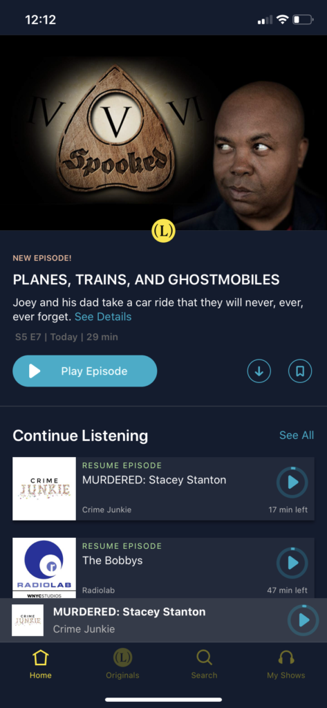
Figure 7 
Figure 8
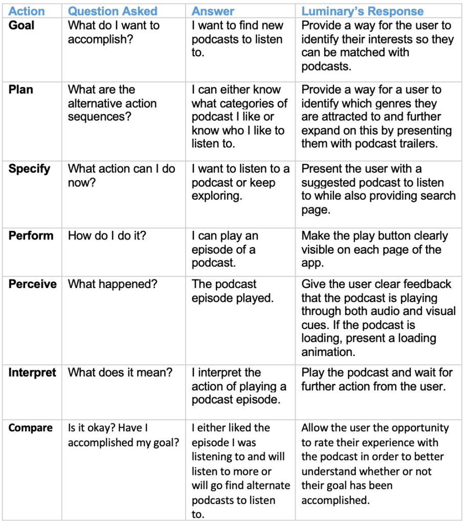
The figure below presents a chart of the seven stages of action in order to take a broader look at the Luminary app and its ability to assist the user through the stages.
Citations
“Promotional Image of Luminary.” Medium.com, miro.medium.com/max/597/1*GqirPObMETRwyefI3ozV0A.png.