Timed Tickets vs. Plan your visit vs. Book your visit vs. Free timed ticket
While it is common for museums to have call to action buttons or multiple ways to guide the visitors to purchase and reserve tickets, there should be a tasteful and simple way to guide the visitor to this action. MoMA’s homepage has 4 ways to purchase or reserve tickets. Each button has different labels which can be a bit confusing.
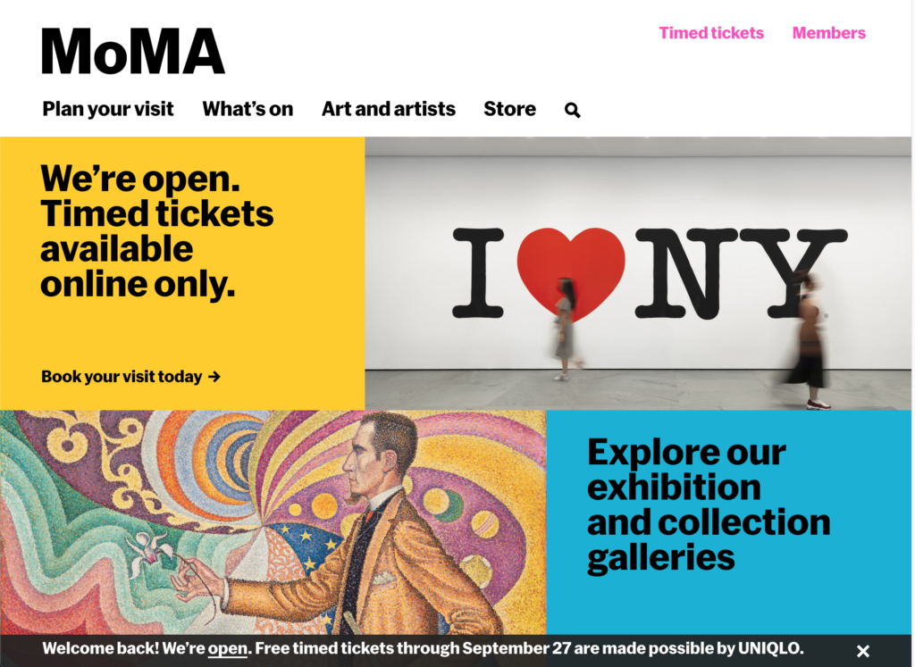
“Reserve timed tickets” is located on the top right section of the site. Another way to complete this action is under “Plan your visit” in the header which contains “Reserve timed tickets” Under the header there is a block on the home page “we’re open Timed tickets available online only; Book your visit today”. On the bottom of the page there contains a welcome back we’re open FREE timed tickets with the date that the tickets are free and available. We can all agree that if someone is on a quest to buy a ticket they will definitely not miss all the signifiers. By Don Norman’s terms the discoverability is good for those who want to purchase a ticket. Encouraging your visitor to purchase a ticket is a big goal for most museum’s site but we must remember that properly labeling these actions can help the user pick the correct action. Simplifying the terms and also reducing the number of choices on a page can guide the visitors to the purchasing ticket page without having them second guess themselves as to what are the steps required to purchase a ticket. It seems like these buttons maybe competing with one another to grab the visitors attention and can cause confusion due to the different labels. While each button takes you to the same page it is important to keep the home page simple and the action for the buttons consistent. If we want the users to purchase a ticket then a button that simply says “purchase a ticket” should be enough and we can save more details in the next page.
Scheduling Tickets
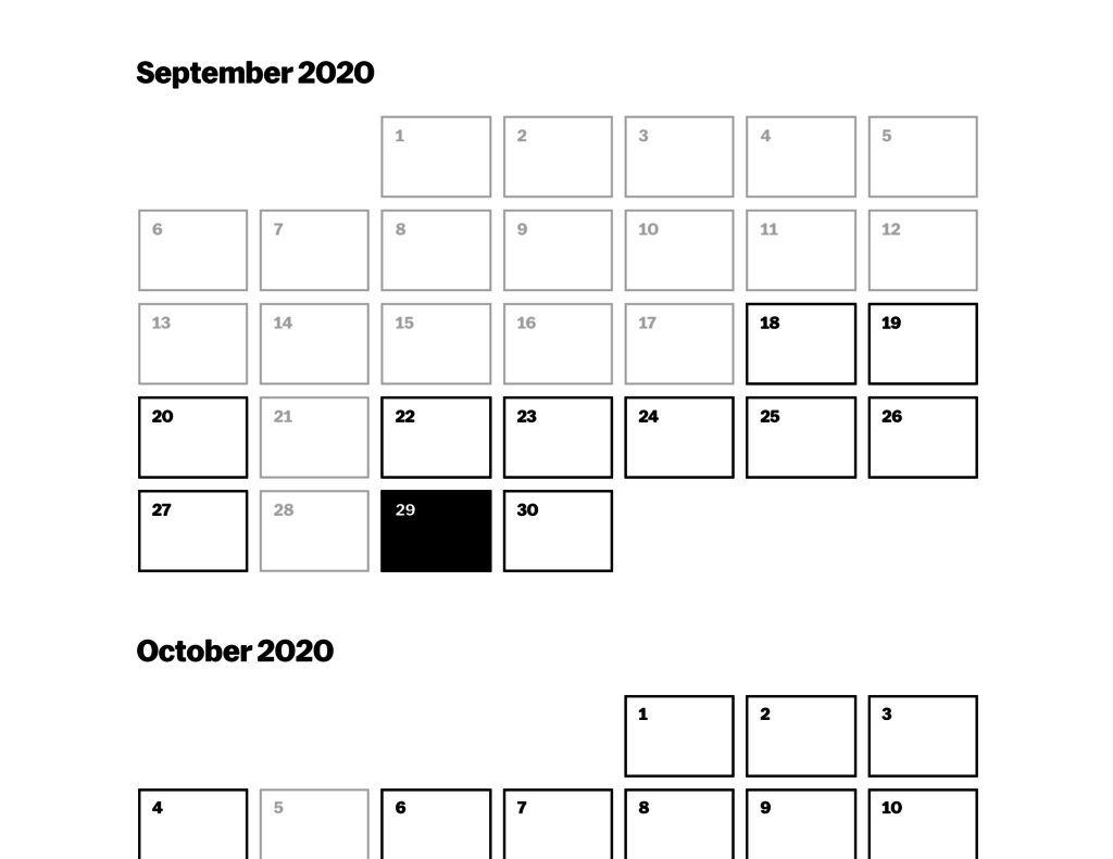
MoMA is known for its modern and minimalist style but having this approach in design can have its pros and cons. It is clear throughout the whole site that there is a simple grid structure that does not complicate the design and doesn’t overwhelm the visitor with information . In this case the design for this calendar is too simple and leaves out critical information such as availability for tickets. In figure 2 you can see the calendar leaves out the days of the week which for some visitors may require them to scroll up again to see what days fall on which days of the week. Adding the first letter to each day can help visitors identify what days fall on the days of the week.
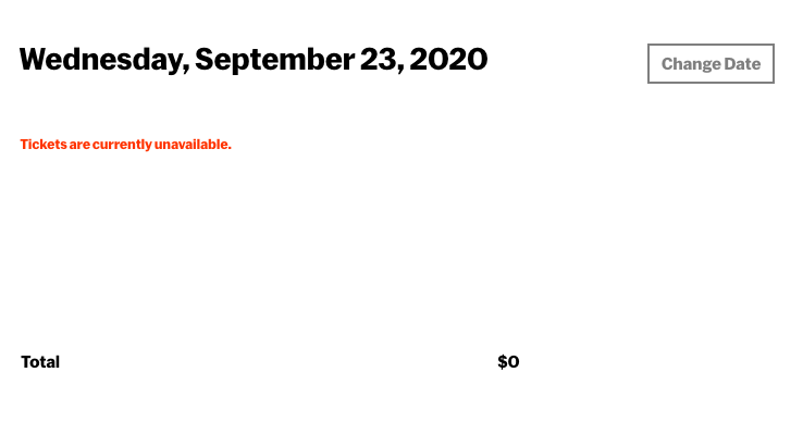
In order for the visitor to obtain information on the tickets the visitor must select a date and wait for to get prompted to another page which will show whether there are tickets available or not. Giving your visitor easy and fast access to this information could reduce the number of clicks required when looking for dates to buy a ticket.
Color scheme and Inconsistency
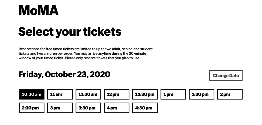
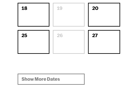
On both images you can see what buttons are clickable. While the site also provides hover over effect for the buttons that you can click there is a insonstitancy for the buttons that are in grey. Because the dates that the museum is closed or tickets are not available are greyed out, visitor may assume that grey indicates that there is no availability or that the option to click the button is not optional. The color scheme for this site is monotone but designers must consider the mental models and behaviors visitors may have when navigating through a site. The buttons “Change Date” and “Show More Dates” could be black or even blue rather than grey or any light shade of black to help eliminate the simple confusion.