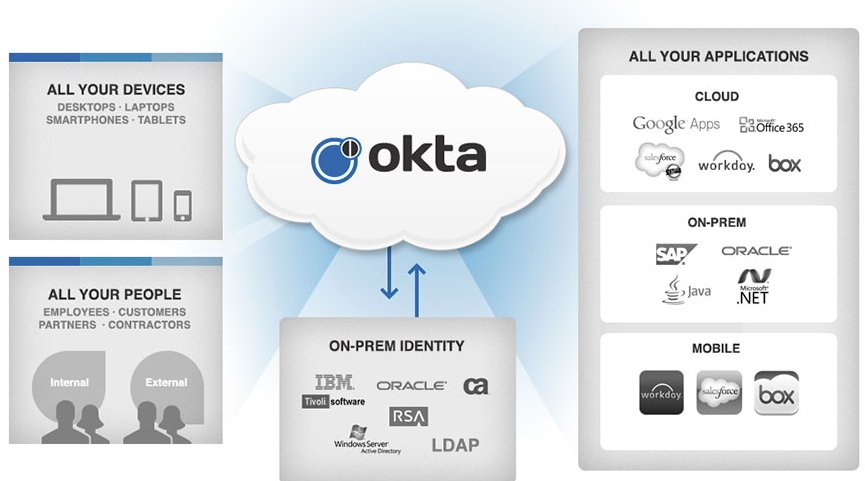
Okta is a secure enterprise-level, identity management service that connects a person with any application on any of their devices. Built for the cloud and compatible with a number of apps, it enables a single sign-on (SSO) login experience for its users while ensuring information is secure for the user’s organization.
Sign In
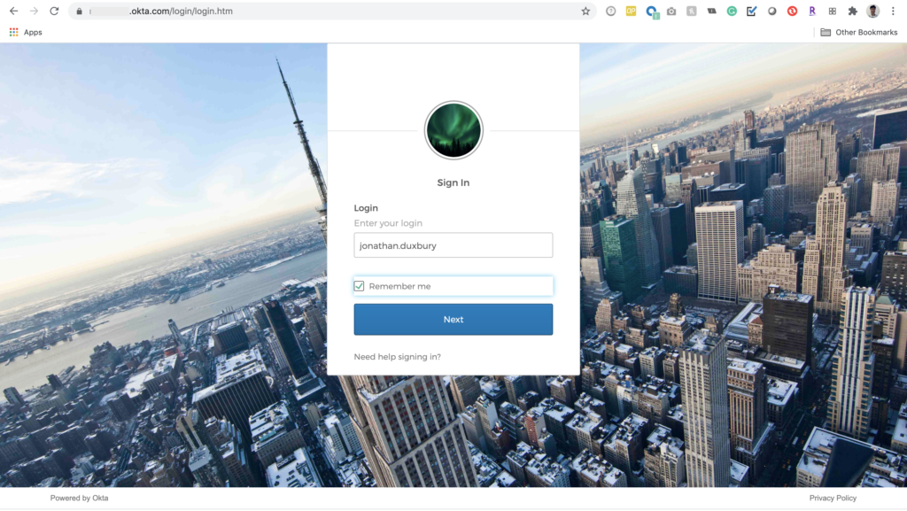
Fig 2. Login Screen (1 of 2) 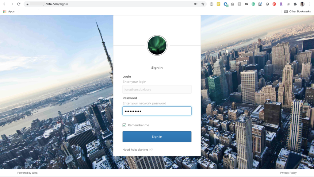
Fig 3. Login Screen (2 of 2)
A user can access all of their enterprise apps via a homepage dashboard at “enterprisename.okta.com”. The user is prompted to log in via a simple login screen. Okta uses constraints by separating each prompt into a separate screen; a user can only complete one intended action before being prompted to move forward through the flow. The use of the blue button at the bottom of the window is clearly labeled, acts as a signifier, and informs the user of what to expect on the next screen.
Okta Homepage
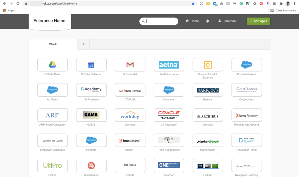
After signing in, a user sees a dashboard view of all of their enterprise apps, affording the user to select any app in a signed-in state. When a user applies knowledge in the mind and knowledge in the world, the apps can be considered clearly identifiable with a standard box containing the app’s brand logo. The logo specifically prevents capture errors despite the consistent shape of the apps across the page.
One challenge, however, is the lack of a clear framework or logical constraint for the order and organization of the apps (e.g., alphabetical, chronological, usage, etc.). Additionally, the lack of a visible scroll bar to view more apps below the fold serves as a secondary challenge. A scroll bar only appears after the user begins scrolling; while this facilitates good feedback, it doesn’t work as a good signifier and negatively impacts the discoverability of additional apps.
The navigation bar at the top of the screen uses natural mapping and clearly recognized icons as signifiers to illustrate purpose and action. Icons are highlighted when a users hovers over them, giving good feedback and clear direction on what actions are available to them. The search bar helps with discoverability and affords the user to quickly locate a specific application.
App Selection
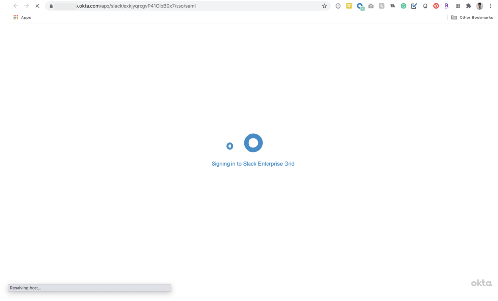
Fig 5. Screen Post App Selection 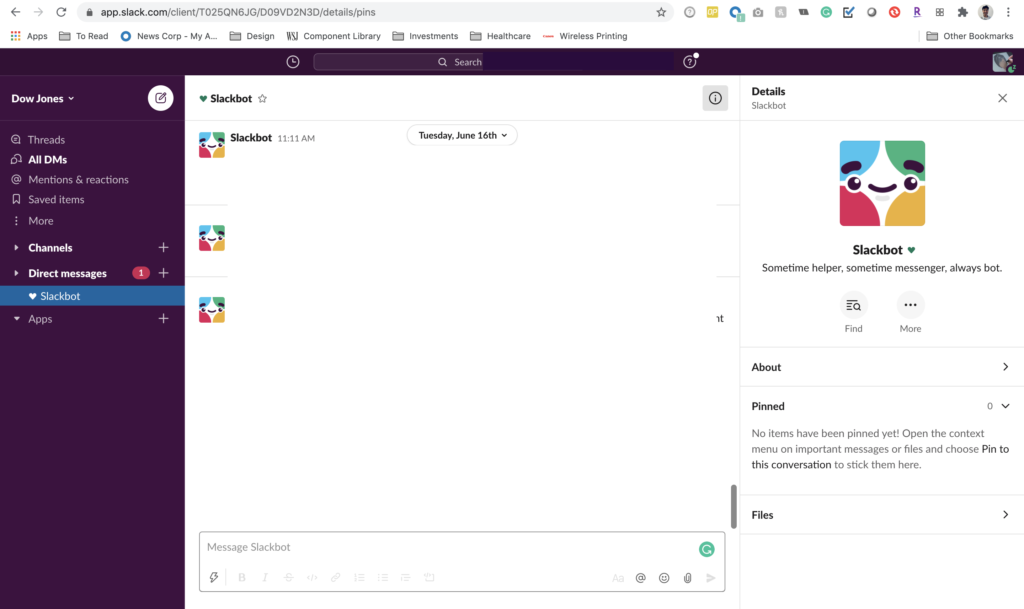
Fig 6. Signed-in State in Selected App
Similar to the navigation bar, when choosing on an app, the user sees the cursor change and the chosen app highlighted to signify selection. They are immediately taken to a new screen that signifies the change of state and a clear label of the next action. These two actions provide clear feedback and concludes the user’s Okta journey, completing the gulf of execution navigating the user to the homescreen of their selected app in a signed-in state.
Conclusion
Okta has become a staple enterprise SSO provider. It is widely used across U.S. businesses with strong adoption rates and solid integrations and accessibility. Overall, its central user experience is clean and simple, enabling the user to perform tasks at hand fairly simply. While there are things that can be improved, Okta successfully enables a user to complete the seven stages of action, from forming a goal to a clear evaluation of outcome.
