This project will highlight an example of good and a badly designed traffic signage in New York City. I will explain and make recommendations to improve the badly designed traffic sign and give feedback has to why the good designed signage deemed as a good design.
The good and bad design of parking Signs in NYC.
Parking signs in New York City have been a pocketbook for road-codes, especially in the industrial part of Manhattan. These signs are notoriously hard to understand, especially when driving. We understand that traffic rules are very complex and are vital, and as a result, the designer saw the need to cram all the rules on the allotted small metal sheet provided for street signage. Not undermining the good designed parking signs, so in the blog, I will provide examples of a good and badly designed traffic sign and why I think these are good and or badly designed. Don Norman tells us in his book “The Design of Everyday Things:” “That a good designed as the right signifiers and affordances” and that “Good design is actually a lot harder to notice than poor design, in part because good designs fit our needs so well that the design is invisible, serving us without drawing attention to itself. Bad design, on the other hand, screams out its inadequacies, making itself very noticeable.”Before I plunge into these designs, it would be pertinent to explain what to look for on these signs. These are not listed in a specific order; however, they are vital for knowing what to look for to provide feedback. The discoverability of the signs: Is it possible to figure out what actions to take in one glance at the sign? The understanding of the sign – can we take one look at the sign and understand what it is telling us to do? Is it too wordy for a quick glance to understand what action/actions to take?We should also know that a good design requires good communication; a good design affords minimal or no thinking because it communicates the right signifiers.
Let us look at the first sign ( Badly designed although signifiers are present). Signage has improved over the years, more improvements are needed for the visual ability for faster comprehension for drivers.
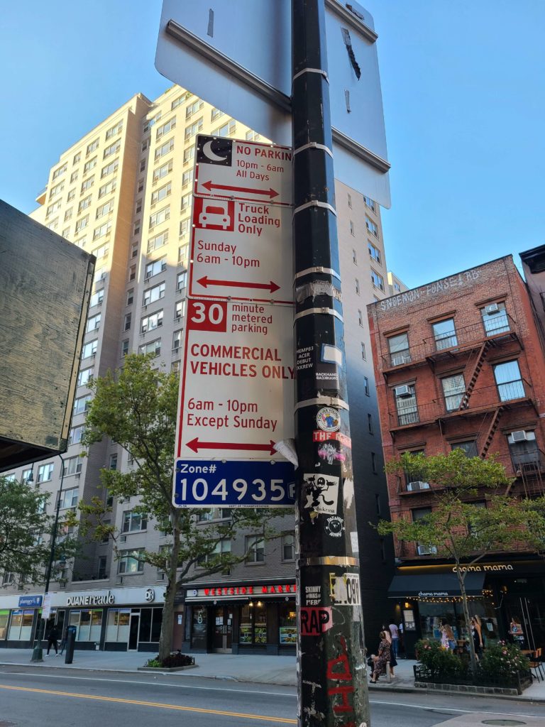
Fig1 Bad Design and display

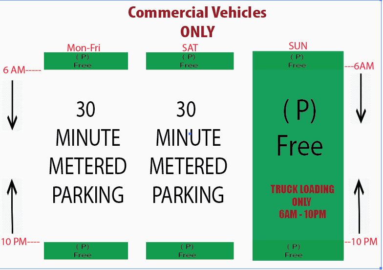
Imagine you are a regular driver, staff, or student at Pratt Manhattan and want to park here. The question is, can you park at this spot? Fig1 signage should have been a simple question to answer, but this simple question takes a lot of mental processing because of the wordy layout. Designers are often placed in situations where they have to design signages that are inundated with parking rules to be displayed in a small space. Which Is why most parking signs are overwhelmed with words or the poles that hold the signs are burden with too many parking signage to one. The above signage represents bad design because; It has unclear signifiers ( drivers can not quickly see what action to take). Poor understand-ability ( drivers cannot quickly figure out or understand what the sign is saying). Low affordance ( the signage doesn’t afford fast decision making). However, I have designed a signage with the right signifiers to quickly understand the parking rules and less stressful on the brain to quickly process and make the right parking decision see Fig 2.
Let’s look at Fig2. This signage represents a good design (my recommendation), one that can replace the signage in Fig1. Fig2 signage is very clear; it has the right signifiers; it is easily understandable and has the proper affordance. Why? This sign affords quick decision making with just a glance because it houses the right signifiers and is easily understood by an active driver.
Fig2 Recommendation

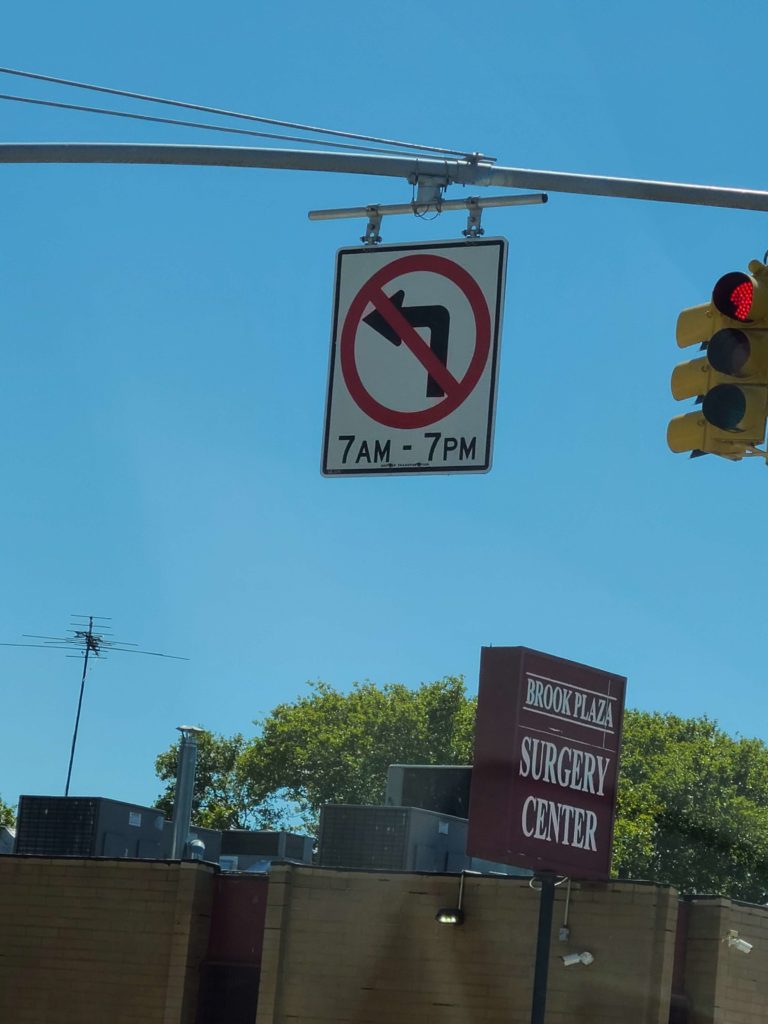
Fig3 Good Design
Fig3 below is an example of a good designed traffic sign. As explained above, a good design fits the need of its customer. This design affords an immediate understanding because it has the correct signifiers in the right places, like the colors, font, and size. Why Fig3 is an example of a good designed traffic sign; this sign has three signifiers that work well together to accomplished the traffic rule. One look at this sign, and you know not to make a left return between 7 am to 7 pm. I like how the red circle representing stop dominates the signage plate, indicating not to turn between the listed hours. You will also notice that the only lettering/words on this sign are the time indicator. Hence the brain only needs to access the occipital lobe to interpret the visual image.
Fig3

Source:
Don Norman’s “The Design of Everyday Things:”