
SHAZAM is a popular mobile app that recognizes and identifies music, television shows, and advertisements within seconds by listening to audio snippets. The app can detect any audio and identify it despite ambient noise, so you wouldn’t have to worry about your friends chatting around the table or the clattering of dishes in a restaurant! Today, the app has expanded to include a discovery page where users can now curate new music and share it with their friends.
Homepage
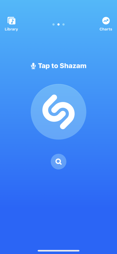
Shazam’s mobile interface has a minimalistic display (fig. 1). As soon as you launch the app, users can discern what actions they could take because of the clear signifiers portrayed through icons. In other words, the affordances, what action a user could take were made visible due to the addition of icons that signify how a user could perform this action. Superficially, Shazam’s mobile interface is coherent and seems unintimidating because of its application of good visibility.
Navigation
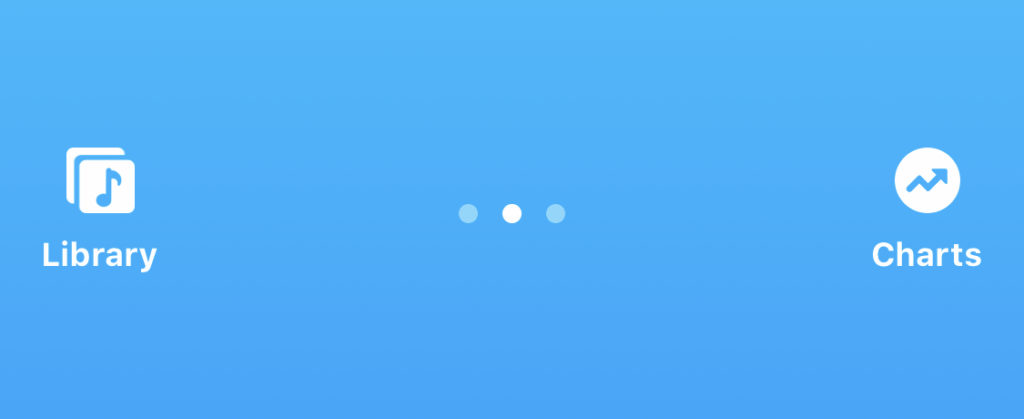
Shazam’s top navigation feels natural and familiar to users. The designers organized the navigation bar with icons that signify navigating between the library, home, and music charts page (fig. 2). The navigation bar is naturally mapped, in which the navigation controls are spatially placed in the way a user would swipe to access the desired page. If users want to access their library page, they will swipe left and conversely swipe right to go back to the home page or access the charts page. Natural mappings allow for good design as it enables the user to utilize the application more seamlessly and proficiently. With the combination of only three pages and good mapping, navigating the app will become memorable and stored as knowledge in the user’s head.
shazam a song
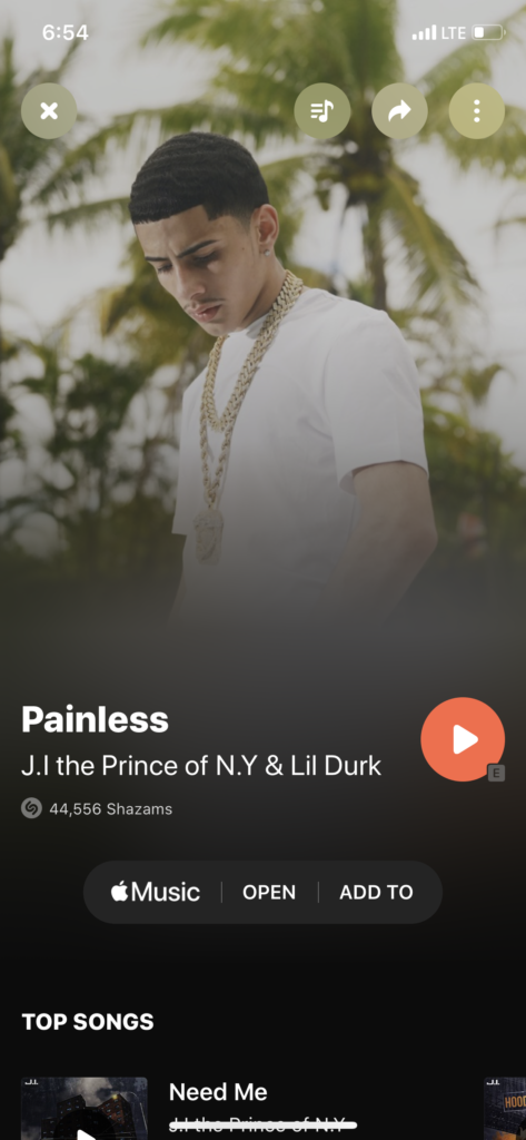
fig. 3 – How to Shazam
If you are a music connoisseur like me and are always hearing new music you like on the go, you no longer have to rely on asking a friend if they know a song’s name or try to remember bits of a song’s lyrics to google later on. Shazam’s main feature alleviates this frustration and uses knowledge in the world to identify the audio we want to learn about. When you access the homepage, the user’s eyes are drawn to the large Shazam button in the middle of their screens. The Shazam button pulsates, prompting users to click the Shazam button. The button uses this pulsating motion as a signifier notifying users that clicking the button affords identification of the audio being shazamed (fig. 3). When you tap the Shazam button, larger circles radiate from the button, signifying that the app is listening to a song. When the app identifies the song’s title and its artist, your screen changes color, and immediately Shazam pulls up the artist’s page where you can listen to the song or see other songs by that same artist. This is an excellent example of good feedback since users are aware of all the actions taking place as they occur and have an awareness of when the action was completed successfully; in this case, the song being identified. The signifiers and feedback displayed when shazaming a song lessen the gulf of execution and evaluation.
One thing I noticed is that above the Shazam button there are instructions on how to Shazam something (fig. 1). The app tells you to “tap to Shazam” and “long press to auto Shazam.” In the Design of Everyday Things, Don Norman mentions that if a designer has to explain how to use something in writing then most likely it is a bad design. I disagree, I think that simple instructions are an additive measure to provide users with clarity. What I do not like about the instructions is that there is a microphone icon right next to it. If users are familiar with the microphone icon and have preexisting knowledge about what it signifies, then they will assume that you can click the icon and enable voice control. This icon is inconsistent with what the actual instructions are telling the user to do which is tapping or pressing the Shazam button. There is an inconsistency between the signifier and its affordance. In order to not confuse users, this icon should be removed from the design.
Library
On the library page, there is an option to view your recent Shazam’s. When a user clicks their shazamed song of choice a page pops up with the name of the song and other relative information about the song and the artist. However, if a user wants to exit a page they would have to either click the “x” button or they would have to scroll all the way up to close the page (Fig. 4). Since the user is already familiar with a left and right navigation to go back and forth between pages, scrolling up is something they may not automatically think of. The consistency of navigation flows here are different, thus by putting a constraint on how to close the page by only using the “x” button would heighten the app’s consistency. Personally, I don’t mind this inconsistency since I like the variation on how to close this window, and I am familiar with other apps using the same navigation methods.