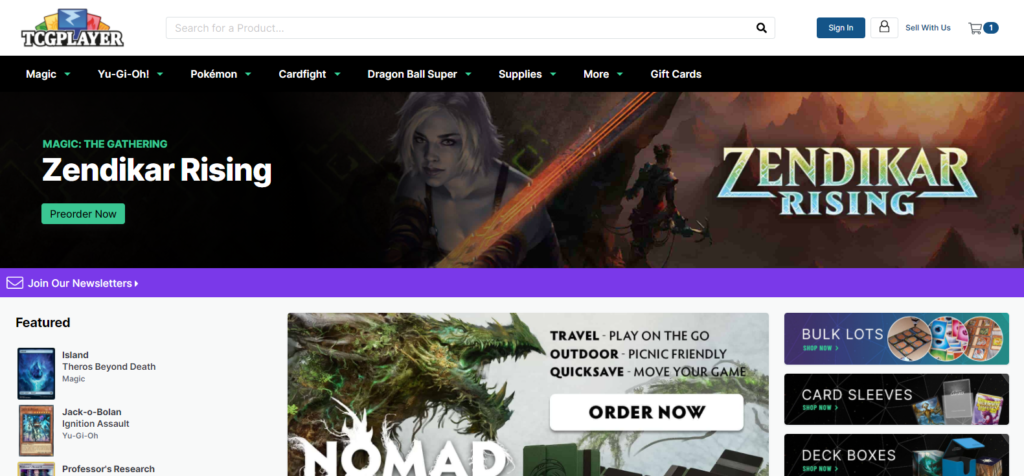
TCGplayer is a popular collectible card-purchasing marketplace, enabling people to buy and sell cards from various games like Magic: The Gathering, Yu-Gi-Oh!, Pokémon, and more. This critique will focus on the desktop experience of buying Magic: The Gathering cards, utilizing design principles from Don Norman’s The Design of Everyday Things.
Let’s start by defining my goal: to purchase a specific Magic card. I must first travel through the Gulf of Execution, trying to figure out how to accomplish this. This is a fairly simple affair, as I can lean on my existing conceptual model of finding things on the internet (I must use a search bar to input my search query). In searching for the search bar, I utilize two common patterns from my conceptual model:
- Search bars are usually rectangular boxes, accompanied by a magnifying glass icon (signifier).
- Search bars are usually located at the top of a webpage (Information Hierarchy and layout).
TCGplayer is partially successful here, but falls short due to the weak contrast in the search bar:

As a normal-sighted person, I am able to perceive this signifier. But for “people with cognitive disabilities, it is recommended to delineate the boundary of controls to aid in the recognition of controls and therefore the completion of activities” (WCAG, SC 1.4.11).
Search Suggestions
Moving on, I’ve found the search bar and begin typing the name of the card I’m looking for: Lightning Bolt. TCGplayer employs search suggestions to predict what I’m looking for – a helpful and “expected sign of a well-designed search feature.”
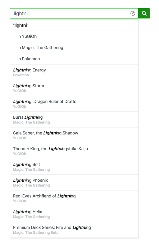
Search suggestions like this embody the principles of receiving immediate, informative feedback, and drastically speed up my ability to find one specific card among thousands. But, improvements to the information hierarchy could be made to expedite my ability to pass through the bridge of evaluation for this search sub-step and reduce potential slips in list item selection.
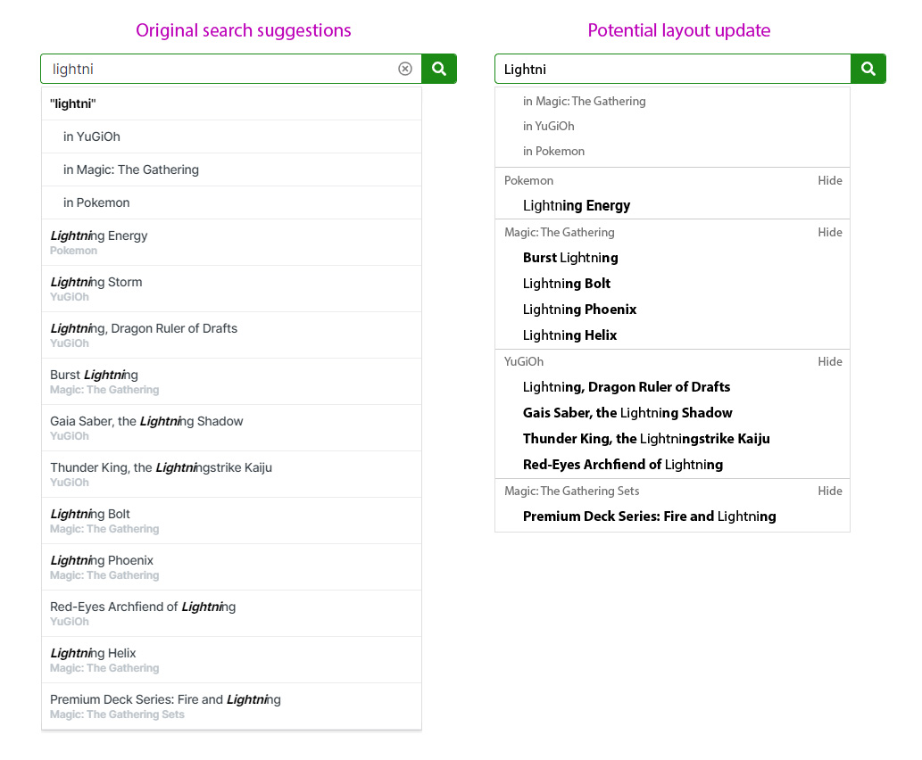
- Instead of duplicating major categories (Magic: The Gathering, YuGiOh, etc) for each list item, create a 2-tiered system that only requires category names be displayed once. This saves space and increases scanability speed by making it easier to overlook irrelevant categories. Indentation also acts as a natural mapping, conveying hierarchy through existing conceptual models of text structure and layout. The new search suggestions height takes up about a third less space, and while each list item is more compact (smaller targets), this sizing was mocked up to be identical to Google search suggestions target heights.
- Reverse the bolded and unbolded rule, bolding the prediction, not what I typed. I know what I typed – what I am quickly scanning for is a match between the prediction (knowledge in the world) and the knowledge in my head (I’m looking for Lightning Bolt). Based on a quick market comparison, Amazon, Google, and YouTube follow this revised bolding rule.
- Though more of a bonus feature, consider enabling users to hide categories that are not relevant to them. I’ve used TCGplayer for years, only to search for Magic cards. If I could hide Pokémon results, this constantly-repeated search task would be permanently simplified for me. Hidden categories could remain in the search suggestions to retain discoverability in undoing hide actions.
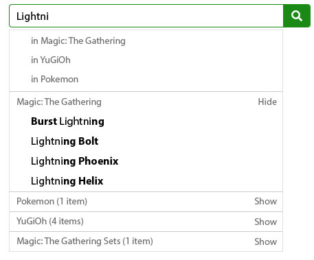
If hide functionality is too complex, consider a passive reorganization of card game categories based on my past searches. If I only search for Magic cards, always display the Magic category at the top of the suggestions list.
Refining by Card Edition and Price
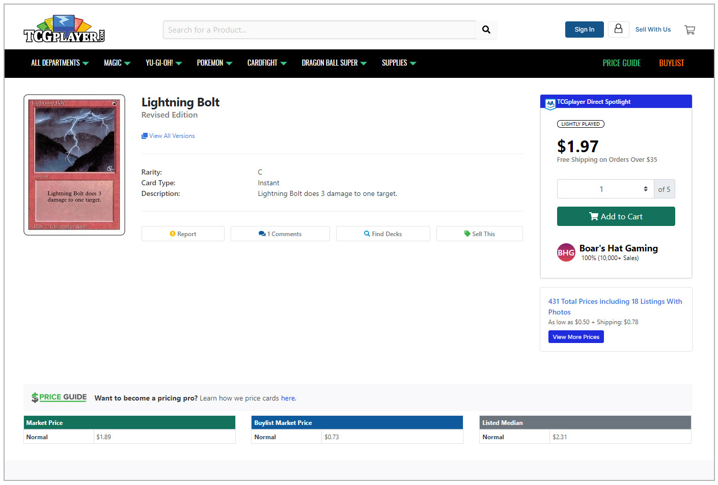
After selecting Lightning Bolt, I am served this page.
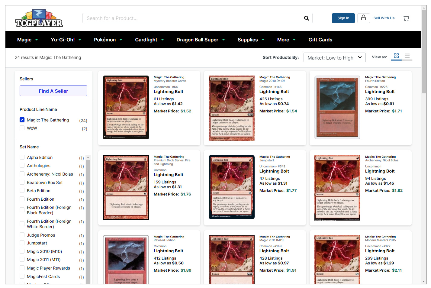
The apparent purpose of this page is to refine my search based on two factors: card edition and card price. Displaying cards visually improves edition selection, which can be a visually-based decision (do I have that art already? Which art do I like the most?). Problems arise when sorting by price.
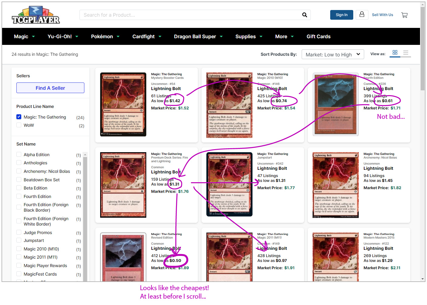
I have two sub-factors to consider when looking at price: the “As low as” price and the “Market Price”. When considering these two factors, a lack of understanding on what they mean adds confusion and complexity to the Bridge of Evaluation, as well as the planning stage of the action cycle. Consider a sub-goal for purchasing Lightning Bolt – I’d also like to purchase it for the cheapest price possible. The “As low as” signifier aids me in finding the cheapest edition, but the only cost-sorting features available for this page are “Market: High to Low” and “Market: Low to High.”
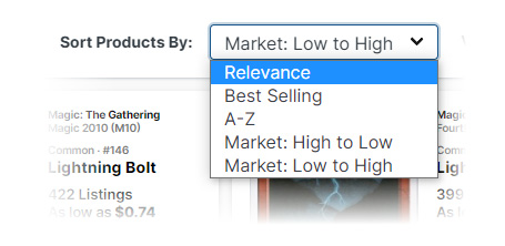
Without being able to sort by “As low as,” I must scan each card edition, utilizing spatial and textual working memory to compare prices of dozens of editions.
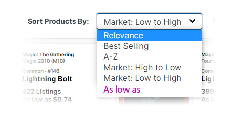
A potential solution to this would be an “As low as” sorting feature. While not particularly discoverable, this solution is likely easier to implement as it requires little interface change.
Selecting a Vendor to Purchase From
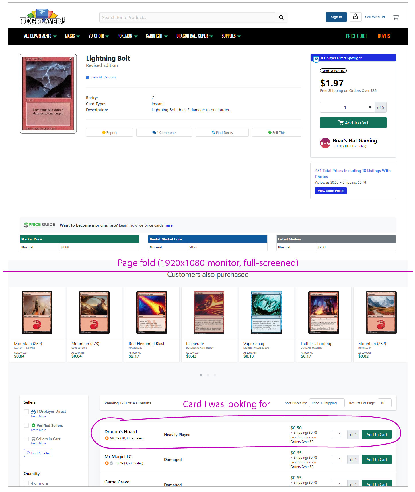
I’ve decided I want to go with the 50 cent Lightning Bolt, and move on to the next step of the card buying process. This is the page I’m met with:
Significant time could be spent analyzing each component shown here, but the major point I’d like to highlight is what isn’t immediately shown – the 50 cent Lightning bolt the previous page promised. The interpretation and comparison stages of the action cycle are not met at first glance – I must scroll below the page fold to find the cheaper card I was looking for.
One potential solution for this issue is to utilize all of this empty space.
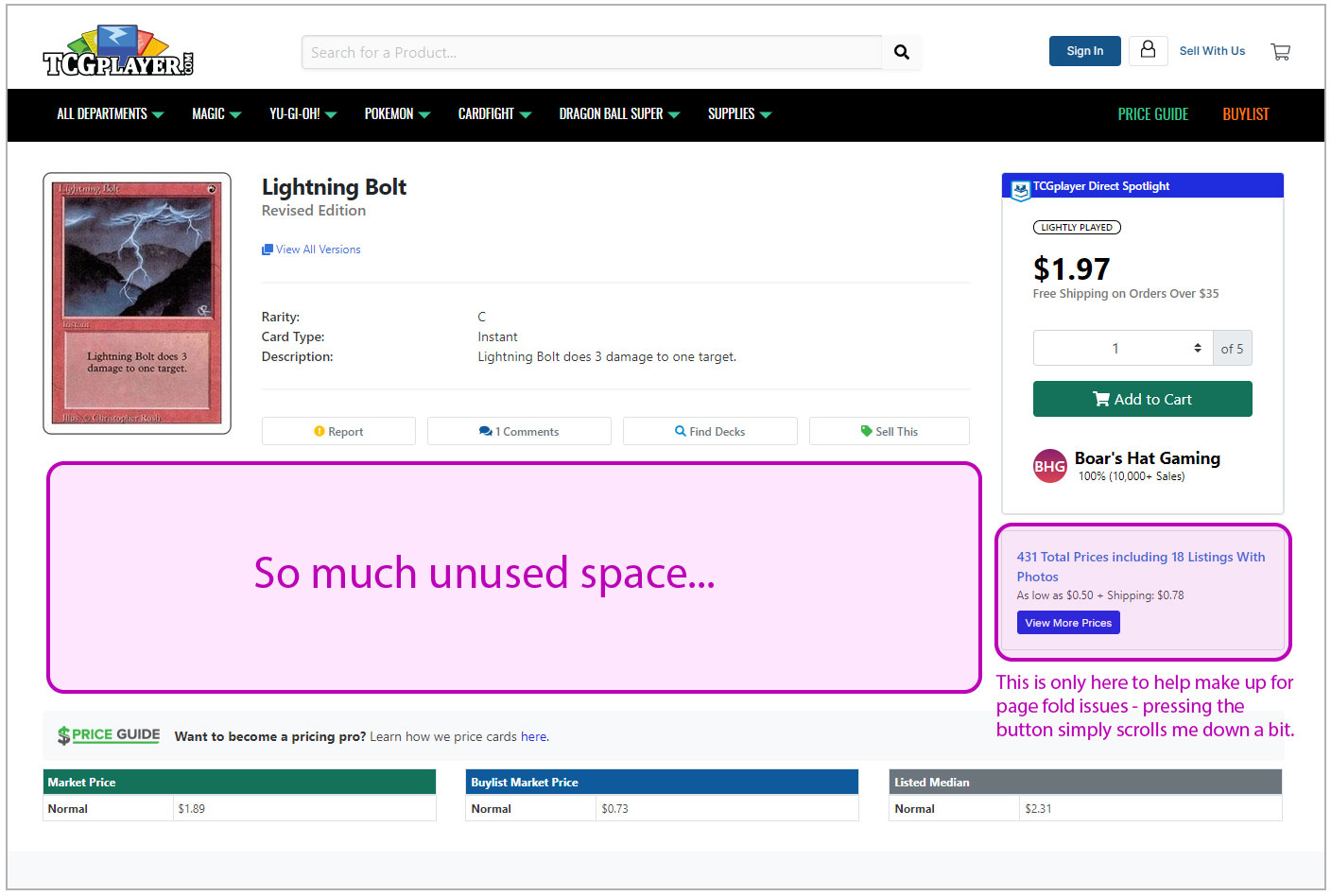
With some layout tweaks, the price listings could peak above the page fold on a standard 1920×1080 screen (browser full-screened).
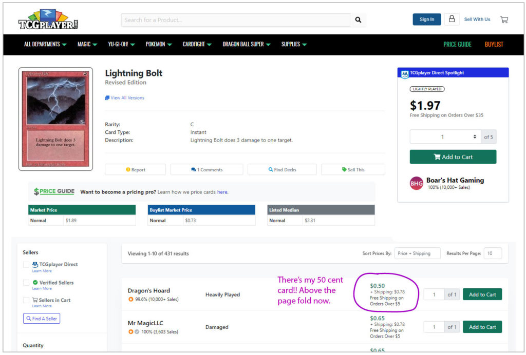
In this mockup, I’ve moved the “Customers also purchased” image gallery to the bottom of the page, as it’s distracting me from my goal. Analyzing this placement from a marketing perspective (perhaps TCGplayers goal is to distract and get me to buy related cards) is beyond the scope of this critique, but a valid counterpoint.
With a click of the “Add to Cart” button, I’ve completed this stage of purchasing Lightning Bolt and am sent to a confirmation page, providing feedback that my goal is (mostly) complete. There are still a few more steps in the full purchasing process, but those follow traditional shopping cart checkout models and can be omitted for brevity.
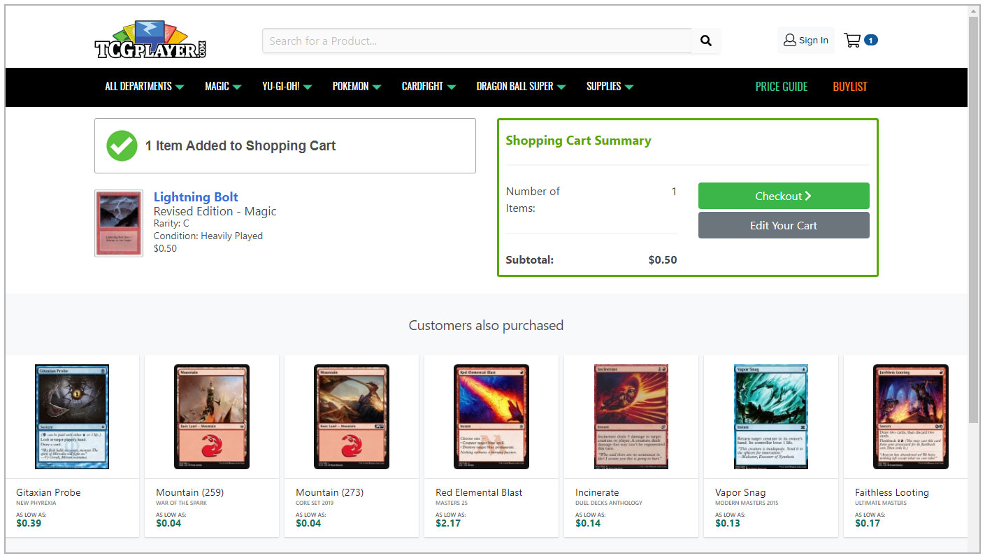
This critique focuses on what TCGplayer could do better across a few key interaction points, and is by no means meant to project an overall negative experience. Their vast inventory, accessible marketplace, and incredibly powerful Cart Optimizer feature all provide a pleasant experience that has led them to be the biggest Magic card buying website at the time of writing. With a few small improvements, they could become even better.