Introduction
Tezza is an all-in-one photo and video editing app created by photographer and influencer Tezza. The app provides iOS users with photo and video presets along with various other editing tools that can be applied in one-click for on-the-go edits. While the iOS app is free to use, the Tezza app also features a subscription based plan for either $1.99/month for photo editing or $3.99/month for photo and video editing.
This design critique aims to assess the design of its’ digital interface, referencing concepts written by Don Norman, author of The Design of Everyday Things. While the app allows for video editing along with creating collages and templates, for the purpose of a clearer review of the app, this design critique will only demonstrate and discuss the process of editing an image.
Initial Screen
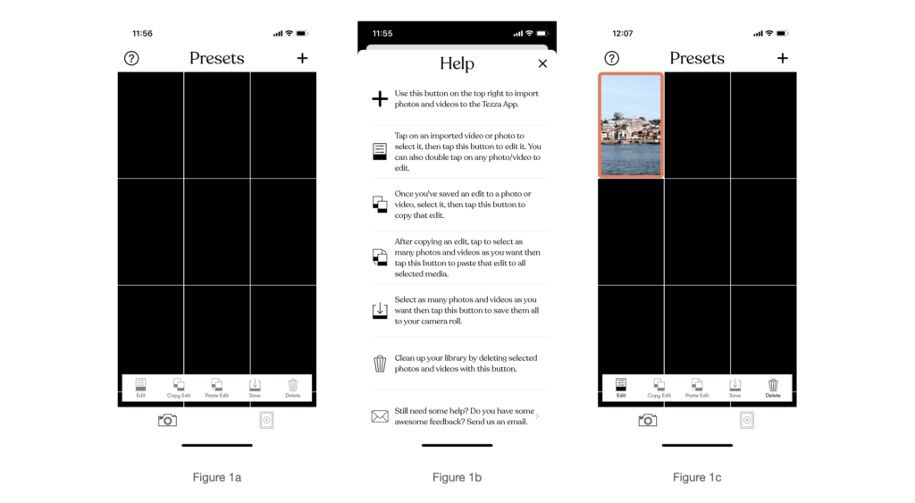
When users first open the app, a grid layout (Figure 1a) appears that is a library which hosts pictures users have uploaded to the app for editing. The interface has a navigation bar at the bottom of the screen with 5 different icons, each labeled clearly allowing for clear instructions. Tezza affords editing by letting users do that by two different ways. The first by signifying the user to click the edit icon in the navigation bar located at the bottom of the screen and the second by double tapping on the image itself. The second method is not as visible or discoverable to a first time user unless the user has read the help guide (Figure 1b) prior to beginning to use the app. The help page appears when users click the ‘?’ Icon located at the top left of the interface. The addition of the help page allows for a better understanding of what actions are possible, and how to perform them (knowledge). To begin an edit, the user will only be able to select the edit button if an image is selected (Figure 1c). This is evident as the edit button will change colour and allow for it to be clicked. Here users are receiving feedback from the app.
Edit Screen
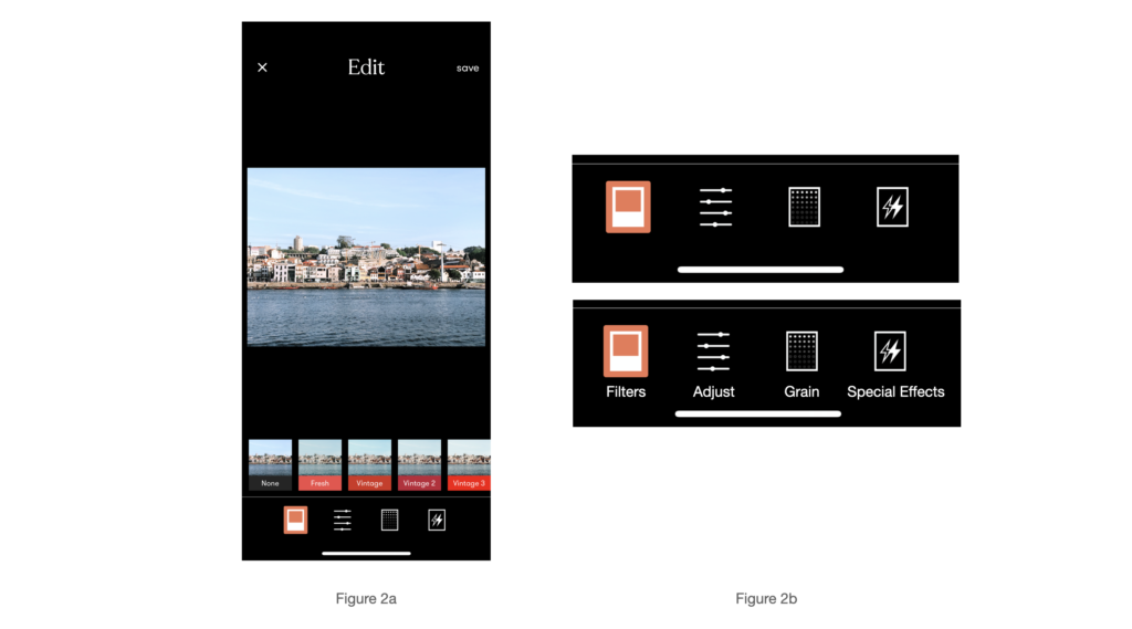
Figure 2a illustrates the next screen of the app, once the user has decided and double-tapped or selected the edit icon. Similar to the initial interface, there is a navigation bar at the bottom of the screen however, none of the icons are labeled with any form of indication. A simple solution would be to include text labels at the bottom of each icon as shown in figure 2b.
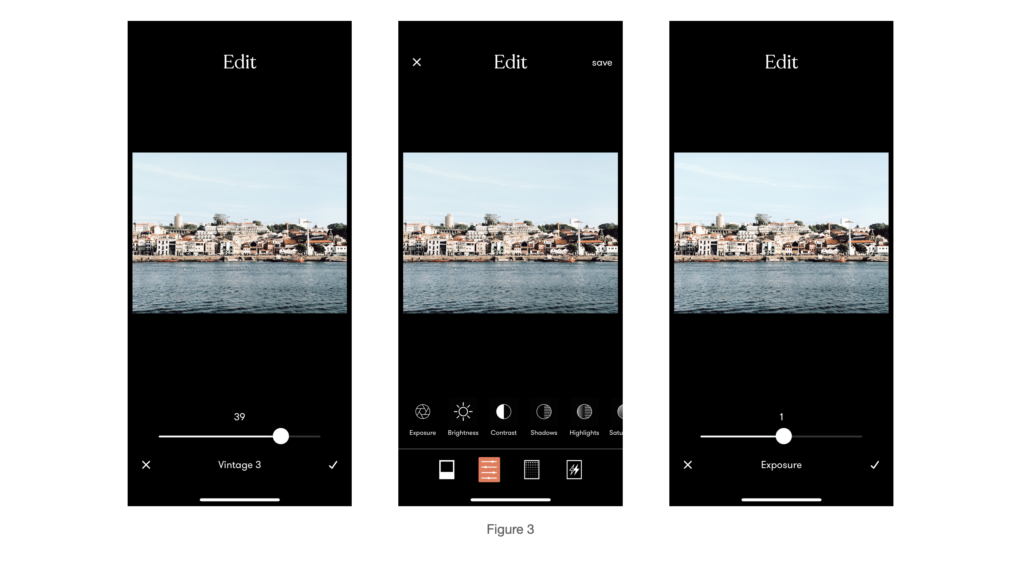
Users will begin to edit an image by selecting one of the many filters available on Tezza. Users will immediately be able to receive immediate visual feedback as the change is instant to the users. Each filter also provides users with the option of choosing the intensity of the filter with the use of a slider scale which implements the concept behind mapping- sliding the scale to the right increases intensity and vice versa.
When users select the second icon in the navigation bar, users are provided with a set of adjustment tools (Figure 3) that appear above the navigation bar with clearly defined labels signifying the user to select the tool most suited to their needs. Each tool comes with the same sliding scale with the intensity increasing as the scale slides to the right.
Additionally, the app’s design utilises Natural Mapping as a new user would be able to figure out how to use the app’s various editing tools by clicking on each icon starting from the left and moving their way to the right, applying the appropriate edits. As a personal user of the app, I found myself naturally selecting a filter, before I moved on to use the other editing tools- changing the brightness, contrast, etc before finally deciding if I wanted to add additional special effects such as frames or a dust filter.
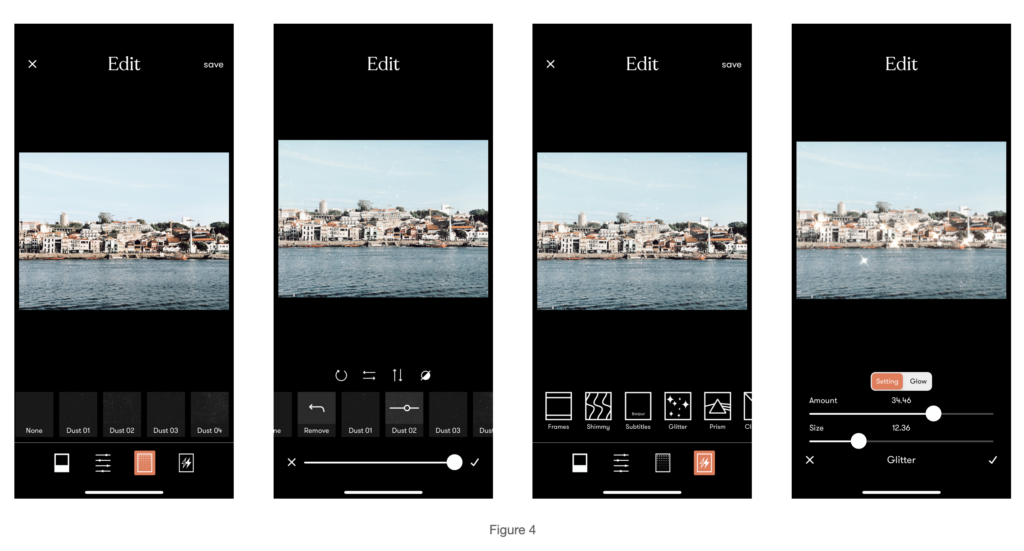
The third and fourth icon (Figure 4) follow the same principles as the ones before. Users are given additional effects that can be applied to their images. At the end of every change made, users will have to click the ‘check’ mark on the bottom right of the screen. Conversely, selecting the ‘cross’ mark on the bottom left of the screen removes the current edit. When the user completes editing a picture, clicking the ‘save’ button at the top right of the screen saves all the edits and redirects users to the initial interface.
After Completing an Edit
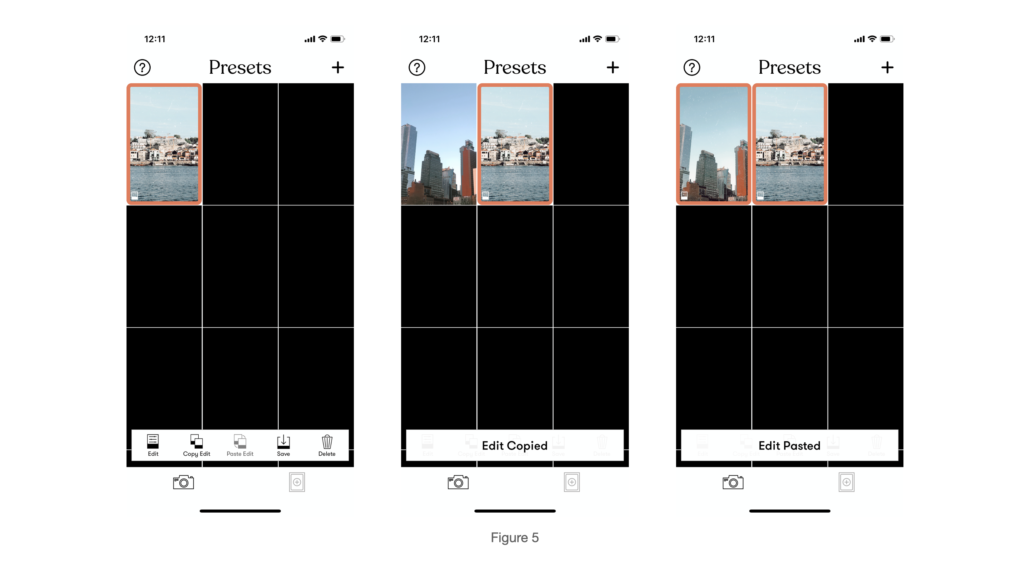
Figure 5 illustrates the Tezza app’s additional feature built in that enables users to copy and paste the edit onto multiple photos. When the user clicks on the photo that has been edited, the app affords that action by signifying copying an edit is possible by changing the colour of the ‘copy edit’ button. Once that button is selected, the user received feedback in the form of the navigation bar changing to display the message “Edit Copied”. Naturally, the user will select a different picture where the ‘paste edit’ button will then become available to be clicked (the ‘copy edit’ icon then becomes unavailable to click) and when that action is complete, the user receives feedback with an “Edit Pasted” message at the bottom as well as a visual feedback of the image changing. The user can also select multiple pictures and select the delete button to remove them from Tezza’s library.
Saving your Image
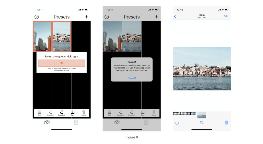
As shown in figure 6, users can save their edited image by selecting the image where the save icon will change in colour and afford the user to save the image. A pop up will appear letting the user know the progress of the image being saved. Finally, a label will pop up letting users know the image has been saved.
Conclusion
The Tezza app provides users with relatively clearly marked and labeled steps in order for users to understand how to edit a photo with the app. Applying Norman’s theory of The Gulf of Execution and Evaluation, I first asked myself the question “I want to edit a photo- How do I use this app to do that? I was able to use answer that question by using the help function on the app to gain knowledge on what each icon meant. As a user I was able to evaluate the end result by looking at the edited image and asking “Is this what I wanted?”. Successfully editing and saving the photo signified I was able to reach my goal of using the Tezza app to edit my picture. Through each stage of the editing process, I constantly received feedback from the app as I got to see edits being applied to the photo in real time.
Norman’s concept of Human Centred Design (HCD) is a process that ensures people’s needs are met and that the product of that result is understandable, accomplishes the desired task while leaving people with an enjoyable and positive experience. Through my experience with the Tezza app, my needs were met as I was able to accomplish the task of editing my photograph in a way that was easy, convenient and efficient. As an avid user of the app for over a year now, I personally have not used another app as I found the experience of using the app enjoyable and suitable for my needs.
