
Tide, a mobile application for focus, sleep, and meditation, uses nature sounds, beautiful imagery, and encouraging words along with clean interface design to help users improve their mental well-being.
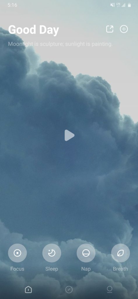
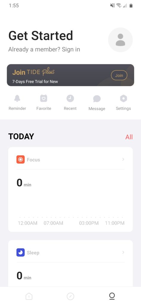
Homepage view
Icons for activities like Focus, Sleep, Nap, and Breath are near the bottom of the homepage, and they are easily discoverable. Along with the text underneath them, they are good signifiers of the main activities that can be performed on the app (Figure 1).
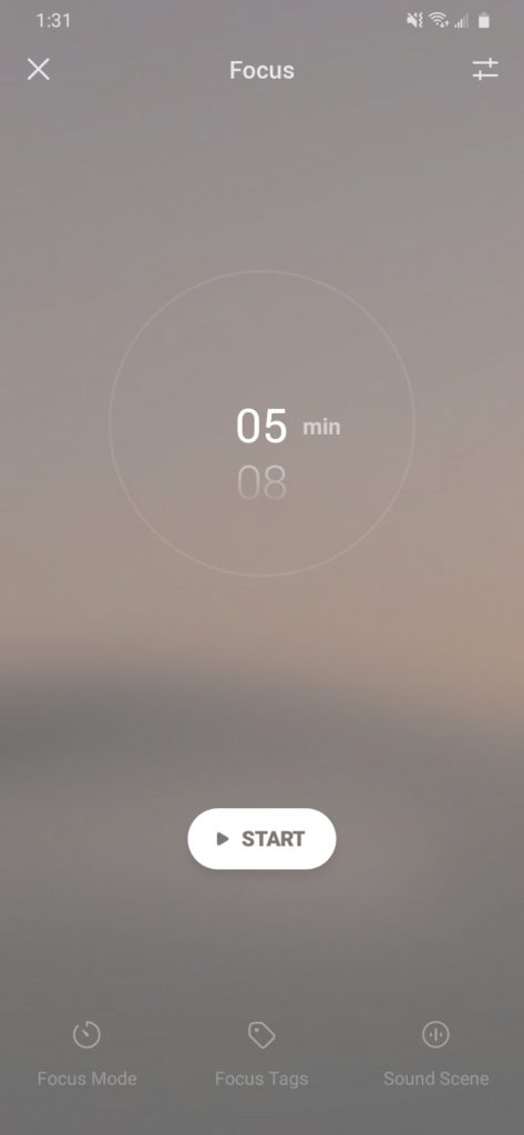
Tapping on the icons opens a timer or the option to set an alarm (based on the activity chosen) which follows natural mappings such as swiping up on the timer or alarm clock increases the time and swiping down decreases it (Figure 2).
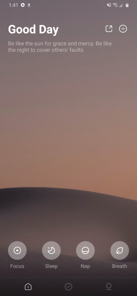
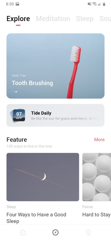
There is a ‘play’ icon in the center of the homepage that signifies that tapping on it will play a sound/media relying on the knowledge in the head of the user that such a triangular icon means media can be played (Figure 1). The sound and the image corresponding to it on the homepage can be changed by swiping sideways from the left or right which uses natural mapping to move back and forth between sounds. However, this feature is not easily discoverable because of the lack of signifiers (Figure 3).
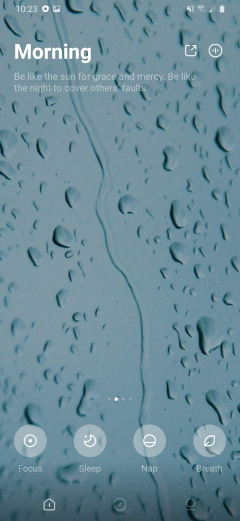
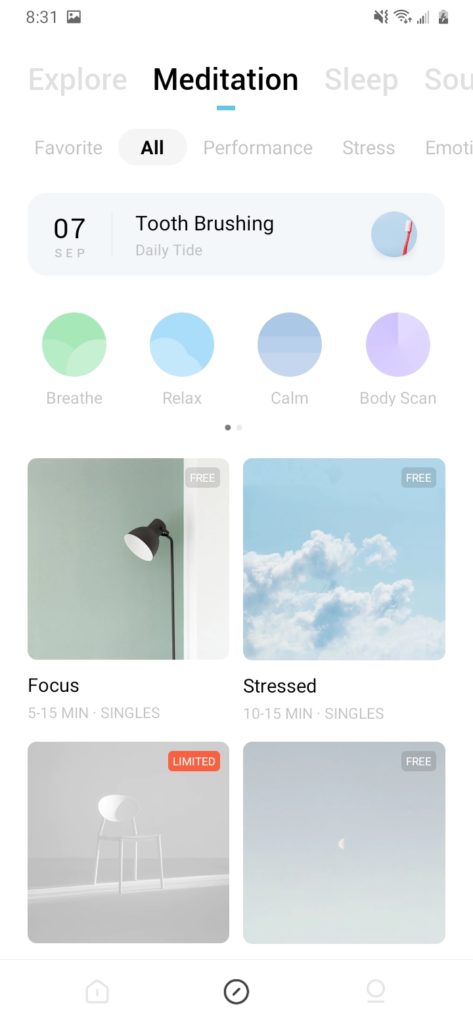
It is only when the user swipes from left or right that dots appear near the bottom of the screen which act as signifiers, indicating other options available for sound and images (Figure 4).
A solution to these discoverability issues and lack of signifiers would be to always display the small dots rather than displaying them only when swiping sideways. This solution fixes another issue that might come up with the sideways swipe feature as some users might make a capture slip, and swipe left or right to access other tabs in the app, a feature commonly used in other apps. The always displayed dots would indicate that swiping sideways will change the media/sound on the page and not the tabs.
Sound can be also be changed by tapping a circular soundwave icon in the upper right corner (Figure 4). However, the sound wave icon might not be associated with sound right away because of the limited knowledge in the head of the user about what vertical bars in the icon might represent, hence not making a good signifier. Moreover, the small size of the icon and its placement in the upper right corner presents a discoverability issue. Changing the icon to the ubiquitous play icon and making the size of the icon a little bigger might solve the issues with signifier and discoverability.
Accessing other tabs
A navigation bar at the bottom of the screen displays three icons, each indicating the three tabs in the app that the user can switch between by tapping on the icon. The app provides good feedback about the tab currently open by highlighting the icon related to it in the navigation bar and greying out the rest (Figure 5).


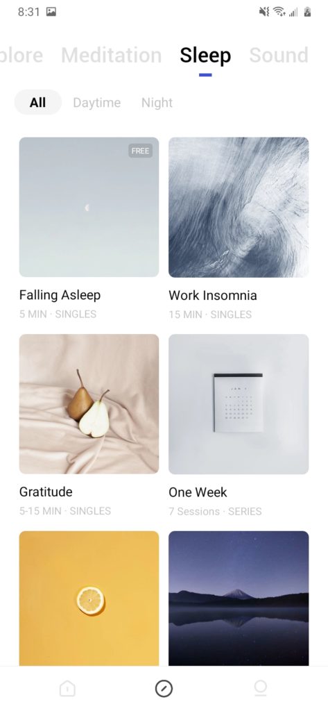
Explore tab
The explore tab opens up to a general explore category for guided meditations and articles as signified by the text icons near the top of the screen. The use of bold text and a small colored bar underneath the text icon provides feedback for which category is open. The text icons for the other categories are greyed out and provide knowledge in the world for the user to understand that there are options for other categories available as well and based on the knowledge in the head, the user can access them by tapping on them or swiping sideways (Figure 6).
Engaging and satisfying the user on the Three Levels of Processing
Finally, what sets Tide apart from a plethora of similar apps is the engagement and satisfaction it provides the user on all three levels of processing. The clean, calming interface and the lack of ads and pop-ups attract the user on the visceral level, the lack of any major usability problems and hindrances, except for some minor issues, satisfies the user on the behavioral level, and the overall satisfaction of maintaining good mental health allows the user to connect and engage with the app on the reflective level.
Conclusion
Despite some minor discoverability and signifiers issues, the Tide app provides an enriching experience through the implementation of good design techniques that create a simple and clean interface, allowing users to focus on their mental well-being.