
Zoom is a cloud-based communication app that recently gained immense popularity due to the pandemic. Zoom has become the chosen tool for people to connect with each other virtually. The app is popularly known for its service that allows users to set up virtual video and audio conferences. Some of the capabilities that Zoom offers include live chat, webinars, and screen sharing.
Login Page
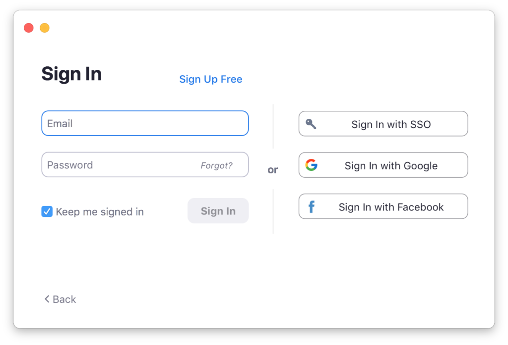
figure 1.1 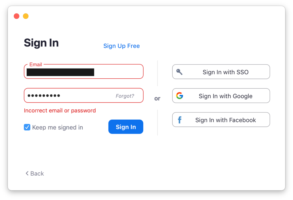
On the login page, users are provided with several ways to sign in to Zoom. The login options are split into two sections, divided by a vertical line and the word ‘or’ in the middle of the page (figure1.1). The divider and the buttons act as signifiers to signal that this page affords logging in by using a zoom account or a third-party account. This page provides good feedback by changing the color of the input field and alerting the users when they input incorrect email or password (figure 1.2).
Homepage

figure 2.1 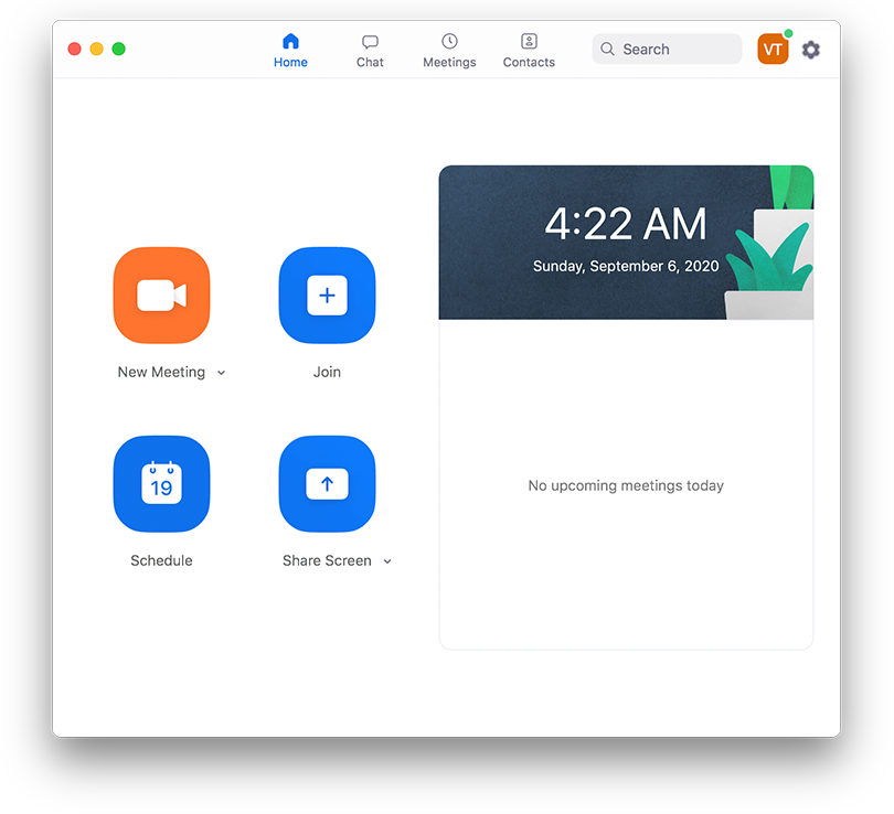
figure 2.2
The discoverability of the homepage is good because of the design hierarchy. The icons, the colors, the size, and the captions aid in establishing the hierarchy (figure 2.1). The top navigation bar also gives a clear indication that the user is currently on the homepage. The system facilitates good feedback by highlighting the part that the user is currently on. There is one issue on the setting button (figure 2.1). It’s not noticeable as a button because of its placement. It doesn’t work as a good signifier and pretty hard to discover. For better clarity, the setting button should be placed aligned with the top navigation bar (figure 2.2).
New Meeting
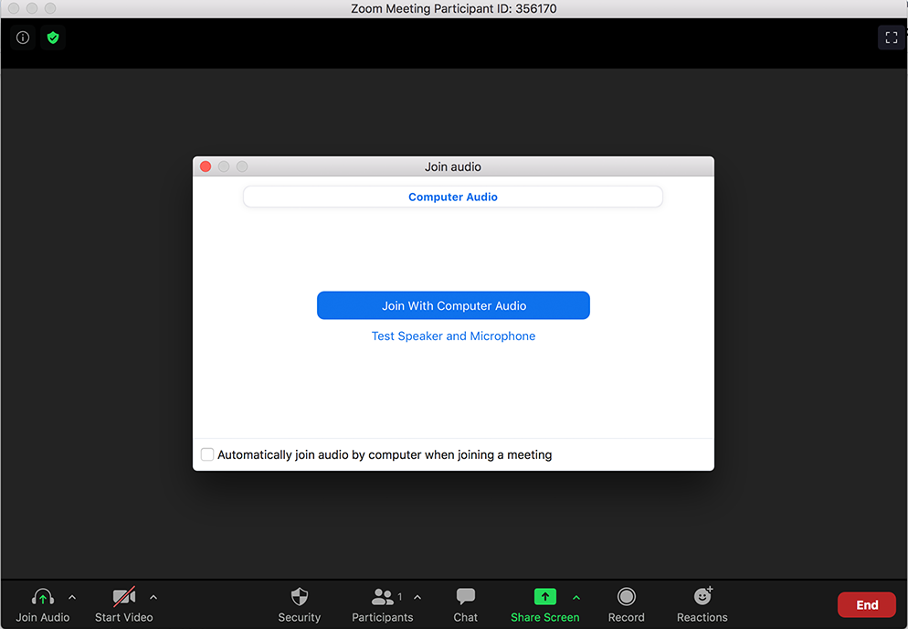
figure 3.1 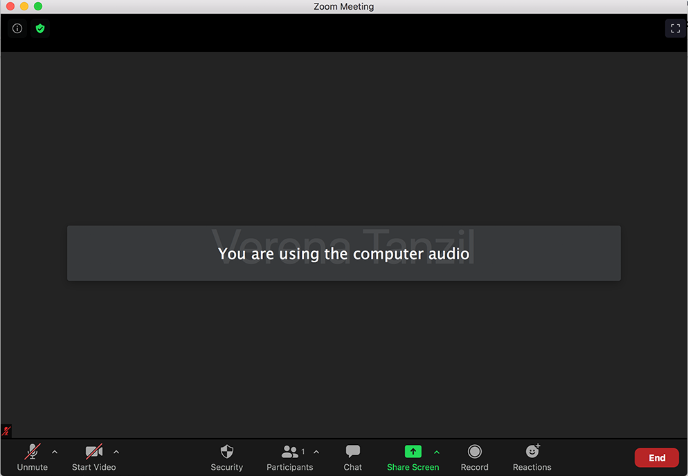
figure 3.2
When the user clicks the ‘New Meeting’ button, the user receives feedback to choose ‘Join with Computer Audio’ or ‘Test Speaker and Microphone’. By utilizing the concept of knowledge in the world, the process to join an audio meeting is relatively easy. After the user clicks on ‘Join with Computer Audio’, the user receives a reminder that they are using their computer audio which indicates good feedback.
Share Screen
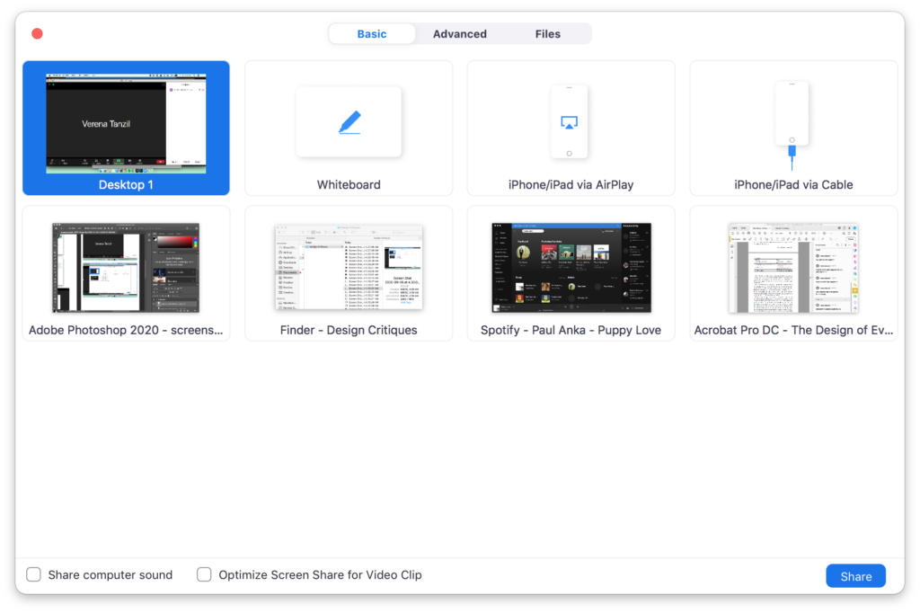
figure 4.1 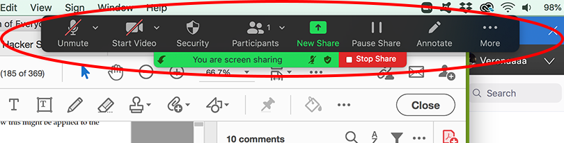
figure 4.2
The preview of the contents that can be shared on the screen acts as a signifier. By adding thumbnails to each shareable screen, the user can easily identify which screen they are willing to share. The user can click on the ‘share’ button to share the screen or double click on the selection, utilizing the concept of knowledge in the head. The user receives an alert on the top part of the screen and the navigation bar on the bottom moves to the top once they start sharing their screen as a part of feedback (figure 4.2).
End Meeting
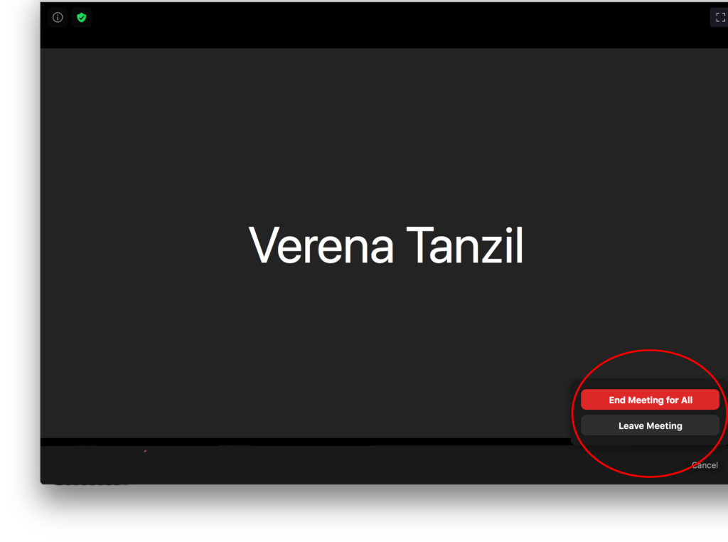
figure 5.1 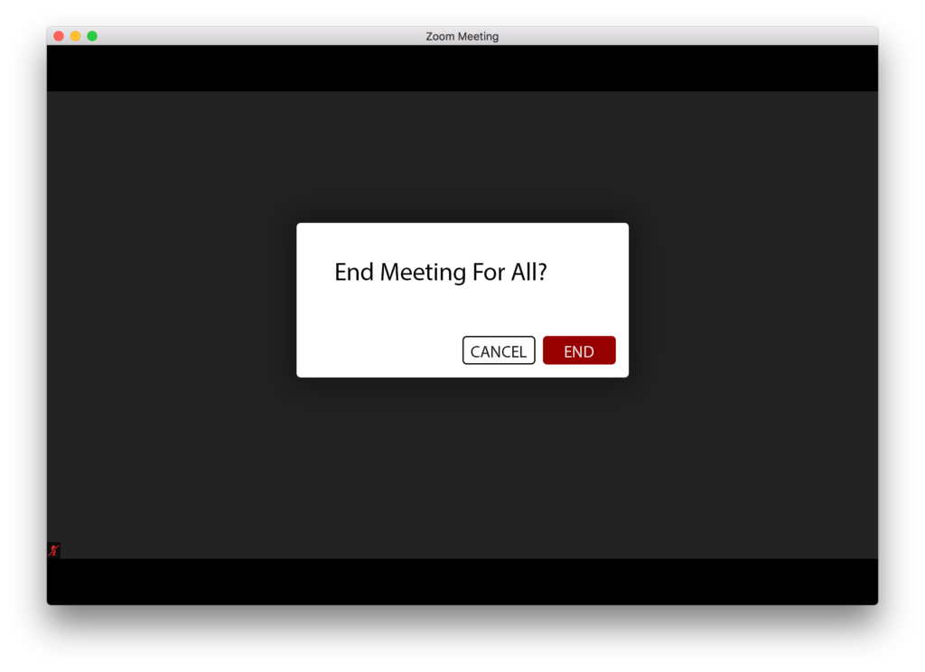
figure 5.2
To end the meeting, the user has to click on the ‘end’ button. The user will then receive two options to click: one is ‘End Meeting For All’ and the other one is ‘Leave Meeting’ (figure 5.1). The buttons work as signifiers. The ‘End Meeting For All’ button informs the user that clicking this button will completely close the meeting room, while the ‘Leave Meeting’ button informs the user that the meeting room will continue without the initial host. The problem arises when these two functions are treated in the same behavior. When the user clicks on either one of the buttons, the feedback that the user receives is the same; The meeting window closes and the user is directed to the homepage. It’s a good idea to give an alert when the ‘End Meeting for All’ button is clicked to prevent any major error from happening (figure 5.2)
Conclusion
Zoom has become a replacement for face-to-face interaction. The application is used widely across the business industry and for personal matters. Knowing this, it’s necessary for the user to know exactly what they are sharing and how to share it. Zoom does a really good job of helping the user to navigate the system by providing feedback and signifier. There are things that can be improved, such as error prevention and minor usability issues. However, it does not impact the experience of using Zoom in any major way.