
National Grid is one of the world’s largest investor-owned energy companies; they are committed to delivering electricity and gas safely, reliably, and efficiently to all their customers in the communities they serve. Their website states that they work closely with customers, partners, and communities to develop solutions to the problem we might face. However, their website does not look or translate this comforting message. I will use concepts from Don Norman’s book to explain three critical reasons I think National Grid’s website was badly designed. Norman tells us in his book “The Design of Everyday Things:” “That a good designed as the right signifiers and affordances,” a and that “Good design is a lot harder to notice than poor design, in part because good designs fit our needs so well that the design is invisible, serving us without drawing attention to itself. Bad design, on the other hand, screams out its inadequacies, making itself very noticeable.” For this design critique, I will highlight three elements that weigh this website down and give appropriate recommendations. Before I plunge into this design, it would be important to explain what to look for on a standard utility website. This list is not in a specific order; however, it is vital to know what to look for to provide the appropriate feedback:
The discoverability of the contents:
- Is it possible to figure out where to navigate for specific information on the website?
- Are the appropriate signifiers available and have the right placement?
- Does the website afford easy customer interaction? Etc.
The understanding:
- Are the written instructions precise enough, so users understand the next step to take?
The gulf of execution and evaluation
- The intentions of the users and what the system allows them to do or how well the system supports those actions
Some of Norman’s list of constraints
- Physical, logical, semantic constraints, etc. These constraints guide actions and eases interpretation between the user and the system.
We should also know that a good design requires good communication; a good design affords minimal or no thinking because it communicates the right signifiers.
Welcome Page.
Let us look at the ” Welcome Page.” This page is badly designed, although they are signifiers present. The page has too much information; it should be straightforward and afford its users to quickly login without being bombarded with too much-written information, see Fig1. However, Fig1a is my recommendation; It houses the characteristics of a good designed “Welcome Page.” It is welcoming and affords a quick understanding with clear direction and the right signifiers.
Fig1 Welcome Page.
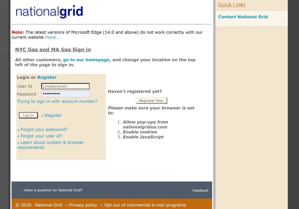
Fig1a Recommended Welcome Page.
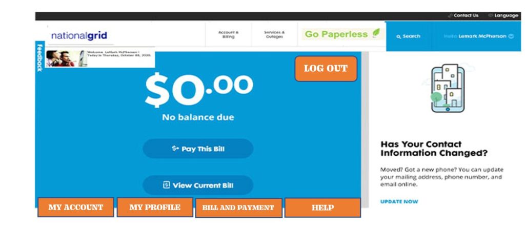
Home Page.
Another poor choice in the layout is the home Page. The navigation bar was not utilized; instead, the tabs that have the signifiers were situated in the middle of the home page, which is very unusual for a utility website. The home page is locking discoverability because it is impossible to figure out most of the signifiers and what actions are possible and where and how to perform them. For a utility billing and payment website, the billing and payment option should have taken president on the homepage because that is the web site’s primary objective. The other information on the website is merely for added knowledge, which may benefit the user. Because of the informationally crammed website page, it is deemed has a bad designed. Fig2 shows the badly designed web page. However, using Don Norman’s technique, I have created a recommended page. This page has a high visceral Level, which affords the user to see their billed amount quickly. It gives them immediate payment options because of its clear signifiers that satisfy functional discoverability. Functional discoverability allows users to know what action to be taken by a glance. See Fig2a for the recommended page layout.
Fig2 Home Page.
Fig2a Recommended Home Page.
Help Page.
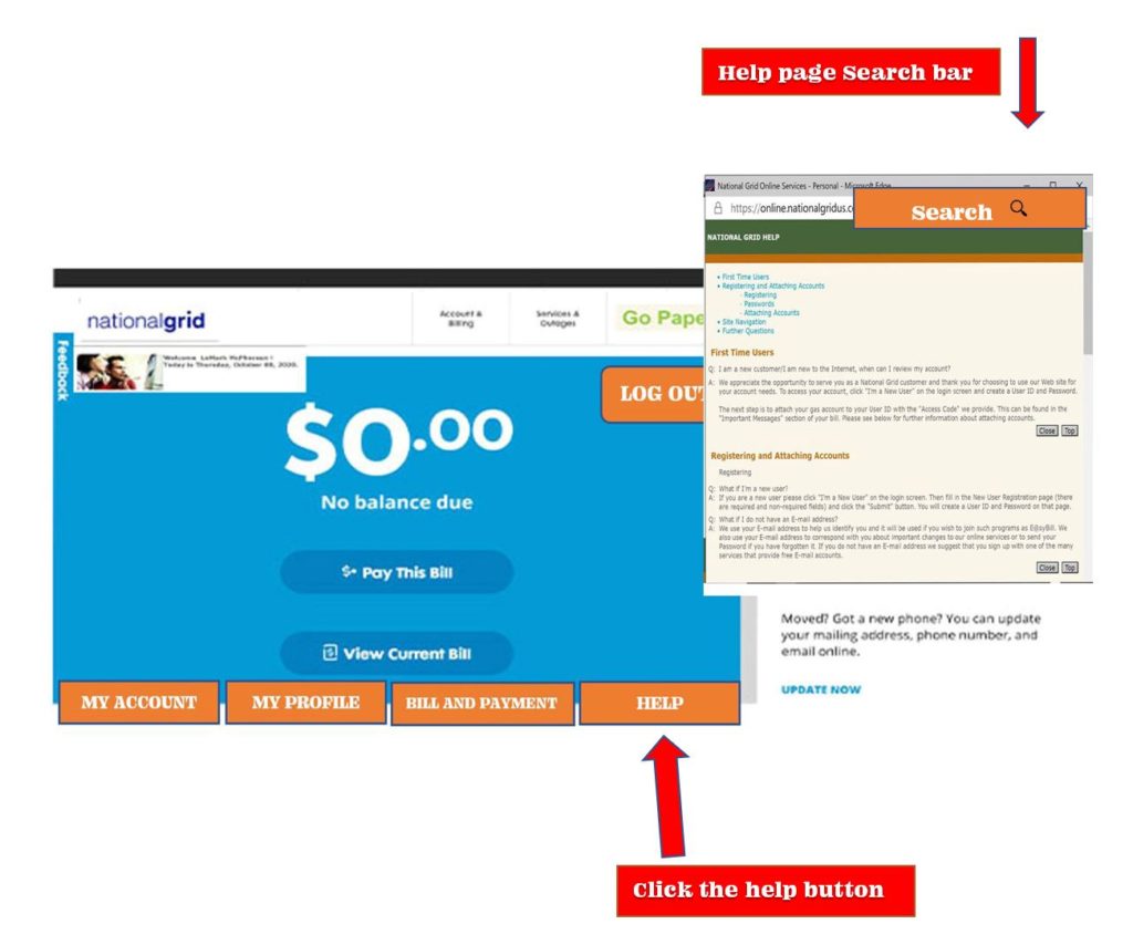
Companies should regard every user who comes to their websites to review their bills or make a payment; the website should provide enough instruction and guidelines for them to complete their tasks and get familiar with the site if they are new to the website. As a standard practice, the website has to help its users, but in different ways. The type of website will determine the kind of help system it provides. The effectiveness of a help system has a direct relationship to the quality of the site’s design. This website help page is poorly designed. The help signifier is located in the upper left corner of the website with regular PT 8 font; this is not discoverable, especially if you are a new user. I also notice that once you clicked on the word “Help,” it opens a new window that forces the user to look through the help document titles to find a solution for their issue. With the knowledge I have garnered from reading Norman’s book, ” The design of everyday things,” his design concepts help me make my recommendations: I Changed and relocated the help signifier to a much easier discoverable area on the website as I did. I placed the help signifier exactly beside the bill and payment tab at the bottom in the website’s footer. I also added a search bar on the help page’s top right, which is the standard I have seen for most websites. The search bar will help the user to find a solution if one is available quickly.See Fig 3 for original layout and Fig3a for the recommendation.
Fig3 Help Page.
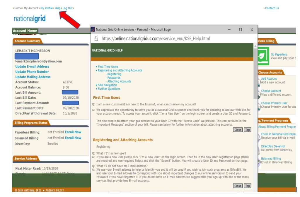
Fig3a Recommended Help Page.
Conclusion.
Using Don Norman’s concepts from his book ” The design of everyday things.” I vehemently believe that the recommendations afford an excellent customer experience because of its easy, user-friendly layout. A layout that is highly influenced by Norman’s concepts, like having the right signifiers, discoverability, understanding, and the thought process of how I will construct the recommended layout that will combat against some of Norman constraints listed in the book, and the use of his “the gulf of execution and evaluation” concept to figure out how I will lay my recommendations out. When all is said and done, the recommended layout will enhance National Grid’s user experience.
Source:
- Don Norman’s book “The Design of Everyday Things.”