Get Canopy
For many New York City dwellers, winter is marked by the notably hot, dry air emanating from their apartment radiator, sparking a renewed online search for a humidifier that is effective, easy to use, and hygienic.
Canopy, a new humidifier designed specifically to eliminate the mold that commonly grows in humidifier tanks, is exclusively available on its website: https://getcanopy.co/
Serving as both its main source of brand marketing and its exclusive retailer, the Canopy website’s visual interface is intentionally designed to clearly the most important information to a consumer and drive the consumer’s behavior to: Shop Canopy.
Applying Cooper’s principles of design, I will explore how Canopy’s web interface works to meet both user and business goals.
STRUCTURE & HIERARCHY
As Cooper notes in his design principles, a well-designed interface should answer following two answers in navigating a site:
- What’s important?
- What’s related?
Canopy answers both of these questions for users through the consistent application of visual properties to group site elements and create visual structure and flow.
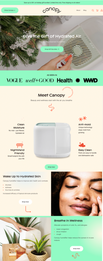
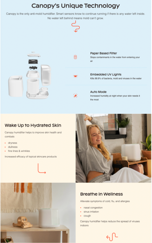
First, Canopy structures its content on a grid, creating horizontal blocks of content and organizing its information from most important to least important, top to bottom. Contrast and hue are used to delineate breaks in content, with alternating colors segmenting the time-sensitive special offer in neon green from the top navigation and product feature set against a more neutral background.
In total, Canopy applies three colors consistently across their website pages to break up the content and guide a user’s experience. As they scroll, a user is easily able recolonize the transition from machine specifications, market comparisons, to the health and wellness benefits (Figure 1).
COMMUNICATING INFORMATION
To communicate information about the product, Canopy’s website interface incorporates typography, icons, and contextually appropriate imagery to highlight the information most important to their user experience personas.
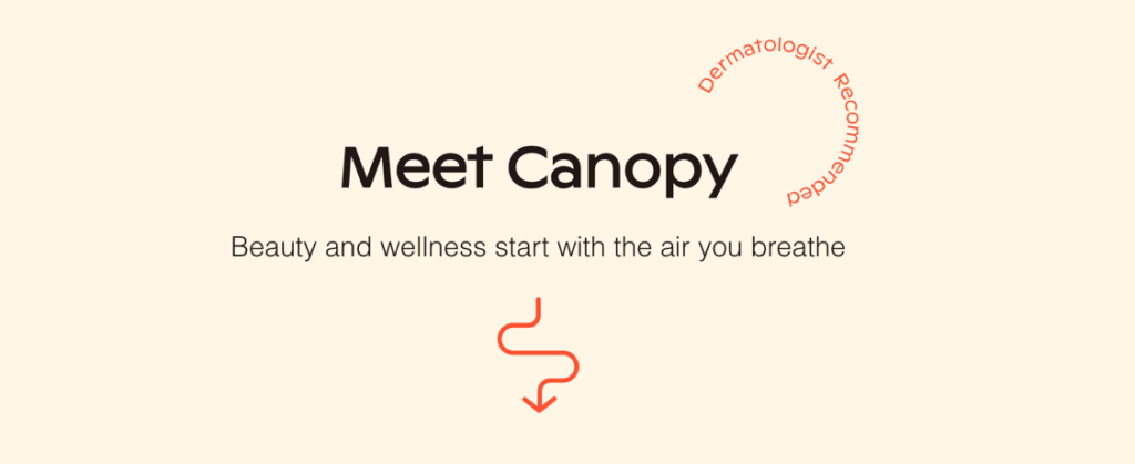
While some icons images focus on the specifications and technology of the machine, others communicate the health, wellness, and skin benefits. Intermixed, are icons and squiggle lines in a contrasting but consistently applied red hue which creates visual rhythm across the sections and guide a user scanning the page for the most important information from section to section (Figure 2).
Furthermore, by skillfully employing images and icons, Canopy successfully limits the amount of text required to communicate to its user personas while visual clutter.
COMMUNICATING USER BEHAVIOR
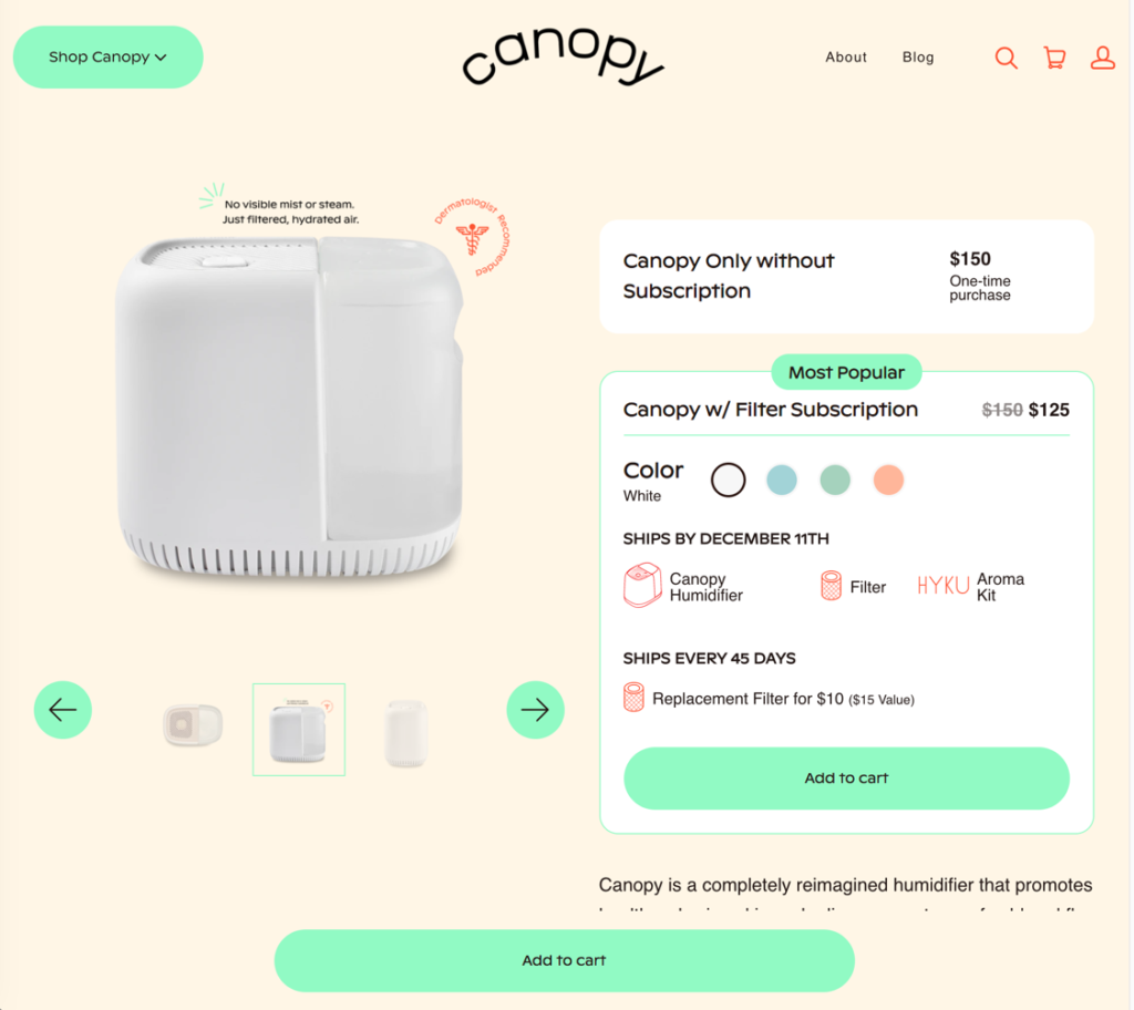
Next, Canopy’s website interface applies the visual property of shape, hue, and value to communicate user behaviors across the website. Much like the bright red utilized to direct a user’s eyes to features and benefits for the product, the bright neon green rounded oval is consistently applied across the site as a call for the user to take action to “shop Canopy,” “Add to Cart,” or click through the product details.
Through consistent application, a user is able to predict the website’s behavior, leveraging the understanding of a bright green button. Finally, by positioning a bright green button that stays with a user as they explore the page, the action to ‘Shop’ or ‘Add a Cart’ is always visible and easily accessible ensuring the action is always available wherever in the research process a user is converted (Figure 3).
BUILDING BRAND VALUE
As Cooper notes, brand value is the sum of all interactions people have with a given company. Therefore, it is not surprising that Canopy has designed an interface that is both attractive, clear, and easy to navigate. By enabling the research and purchasing process to be both easy and aesthetically pleasing, users are inclined to extend the judgement of the web interface to the product itself. For a product exclusively marketed and sold online, a well-designed interface is essential to building brand value.
Through attractive and simple interface design, Canopy’s website effectively meets the user’s goals and ultimately the business goals.