Why Humanscale?
Through the pandemic, I succumbed to the realization that having a chair that facilitated good poster was going to be essential to work from home effectively. I’m a full-time student, but I also work full-time at the moment. I’m sitting to work on projects, listen to class lectures, do homework. It’s a lot of sitting. With the increase of time spent sitting, it was taking a toll on my back. So, I began searching for an office chair to give me the appropriate lumbar support that my back desperately craved. After reading through a few articles, and going to a “healthy back” store to test out a few chairs (including the well-marketed “X-Chair”), I discovered the brand Humanscale. I’ll be critiquing Humanscale’s website, which helped me assess and decide on all of the features I wanted to create the ultimate custom office chair of my dreams.
Who is Humanscale?
Humanscale is a leading design and manufacturing company of ergonomic products. The mission of their company is to create products that improve the health and comfort of people at work. They successfully have done both for me since receiving my chair this past week! But enough about me and my chair, onward to the critic.
Grouped elements and Hierarchy
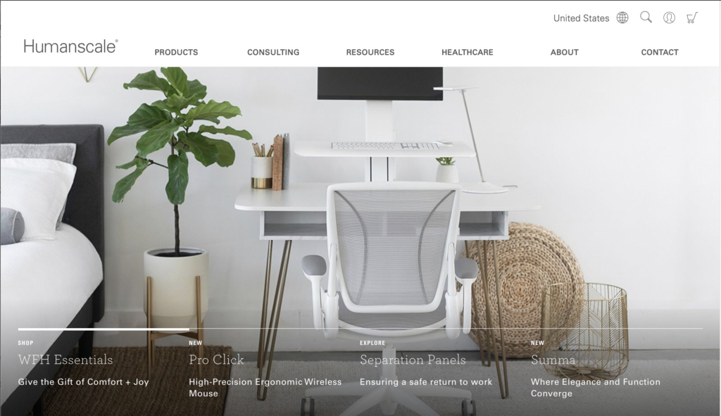
Per Cooper’s principles of great Visual Interaction Design, a good website must employ “visual properties to group elements and create a clear hierarchy”. The groupings are clearly indicated at the top of the page with a high contrast of black and white above the graphical images beneath to distinguish separation (See Figure 1). I found topics for their headings a bit confusing. The “Consulting” grouping, for example, dealt with topics in ergonomics education and consulting services, where as the “Resources” grouping was specific to design tools or toolkits. With those topics being so inter-related, they could have been grouped together. Otherwise, the hierarchy is clearly identifiable at the top of the page shown in Figure 1.
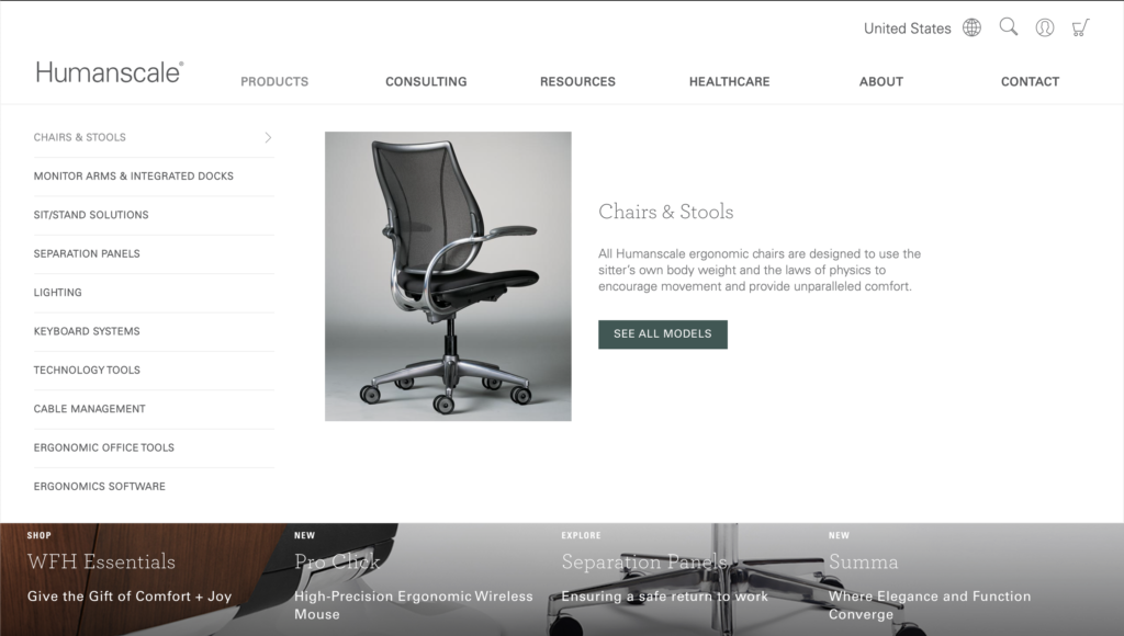
Once clicking on a header, the website clearly indicates the subcategories and the highlighted subcategory with:
- A different color value along with an indicator “carrot” on the button
- A helpful visual and text description
- An guided action button to explore more into the category
These elements helped me understand what was selected and where to click to find out more information. I would have liked to see a stronger contrast between the subcategory and the highlighted category as the thinner text vs. bolding made it harder to read without the helpful description on the right. Similarly, when the headers go from black to grey when highlighting over each topic, there was not a very clear distinction of which one you are hovering over. But overall, there is contrast between the header topics and the section of the page beneath.
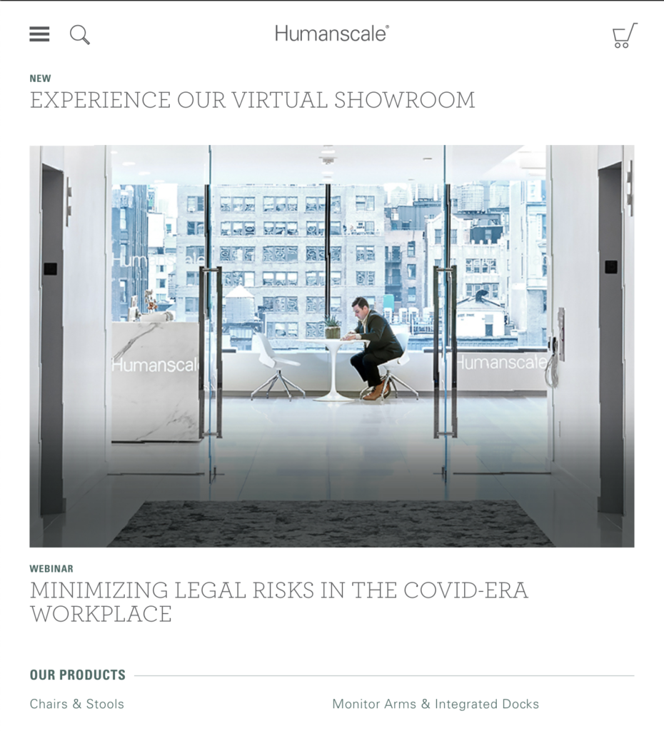
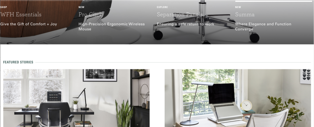
Another grouping is found at the bottom of the “above the fold” section (See Figure 2), which points users to sections that range from a broad to more focused options. This can be helpful for a Know-Item seeker vs. a more exploratory seeker. In both instances, they make good spatial grouping decisions to make it easy for the user to identify where to click to get to the topic of interest. However it may have been more helpful if there was a box around each grouping when the solid bar was above the given group, to isolate the topic more fully.
Visual Structure and Flow
In addition to the aligned labels used for the subcategory selection for the hierarchy, the page has a good alignment across groups and control plans from a modular perspective (See Figure 3).
New Features 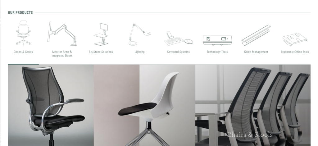
Products 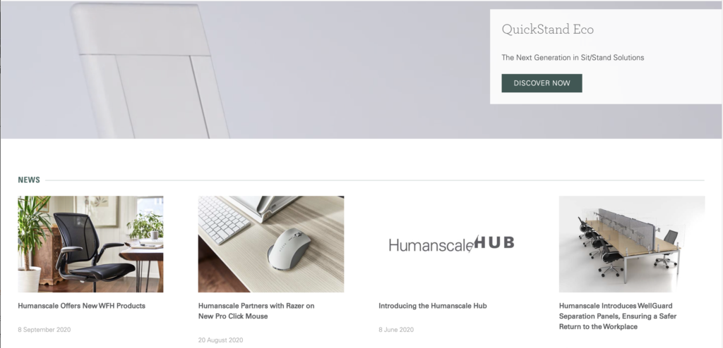
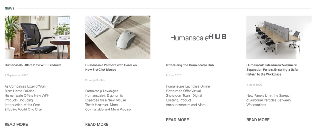
News 
Team Members 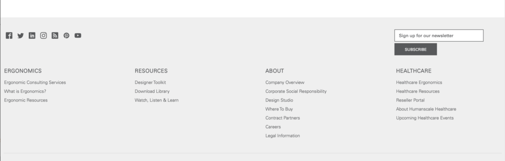
Footer
While the spacing differs in each section (See Figure 3), the content is very responsive, as the size of the screen narrows (See Figure 4). The page also makes efficient use of space as the controls for headers become embedded within the “hamburger” icon when the page narrows.
The content is segmented well throughout the homepage, making it easy for a new-comer to navigate understand what Humanscale is and what they offer. With helpful headings, lines, and color changes to indicate different sections on the page (See Figure 3), the user can read through the page without feeling overwhelmed. This is further augmented by the balanced use of color. However, the varied grid makes the spacing of text appear odd at certain points, where I’d would have preferred to see a more symmetrical use of space used (See Figure 5 and Figure 6).
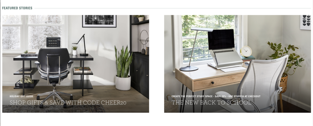
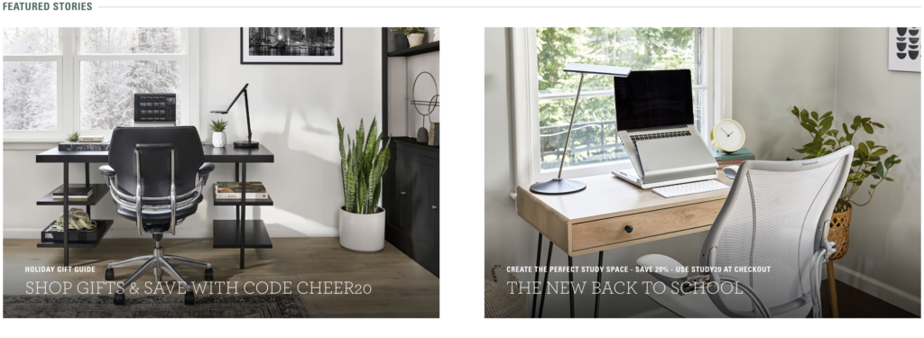
Additionally, they make good use of visuals throughout the page to convey their text for additional context by topic area (See Figure 7).
Cohesive, Consistent, and Contextually Appropriate use of Imagery
There are not many icons used, apart from the quick action-related ones at the top of the page to indicate the shopping cart or search. There’s some used in the “Our Products” section of the homepage, which are very detailed, rather than following their more minimalistic branding. However, they do not differ greatly in color so it’s not too distracting. Additionally, they have descriptive text beneath to avoid confusion on the category of product (See Figure 8).
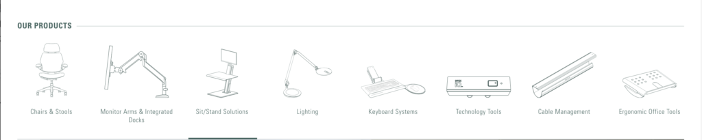
I wanted to bring up that I identified a bug in the above section, when hovering over each icon. The line at the bottom to indicate where you are, moves to the next icon before you move your cursor to the next icon (a bit frustrating to know if I’d go to the right place when I clicked on the icon).
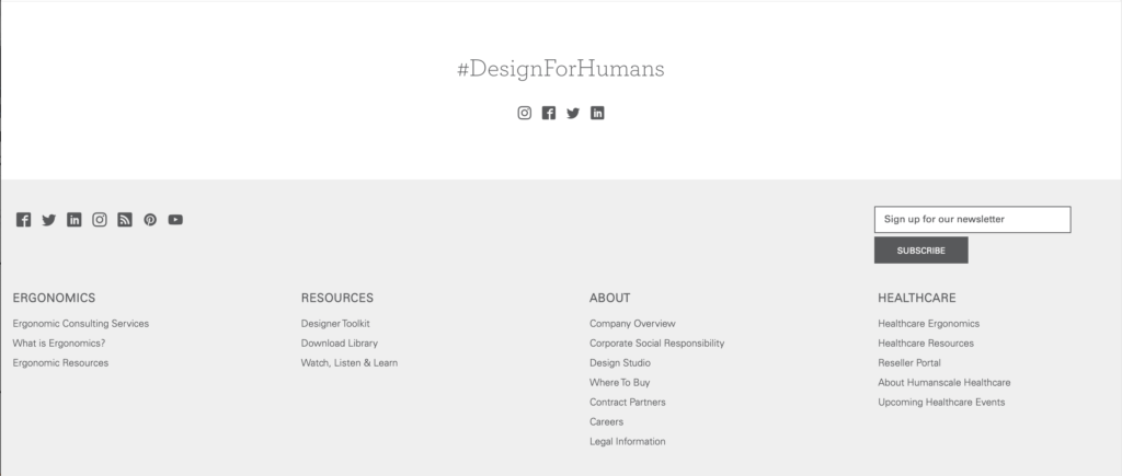
The only other section that uses functional icons is the page footer, so users can follow Humanscale on various social media channels (See Figure 9).
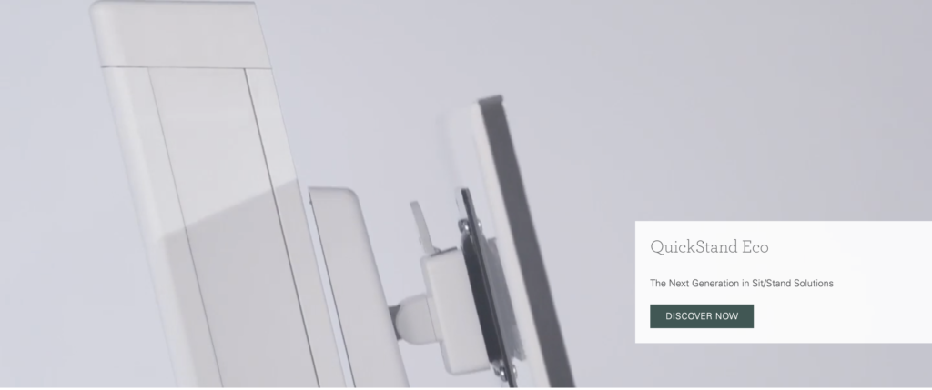
Icons aside, I particularly liked their use of visual elements to augment their text. For example, their enhanced video segment of the homepage in Figure 10, which is screenshot of a video for this blog. It shows how the “QuickStand” quickly elevates its height, which makes me want to click “Discover Now”.
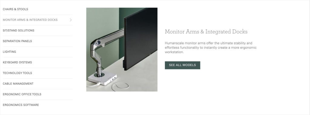
As mentioned in an earlier section, they also use visual elements to show what to expect when the user clicks into each product area as well (See Figure 11). This makes for a very clear journey to get to the product I am interested in exploring.
Style and Function, while Avoiding NoiSe, and Cluster
Through the minimal color palette and aesthetically pleasing images of their products, which zoom in a little when you hover, it conveys a very interactive website. As a whole, it aligns with their brand: clean, modern, and minimal, while at the same time, an inherent focus on user-centered design.
Conclusion
Humanscale has a very engaging website and like their amazing chairs, take modern aesthetics and comfort to a whole new level. Their website is very well structured, clean, minimal, and creates an excellent guided experience for multiple types of seekers: Know-Item, Exploratory, and Re-finding.