About
MUJI is a Japanese retail company which offers a wide variety of good quality items from stationery to household items and apparel around the world. MUJI’s brand idea is “no-logo” or “no-brand”, and it is also famous for its minimalist design philosophy.
The homepage of MUJI in the US is different from other regions’ websites. For the design critique, I focus mainly on homepage and online store page of MUJI.
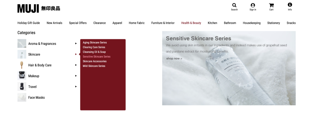
1. Online Store – Side Bar (Positive)
When hovering over the “Categories” side bar, it expands submenu that help users delve deep into different product series. The product series also changes color on hover. Both menus give user live feedback on every step of action. In e-commerce site with a huge amount of products, it’s essential to have clear navigation steps. According to Android Design Principles, “Break complex tasks into smaller steps that can be easily accomplished. Give feedback on actions, even if it’s just a subtle glow.”.
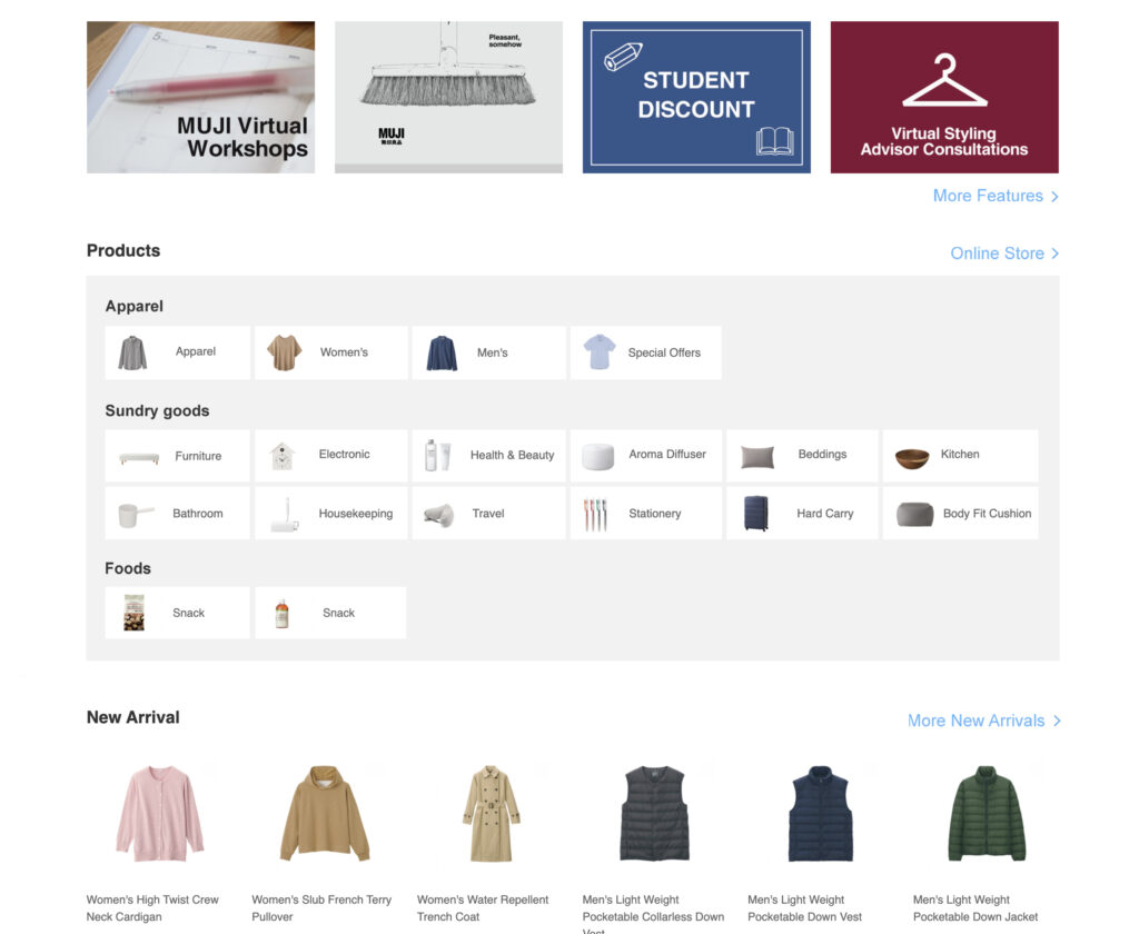
2. Homepage – Products Category (Negative)
Compared to other content on homepage, the pictures and texts of “Products” are very small. Although such size contrast is artistic from a design perspective, it’s difficult to attract people to click on it, influencing the visibility of products category. There are even some words jammed with pictures, which makes it not visible enough for users to recognize. Meanwhile, “More Features”, “Online Store” and “More New Arrivals” links, as the primary channels for conversion, are also not indicative enough for customers.
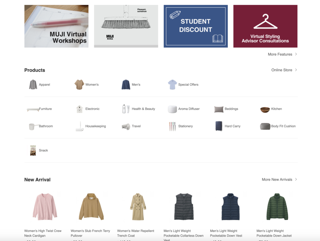
Suggestion:
In order to make the texts and pictures more identifiable,products can be divided to three types more clearly. The modularization of products can show product category directly, also these button-shaped modules make it easier for users to click. Meanwhile, the links “More Features”, “Online Store” and “More New Arrivals” can be more distinct.
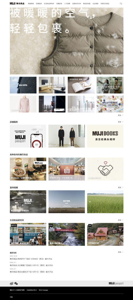
3. Homepage (Negative)
For homepage of brand, it’s beneficial to show the brand idea, promotion video and brand news. However, the homepage of MUJI hides most of its brand information in the little words of top navigation, which lacks discoverability of brand information and makes the design of homepage comparatively too plain. By comparison, the MUJI China official site contains more brand elements, which helps to build brand value.
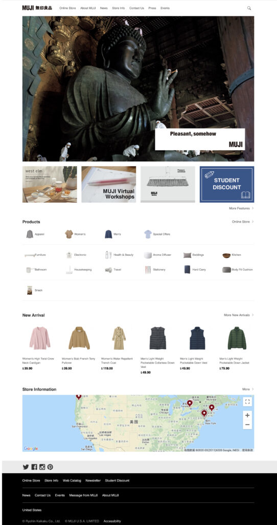
Suggestion:
Take MUJI China homepage as an example. It includes recommendations, store service, promotion videos and brand campaigns. By showing distinctive brand features and brand ideas modularly, it establishes the brand value diversely.
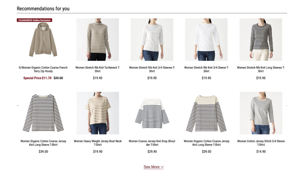
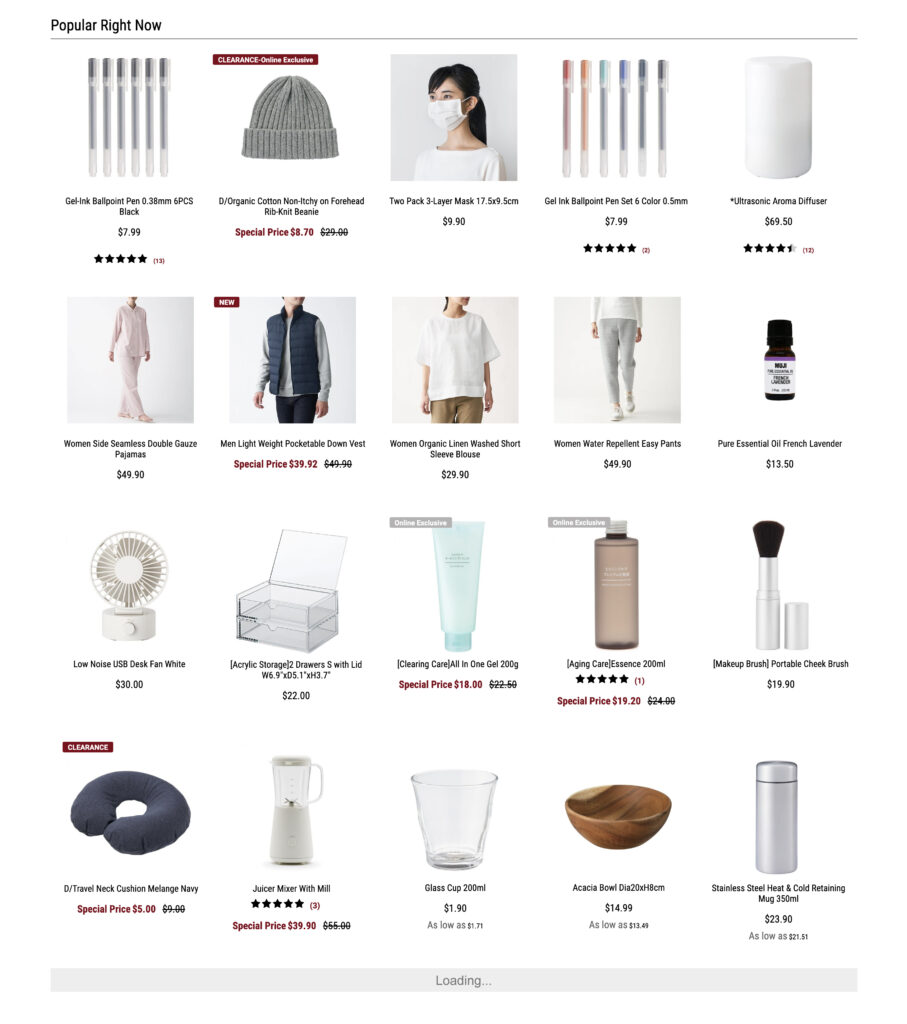
4. Online Store (Negative)
Online store page adopts static slider to show Recommendations for You and Popular Right Now products, so users need to click manually to view more items. Only five items in a row causes inefficiency of display and high operation cost of users. The essence of e-commerce website is still commodity platform, many customers browse the site like window shopping. This kind of action can be explained as the Conceptual Modal by Norman. Therefore, showing more recommendations directly can let users browse freely, also increase exposure of products.
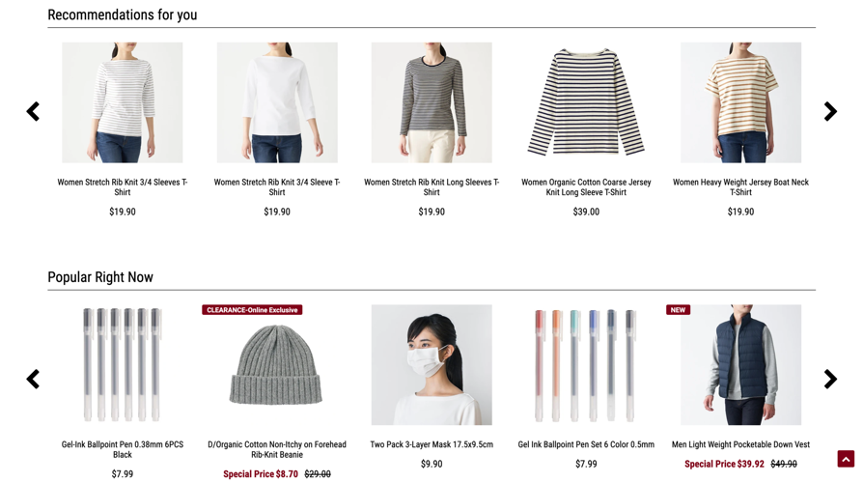
Suggestion:
Recommendations for You can be expanded to four rows. Show two rows by default, and unfold remaining two rows when click “See More”. Popular Right Now is the last part of main content which doesn’t influence the display of above content. So it can become products information flow, allowing users to browse at will and increasing the possibility of users to see more products. Therefore, it can display four rows by default and automatically load the following four rows when scroll down to the bottom. The maximum number of rows could be 24~32, which is 6 to 8 load times, so as to display more products and prevent users from losing patience because of unlimited information in the same time.