The New York Times is one of the biggest newspapers in the US. With its wide coverage of daily news on politics, business, tech, etc worldwide, I want to closely investigate the homepage on how its web experience is designed with heavy information needed to be presented referencing Cooper’s principle of design.
The Structure
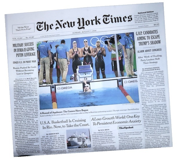
At a first glance, the main structure of the website is inherited and highly referencing to the style of the printed newspaper. This not only gives the reader a sense of familiarity transitioning from reading the paper version, but it also kept the system that has been working for them for a long time. It is a clever way to have consistent branding and not compromising the reading experience on the web.
Hierarchy
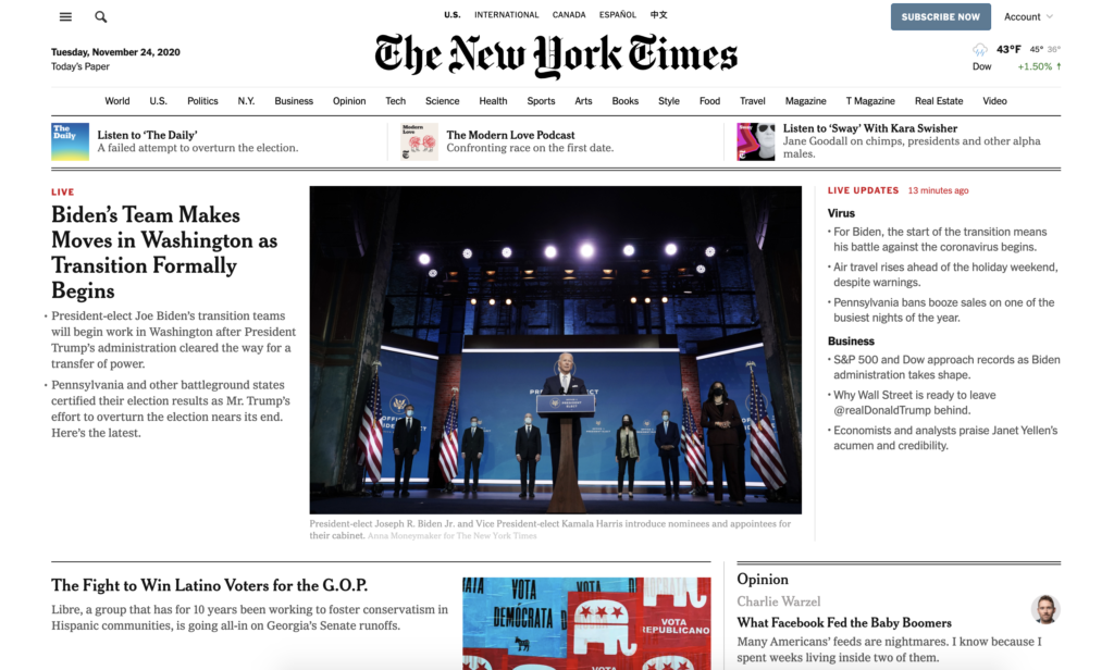
As Cooper stated, the most important element should be larger and greater in contrast. It is very clear that the first thing reader will see on the page is the name of the page. Then the reader will see the big hero image in the center, featuring the top news of the day. The title of the top news has the second-biggest font size so that the reader’s eyes will be directly attracted to it. Live news will also have a red text directly above to create even more contrast and hierarchy.
Grouping
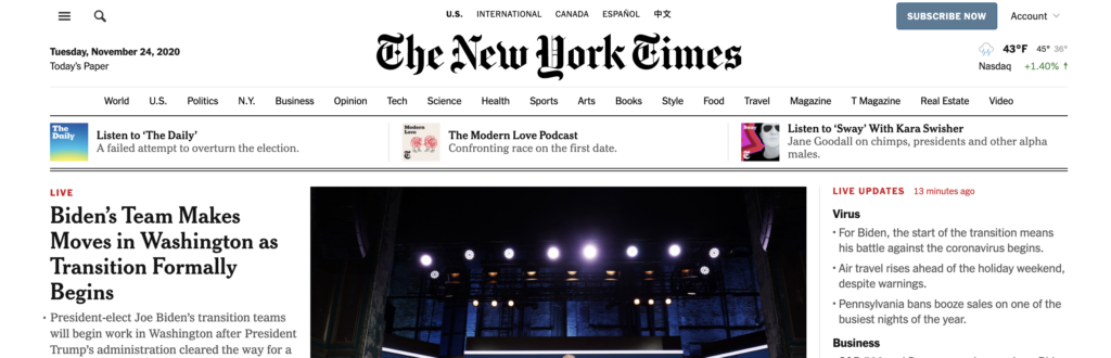
Because of the large number of topics that are included, NYT adopted the system of using double lines, single lines, and light grey lines to distinguish different sections.
- The double lines are used to separated big topics;
- the single lines are used to separate different news under the same topics;
- the light grey lines are used to feature different aspects within a single news story.
It also uses proximity to visually divide each section. The items that are closely related are closer together while the item that needs more hierarchy have more space around them therefore drawing more attention.
Grid System
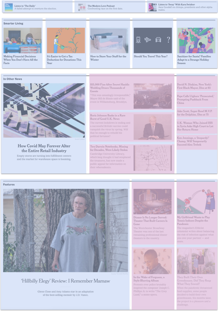
NYT website has adopted a 5-column grid system. The blocks can freely adjust from 1 column to 2 or 3 columns depending on the content and the hierarchy of the news. If a section of news needs more hierarchy or emphasis, the more space it will take up. Smaller thumbnails or headlines will take up only one column. Horizontally, the stories are divided by rows within one column.
It is also worth noting the order of tasks, or how the eyes scan the screen according to Cooper. Cooper said that a good logical flow is when the eye movements match the paths through the interface. I noticed that the bigger columns are always on the left while on the right side it is always the single columns. It is because when we read, we tend to look at the bigger space first, so by putting the bigger columns on the left, our eyes automatically go from the left to the right, making it a smoother reading experience.
Text
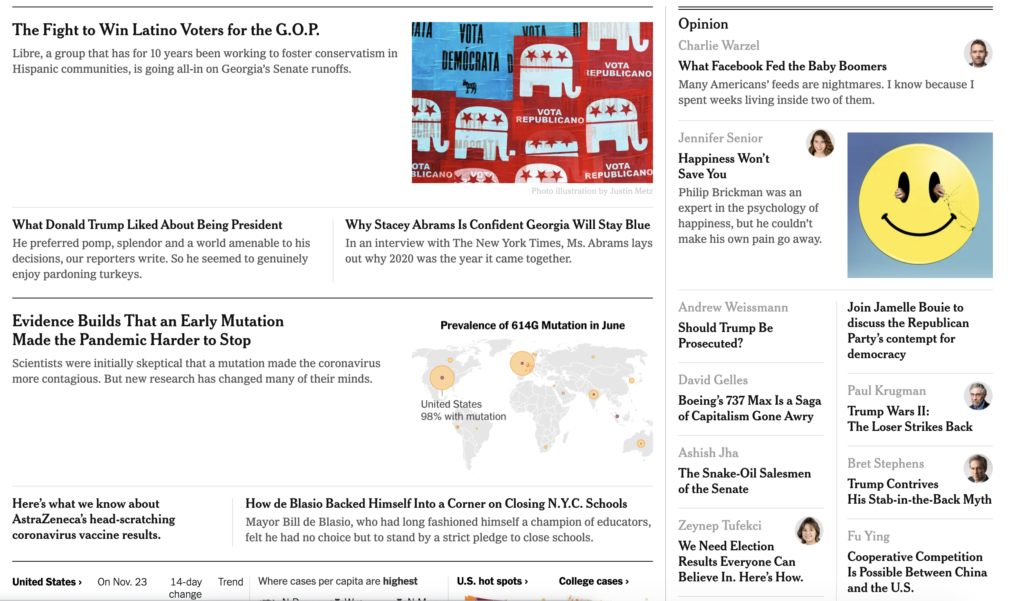
The texts on NYT are highly contrasted suggesting a strong hierarchy. The title of featured stories is in a bigger display text while the subtitle is in a smaller but bolder font. Any other texts that are less important are displayed in grey, such as the image credit and description of images. The headlines are always short phrases so it’s easier for the readers to have a quick grasp of the content, and if needed, there will be smaller descriptions underneath for more information.
Colors
All the colors on the page are from images. The text colors and line colors are all in black and grey which provides a basis for the images to pop and stand out. This is great because too many colors will distract the readers from the actual content and also making the page look very busy and loud.
Visually Displayed information
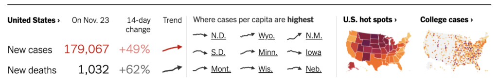
On the homepage, there is a section where NYT shows a small preview of the Covid-19 trend. It does a really good job of displaying both data and trends in such a small space. I like how there is both the percentage of change in 14-day as well as a graph of the trend. The red color also indicates the increase very directly. Small design decisions like this help readers grasp information very quickly and help them understand it instantly.
Overall, NYT did a really great job handling such a great amount of information with a clear structure and hierarchy. It is great to see familiarity with reading a paper version of a newspaper while also making it work as a responsive web. I found it easier to read on the web than the paper version because they’ve added a lot of small details to distinguish between blocks such as grey lines and texts. The structure of the grid makes it easier to transition from web to mobile. The reading experience is very formal, clean, and professional. The website is a great reference for someone who is looking for inspirations for structuring text-heavy content.