Overview
Summary:
Nike, Inc. is an American multinational corporation that is engaged in the design, development, manufacturing, and worldwide marketing and sales of footwear, apparel, equipment, accessories, and services. It is the world’s largest supplier of athletic shoes and apparel and a major manufacturer of sports equipment (wiki). Nike.com is the official website of Nike.Inc. We choose Nike.com as our research target because it is a commonly used online shopping website, which has representative significance for understanding the users’ online shopping process and getting users’ feedback.
We conducted the usability test by using Tobii Eye-tracking software to identify the usability issues of Nike.com. The analysis of the test resulted in three key recommendations:
- Move the filter from the left to the top above the average fold point and hide some filters that are not commonly used.
- Change the selection mode to a new type that allows the users to choose as many filters and when they submit the form, the webpage only refreshes once.
- Add a quick view function that offers the available color and size to the user.
Problems:
- Does the filter satisfy the users’ online shopping habits?
- What are the most and least commonly used filters?
- Does the product preview provide sufficient information for the user?
Goals:
- Understand the online shopping patterns of users.
- Analyze the usability test result and give recommendations for improvement.
Team Members: Xi Chen, Umang Arora, Nora Gordon, Hriti Prashant Shah
My Role: UX Researcher & UI Designer
My Contribution:
- Conducting the eye-tracking test and getting the pre and post questionnaires ready.
- Reviewing all the video recordings and keeping notes.
- Choosing the proper webpage that all participants have interacted with to limit the controllable variables to the minimum range.
- Sharing the notes and giving the recommendations.
- Redesigning the filter.
Timeline:
10/28 Make the appointment with the participants
11/2 Conduct the eye-tracking usability test
11/10 Collect and analyze the data
11/15 Collaborate to give recommendations
Mentor: Elena Villaespesa
Process:
- Learning how to use the software: get familiar with the settings in advance to make sure the whole process is smooth enough to obtain the most authentic and reliable user data.
- Knowing the technology: learn the principles and limitations of Tobii can help us understand which problems must be solved before any tests.
- Making appointments with the participants: check the date with the participants in advance and make sure they will show up.
- Preparing the proper tasks for the participants to complete: knowing the participants are young graduate students with abundant shopping online experience.
- Staying in touch with group members: attending the meetings regularly to share ideas, give suggestions to keep the project on the right track.
- Conducting the test: calibrating the software, asking the participants to sign the consent form, and complete the pre and post questionnaires.
- Analyzing the findings: collecting the pre and post questionnaires results, reviewing the video recordings, making the problem list, using different metrics to analyze the test result. Getting a clear understanding of the users’ basic online shopping habits.
- Giving recommendations: sharing notes and thoughts, combining the participants’ behaviors, and quotes to give reasonable suggestions to improve the usability of the website.
- Redesigning the webpage: collaborating on Figma and making changes based on the research for the webpage.
Research
Task:
Each participant was asked to explore the webpage for 15 minutes with a specific task and was then asked questions about his/her experience.
Scenario: You are a size Medium (US6). Find three pairs of women’s athletic pants under $100 for three activities:
1. Yoga
2. Running
3. Casual errands
Pre and post Questionnaires

Quotes:
“I like to scroll around … feels a little aimless so I’ll go to this (size filter).”
“I don’t want another pair of black pants so I’ll select orange.”
“I guess I’ll do it one at a time?”
“Oops! I forgot about the size.” “ID Lux leggings… what’s that?”
“I like to view products on sale first.”
General Findings:
- The participants don’t like to look at the filters below the average fold point.
- The participants feel confused about some unusual filters.
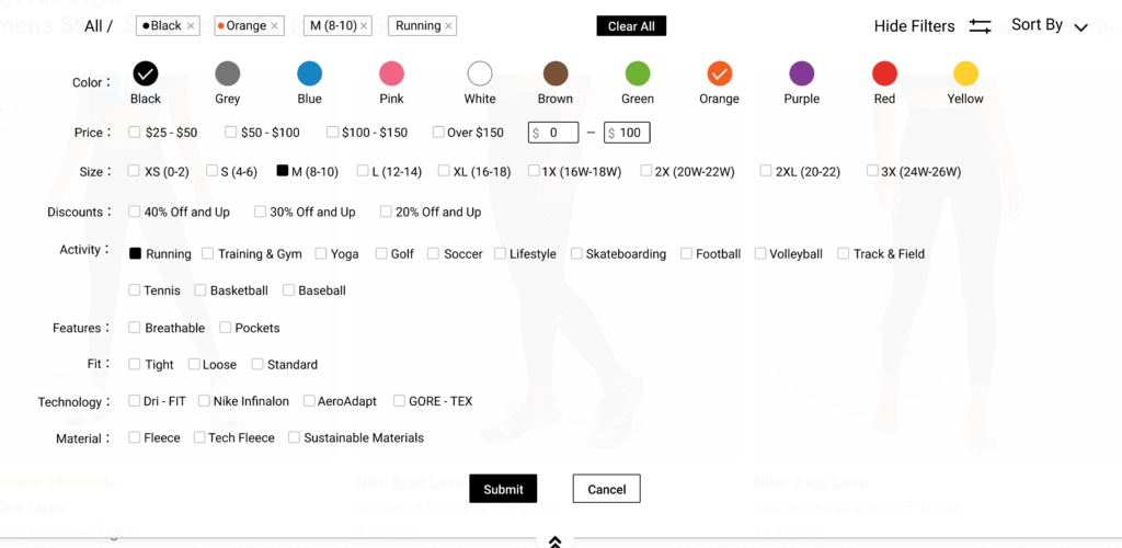
- The participants prefer to use the “size”, “color”, and “price” filters to find specific products.
Analysis
Finding #1
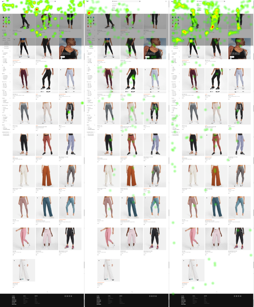
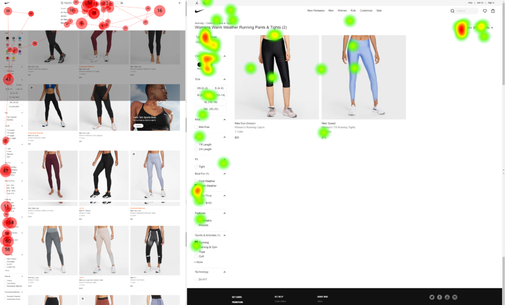
From the heat map, we see that all of the participants focus on the area above the average fold point, and from the gaze plot we find if they have specific goals, for example, choosing the running pants that are under 100 dollars, they tend to use the filters on the left side to filter out the result, otherwise, they will not even look at the filters below.
Finding #2
After each click on the filter, the page will be reloaded. The participants cannot select what they want at one time, they need to keep scrolling down to add another filter. Besides, there is no direct feedback after each click, for example, highlighting the choices that they made.
Finding#3

After the participants click the product they like, they are redirected to the product page. However, they find either the color or the size is not available for them, and there is no clear indicator to tell them if the product is out of stock before they jump to the product page. They have to go back and filter out the products that are unavailable to them.
Recommendation#1

From the pre and post questionnaires and the behaviors when the participants were using the filters that we observed, we select out the most useful filters that the users prefer to use when they choose the products and move the filter all the way up to the top. We decide to hide some unusual filters that the users think are not very useful, and if the users want to use these filters, they can click the down arrow to see all the filters.
Recommendation#2
We change the selection mode based on what we observed. We keep the checkbox design but the checkbox should allow the users to choose as many filters as they want at one time to get the best-match results easier and faster. After the users submit the selections that they make, the webpage will be refreshed only once which saves the request times of obtaining data from the back end. It can not only offer a better user experience but also reduce the pressure of the server for each session.
Recommendation#3

Adding a quick view function that offers the most useful information, for example, the color and size to the users before they jump to the product page. Thus, they do not need to jump to the product page to see if the specific size or color of the product is available for them.
Conclusion:
Nike.com has a clean and easy to understand website layout. Compared to some other online shopping websites, Nike.com has a well-organized navigation system and the participants are very familiar with the website, they like to look at things on the website. Besides, the checkout process is clear and easy to use for the participants. The website allows the participants to see all the products on one page without pagination is also a good user experience. As the world’s largest supplier of athletic shoes and apparel and a major manufacturer of sports equipment, the company does a great job in the retail industry. It will be even more successful if the designers who work for the website can make some improvements and offer better online shopping user experiences.
Takeaways:
- Being familiar with usability test and being prepared for any kind of obstacle is very critical. We prepared very well before the test, however, there is still something we can not predict. Some of the product links cannot be opened correctly during the test, we asked the participant to talk us through the process that she will do to finish the task. I think it was a way to make up, but if we had the chance to do a pilot testing before the real test, it would help us to solve these problems in advance.
- The usability test is an excellent way to get feedback from the participants, thus quality is essential to get an accurate analysis result. However, quantity is also a vital factor that will affect the result. Three participants, in this case, is a relatively small sample to the online shopping group. It may not represent the majority of the users. We should recruit more participants to take the test to get more precise results.
Appendix:
Pre-test questionnaire, Post-test questionnaire, and Script.