At present, Chinese e-commerce companies attach great importance to offline retail, because online traffic is approaching saturation, and offline retail still has great potential. In the next few years, Tencent will invest many resources in “smart retail”, trying to bridge the gap between online and offline. Meiriyouxian is an O2O e-commerce platform supported by Tencent.
This platform mainly provides fresh foods or daily necessities. It covers all categories related to everyday life, such as fruits and vegetables, seafood, meat and poultry, milk snacks, etc. Meiriyouxian establishes an extremely fast cold chain logistics system of “urban sorting center+community distribution center” in major cities every day to provide users with an extremely fast delivery service of “two-hour door-to-door delivery” of fresh products around the world. In this article, I will mainly talk about the emotional design of the “Meiriiyouxian” homepage.
1. The design of the intuitive level
The basic principle of intuitive design comes from human instinct. The main physical characteristics of this level are that vision, hearing, touch, and so on. Most people want an item at first sight, and they often instinctively choose something that looks good, or the top.
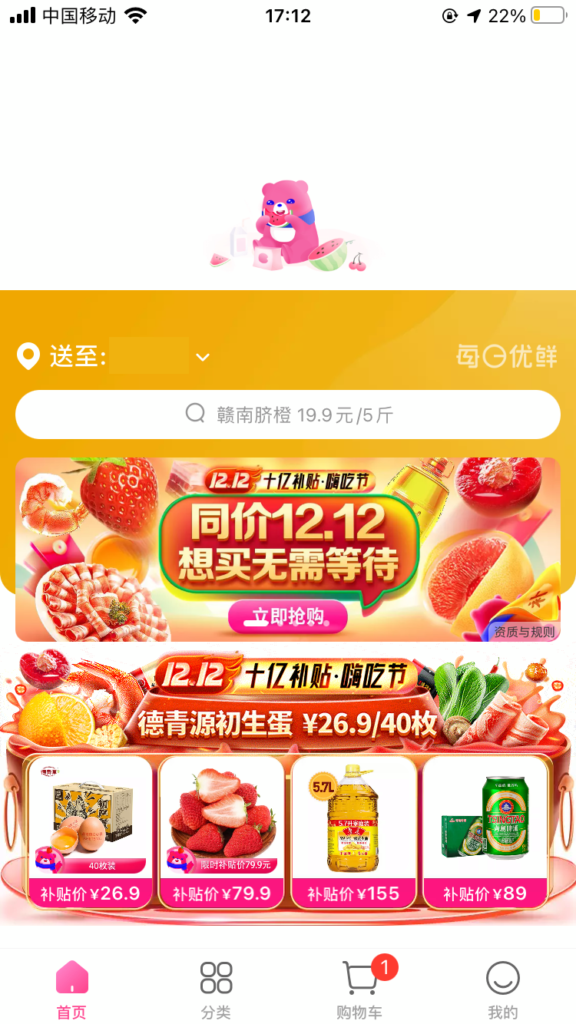
Open the home page of the product, which is very rich in content. What appeals to me the most is the middle position of the discounted merchandise display. The border of this section is designed with daily common commodities. This design can highlight the characteristics of the brand different from other e-commerce platforms and show the recommended products to users more intuitively.
2. The design of behavior level
The behavioral design focuses on practicality, useful functionality, easy to understand, easy to operate, and physical feeling. User-centered is the core of the design.
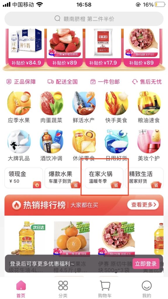
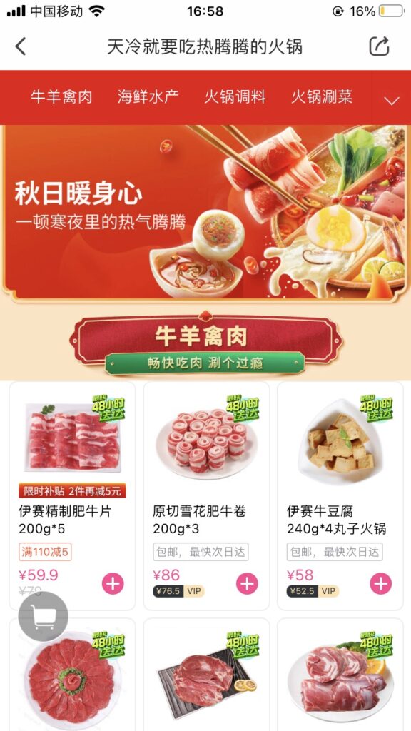
In addition to merely displaying product types and promotion information, the product also considers the possible usage scenarios. Chinese people like to have a hot pot with their families in winter. Sometimes they ignore some materials, such as spices, when choosing commissions on different pages. Click the “Hot Pot at Home” button, and the users can see that the relevant ingredients, seasonings, and equipment are all arranged together. It is very convenient for users. They can purchase all the materials needed to complete the task of “eating hot pot” on one page without jumping to different categories to choose.
3. Design of reflective level
When users use products, rational thinking will often make users evaluate the products. This level involves culture, education, personal experience, etc. One person feels good, but another person may find it annoying. Everyone feels different about themselves.
When I refreshed the page, I noticed that this product designed the loading bar as a personified product image. For a limited-time commodity, it is a typical behavior to refresh the description page anxiously. By replacing the loaded icon with an anthropomorphic dynamic effect, it can alleviate the negative emotions of users and deepen the familiarity of users with brands.