What does Notion do?
Notion is an application that provides various components such as notes, tasks, databases, billboards, wikis, calendars, and reminders. Users can create their own systems for information management by customizing these components based on their needs. These components can be used independently or collaborate with others across the platform.
In this article, according to Jesse James garret’s five elements of UX, I will analyze how the notion helps users create their information systems and form file management from five levels.
Strategy
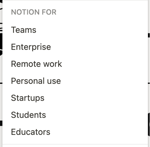
Notion aimed to serve people with needs of manage multiple types of documents and coordinate with a team. Notion select multiple mental models as their potential user groups.
Scope
- Usage scenario: In order to store and manage files in work, it is often necessary to open multiple applications. Switching from different software to review information greatly reduces work efficiency.
- Key task (how to solve users’ needs): notion solves this problem with its all in one principle and improves people’s work efficiency.
Structure
Important strategies
All files are based on block, and users have multiple choices to define block. Different kinds of info systems can be built by organizing and relating blocks.
Skeleton
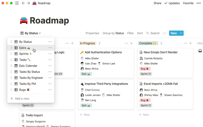
Pre-built Template
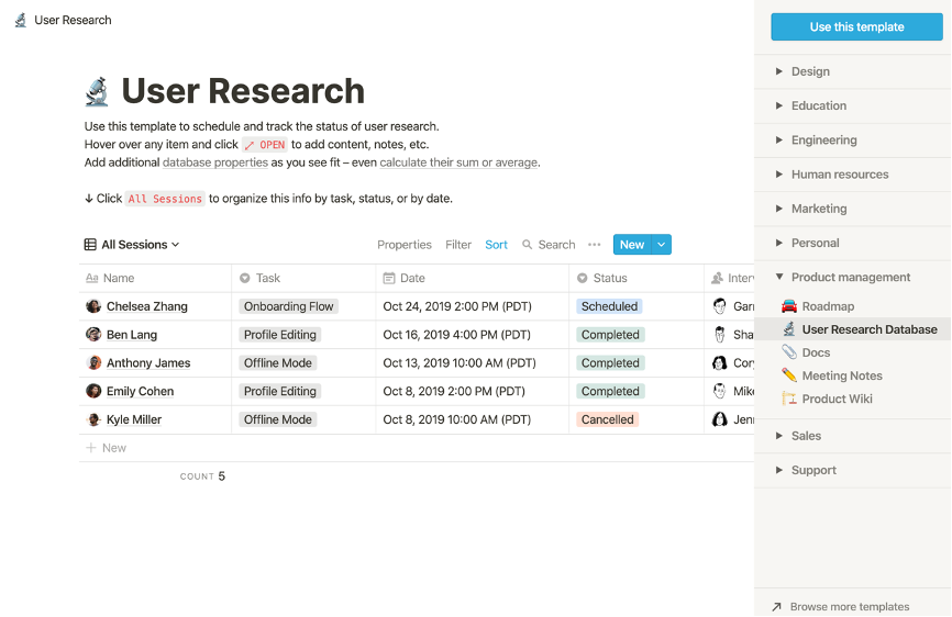
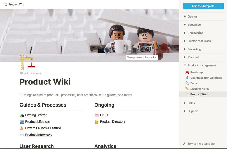
First, designers design different types of templates for users to systematically manage pages or databases. These templates are constructed based on the professional backgrounds and related usage scenarios of users. Taking product management as an example, the team has five different templates. The whole team can use the user research database to check the interview progress and follow-up review. Product wiki can help the team to build a document system and classify files of different types and uses.
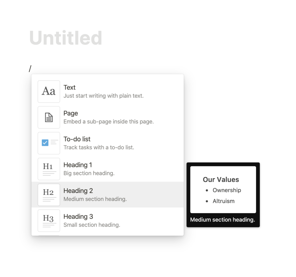
Rich Types of Blocks
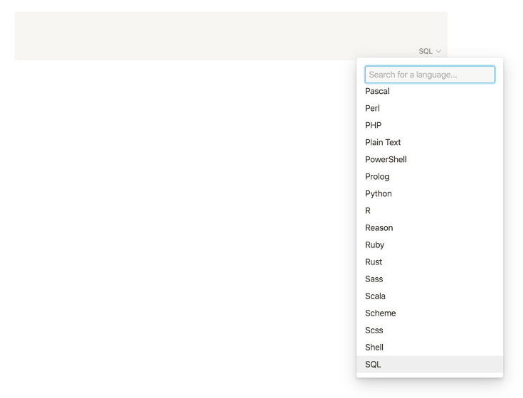
It is not uncommon to use markdown as a way of typing on digital devices. Although Evernote also provides this service to users, the rich block types are the unique characteristics of the notion. Designers fully consider the possibility of block types and offer a better user experience.
Let’s use the developer as an example. The developers are users who organize various types of files in different encoding languages and update records frequently. However, most of the competing products do not meet such requirements and only support uploading common documents such as doc and PDF.
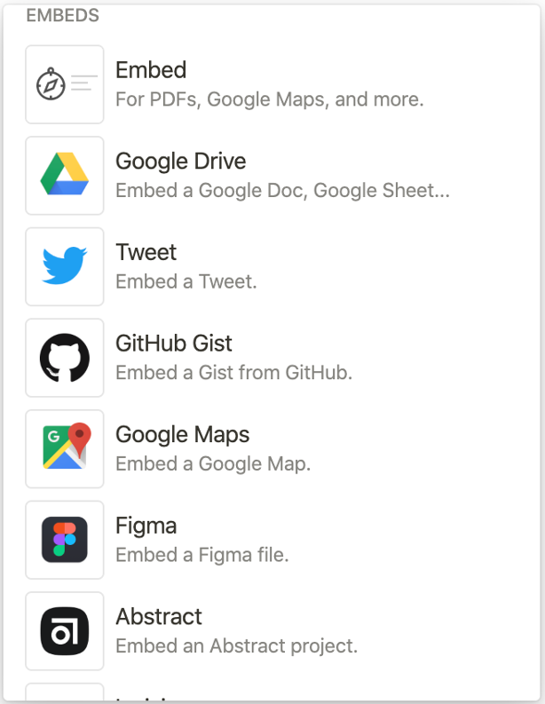
Designers also need to store and organize a large number of design documents, inspiration, interview records, etc. With notion, designers and developers can have more choices, such as associating content from a third-party platform or directly selecting a block type.
The block-based design has also caused some problems.
The first is the cost of learning. Most users are used to the typing rules designed by Microsoft. Other software like Google Docs has adopted these rules. Even though the notion provides guidance and forums to help users getting familiar with markdown, they still need to spend extra time to learn markdown’s operation methods. Many of them can’t start using it smoothly at the first time. This will cause the product to lose some potential users in the early stage.
The second point is that there are pros and cons to adopting block design. Block allows users to arrange at will without messing it up. The designer has carefully planned the block’s size and layout. Therefore, it ensures the neatness of the whole page. No matter how the user drags and moves the block, it will not make the page look chaotic. However, some content types that can’t adapt to the block format, such as drawing and prototype design, can’t be used in notion.
Besides, because the block types are too rich, users who are unfamiliar with shortcut keys often need to turn from the top to the bottom of the list. How to organize block types better is a crucial part for PMs and designers need to consider. One of my suggestions is to provide users with the function of customizing the block option bar. Users can increase or decrease their commonly used block types independently.
Surface
1. The whole webpage looks refreshing. Their colors are beige and orange. Illustrations and some icons are used in the emotional design, but the balance between professional and design sense is well maintained. Users can set cover page and add icons for each page, thus reducing the inaccessible feeling often generated when using traditional office software. The color contrast makes the content clear.
2. In addition, using markdown’s own characteristics, users do not need to consider font attributes, size, line spacing and other issues. These are designed in advance by the product team, and users only need to select the text type (title 1, title 2, toggle list, etc.). This design can help users focus on the information itself and save a lot of time and cost, so as to keep the page clean and readable, which is convenient for reviewing.