Introduction
Bilibili.com, which is also called B-site, is one of the most trending video websites used in China today. It is especially popular among the younger generation. Originally, it provides contents based on animation, comic, and games (ACGs). Now, more and more daily life videos are being uploaded by creators, ranging from music, dancing, science and technology, entertainment, movie, drama, fashion, strategy to advertisement films. The most well-known feature that differs it from the other existing Chinese platforms is the scrolling commenting system called “danmu”, or “bullet curtain” in translation. The design of the site is worthy of discussion as it contains relatively much information and functions. This critique will walk through the organizational system, the labeling system, the navigation system and the search system for the readers. After reading, hopefully the website will seem clearer and easier to use for those first-time accessors.
The Organization System
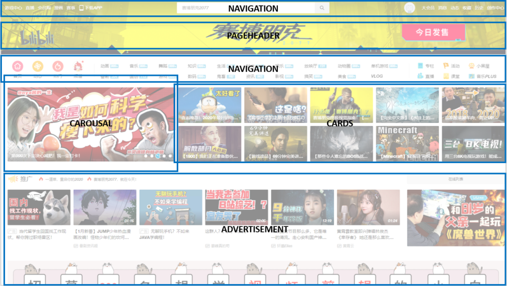
The information is organized hierarchically for the site. The homepage is primarily composed of navigation bars and cards. The cards are basically showing the video front image and its title descriptions. The navigation bar appears repetitively throughout the site for user guidance. The homepage is segmented into 22 sections, representing the categories of the video. By scrolling down the page, user can see the sections of videos one by one and go back and forth by clicking on the navigation bar.
The Labeling system
The site mainly labels the videos by categories, and the navigation by function. The video categories include bangumi, music, dancing, knowledge, daily life, fashion, entertainment, movies, game, digitals, Chinese anime, “Guichu”, information, TV shows, fun, animals, food, and vlogs. The function labels are homepage, bangumi, game center, live stream, online store, comic, competition, BW, writings, activities, lessons, music plus, banned room and download app. The other function labels are for registered users, containing membership, messages, updates, favorites, view history, and upload center.
Bangumi appears twice as the website attracts most of the users for its anime shows, thus it provides multiple ways for users to access them. The two most common seen label on the site is “refresh” and “more”, which are seen in every section of videos. “Refresh” allows users to constantly see new videos and “more” leads them to the specific page for their choice of type of videos.
The Navigation System
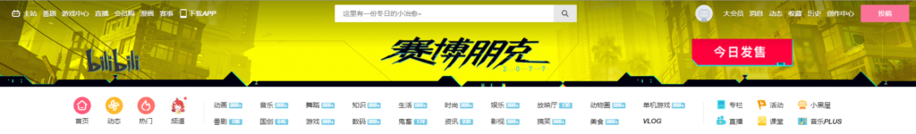
The homepage of bilibili.com has both vertical and horizontal navigation bars. More importantly it has two layers of navigation. The first layer of navigation is a menu that dwells on the top of the website, showing a higher level of importance. It contains links to personal accounts, general settings, favorites, histories, and etc. When user clicked on the avatar, there will be a dropdown menu for users to act on further. Also, there is a pink call-to-action button said “UPLOAD” on the right corner of the web. Meanwhile, the second layer of navigation locates beneath the banner, which is separated into three columns. The first column contains personalized information pertaining to registered users. The second column are 20 tags of video categories. The third column is less used and functions in test.
The vertical navigation is affixed on the right for users to quickly direct to the content they want to see on the homepage. There is a back to top button at the bottom of the bar. Moreover, users can adjust the position of the bar themselves too. Within each section, there are tabs for users to switch published date and detailed categories of the videos displaying.
The Search System
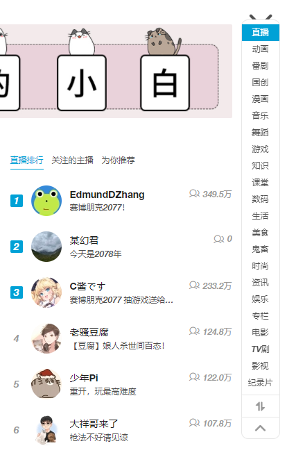
The website employs both exploratory seeking and know-item seeking. The know-item seeking can be done through the search bar located at the top of the website, parallel to first layer of navigation. Users can type in the keyword, or the full title of the video, uploaders or anything else on their mind to search directly for results. The exploratory seeking is located beneath the banner in the form of two rows of badges with the number of new videos uploaded today, such as “999+”, besides them, which is introduced above as the second layer of navigation. In this case, browsing via navigation is also deemed as search items for the users to browse over. It is “known-item” because it is designed for users who are not sure what specific videos they would like to watch, but only having an idea on the topic they would like to explore.
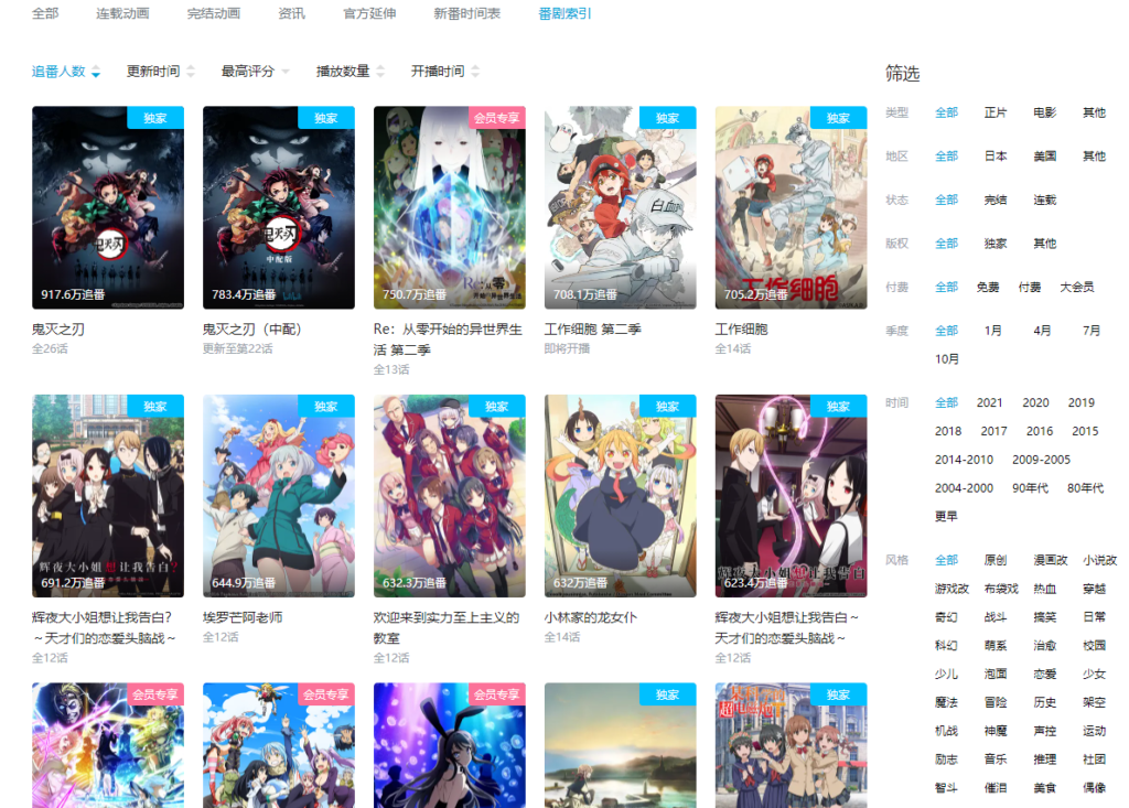
After the user has chosen and clicked on the category they want, for example, bangumi. It has a glossary, which is also know-item seeking for the users to seek for bangumis from year, season, type, paid or free, and also re-rank by comments, rankings, and etc. This allows the users to read through a range of items generated when they are not able to articulate a specific bangumi they would like to watch.