About the Project
The redesign of the New York City Parks & Recreation (NYC Parks) central navigation and ‘Find a Park’ feature was part of a project for Information Architecture and Interaction Design course at Pratt Institute in the Fall 2020. I worked on a team of three, tasked to design a mobile responsive website applying insights from user research.
My role
I served as Copywriter for the group, drafting and finalizing copy for research protocols, prototypes, presentations, and wireframes. In addition, I worked as a user researcher, designer, wire-framer, and interaction designer.
TOOLS USED
- Slack
- Figma
- Optimal Workshop
- Adobe Illustrator
- Google Suite
- Microsoft Suite
Defining Challenges
Our client, NYC Parks, manages over 1,700 parks serving over 8 million people across New York City’s five boroughs. Currently, New York City Parks & Recreation’s website, nycgovparks.org, serves as the only official online space for New Yorkers to access comprehensive information regarding NYC park’s facilities, features, events, and attractions.
Therefore, the challenge is to redesign the central navigation and Find a Park feature to ensure that millions of different users can easily and quickly find relevant information where they need it, where they need it. To accomplish this task, our team set out to develop mobile-optimized and content-driven solutions that improve find-ability and, by extension, improve New Yorker’s engagement with NYC Parks.
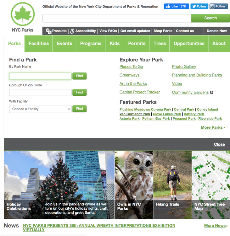
CURRENT SITE & FIND A PARK FEATURE
The current website’s central navigation and user pathway to the ‘Find a Park’ feature is confusing and overloaded with information that it is hard for a user to discern what is relevant to their intended use. The nine top navigation labels do not guide user engagement but appear to enable excessive overlapping in their subpages hindering fast user access to NYC Parks content. Similarly, the ‘Find a Park’ preview currently nestled under “Parks” offers only rigid and limited search capabilities. Neither the homepage nor the Find a Park feature is mobile-responsive, further restricting user engagement with the NYC Parks web content.
Therefore, the client is asking to redesign the navigation and Find a Park feature for responsive web that is location driven and leverages current existing design systems and content. The client also asked that the redesign should be geared for users that we community, well-being, and family centered.
Redesign Process
1. User Research
2. Structuring Content
3. Design Principles
4. Wire Framing
1. USER research
The first step in our redesign process was the discovery phase through which we developed research objectives to help us meet our research goal: to understand the context in which users engage with the NYC Parks website.
Our research objectives focused on identifying different user’s habits, motivations, and decision-making process for visiting a New York City park. We conducted a series of 6 pure observations, in-situ, semi-structured interviews, and in-depth exploratory interviews. We compiled our notes to analyze the results through an affinity diagram to identify key user insights and develop user personas.
user insights
- Park’s proximity to a user’s location is a driving factor in determining which park a user will visit.
- Parks serve as both points of respite from city life and connection to community for visitors.
- Parks built-environment, or features, facilitates a visitor’s activities or within the park.
- User decision process is currently fragmented, or split between multiple platforms, or online resources, for finding a park.
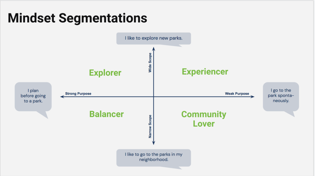
USER PERSONAS
We further applied our key user insights of motivation and proximity to model personas by charting user behaviors and motivations on a graph quadrant, plotting purpose, or level of consideration or planning in the decision to visit a park, on the X axis and scope, or range and proximity of parks, on the Y axis.
- Explorers have a wide scope and strong purpose. Explorers will consider visiting parks outside of their close proximity in order to visit a park that best supports their intended use.
- Experiencers have a wide scope, but weak purpose. Experiencers will consider visiting parks outside their close proximity, but without much premeditation or preplanning.
- Balancers have narrow scope and strong purpose. Balancers will only consider visiting parks within easy distance of their current location if a special event, activity, or engagement requires them to do so.
- Community Lovers have narrow scope and weak purpose. Community Lovers visit their local parks out of habit or routine, without much preplanning or thought.
USER JOURNEYS
Next, we applied our user research, insights, and personas to develop a user journey. For each step in the user journey, we identified potential design solutions with special attention to proximity, or location information, as both important to users and our client, NYC Parks.
| USER JOURNEY | ACTIVATION | DECISION | NAVIGATION |
| DESCRIPTION | Motivation or desire to visit a NYC Park, triggered by factors external or internal to the NYC Parks Website. | Research and planning process in selecting a park to visit. | Platforms users consult for directions to the park. |
| DESIGN OPPORTUNITY | Develop recommendations within the Find a Park landing page the based a user’s interests, current location, or events information. | Design a searching system that draws on user’s mental model to search in maps for nearby park. Develop robust filtering system utilizing NYC Parks metadata to tag parks by location, features, and by the types of activities each park best supports. | Streamline the process for navigating to the park by linking out directly to Google Maps once a user has identified a park to visit. |
| USER RESEARCH | Users with weak purpose like Experiencers and Community lovers could discover new pathways to engagement through personalized recommendations. | Synthesizing in-map and filtering features can address ranges in persona user needs across scope and purpose. | The current process is fragmented, featuring easy navigation to the park completes the process seamlessly for the user. |
2. STRUCTURING CONTENT
Next, to support findability of the Find a Park feature within the NYC Parks website, we began the process of re-structuring the central web navigation. The current navigation is overcrowded and confusing.
We conducted cart sort and tree tests in Optimal Workshop to make the following improvements to the current sitemap:
- Combined ‘Events & Programs’ to reduce overlap and cross linking and create one clear entry point to programmatic content.
- Provide meaningful labels that connect information architecture to user intention like ‘Visit,’ ‘Get Involved.’
- Create limited, but meaningful contextual linkages between hard to identify needs like ‘special events permit’
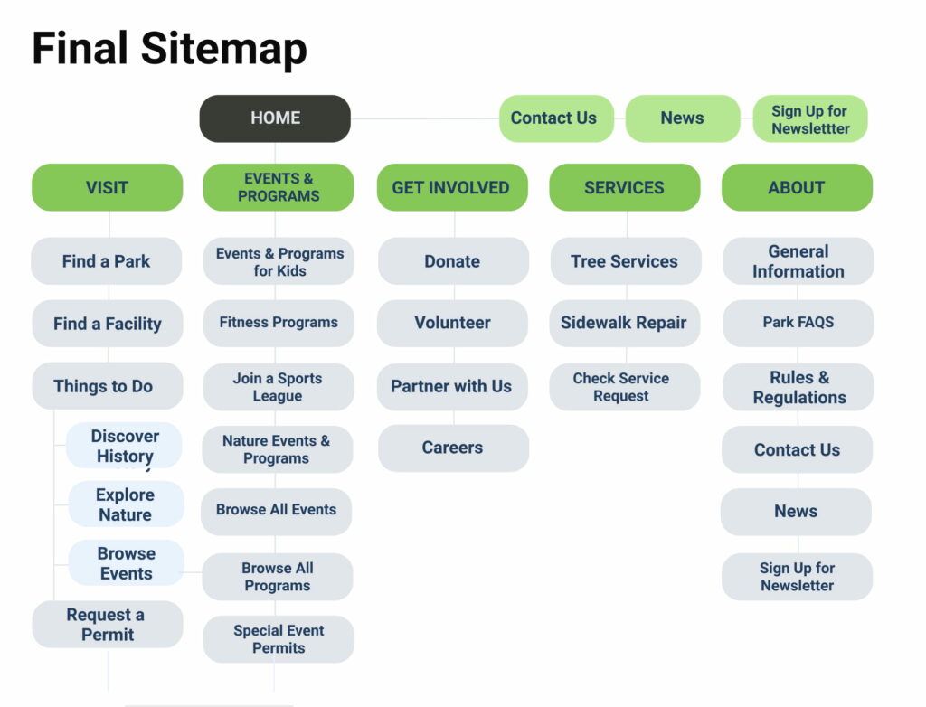
Moreover, by redesigning the central navigation in tandem with the “Find a Park” feature, we are able to better understand the larger ecosystem our which our feature lives, incorporating navigational systems like breadcrumbs to ensure a user is able to locate their position within the NYC Parks website.
3. DESIGN PRINCIPLES
Incorporating insights gained from user research and prototype testing, I set the following design principles to guide the design of my final wireframes:
- User context is key
- Meet the users’ needs
- Keep it simple
- Keep it consistent
3. WIRE FRAMing
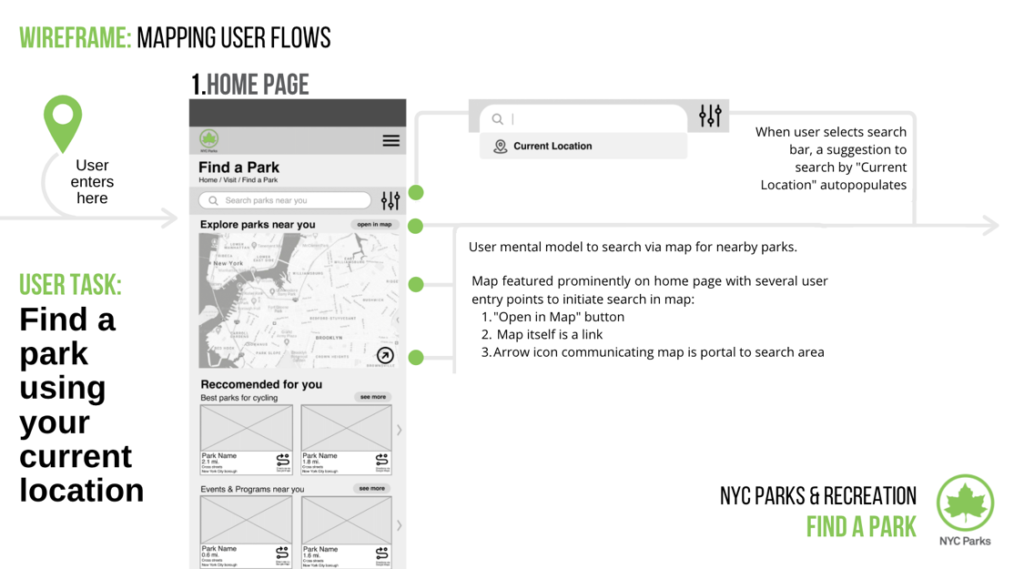
Incorporating insights from user research and findings from user testing, I developed a wireframe to support the user flow: “Find a park near you.” Adjusting frames from our prototyping process, I applied a lens to every interaction and feature that is part of or works in support of a user’s location driven search, including:
- Search bar prompts users to search by “Current Location”
- Find a Park homepage ‘Preview’ map is accompanied by icon that communicates it is clickable
- Compass icon within in-map search provides users an action for users to ‘orient’ their search to their current location.
- Importing icons and Google Maps data into the map interface allows users to find a park that is in proximity to a secondary attraction, business, or travel hub.
- Adding ‘distance’ as a filter allows users to define for themselves what ‘nearby’ means in their particular context.
- Consistent application of park’s distance from a user’s current location in all park detail communications
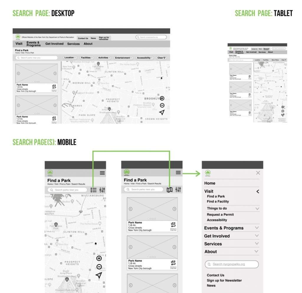
Finally, with mobile optimized design solutions a top priority, I broke down the search pages and central navigation at the desktop, tablet, and mobile breakpoints, ensuring that users are able to fully engage with the NYC Parks Find a Park Feature, where they need it, when they need it.
With empathy at the center of the project, my team and I were able to provide preliminary design solutions to both the overarching website architecture and Find a Park page that improves findability and presentation of relevant information.
Conclusion & Next Steps
In the end, this project taught me the process for launching a website redesign by positioning the user at the center of the design. From start to finish, my team and I worked to apply empathetic design solutions to meet our users’ needs, prioritizing location, to meet our clients’ needs to increase findability and presentation of relevant information.
Moreover, as an iterative process, designing the interactions for “finding a park nearby” with the Find a Park feature can still benefit for further user testing and review. This includes incorporating the user flow for granting permission to utilize a user’s exact location for the in-map search function, or further development for users who do not share location data.
Next steps, like the rest, will center around the user.