About Our Project
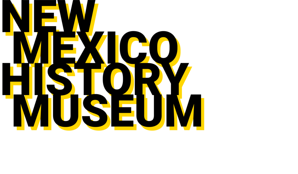
The New Mexico History Museum tells the stories that made the American West, from the lives of indigenous Americans to Spanish colonists, the Mexican era, Santa Fe Trail merchants, the railroad, cowboys, outlaws, scientists, and hippies. The New Mexico History Museum’s website was chosen as a redesign project for the INFO 643 Information Architecture and Interaction Design course at Pratt Institute School of Information to improve the user experience and the information architecture of the website.
The New Mexico History Museum tells the stories that made the American West, from the lives of indigenous Americans to Spanish colonists, the Mexican era, Santa Fe Trail merchants, the railroad, cowboys, outlaws, scientists, and hippies. The New Mexico History Museum’s website was chosen as a redesign project for the INFO 643 Information Architecture and Interaction Design course at Pratt Institute School of Information to improve the user experience and the information architecture of the website.
Scope of the Project
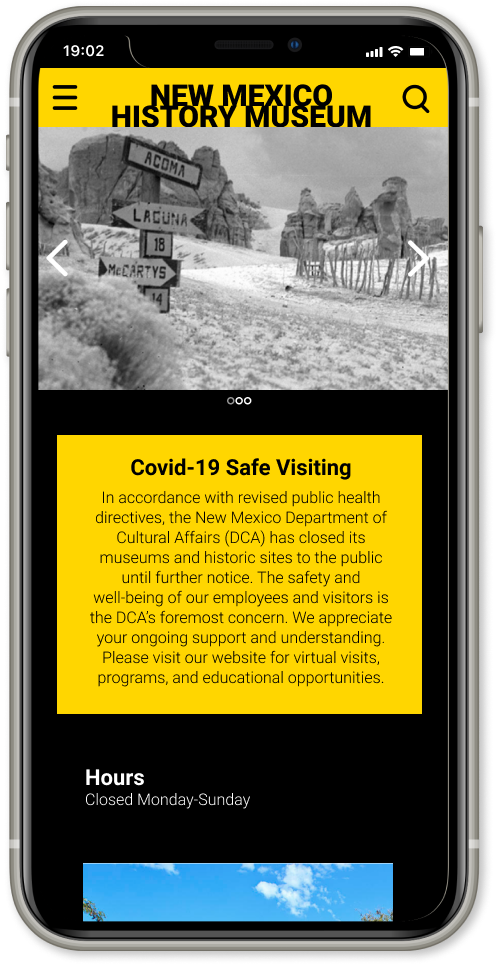
The New Mexico History Museum website has all the necessary information for visitors to learn about the museum and plan their visit. However, the format in which it is currently laid out makes it difficult for visitors to navigate the website and find the important information.
How can we redesign the website to encourage more people to learn about the museum and its collection and find the necessary information to help them plan their museum visit?
Redesign Goals
Create
informative and friendly style identity
Design
website layout that is easy to navigate
Improve
clarity of information architecture and site content
The Team
In addition to working as UX researchers and designers, we also assigned ourselves other roles to keep the team on track. Because of the restrictions due to Covid-19, our team collaborated remotely throughout the entire redesign process to create the high fidelity mobile prototype of the New Mexico History Museum.
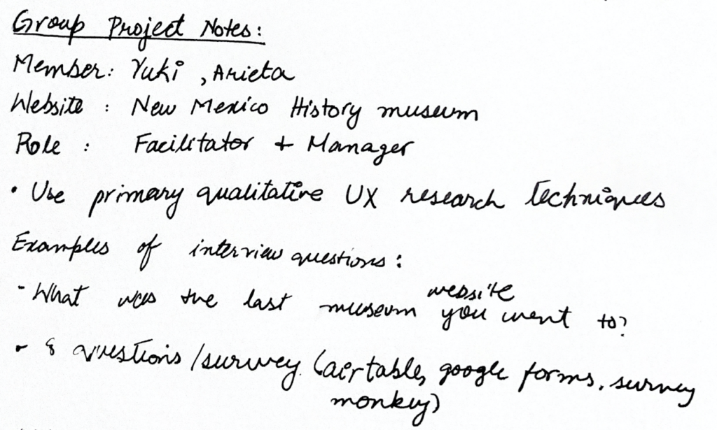
- Fariah Qasim (me) the Project Manager + Facilitator
- Yuki Shimano the Administrator
- Arieta Palevic the Editor
My contribution to the team
- Conducted UX research and user testing
- Created paper prototypes of the website
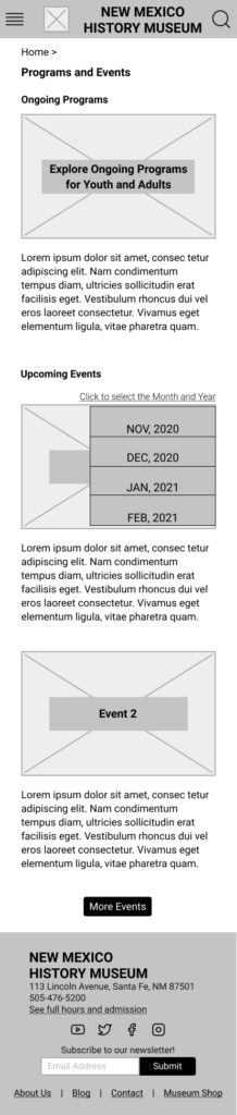
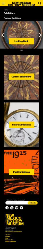
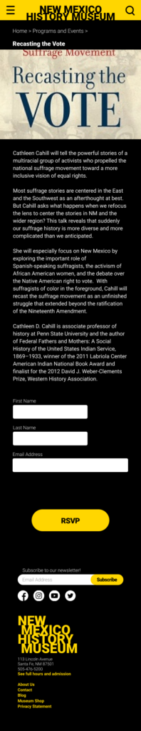
- Created medium fidelity and high fidelity wireframes and prototypes for the Exhibitions page and the Programs and Events page.
Tools Used
- Figma (design tool)
- InVision (prototype tool)
- Zoom (video conferencing and user interviews)
- Miro (online collaborative and brainstorming activities)
- Slack (online collaboration)
- UserTesting (remote unmoderated user testing)
- Optimal Workshop (card sorting study)
- G Suite (google docs, sheets, slides, forms)

Our Process
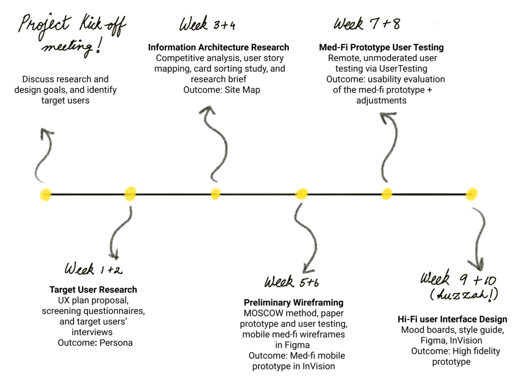
Project Meeting Kick-Off
During our first team meeting, our team brainstormed the goals of the website redesign. We evaluated the usability of the current version of the website and decided to focus on improving the organization of information on the website and creating a friendly and inviting visual style.
Our identified target users
- Someone who likes visiting museums and visited a museum in the last three months (or used to visit museums once every three months before the pandemic)
- Someone who visits museums for professional reasons such as a curator
- A parent or teacher who might be interested in setting up field trips
01. Target User Research
The team used screeners to recruit 5 participants from the target groups for 30-minutes one-on-one interviews via Zoom, and each team members conducted interviews with a particular user group.
Through these user interviews, the team focused to answer four research questions:
- What kind of users will visit the New Mexico History Museum website?
- What information and services will they look for on the website?
- How will they navigate the website to find the information and services provided?
- How would their experience vary if they were local or tourist?
Outcome: User Persona
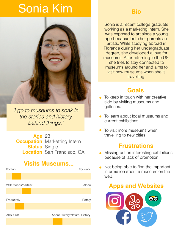
Key Findings
- Museum group visits are a way to socialize for many
- When traveling, people visit museums to learn more about the history and culture of the place they are visiting
- Users fear missing out on an interesting exhibition and would like to receive updates about current and upcoming events and exhibitions
02. Information Architecture Research
Understanding the Competition
Our team looked at other museum websites to learn how they presented information. We chose five competitors and compared six dimensions across their websites.
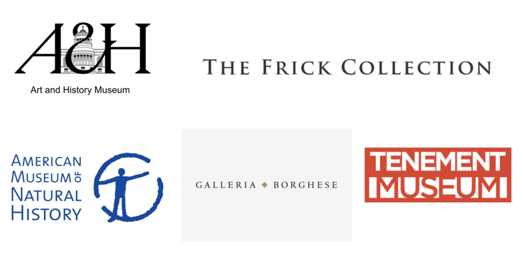
What we learned from our competitors:
- Images on the homepage were accompanied with information about them
- Hours and tickets information was listed on the homepage without having to scroll too far down
- Navigation menus were informative, with a clear and easy to follow navigation system
- Homepage has a clean and consistent layout
- Colors were effectively used to highlight important information, balanced by negative space
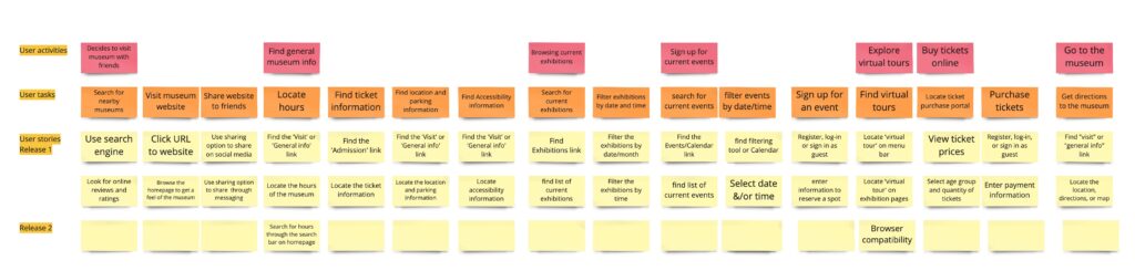
Our team conducted a user story mapping activity on Miro to capture the user’s journey as they perform various tasks on the website. This allowed us to prioritize the tasks that needed to be carried out by our website.
User Story Mapping
Card Sorting Study
Our team conducted an open card sorting study with participants we recruited using Optimal Workshop. Participants created and named their own categories and sorted 59 cards into those categories. This study helped us understand how users expected to categorize information on a museum website.
Outcome: Revised Site Map

- We simplified the navigation menu with fewer categories
- Education programs were consolidated with other ongoing museum programs
- Tours and group visits information was added under the Visit us page
03. Preliminary Wireframing
MoSCoW Technique
Our team used the MoSCoW technique (Must have, Should have, Could have, Won’t have) on Miro to prioritize the tasks and features of the website that we needed to consider for the redesign process.

Each team member created their own paper prototypes based on the sitemap. Each member tested their prototypes with 2 participants and adjusted their paper prototypes based on the participants’ feedback. In our meeting, we then combined these paper prototypes to create the low fidelity wireframes of our website.
Paper Prototype
Med-Fi Wireframes
Based on the low-fi paper wireframes and the feedback we received from the participants, each team member created the med-fi wireframes of a section of the website on Figma. I was responsible for working on the Exhibitions page and the Programs and Events page. The team worked together on the Home page.


We uploaded these med-fi wireframes to InVision and we created the med-fi prototypes of the website. I was responsible for prototyping the wireframes I created.
outcome
Med-Fi Prototype

04. Med-fi Prototype User Testing
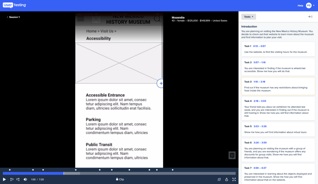
Each team member created and conducted remote unmoderated user tests with a total of 4 participants via UserTesting to evaluate the usability of the med-fi prototypes. The participants were asked to complete a series of tasks while thinking out loud their thoughts, impressions, and feedback regarding the website.
Outcome: Med-fi prototype usability evaluation + adjusted prototype

05. High-Fi User Interface Design
MOOD BOARD
I used the mood board technique to figure out the look and feel of the museum website.

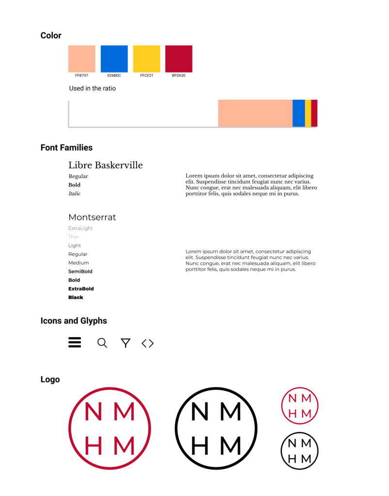
Style Guide
Each member of the team created a style guide for high-fidelity wireframes. The team then voted to pick one of the members’ style guide.
Style Guide selected for High Fidelity wireframes

High-Fi Wireframes
Based on the style guide chosen, the team created high fidelity wireframes in Figma.

Outcome

High-Fi Prototype
Conclusion
Our team presented the high-fi prototype to the rest of our class via Zoom in a 10-minute presentation which included mobile prototype walkthroughs. Our project received overall positive feedback. We recorded the comments and suggestions from our classmates for further improvement of the website design.
What’s Next?
To improve upon my work, I would further like to…
Run user tests on the high-fi prototypes to further improve the information architecture and evaluate the usaibilty
Work on the UI design of the wireframes to add more of the New Mexico look and feel to the website
Research more about interactive features or improve on the existing interactive features on the website such as virtual tours