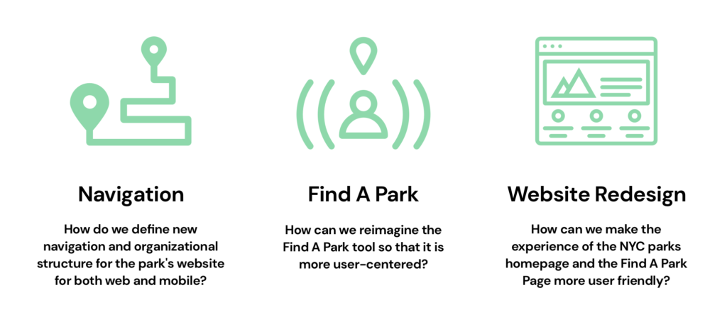
Project Brief
This project was for the Information Architecture & Interaction Design course. I teamed up with Ellen Connell and Jiyoung Lee to work on the project. Our goal is to reimagine a more user-centered find-a-park tool on the nycgovparks.org website. As well as redefining and reorganizing the navigation structure for the park’s website. Our end product will optimize both for desktop and mobile.
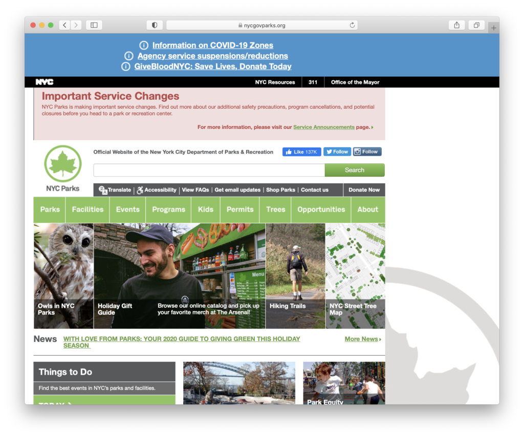
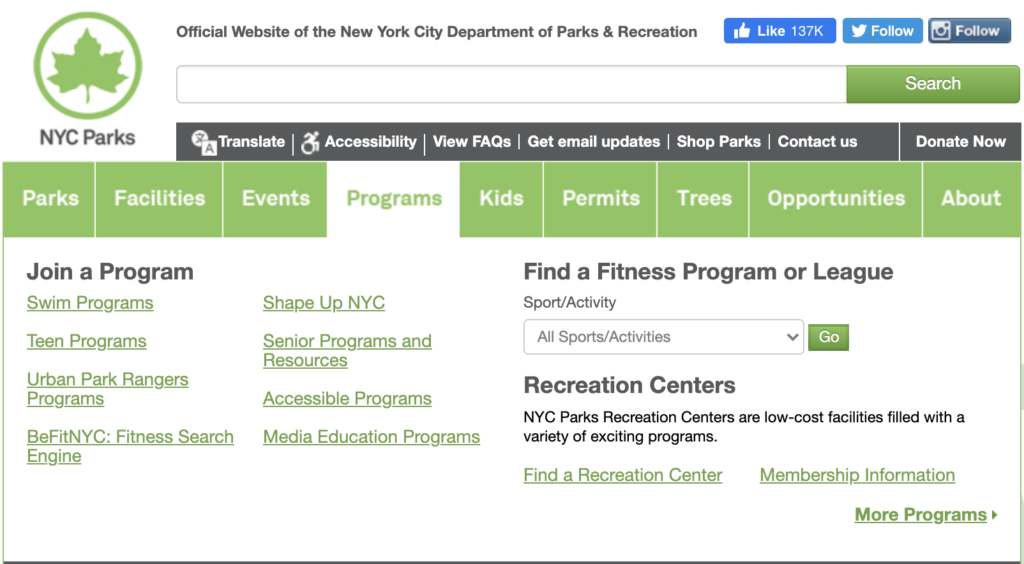
The Current Site
NYC Park’s vision is to create and sustain thriving parks and public spaces for New Yorkers. NYC Park’smission is to plan resilient and sustainable parks, public spaces, and recreational amenities, build a park system for present and future generations and care for parks and public spaces. The priorities below will help them translate the vision and mission to areas of focus and action, making abetter parks system for all New Yorkers.
Qualities that our client is looking for:
- Mobile-Optimized
- Consistent Branding
- Content-Driven
Our Audience:
- Community seekers: Pursuing cultural enrichment and ways to be engaged with the community.
- Well-being-driven: Use the park to improve their health and well-being.
- Friend and Family-centered: Use the parks as a social space, a meeting point for friends and family.
Our Challenges
Our Process Overview
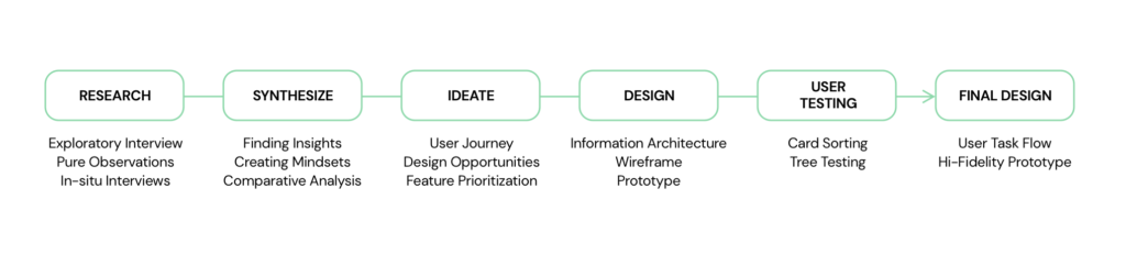
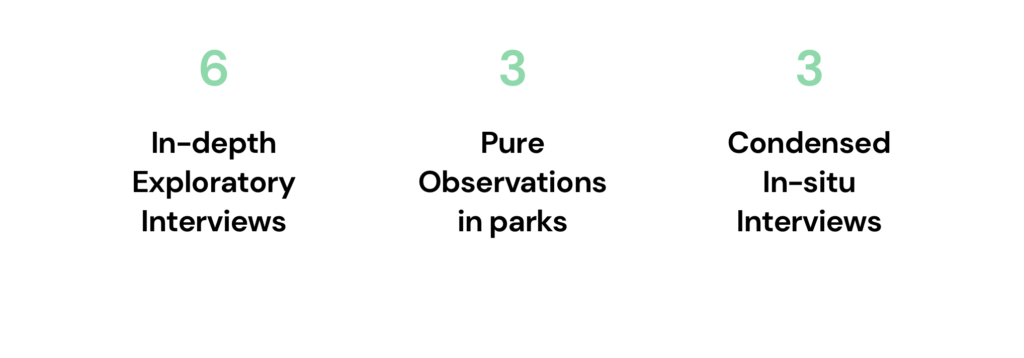
User Research
Our Findings
- Proximity to a user’s current location is a driving factor in determining which park a user will visit.
- Parks serve as both points of escape and connection for visitors in quarantine.
- A park’s built-environment facilitates visitors’ interactions with and activities within the park.
- Users use multiple channels to search, decide and navigate to park.
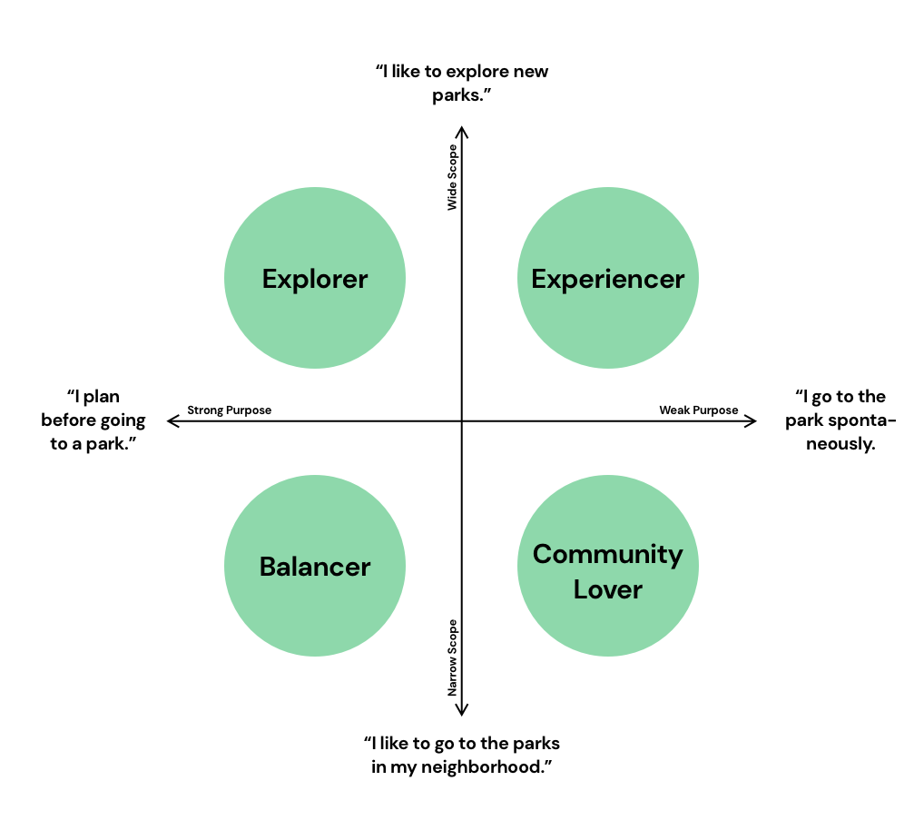
Mindset Segmentation
In order to better understand our types of users, we created 4 mindsets according to their level of exploratoriness when choosing parks and their level of planning before going to parks.
User Journey Mapping
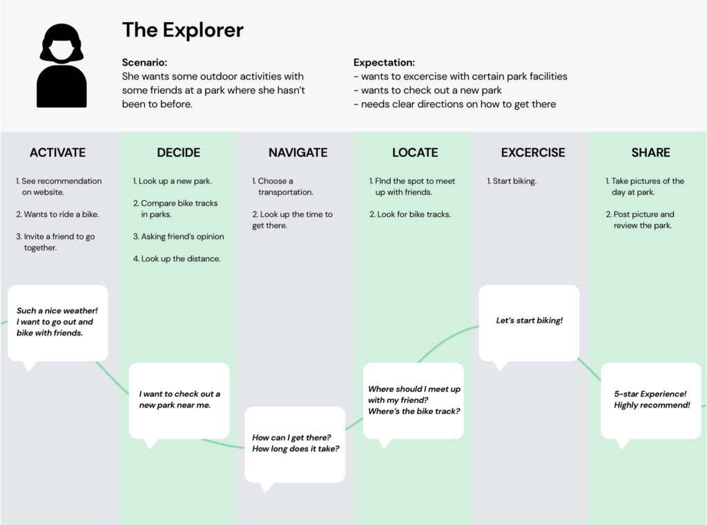
We then developed a user journey map with the Explorer’s mindset as he/she explores the broadest in scope and has the strongest driving purpose with the most potential opportunities our Find a Park feature. By graphing the user journey map, we are able to identify design opportunities and important user needs in each step of the journey. The scenario provides us with an inside view of what the user might be thinking when using our product, therefore, we’re able to better empathize with the user when designing our features.
Feature Prioritization
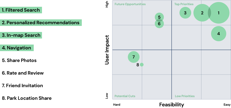
We prioritized features from our list of opportunities by focusing on what was the most feasible and had the highest user impact. We also weighted each feature as it corresponds with NYC Parks’ organizational goals to increase findability and be content-driven, without needing to build additional new tech or new content.
Low Fidelity Prototype and User Testing
Our four user tasks are centering around ways of finding a park:
- Find a park through a recommendation.
- Find a park through proximity.
- Find a park using filters.
- Find out how to navigate to the park.
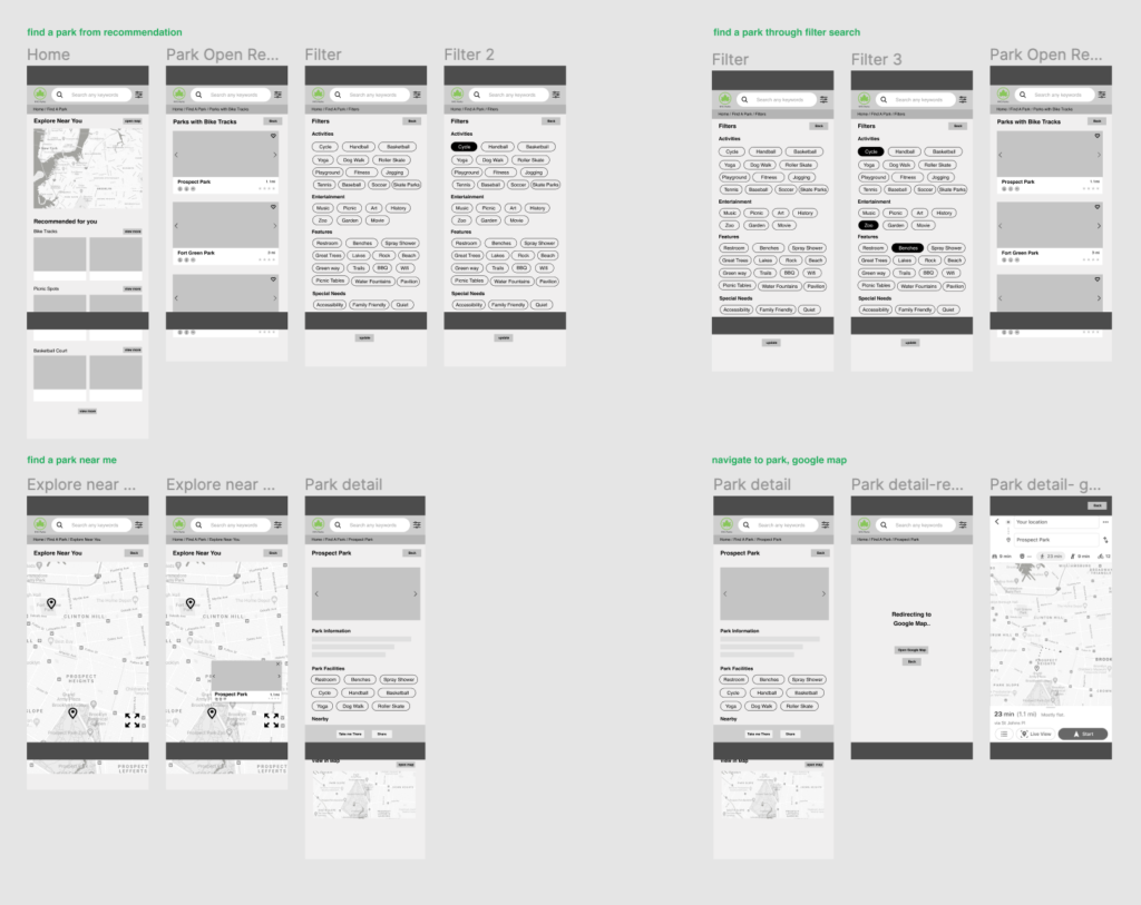
We created a clickable prototype and did user testing with 6 people. The feedbacks are generally positive. However, we have some problems with the position and naming of the buttons such as “back”, “zoom in”, “take me there”. Small details like this really affect the experience when navigating through the website. Usability wise, our users would like to access both map and filters across all pages since they are our two main features. We have then extracted their feedbacks and made changes accordingly.
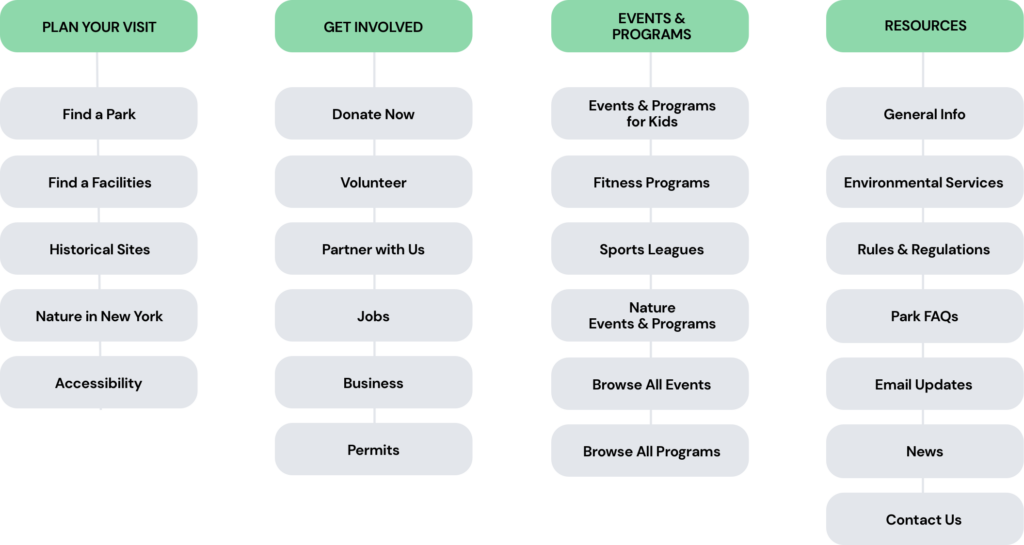
Information Architecture
Here are some of the major problems we found:
- Too many categories
- Vague Naming
- Overlapped groupings
- Possible misunderstanding of information
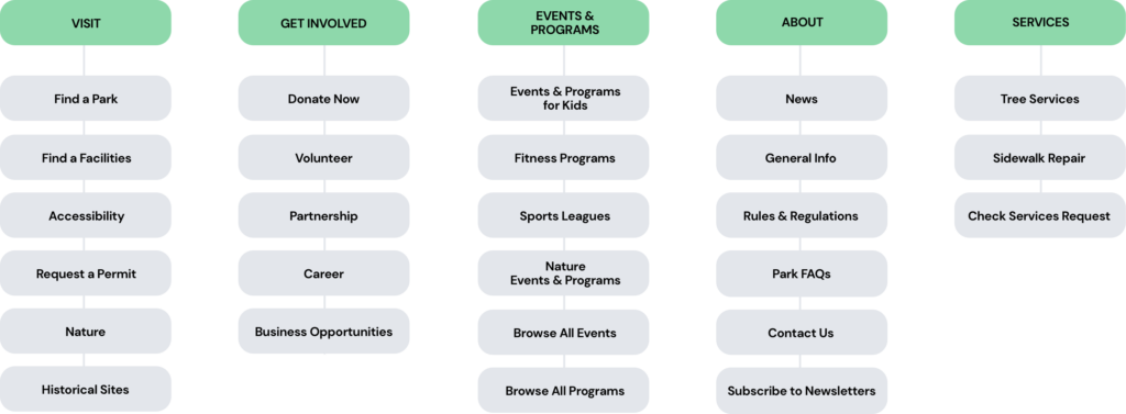
We have then drafted a site map and used Optimal Card Sort to send out to 6 users for testing. After closely synthesizing the result, we created a second version based on the feedback. The new version is a lot clearer in terms of the naming of the groups and labels, and a lot straightforward for the users to understand where to go to find things.
Two major changes:
Resources
People have a different understanding of resources and what should be included. When card sorting, they would categorize other labels such as permits and accessibility here. We then realize that the naming of “Resources” is too broad and vague. So we solve it by further separating them and created a new section called “About” where we included general information, FAQ, and news, etc.
Services
Since services are solely content for construction workers, we separated the group so that the workers that need this type of information automatically go there while the rest of the visitors who are not looking for service will leave out this group and focus on other groups. This ensures the categories don’t mix up for different audiences.
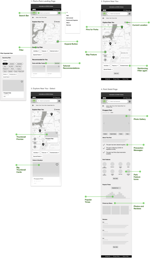
Final Prototype – Find a Park Through Proximity
For the final assignment, we are asked to choose one specific user tasks to continue to refind our prototype. I have chosen the task of finding a park through proximity, using the map feature. Based on previous feedback, I have reorganized the position of buttons so that they are more familiar with the mental model of users. The overall hierarchy and structuring of the content have also been refined.
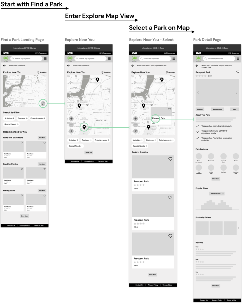
One major change I made during the revision of the prototype is the content featured on the park detail page. During our user research, most of our interviewees care a lot about the security of parks during the pandemic. By including precaution messages and highlighting them, the park-goers can then know if this park is safe for them to hang out.
Another thing that popped up a lot during our interviews was the features and facilities of the parks. People look forward to different activities at the parks and a lot of times they plan around those activities. Therefore, the park features icons added will solve the problem by showing them what a park is offered in a clear and easily understandable way. On the original website, there are illustrative icons provided, but one has to look very closely to understand the icons. The popular time graph, inspired by Google Map, will communicate when and how crowded a certain facility is so that people can plan ahead and avoid unnecessary gatherings.
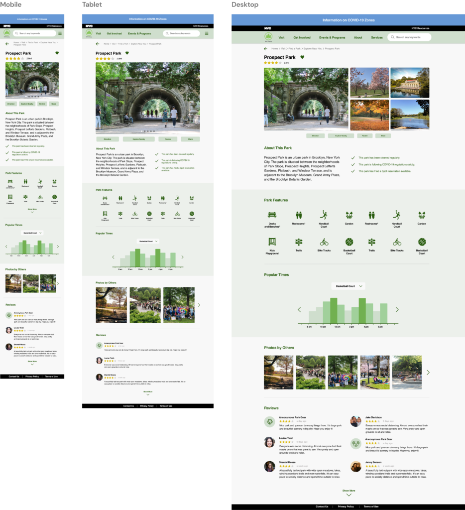
Hi-Fidelity Prototype – Park Detail Page
Finally, I designed the park detail page optimized for mobile, tablet, and desktop. The desktop and tablet follow a two-column grid while the mobile follows a single-column grid. To make the Park Feature and Popular Times stand out since they may be the most helpful content on the page, I highlighted the background color to create more contrast. The page adheres to the original NYC Parks branding with a light green accent color making the experience feels friendly and close to nature.
Conclusion
Overall, we want to help create a thoughtful and seamless experience for the users to find a park to go to and have some fun at the parks during this special time. Throughout the entire process, my teammates and I have started from zero and built our experiences and knowledge through real actions. We have conducted user interviews, user testing, extracting findings, and redesigned this website from the insights of real people. Even though we have made numerous mistakes, I found that interaction design is a constant process of failing and redefining, and repeat. So it is never too late to learn more about the users and to go back and make changes.
One thing I learned the most is to never assume something based on our own experiences because how others see and think will never be the same. The purpose of user research and user testing is the key to be closer and closer to the mindset of our users.
For our next step, I would want to continue designing the prototype for our Find a Park tool and revise based on feedback I receive.