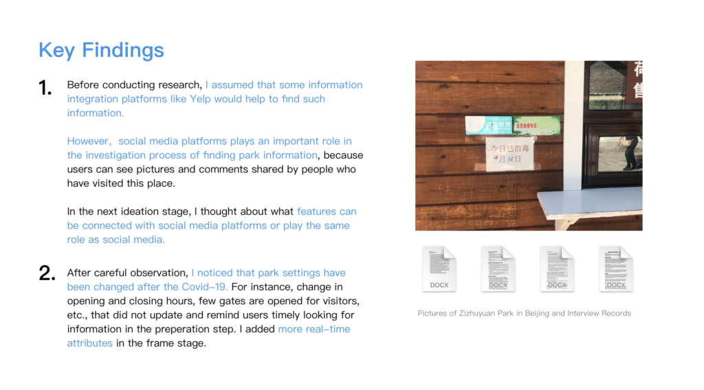
School Project | INFO643 Information Architecture and Interaction Design | 15 weeks
The challenge our class faces is to redesign the nycgovparks.org website. This website is the official website of the New York City Department of Parks & Reconstruction. Users can find information about parks and extra services such as permits, sidewalk repair, and so on.
Team Member
Danielle Kingberg, Staci Hou, Wenjng Wu
My Role
User Interview, Contextual Inquiry, Ideation Sessions, Design, Prototype Evaluation
Tools
Figma, Optimal Workshop, Google Drive
About the Project
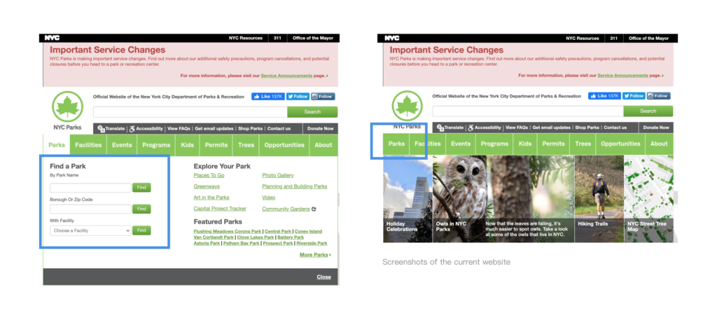
Our group chose to redesign the function “Find a Park”, which is one of the core functions of the whole website. Users will find parks that meet their own requirements through this website. After the team members experienced the existing websites, we found that there is still much room for improvement in this function. For example, the function entry is not obvious, so the user needs to click “Parks” in the navigation bar. In addition, there can be more possibilities for the function of searching.
The Design Process
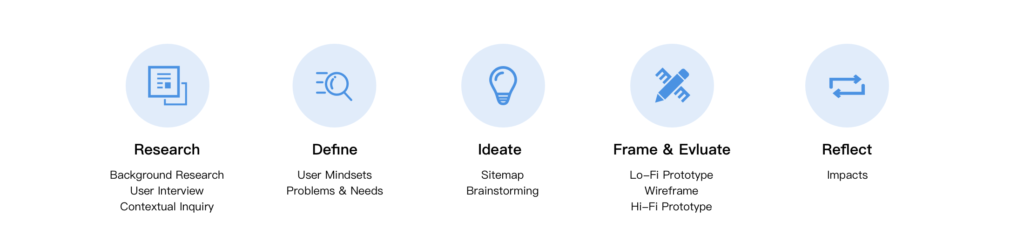
Research
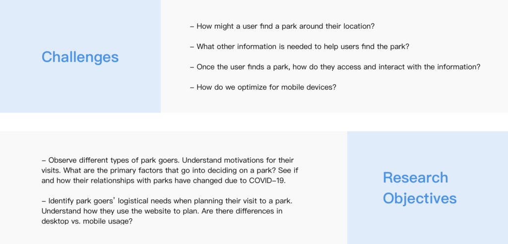
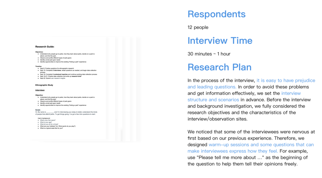
In this step, our group discussed the challenges and target users in the research phase. User research was affected due to Covid-19. Team members live in different cities, which have different isolation policies. Therefore, we choose to interview users online and invite them to try out the current website. The selected respondents are park visitors. In the context of contextual inquiry, we went to the parks in our city to observe people’s behaviors and potential needs in this experience.
Define
User MINDsets
Through interviews and contextual inquiry, we have summarized three kinds of users‘ mindsets.
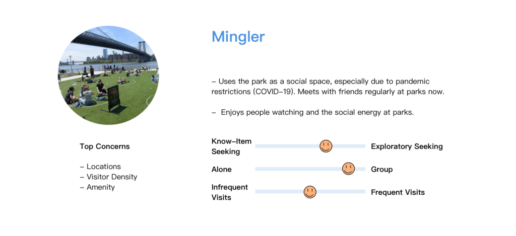
Mingler has strong social needs, so we thought about the possible scenes of sharing in the frame stage and designed buttons. Shared users can see key park information more intuitively.
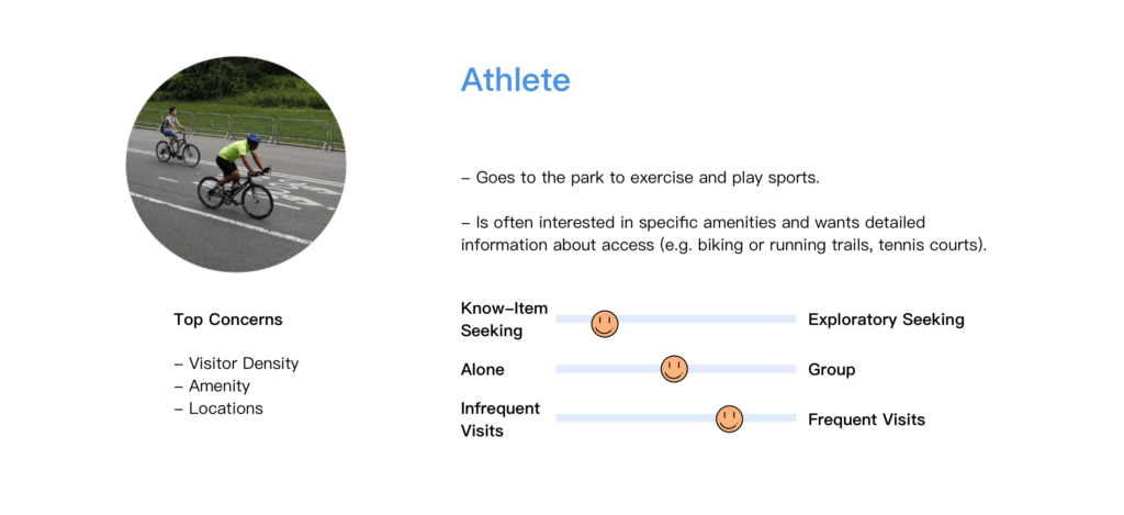
During the epidemic, athletes are more concerned about the flow of people than facilities. Users will be able to see the traffic forecast or real-time information at a specific time. We hope to corporate with the API of Google Maps to realize this function.
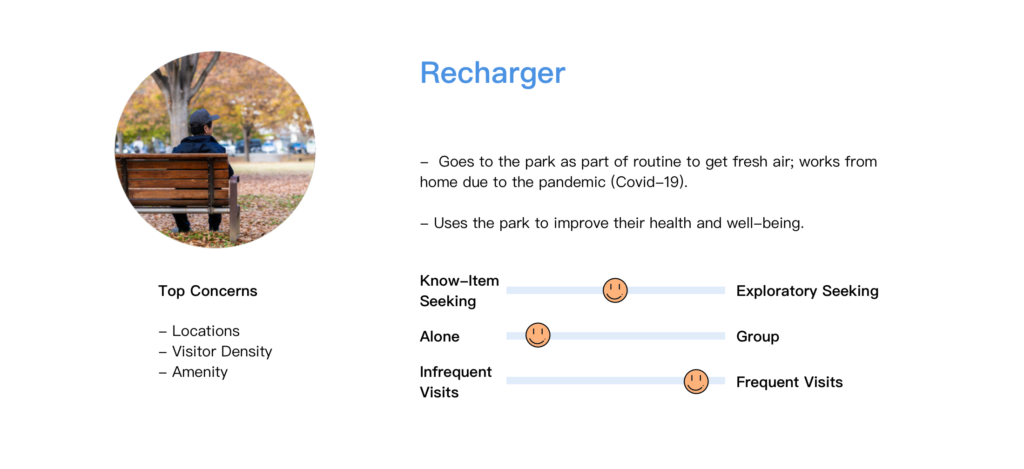
There are many rechargers among the target users. Their curiosity about new parks is not greater than the other two mindsets. They mainly pay attention to the geographical location of the park. In the prototype, we designed a map view in the result page for rechargers to locate parks.
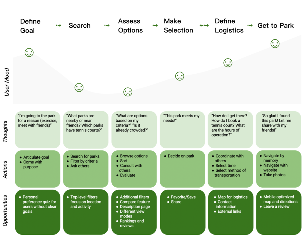
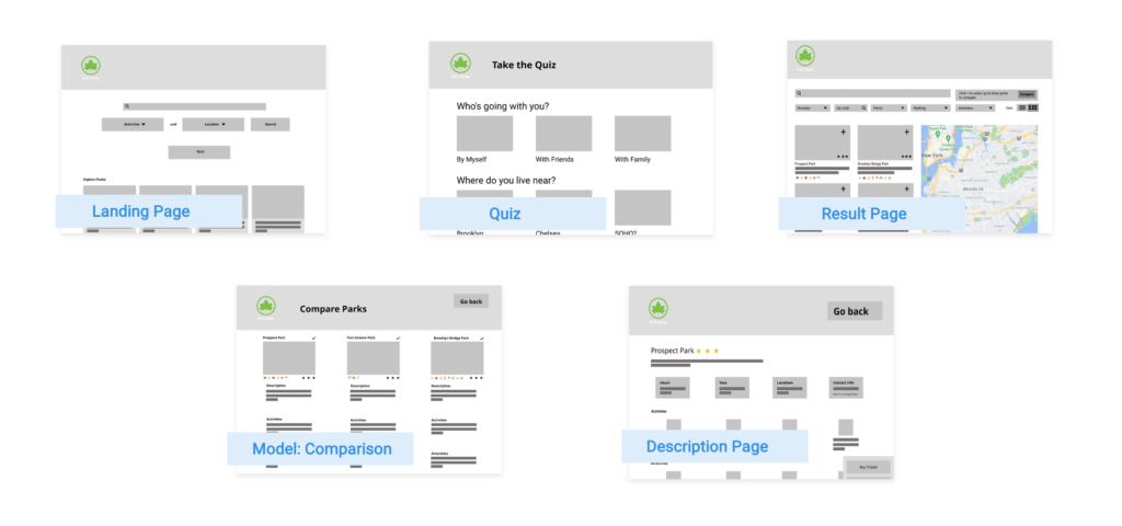
Journey Map
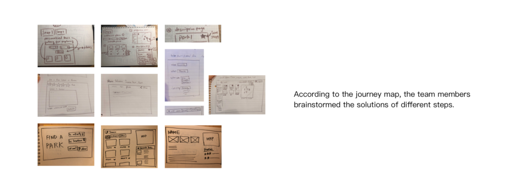
Our group established the journey map of “find a park” by combining benchmark analysis and user research. We fully considered the pain points and design opportunities in each stage. We defined five core pages and interactive processes based on the insights of the journey map.
Ideate
Sitemap
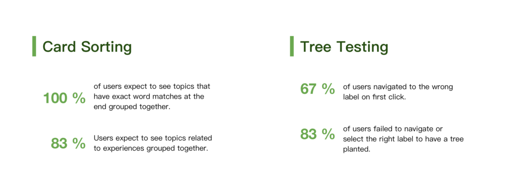
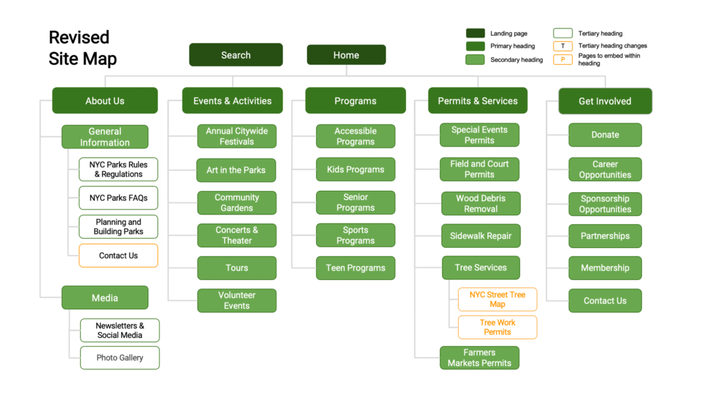
Reviewing the user’s test data, I realize that the information architecture of a website is very complicated, especially like Nycgovparks. This kind of website involves a wide range of information dimensions. At the same time, the granularity of information under each classification is very fine. For example, users can even find which plants are in the park.
Reflection: Although our new navigation has optimized some information categories through two testing methods, we still need to verify the results in the future. The top-level is adjusted to five, which makes the front page look very neat. But it also means that each category contains more information. When there are more than nine messages on one level, the user experience will be negatively affected. The next design process still needs to consider the navigation architecture.
CORE PAGES & FEATUReS
Frame & Evaluate
Design Principles
- Design for aesthetics and minimalism
- Present information in a logical order
- Eliminate unnecessary steps
- Make things easy to find
- Prioritize user feedback
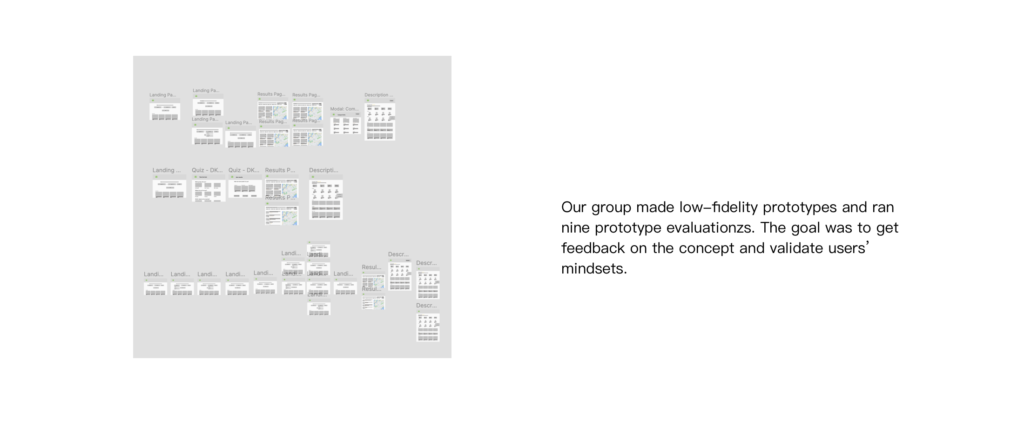
lo-fi Prototype
Prototype evaluation
What I learn:
- The overall features are on the right track to support the user’s journey. However, further due diligence is needed to validate the capabilities of each feature to ensure they will effectively help users find suitable parks to search (e.g., comparable content and helpful quiz questions).
- We need more insight into how park goers use their mobile device to find a park and plan their visit. In the subsequent phase, we’ll research how we can optimize the mobile experience.
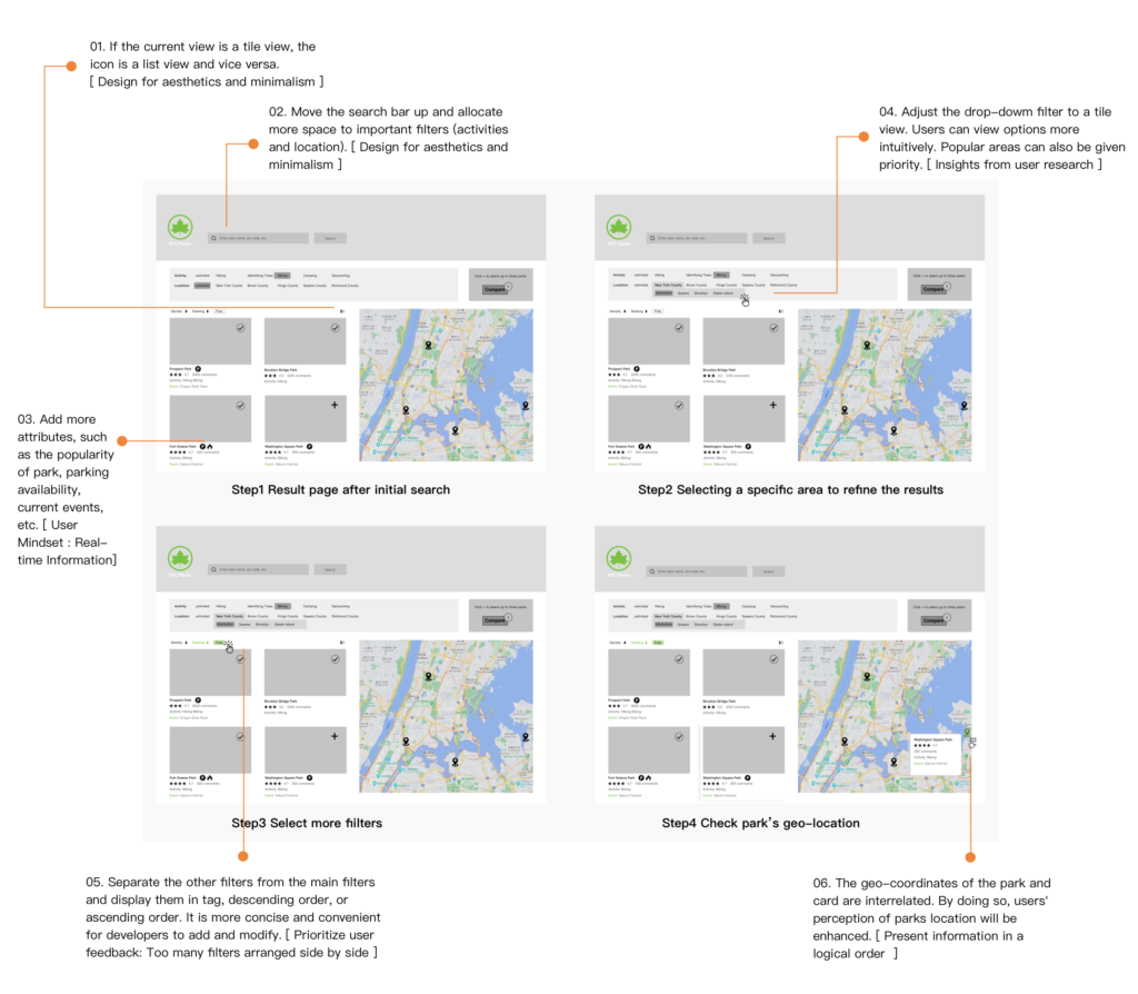
According to the feedback:
I decided to optimize the advanced filter for the next iteration. Most users usually have certain conditions when selecting parks, which makes them prefer to use this function.
wireframe: Advanced Filter
One page in three breakpoints
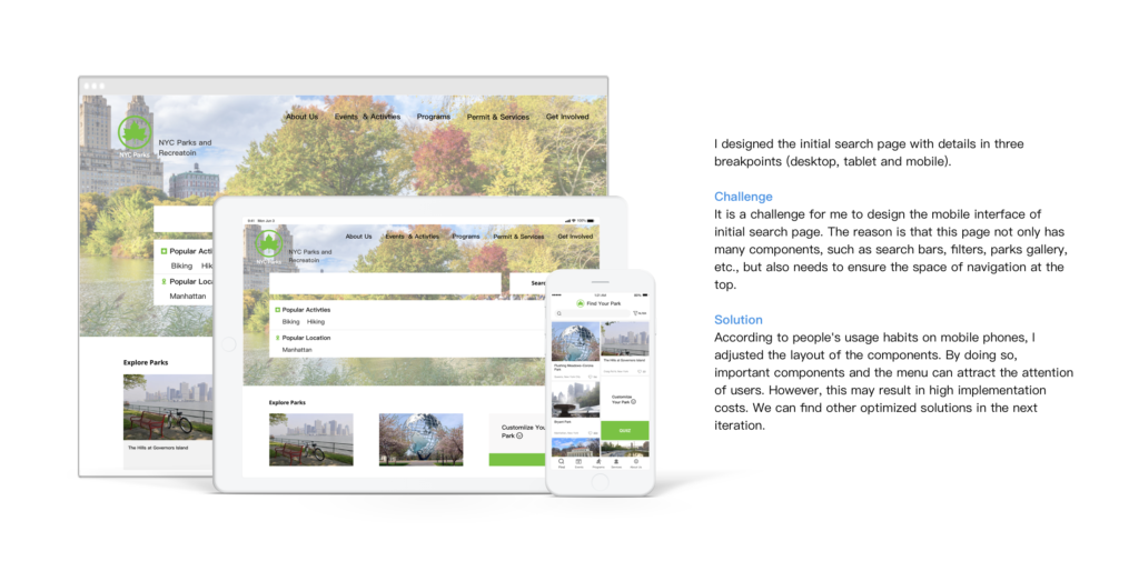
Reflect
Opportunities
User research can help me to think and design systematically. I can better organize and introduce the logistics behind the design to stakeholders. However, the user studies used in this project are mostly qualitative. In the future, our group can combine quantitative data analysis to verify our functions and ensure that mainstream users have a good user experience.
Reflect as a Designer
As a designer, I strive to provide users with a better user experience and help users establish more connections with the parks.
Many parks provide various events and programs for goers. With common search functions, it is difficult for users to explore new parks actively. We designed the function “quiz” to offer personalized recommendations of parks, hoping that users can explore more new parks and enrich their spare time.
Social Impact
Through this project, I hope to attract more people, especially the younger generation, to get close to nature. As people get closer and closer to nature, it is easier to notice the environmental problems that need urgent improvement.
Besides, due to the epidemic, many people are worried about their safety and stop going to the park. We designed some real-time information content and new functions to provide more reliable security. While helping the public protect their own safety, they can also enjoy the sunshine.