About the Project
The design project for Information Architecture and Interaction Design course during Pratt’s 2020 Fall semester surrounded a redesign of the NYC Parks website. I teamed up with Jiae Oh and Zhichun Zhou. The name of our team, and what I will refer to us as, is Team Green. My role as Project Manager was to make sure that all of our deliverables were met on time. I also assisted in organizing information from meetings.
The Design Brief
Our goal as a team was to redesign the NYC Parks website, specifically the homepage navigation and organizational structure. Team Green’s goal is to make sure the homepage has concise, relevant, and easily navigable information. We also needed to optimize NYC Parks’s website for desktop and mobile structures, while keeping the brand consistent.
The audience we had to focus on was the following:
- Community seekers: Pursuing cultural enrichment and ways to be engaged with the community.
- Well-being centered: Use the park to improve their health and well-being.
- Friends and family-centered: Use the parks as a social space, a meeting point for friends and family.
In order to resolve these challenges, we followed the process:
- Discover
- Define
- Design
- Evolve
Therefore, we began by doing exploratory user research.
Research
Exploratory Research
| Six interviews | Semi-structured, 1:1 phone interview |
| Six interviews | Contextual inquiry, 1:1 remote video/in-person |
Given our research, we created a user journey map consisting of insights from our affinity map and where opportunities existed.
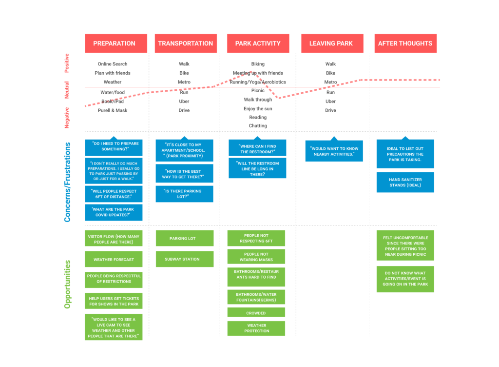
Team Green’s research insights were:
- Users are either externally focused on other people’s behaviors or internally focused on their own behaviors regarding Covid safety guidelines.
- Users tend to spontaneously go to parks as opposed to planning their trip, but they later regretted not knowing what events and activities that they would have liked to attend or prepare for.
- Users mainly seek quick recommendations from their trusted social network as opposed to taking time to do research on their own. They rely on this to help make decisions on what parks they should go to.
- Users choose to go to parks near their apartment for convenience to easily meet their social needs and exercise needs.
Low Fidelity Prototype
In order to better incorporate a redesign of the website, Team Green created and tested 6 users on a low-fidelity prototype to see what users expect from the park website, and understand other needs that we may not have captured during the interviews.
Our prototype scenarios focused on: Searching a park nearby; finding an outdoor activity to do with a friend at a park; and discovering COVID requirements before going to the park.
We uncovered the following insights from the prototype interviews:
- Covid content should be park specific, as opposed to being generic, and be accessible in each park page.
- The search bar at top of homepage needs to be more generic by adding keyword examples in placeholder text; the “keyword” search label was confusing.
- There was confusion between the category labels “events”, “programs” and “activities” – we should define them based on conceptual mental models.
- Park details screen had confusing labels (i.e. ‘save’) and redundant call to actions that were not needed.
- Users expect directions capability in the map on the park details page.
- Users liked seeing both the exploratory aspect of finding things to do and the know-item seeking (search bar).
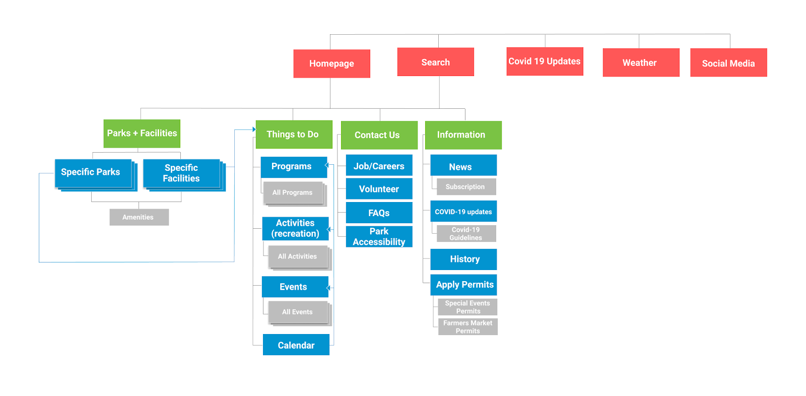
Information Architecture
In order to better understand the structure of information that would be most simple to navigate, we did an open card sort with six users and 50 labels to get an idea of how people thought about different categories and classified them.
The overarching theme of activities, events, and programs was “Things to do”. For simplicity of the overall structure of the site map, we included Activities, Events, Programs, and Calendar within that category.
We then performed tree test interviews to gather more clarity on the current navigation structure. Six questions were distributed to six participants. Based on the findings, we updated the site map to create more cohesiveness or information loop between the different categories. For example, we connected park pages to things to do so that users who would find a park could also find the relevant information for that specific park.
Final stage
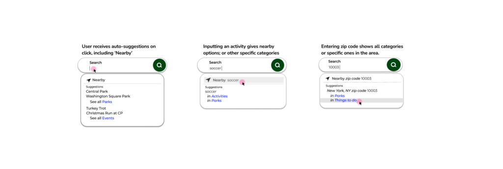
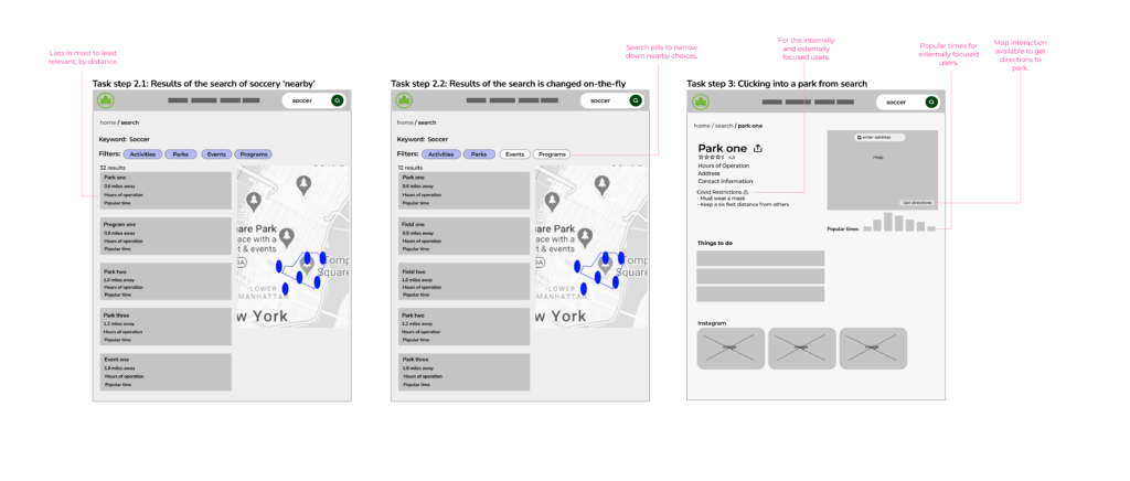
The last project task involved creating a user task flow and a high fidelity wireframes at three break points (desktop, tablet, mobile). Because our research uncovered that park goers prefer to go to parks near their home, I decided to focus on the homepage’s search workflow, using a ‘nearby’ feature. I also focused on features for users that were internally or externally focused on the COVID-19 requirements from the exploratory research insights.
These are some Design Principles that I kept in mind:
- Make the elements of the page inviting and appealing through images, colors, etc.
- Use consistent language, component placement on screen.
- Keep a simple navigational structure; “less is more”.
- Make it accessible to all users (color, text, size, etc).
- Provide constant feedback for users on elements and interactions.
Task Flow
After the user enters search parameters from the homepage, they can find results they please with easy navigation and park details.
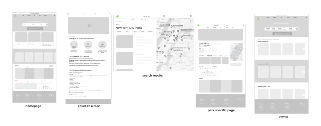
High Fidelity Wireframes
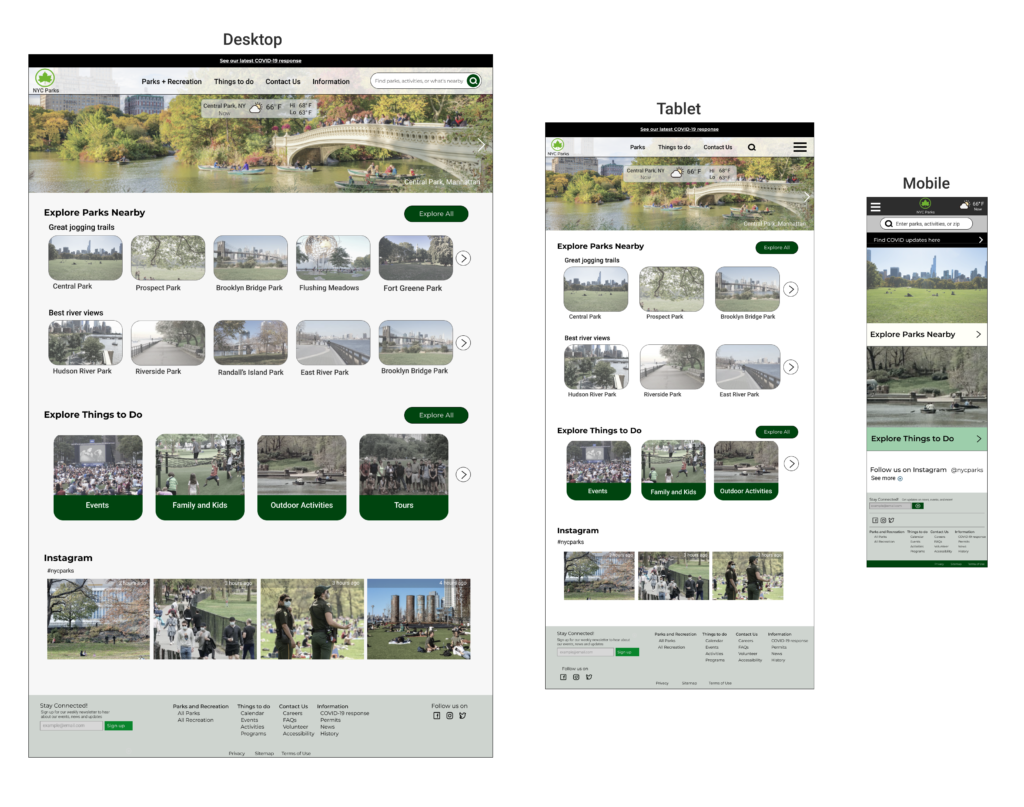
After completing the user task flow, I finalized the homepage redesign by including exploratory options that take advantage of nearby park locations, the discovery of activities, and finally included a social network piece based on the earlier research insights that users prefer to seek social network recommendations instead of doing their own research. The homepage redesign was completed at three breakpoints: desktop, tablet, and mobile.
Next steps
Design
As the next steps, I would continue testing my recent user task flow to validate that users’ needs and expectations are being met. I would also then start tackling other parts of the website, such as the Calendar and Things to Do. Due to the vast amount of content in the NYC Parks website, I would do another round of tree test. These next steps would continue incorporating user testing to keep fine tuning the final website.
Reflection
As my first design project at Pratt, I realized that tackling a homepage redesign can only be done at small steps – if it is all tackled at once, it will be extremely overwhelming. I learned that it is important to always keep the research in mind at each phase of the cycle, each decision is made from the insights and should continue for the entirety of the project. I will keep reflecting on this project after the course, and will most certainly keep these in mind for future projects. Thank you for reading.